Ballyshannon
-
Posts
69 -
Joined
-
Last visited
Everything posted by Ballyshannon
-
 Thanks for the input! As mentioned in my update above, I was able to figure it out and @gdenby, it appears we used the same process. Here is the final result added to the Celestron 11" SCT I created from scratch. Still doing some tweaking, but it's getting close. I've only been working with Designer for about a month now, and am really enjoying it.
-
Here's the image. I want to use the small finder scope attached to the telescope for another project and have it outlined for subtracting the telescope. There are three other areas of white outlined in red that I want removed from the finderscope. Finderscope_subtract open spaces.afdesign UPDATE: Figured it out. I first moved the main image into the outline layer to remove the main telescope image, leaving only the finderscope. I then moved each of the curves outlining the areas I wanted removed to the top of the layers list (above the grouping layer). I then selected all layers and used the subtract function to remove the open spaces. Worked great.
-
I have an image with four areas of white background that need to be subtracted. Any suggestion(s) how to do this? I tried using the Alternate Fill option but doesn't work. Forgot to specify Affinity Designer.
-
That was the first thing I tried and throws the text off to the the right side of the circle. Apparently align center only works when typing normal text that's not on a path.
-
I do logos and various jobs that require text within a circle on a path, and have yet to discover how to make sure text is precisely centered when dragging it around the path and into position without using guides and eyeballing it. Is there a function I'm missing where I can just tell it to center on path?
-
This forum has been SO helpful and I just learned another new function! I wsan't even aware of "Alternate" fill mode.
-
Agreed. Along with other suggestions to make the program even better, this would be very helpful and welcome.
-
firstdefence, that method works well and allows for kearning after-the-fact. Thanks!
-
Thanks for the suggestion and it does work, but when adding the outline fx, how did you keep the outline from producing rounded/mitered corners? Every time I try it, I get rounded corners and I want to retain sharp corners on the cap A, N, etc.
-
Using Affinity Designer, I want to create a thin stroke/line effect around the inside of my name typed in a heavy font (Aardvark), so the line is a few pixels away from the edges. I've tried a few things that haven't worked and need some suggestions. Can it even be done?
-
Nice job MEB!
-
I do high end magazine/publication layout, and always have to convert client-supplied RGB jpg images/photos to CMYK in Photoshop for print. It's usually not a problem other than watching for color shift, especially blues and reds. Blue skies turn purple and reds go orange, both requiring correcting. Personally, I always design client logos in 300 dpi CMYK from the start. That way, if they need it for print, they're covered. If they need it for web or other RGB based media, CMYK can easily be converted to RGB, usually without color shifts.
-
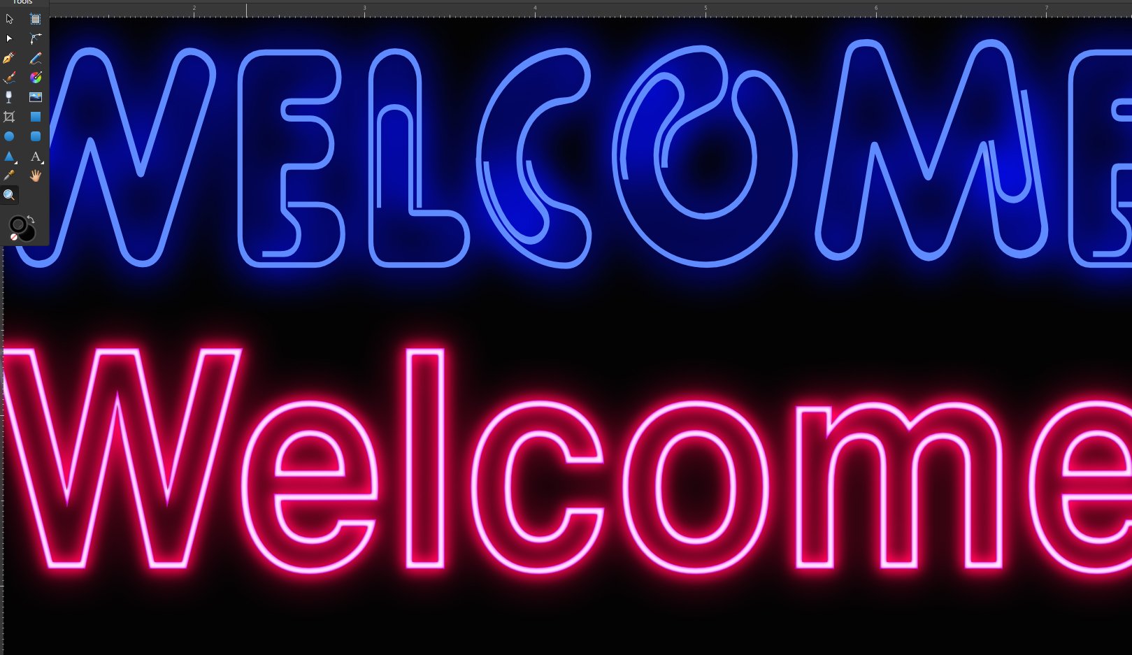
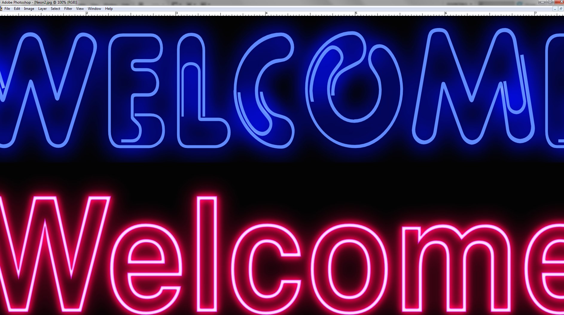
Thank you MEB. I understand that the exported images will only look their best at 100%. However, as I mentioned, viewing the images at 100% in AD produces a lower quality image than when viewed in Photoshop at 100%...as you say, due to differences in how each program renders images. I haven't been using AD long, but so far, neon text is the only project I've experienced this issue with, most likely due to the intense fx used. All other project exports look the same as the native file when viewed in AD.
-
Here is the original AD file, although the specific fonts may not be loaded on the system viewing the file. However, if the fonts are substituted, the file would simply show a different font with the same neon effects. The fonts used are Pipeline and Swiss721BdOul BT. I've also included a zoomed-in screen capture of the original AD file, and a zoomed-in exported JPG in Photoshop. I was viewing the exported files in AD when seeing the jaggedness, but interestingly, the exported images look much better in Photoshop than AD. The JPG in Photoshop actually looks pretty good. Sorry, should have specified I'm using Affinity Designer. Neon2.afdesign
-
Thanks Bruce, but I'm not seeing "Merge Visible" in the Layer menu. I see "Promote Group to Layer" but is greyed out and not available. I tried Rasterize and checked "Preserve layer fx" but didn't help.
-
I've been working with different ways to do neon text created at 300dpi and have produced some nice results, but every time I export at 300dpi using PDF, EPS, or JPG, the overall quality drops. And corners, curves, and angled lines in the text are jagged, as well as the outer glow and basic effects not looking nearly as good as the original Affinity file. I've tried various export settings but nothing looks usable in a project. The only way neon text looks the same as designed is if I do a screen capture, but then it's 72dpi. I can change the dpi to 300 in Photoshop when pasting the image, but the size then goes from 8" to 3". Ideas?
-
Exactly. Corel Draw was able to warp text from the start MANY, MANY years ago. Basically Affinity is a good program but it's disappointing that any vector program in 2018 is incapable of warping text since it's such an important tool for any designer.
-
I figured it out. After outlining the area of his glasses to be removed, I had to make sure the curves layer was on a separate layer and not nestled with the background layer, select both the background and curves layer, and use the Subtract function.
- 1 reply
-
- 1
-

-
I have removed the background from a portrait photo of my brother who is wearing glasses. His head is at an angle with part of the left frame/lens of his glasses extending past his face. After removing the background from around his head and face, how do I then remove the background from the small section of his glasses showing past his face?