Chris26
-
Posts
915 -
Joined
-
Last visited
Everything posted by Chris26
-
 Ivan, no professionalism is required. And yes you are right about one thing, make sure you do not have any artificial or natural window light behind you, this is a killer. BUT, All laptop screens are set to a luminosity level (candelars) way way above what is acceptable for viewing images. You will always wonder why your prints come out darker on a printer. If you intend to do a lot of photography and send to printers then callibrating the monitor is an essential. Secondly,the rudimentary software that comes with the Dell for example is not a calibrating mechanism, it simply adjusts for comfortable viewing andthe two are worlds apart. Calibrating will set the shadow and highlight values and adjust RGB colour and set temperature ambience (ie the light that is currently in your room will be taken into consideration) the latter is perfect if you work in a room where the light does not change, or if you decide to work with a daylight bulb on your desk or something. There are a few more details as well but basically it is not a waste of money, if you print regularly, or send to a printer once a month for example. The time saved and the money saved in paper and ink is wellworth it, not to menttion the absence of that scream when the print is not as you expect. The only thing required for calibrating your monitor is to google and read a little about colour management and what the software does, apart from that you hang the spectrometer on your screen press some knobs and away it goes. KInd regards Chris
 -
. .
-
Is there a way to control the opaque/transparency value as you use the brush tool on masks. At the moment I can only seem to get full transparency when I would like 50% for example. Chris
-
One point to make here, calibrating does not synchronise printer with screen, what it does is to make sure that you have a consistent work flow, for example, I always know before hand how my print will look because my screen has slightly brighter pixels at the lower end (12.12.12 to 20.20.20 RGB these are dark shadows) But these will be printed out lower meaning total complete black, knowing this means i just simply lighten these areas if the aesthetics are more pleasing. Also I can be assured that all my colours will be exactly the same apart from say on screen I see more deeper reds, but I know these can not be printed out so deep, but that does not matter, I adjust or I leave, the point here is that there is very little room or no room for dissappointment when you print, or when you send to the printer, as long as you proof with regards to the latter. Northlight images will give youa lot ofinfo and he has those excellent test cards you can download.
-
Document setup PPI ? DPI ?
Chris26 replied to Chris26's topic in Feedback for Affinity Publisher V1 on Desktop
- 27 replies
-
- 1
-

-
- document setup
- printer
- (and 2 more)
-
Why Have I never noticed that Rubbish Bin? I've been looking for that all over affinity.....it must have been masked when I was doing it...... Ok yes I know, the image frames have a tint of grey, sorry, I was seeing blue in my images top and bottom and just asssumed you saw grey instead....but thanks for pointing out the rubbish bin for me. So at least now I have that perfected and the drag frame sliders independently of image mastered, and don't place TIFF's with alpha channels.
-
Ireland, very close. Hick, Windows photo is a plaything and not geared up to render images in such a most precise matter colour wise. Secondly, each piece of image rendering software will have differences in its rendering software for displaingy pixels on a screen. The most important thing is how it prints, not how it looks on screen. However, one of the first steps in colour management is to calibrate your display. A lot of people can not afford this, 140 euros will get you a superb colorimeter and calibration software from Datacolour for example (I use that one). My laptop is not calibrated at all at the moment except for what I altered myself inside the windows software where I could just to give me a guide. My photos fom the mac and the print match up perfectly, but my photos on my laptop look 'orrible, BUT, I place my image from the mac onto the laptop with complete confidence knowing exactly how it will print. Because it does not matter what it looks like on my windows screen. Also when I send it to my pdf on windows it looks even more different, but I don't care, I know it will print perfectly. Why? because all the informaton contained within that image that tells it how it should look never changes from screen to screen from pdf to pdf, but how it is rendered on a given device WILL change. But no colour or luminosity values are being altered. Does this help?
-
Ireland, very close.
-
I did this procedure twice, and results were the same, no idea about the tint, but you only get the tint and that border when you iport into a constrained frame as mentioned earlier.
-
.
-
SIMPLE SOLUTION FOUND, unbelieva-a-bubble...by not using the image tool or the frame tool. Transparency problems I had were caused by using these methods of importing. they give a bounding box to the image. The top screen shot (top image) is what I have been trying to do since last night Simply open your image from the hard drive from within affinity, drag (do not place) drag the image to your document page and use transparency tool. This first screen shot shows it clearly, regards the second screenshot, not clear.(I could not delete this one, if affinity forum has a delete button for deleting images before you commit to post please tell us). nsions as original, now apply the transparency tool. Done. Chris

-
Yeah, that is annoying. I uploaded it directly from my USB where it was saved in photoshop to adobe acrobat. Coming then through the windows internet to upload to affinity - How the hell foxit grabbed its paws over it beats me.
-
From a land where passing cars still stop and chat on the road and people still wait until the conversation is over, where sheep are often found wandering along some roads, where painted words on roads for instructions are ALWAYS written backwards, I mean that, where sign posts say 4 km to such and such a place and then you travel two Km only to see another sign 4 Km again. and where an absence of bureaucracy is a delight.
-
Hallo fde, that was the first thing I tried, the problem with that is that there is white on the colour as it fades away downwatds, you want that colour to be sort of toned down gently not covered in half see through white. Also upon trying to gradiate by applying a mask over that faded area I get nothing, but that is becasue i simply can not get this mask business to work in affinity, that bit is the most frustrating of all, masks are fundamentally straight forward but affinity's version is complicated and un-intuitive for the likes of me, plus what the hell does 'ramp' mean? where are the tutorials for this masking feature? So far that long winded path I did comes very close to what I am looking for. Chris
-
Hallo Wosven,t hanks for that image, I see that the top image is the better one for me. So after playing around I see on the Layers Panel, third layer down you have a rectangle, with a sub layer called curve. I replicated what I think you did:: 1. Created a shape using the pen tool 2. Adjusted nodes accordingly 3. Filled shape with white 255 255 255 4. used transparancy tool and dragged 5. Use FX dialogue to apply radial Gradient 6. Gaussian blur over all this is a long winded path than the one click drag in indesign Forget this image, wanted to delete but see no way of deleting uploaded images?
-
Hallo Hick, I have scanned in some random pages from a book I uploaded in PDF, it is only 4.5Mb so easy download. I Highly recommend this book for a couple of reasons: It's called: The Creative Digital Darkroom by Katrin Eismann and Sean Duggan, I have 2007 edition. 1. Most Photoshop tutorial books are photoshop specific, they tell you what to do and how to do it and what buttons to press, what we need is to UNDERSTAND what we are doing and why we need to do it and When not to do it. This is not always obvious from youtube and other sources of so called tutorials, there is more confusion out there than clarity For a Beginner, as you become more knowledgeable you will be able to target google precisly and thereby save yourself hours of fruitless video watching. 2. This book is not photoshop specific, but it is based on everything you will find in photoshop to do with editing an image. And therfore is suitable for anyone doing any sort of editing in any software. It covers everything from colour management policy to complex editing with all the basic stuff in between. You can simply pick a chapter and read, you do not need to start at page 1. Also more importantly, it is a book that will not go out of date in the foreseeable future. 3. It lays foundations, is not information overload and will give you a brilliant grounding in areas a lot of tutorials never mentiont (exception is Linda .com) Lastly ,my two-penneth, KEEP AWAY from brightnes-contrast slider, never use it, it is a legacy panel, and it is like using an elephant to peel aan apple. You never ever need to use it. There are much more efficient ways to brighten and to do contrast than that monstrocity, it is a like throwing a stick of dynamite into a lake to catch the right fish. Curves, Luminosity masks, high pass filter, and yes even unsharp mask can be used to increase contrast without sharpening. I hope you enjoy your journey in all this. Chris PS, getting fed up with windows here, I uploaded an adobe acrobat file, but now you see foxit pdf simply because i transfer everything from my mac to this plaything they call a computer. Excuse my language but this Bl%!%dy terrible, it should not be .exe, when it is pdf. I have just tested it by downloading it myself and everything went ok, another case of windows taking over..... FoxitReaderPortable.exe
-
Wosven, thankyou for your help. I have downloaded both now and will have a look later on today, I do appreciate your help. Funny....when writing and typing to so many people at once, what you think and what you type sometimes go a blur in the hecticness....I know there are no channels or masks in IDD, I was simply thinking the both of them as I was writing. Alfred, I just downloaded BOTH files with ease. using the same manner. No problem. My computer did NOT block anything, unless it was in a bad mood lst night! Affinity clearly said something that was nothing to do with anti virus, malwarem security, defensive mechanisms, strategic deflection or anything else of this nature. It was clealy on the the affinity desktop environment. this is all I m saying it is no big deal at all, it really really does not matter, but I know what I saw. Respecfully. Chris
-
No I could not even download it, it was blocked before any download started. But I take your point and respect your better understanding of affinity than I do. thanks for the input Alfred.
-
Hi Wosven, yes I will have to take the image back into indesign and do it there Oh I can't! Well Photoshop then, but the problem is that I will have text aligned in a certain way I need to eyeball this in page layout, calculation sizes and distances will not work,so taking into photoshop is not possible, Indesign has a simple gradient tool (affinity calls it transparency tool) and the gradient tool in affinity is just a colour thing, no good. So indesign is just one click 3 seconds and drag and it blends straight away with the background page, so I guess affinity does not do this yet? But that mask dialogue is a problem and I will have to somehow understand there system of working it. And then how to use it. Thanks for the help though.
-
It was It was in the affinity window that I read the message'' The owner does not have permission....or something, or you have not been granted....' I never took a screen shot but the wording was along these lines. It was not my windows that did this.
-
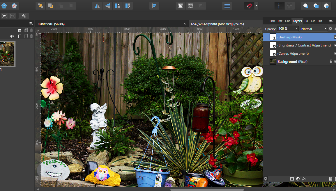
Ok, I already see a number of issues that need attention. But firstly when I loaded the image into affinity publisher I received this message (first Screen shot), not quite sure what it means though. I took the tiff and the raw into photoshop. Compared them side by side at 100%, clealy a differnce and not bad on screen but colour saturation was visible even at 50%.and at 100% I couldsee colour artifacting. However at 200% the raw was fine, but the tiff was full of colour problems and there was a breakdown of pixel integrity as a result of over use of the saturation, or curves or sharpening. All this confirmed my suspicions that you are employing too many adjustments at once and destroying your image. I then loaded the affinty image and yes, there I see, unsharp mask, brightness and curves, you have literally TRIPLED the same effect and which has led to a pixel breakdown and colour artifacting while partially invisible at 100% is clealy visible at 200% and this will be translated data sent to a printer and affect output quality. These are my first impressions. One other thing I did not understand was the resource manager in affinity did not pick up on this image. I saw in Photoshop that you have a 300PPi at 6000 pixels long side roughly, you have an excellent image, top notch, but you have destroyed its potential. You need to learn to use non-destructive editing and begin by grasping fully the issues I mentioned earlier in a workflow, I say all this kindly and only to help you, I too was a beginner once and know howit felt by the dazzling array of editing tools we have at our disposal. Kindest regards, Chris .
-
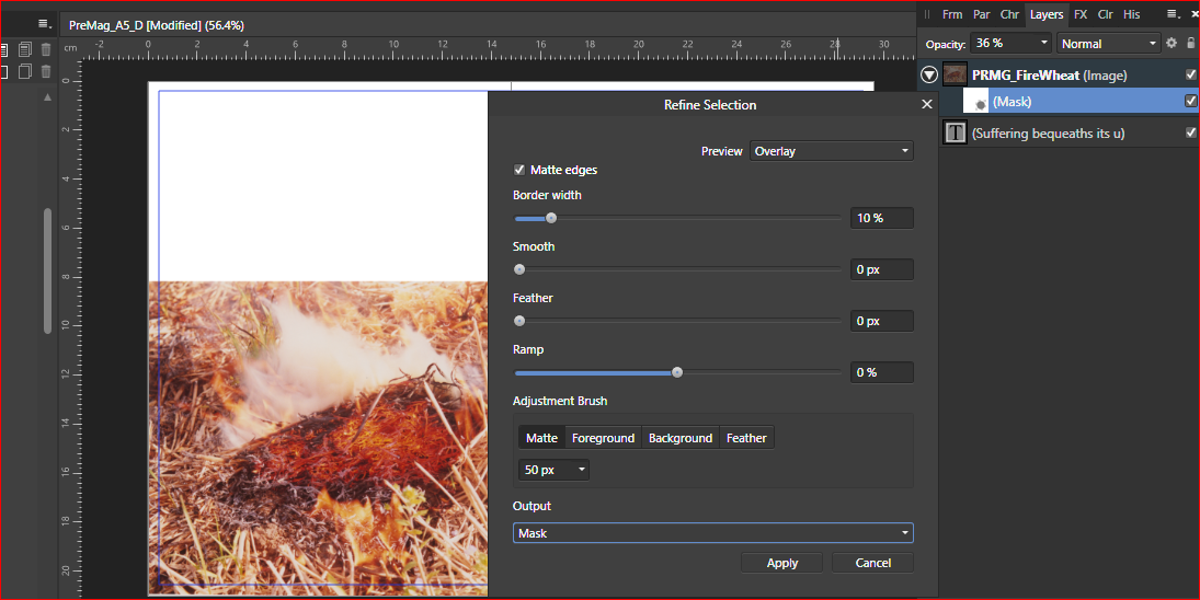
Ok, Wosven, First the attachment does not open, it is blocked by affinity. Second, masks and channels have been a huge part of my editing over the last 5 years both in indesign and mostly in photoshop and I am very familiar with them. But For the life of me I am perplexed and confused by how they work in affinity. There are absolutely no tutorials or help files on this that I can find. The dialogue box, half or it is a complete mystery despite playig around with it I am no wiser, sorry. feathering, smooth, borderwidth I undrstand, but the rest????. Also I don't see, after messing around for ages, how on earth you can apply anything without using a brush. So I would appreciate an explanation about how to work with this feature, really, messing with it just gets me frustrated. I can read for hours, and study, but if there are no helps or tutorials I have to post, I really do not like posting like this, but there really has to be some more in depth tutorials about affinity publisher. After I have applied the mask, I can not seem to do anything logical with it. blends and
-
May I now say in view of what you just mentioned, use curves sparingly, to avoid adjusting colours when you use curves, set then that curve layer blend mode drop down menu to 'Luminosity', then you only alter the darkness and light values WITHOUT making any alterations to colour at all. Just a quick tip. Another option here when wanting to adjust contrats, and there are many, but this is an easy one, Duplicate that image in the layers. Find a 'High Pass' and apply it to the image, then set the blend mode to overlay or soft light and adjust opacity to taste. These are non destructive ways to apply contrast and keep colour values from altering in any way and also you retain the ability to alter the image if it is not to your liking after a first print. I of course am assuming that these functions are avaiable in the software you use, but hopefully in Affinity photo Chris
-
As you can see from the image I am not placing it full page size, I have been trying to merge the top edge of the image into the page so that there is no straight cut-off showing. I tried to place a rectangle over the top, fill it with white and then set to 100% gaussian blur, but as you can see it does not work, is there an efficient way to do this in affinity please?
-
Reading RAW files
Chris26 replied to Linslusen's topic in Pre-V2 Archive of Affinity on Desktop Questions (macOS and Windows)
I pulled this from the web - So this is a RAW format specific to Sony's own particular camera that you are using, this should not be a problem, you could try going to a raw file converter, not the ones that convert to jpeg, but here: https://supportdownloads.adobe.com/product.jsp?platform=Windows&product=106 you can convert your sony raw to the more common DNG (digital negative) I would imagine then Affinity provides the thumbnails because this is the most used. Adobe bridge for example would probably show the thumbnails of this camera RAW, as you will notice from the link, Adobe keep adding more support for the constant new RAW formats that are proprietry for a specific camera. I hope that I have understood you here correctly. Chris format raw. T