Fahneflycht
-
Posts
15 -
Joined
-
Last visited
Everything posted by Fahneflycht
-
Problem with Helzel Fraktur typefaces
Fahneflycht replied to Fahneflycht's topic in V1 Bugs found on Windows
OK, thanks for your quick reply. The fonts I showed in my sample aren't the only ones affected by this problem. What I don't quite understand is why only some of his fonts (I'm guessing about 20%) would have this issue whereas most work flawlessly with Affinity and with other applications. I would have thought he'd use the same engine for all his fonts, as the typographical rules apply to all fraktur typefaces, regardless of their outward appearance. I also don't understand why this problem doesn't occur when using Word 2016, which was why I thought it might have something to do with Affinity. Still, I accept that the only way to find out would be to examine the code used in the affected fonts, but since none of these are freeware, this would require Mr. Helzel's permission. Bottom line this means that I will simply have to avoid using the affected fonts for any longer project, at least until further notice. -
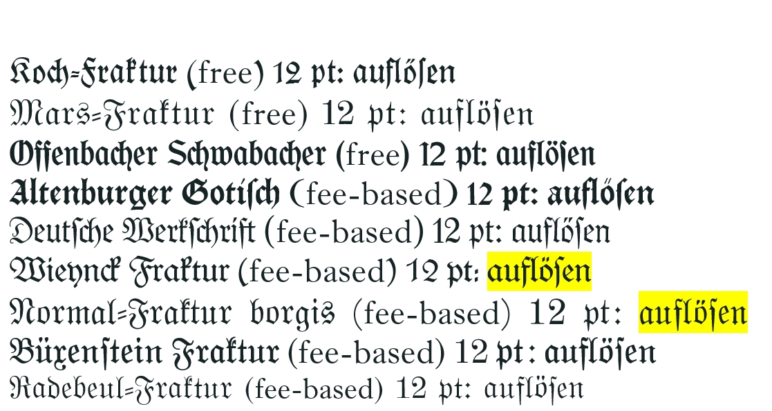
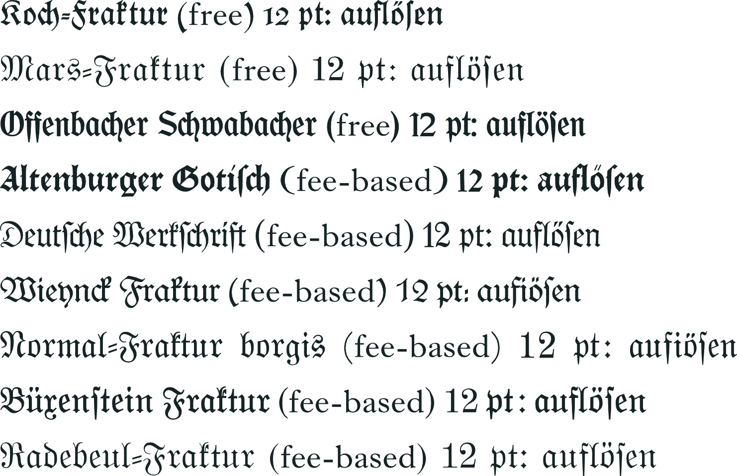
Big fan of Affinity software suite here! As a fly in the ointment, however, I have now discovered an irksome problem with its handling of certain Fraktur fonts. In addition to being well designed and historically accurate, Gerhard Helzel's opentype fraktur fonts (www.fraktur.biz) automatically provide the correct setting of ligatures as well as the long s, where the typographical rules require it in German. Helzel's fonts may thus pretty much be considered the aesthetic standard in this genre. The Affinity suite accurately sets the long s as well as other ligatures like [long-]st, fi, ff, fl, etc. It also generally correctly does not set ligatures where these do not belong (e.g., in words like "ausstellen" or "auffinden". Unfortunately, with some of Helzel's fonts, the ligature fl is incorrectly replaced with an "fi" — instead of setting "auflösen" (correct would in this case be no ligature), Affinity converts the fl into fi, i.e., it sets "auffiösen". It seems this problem is confined to the ligature fl alone, and curiously enough only with some of the Helzel fonts, with most of them Affinity correctly sets [f+l] in such words. As MS Word as well as another Windows app of mine always function properly with the affected fonts, I conclude it must be Affinity that contains a bug here. Manually intervening with zero-width spaces is possible, but is a highly cumbersome method to use in longer texts. The problem only affects about 20% of the Helzel fonts and even with these, Word gets it right and the false ligature apparently only appears in Affinity (see attached screenshots for how both applications set the word "auflösen" in a few sample Helzel fonts). Is there perhaps a quick fix to this problem (e.g., substituting "fl" for "fi" at the relevant place in the code, perhaps?) that could be included in the next upgrade?

-
Ligatures in Affinity Publisher latest update
Fahneflycht replied to Fahneflycht's topic in V1 Bugs found on Windows
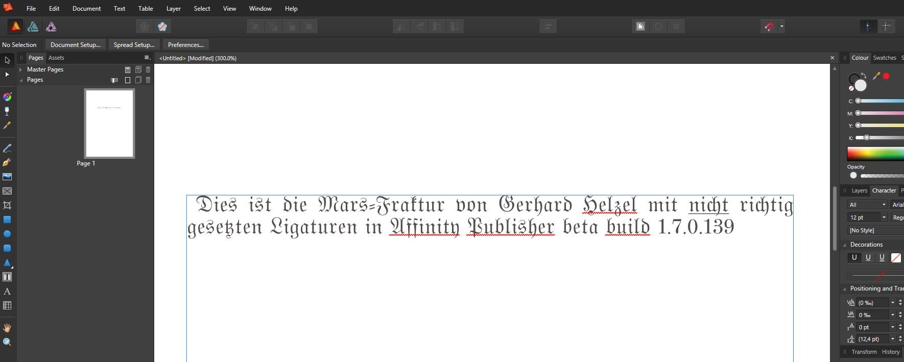
Hi again, I've prepared a sample document which I've uploaded both as an Affinity Publisher as well as a *.pdf-document which hopefully shows what I meant with ligatures becoming decomposed when paragraph alignment is justified last line left. This is in my world at least a new problem which I didn't have with the old AP Version 1.7.3. Grateful for any tips or corrective steps, if possible. If you need the Mars-Fraktur for any reason, the OpenType-version of it can be downloaded here for free: http://www.fraktur.biz/MarsFrakturOT-Normal.zip Sample of Incorrect Ligatures.pdf Sample of Incorrect Ligatures.afpub- 9 replies
-
- 2
-

-
- ligatures
- justified text
- (and 1 more)
-
Ligatures in Affinity Publisher latest update
Fahneflycht posted a topic in V1 Bugs found on Windows
Hi everybody, since the last update ligatures in Affinity Publisher (Version 1.8.0.584, Windows 10) only work properly if text is not justified. If I set text as left-, center- or right-aligned, ligatures like ff or fi are set correctly, but if I then set that same text as justified (last line left, centered, or right) the previously correctly set ligatures disintegrate into individual letters. The problem seems to exist independently of my choice of typeface. Also relevant to this are the following points: A couple of days ago, my Windows 10 was updated to version 1909 (Build 18363.693), which also included an update of Microsoft.NET. I have many German blackletter (fraktur) fonts developed by Gerhard Helzel that set the frequently used long s automatically, where this is appropriate. In addition, I have many (free) blackletter/fraktur and antiqua fonts from Ligafaktur (www.ligafaktur.de), all in the LOV-version, that set the long s and other ligatures automatically where appropriate. All fonts (ordinary antiqua, Helzel, and Ligafaktur) use the correct ligatures in Microsoft Word 2016, regardless of the paragraph alignment is left-aligned or justified. Similarly, all fonts worked flawlessly in Affinity Publisher until the latest update (to Version 1.8.0.584). All fonts (ordinary antiqua, Helzel, and Ligafaktur) work flawlessly in Affinity Publisher if texts are simply set as left-, center- or right-aligned. If texts are justified (last line left, center, or right), however, all ligatures are dissolved into their individual components. The Helzel fonts still set the long s, where this is appropriate, but all other ligatures are dissolved. With the Ligafaktur fonts, all ligatures are dissolved and a round s is erroneously substituted for the long s. From this I conclude that the ligature problem lies with the newest update to Affinity Publisher (to Version 1.8.0.584). I'm not qualified to speculate as to whether or not the contemporaneous update of Microsoft.NET is likely to have something to do with it. If I set kerning to "manual" or optical alignment to "none", there is no change. Does anyone else have this issue? Does anyone know of a quick and simple fix to it? Many thanks in advance. Faneflycht- 9 replies
-
- 2
-
-
- ligatures
- justified text
- (and 1 more)
-
The numbered list button in Publisher seems to work only if used at the top level and sequentially. If one tries to introduce a list entry hierarchically below the top level (e.g., "1. History ... a. 1960s"), a second listing number is introduced (i.e., "1. History ... a. a1960s"). If one tries to remove the extra "a", the list number disappears entirely and the entry is then converted to normal text, but as it seems with a different indentation than either the previous list or previous text. A workaround using text styles is possible, but cumbersome to use, and the numbering is then no longer automatic. A similar issue concerns footnotes and endnotes. One would wish a button to handle this. Currently, one must, it seems, use a text style as a workaround. One must then keep track of the numbering oneself. If one wants a footnote on the same page (rather than an endnote on a separate page), one has to insert a separate text frame so as to avoid having the footnote move if additional text in the main text frame is inserted. As there are very limited entries in the help section on these issues, I must assume that I haven't simply overlooked something obvious. If I'm wrong on this, I'd appreciate a hint from someone in the forum. If on the other hand my concerns are valid, I hope remedies will be offered in the next version, as both features seem to me fairly central in a professional DTP application like Publisher. Many thanks in advance, Fahneflycht
-
In my view, the probably most serious missing feature in the current Publisher beta is that there is still no quick way to insert a footnote or an endnote. It would be desirable to have a tool for this, once Publisher goes commercial on June 19. Maybe it's no big deal -- Page Plus managed footnotes and endnotes very well. If such a tool is already being planned, it would be very nice if one could also insert cross references into footnotes/endnotes.
-
Call me dumb, but....
Fahneflycht replied to NauticalMile's topic in Feedback for Affinity Publisher V1 on Desktop
AP will be a great application one day, but it still has a ways ahead. By way of the beta process, hopefully most of the missing (or still unclear how to use) features will be added and most of the bugs fixed. I am willing to be patient based on this prospect. In the latest beta version, the automatic ligature settings of Gerhard Helzel's Fraktur fonts work flawlessly, proof that progress is possible. Here's my quick and preliminary list of additional suggestions for future releases: 1. I, too have been using Page Plus for years. I think AP will prove more stable than PP, and I for one would accept forfeiting some of the user friendliness of PP in return for more versatility and stability. Even so, the ability to import PP and Word documents directly (i.e., without intermediate conversions) into AP would rank high on my wish list. 2. In AP beta, the color selection in text styles seems to behave somewhat erratically. I've formatted text in a particular color and the next day, it seems like some kind of default has substituted the color I had defined the day before, even though I had converted the base text style and saved my changes. Maybe I've just overlooked something or done it backwards, I don't know. A nice feature of PP was the ability to select predefined colors according to, e.g., the CMYK or RGB schemes and apply these to text with one click. Would be nice if one could save one's favorite colors and apply these with one click by way of a button or an icon and not have to adjust the individual settings each time. 3. The "base" character style uses Arial 12 pt. When I define a new group style with a different typeface and type size, AP seems correctly to save the corresponding settings for that group. When I then define a character style based on the new group style and apply this new style to existing text, however, I seem to end up with the correct type size, but in Arial. When I try to redefine the tracking setting of the character style, I end up with Arial and the original type size (12 pt). I have to admit, I'm still in a trial-and-error mode with this and have perhaps simply not yet figured out the correct way to do it. Someone who's ahead of me might wish to test to see if the problem described is just my own ineptitude or if it's a real bug that could perhaps be easily fixed. 4. I haven't detected yet how one can add footnotes or endnotes to AP documents, but maybe this is already in the works? Greetings, Fahneflycht -
OpenType support missing
Fahneflycht replied to Fahneflycht's topic in [ARCHIVE] Publisher beta on Windows threads
Thank you very much for your efforts, Sean P. Fyi some further comments on this. I'm no expert when it comes to programming, yet it seems to me that Gerhard's fonts should be ok, since they work flawlessly with Word 2010 and later. Curiously, some of Gerhard's fonts work with Microsoft Publisher 2016, whereas many of them (maybe 4 out of 10 or so) do not work at all (i.e., with MS Publisher it's an all-or-nothing proposition). With the sole exception of a minor feature (viz. the automatic dissolution of certain ligatures that is required in certain words) all of them also work perfectly in QuarkXPress 2015. If the font design itself were to blame, it would seem to me as a layman that the fonts would not work with Word or QuarkXPress, either, or am I perhaps just overlooking/misunderstanding something about OpenType programming here? -
ok, great, I had overlooked this feature. Thanks for alerting me to this.
-
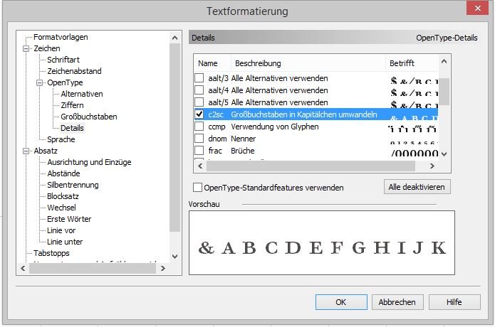
Hi again, One more suggestion regarding OpenType features in APub beta build 1.0.7.139: One feature that I found helpful in Page Plus was the ability to select individual OpenType features such as the ability to display capital letters as smallcaps (see screenshot; useful e.g. to construct lists of content where the capitals are to be retained) as well as to select individual ligatures. Some fonts offer historical ligatures, e.g. ct with a hook over the c, which may be appropriate in some situations but not in others. In PagePlus you could (to the extent the functionality is available in the particular font) select to omit such ligatures while retaining others in it. Particularly helpful was the checkbox list where the available features could be selected or deselected on an individual basis. APub so far seems to offer “all or nothing” in this regard. On my wish list for Apub would be such an individual checkbox list feature as was available in PagePlus. Thank you for your consideration of this suggestion. Fahneflycht
-
OpenType support missing
Fahneflycht replied to Fahneflycht's topic in [ARCHIVE] Publisher beta on Windows threads
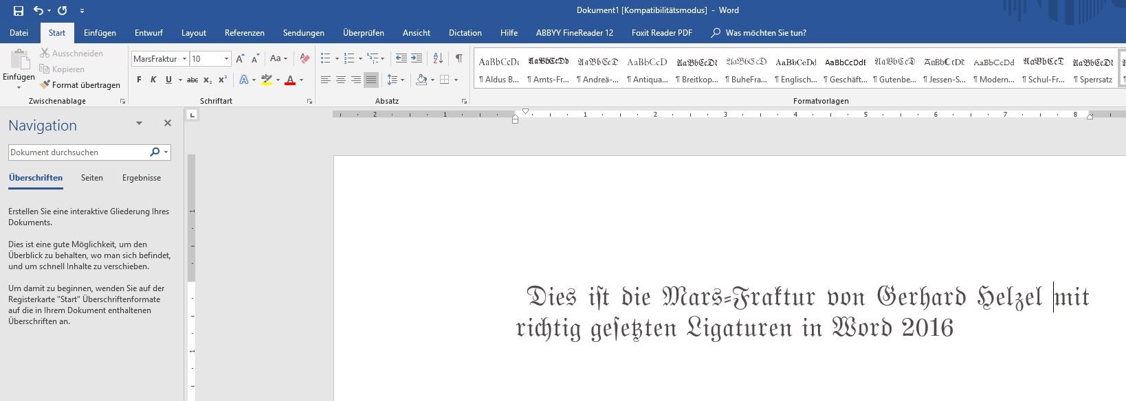
Hi Sean P, As you requested, I've attached the "Mars-Fraktur OT", which is offered by Gerhard Helzel free of charge. Presumably the OpenType engine is the same as in all his other fonts, so of this one can be brought to function properly, the others ought to work as well. I've attached screenshots using this font in Word 2016 and with APub build 1.0.7.139, respectively. The ordinary ligatures like f+i and even c+h are set correctly by both programs, but the automatic setting of "s" work with Word 2016 but not with APub beta. As I prepared the screenshots it occurred to me that APub beta is not yet available with German language support and that this might be part of the problem. However, Gerhard's automatic s works even with an English text in Word, but not in APub beta. As I understand the OT-functions in Gerhard's fonts, a long s is always set automatically in any language as a round s can never occur at the beginning of a word. The more complicated rules would not work in English, as they are specifically programmed by Gerhard to work with German words but not necessarily with other languages. Thanks for looking into this issue and please let me know if you need any additional information from me Best, Fahneflycht MarsFrakturOT-Normal.otf
-
Sorry to nag about an esoteric issue that is probably of no concern to the vast majority of DTP users -- to me, however, it is highly important that the automatic typesetting of long s in Gerhard Helzel's open type fonts function properly - which is still not the case with build 1.7.0.133 (win). If the automatic long s-function can't be implemented in Apub for some reason, I would have to continue to use Word, where this function works flawlessly, even as Word is rather clumsy to use in so many other aspects of DTP. But if this particular function works so well with Word, why can't it be done in Apub? Would seem to me that a skillful programmer could solve this quickly. However, as I am no programmer myself, I may be making an inference that is way beyond the scope of my knowledge, so please pardon me if I'm mistaken in this regard. https://forum.affinity.serif.com/index.php?/topic/67933-opentype-support/&tab=comments#comment-351320
-
OpenType Support
Fahneflycht replied to Fahneflycht's topic in Feedback for Affinity Designer V1 on Desktop
Sorry to nag about an esoteric issue that is probably of no concern to the vast majority of DTP users -- to me, however, it is highly important that the automatic typesetting of long s in Gerhard Helzel's open type fonts function properly - which is still not the case with build 1.7.0.133 (win). If the automatic long s-function can't be implemented in Apub for some reason, I would have to continue to use Word, where this function works flawlessly, even as Word is rather clumsy to use in so many other aspects of DTP. But if this particular function works so well with Word, why can't it be done in Apub? Would seem to me that a skillful programmer could solve this quickly. However, as I am no programmer myself, I may be making an inference that is way beyond the scope of my knowledge, so please pardon me if I'm mistaken in this regard. -
I frequently create documents set in the traditional German Fraktur alphabet, which requires certain ligatures that are not used in texts set with ordinary Roman letters. The most important one of these is the use of the so-called long s (Unicode U+0073), which may not be used interchangeably with the normal so-called round s but is used according to certain rules. The best Fraktur fonts out there are those that have been digitized by Gerhard Helzel (see http://www.fraktur.biz/). His OpenType fonts have been programmed to employ all required ligatures including the long vs. round s. These fonts work perfectly with Word for Windows 2010 and later and with InDesign as well as with XeLaTeX and certain other freeware programs. Most of them (not all) also work with QuarkXPress 2015. With the beta version of Affinity Publisher, the automatic setting of long vs. round s doesn't work, although conventional ligatures do seem to work. On my wish list would be that the above-mentioned OpenType ligature automatic would work also with Affinity Publisher.
- 3 replies
-
- 1
-

-
- typography
- fraktur
- (and 1 more)