TheEarnestBunbury
-
Posts
8 -
Joined
-
Last visited
Everything posted by TheEarnestBunbury
-
affinity photo Designing Pulp Book Covers
TheEarnestBunbury replied to TheEarnestBunbury's topic in Share your work
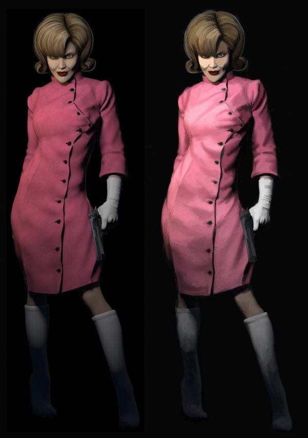
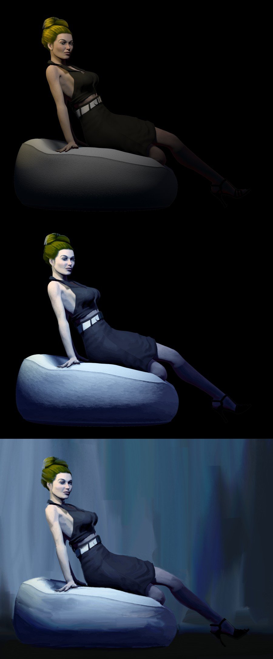
C&C are always very welcome - I make no bones about not being an artist (which is also why I'm not comfortable doing things for friends but I've a couple of them who do ask) and while I've little ambition on my part, I'm always happy to glean anything I can from the advice from those who are and are willing to give it. Poser anatomy has always been a little odd and I'm afraid that I'm working with some fairly old models that I was able to purchase a lot of stuff for cheaply in sales over the last couple of years (I think you can only afford to get into using it if you go the route of buying the old stuff cheap - this wouldn't be a viable way of producing cheap covers otherwise). Poser's camera always needs a bit of adjusting from the defaults. I must admit, I thought I had it just right when I rendered and certainly, nothing noticed in the faux painting - but when the arm was overlapped against the white panel, divorcing it from its context, then things started to look tricky as it just pops right out. There was a bit of creative selection and lightening up all round which helped but now that you mention it, I suppose it may even be possible to shorten the arm a little within Affinity, so I might just give that a go when I get back from my holiday (I'm just having a last cup of tea before I leave). I'll re-post if I manage it. I shall also have a go at that thumb -
affinity photo Designing Pulp Book Covers
TheEarnestBunbury replied to TheEarnestBunbury's topic in Share your work
Here are a couple that a friend asked me to do for her - not quite as pulpy but similar sort thing.
-
affinity photo Designing Pulp Book Covers
TheEarnestBunbury replied to TheEarnestBunbury's topic in Share your work
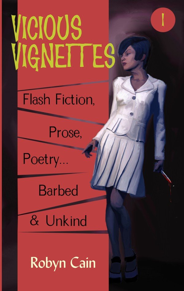
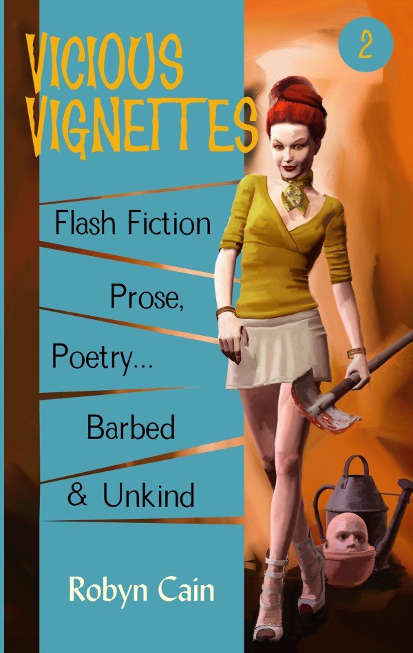
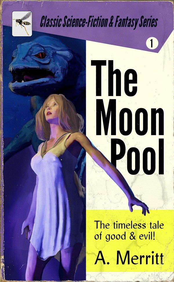
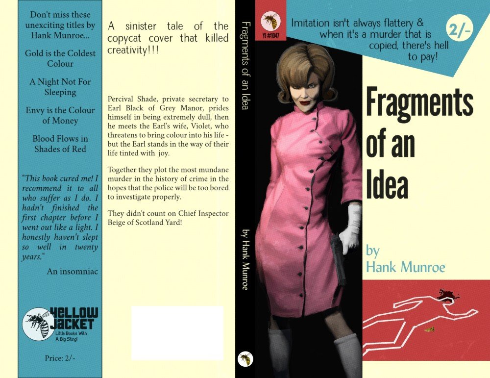
I haven't posted in an age it seems. Still, now that I have Affinity Publisher, I'm keen to get into typesetting. To train myself up, I thought I would hunt down a few classics in the public domain, which in turn is going to mean book covers. I've found that Lulu do pocketbook sized paperbacks and so that's what I've prepared this for (it's only about 4in x 7in.) - obviously, I won't have the wear and tear on there for printing a book for myself but it looks good for display. I've based the layout on the same source as my first post here and will continue using it for other classics I practice on as I like the idea of using the top and spine colour to indicate genre, while the layout provides branding more than the logo does. I must admit that I'm quite looking forward to reading this book again, as well has having it back on my bookshelf (it was something lost in a move).
-
affinity photo Focus stacking - 160 and 25 frames
TheEarnestBunbury replied to unni's topic in Share your work
It's too easy to forget just how amazing the world is - work like this is a wonderful reminder. I'm blown away and really don't have the words to express my feelings, so I'll have to settle for Beautiful, and Thank You! -
It's been a long day... thank you for making me smile at the end of it
-
affinity photo Designing Pulp Book Covers
TheEarnestBunbury replied to TheEarnestBunbury's topic in Share your work
Hi, I was just looking at a couple of your posts and was very impressed with what you have done with compositing and Dynamic Auto-Painter (also your T-Rex mouth-cam, which was great fun). I do think that 3D models lend themselves very well to a natural media finish - partly because of the uncanny valley. Photos of faces that have been filtered this way, often fail to sell the effect because it can't hide the exactness of the photographic source, while the little failings in a 3D model that gives rise to the uncanny valley in photo-realism, actually help sell a natural media effect, suggesting the imperfect hand of an artist over the perfect rendition of film. -
Wow! Excellent work - the composited spider blends in perfectly rendered with the paint effect. I like the second of these in particular thanks to the greens picked up in the spider's body.
-
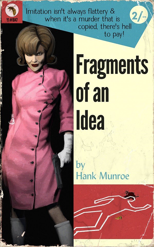
I've been working on how to create book covers that imitate those of the pulpy paperbacks of years past. The idea was to work on a method that others could use as a viable - and so necessarily cheap - option for the self and Indie publishing market. I had been making do with an old version of Photoshop Elements that came with my Bamboo Fun & Touch tablet but decided to take the plunge and try Affinity Photo when I got a new computer, and that turned out to be a very good decision. So... I start off in a program nobody likes to mention - Poser. I'm not too fussy about render settings as so much is changed in post, what matters is the figure, the posing, and the lighting. The result is then opened in Affinity Photo, where I start with some adjustment layers (highlights/shadows, brightness/contrast, colour balance), along with a plug-in from Topaz called Simplicity. This result is then saved out and opened up in a paint program called Art Rage and then attacked with an oil brush and knife to leave me with a faux painting. In Affinity Photo, I've been building some book cover templates and the faux painting is introduced there, with some wear and tear added for a display version. The two designs I've posted here were both based on Mike Shayne covers (the first is one I've seen copied by other publishers, the second is a bit of a classic - enough for someone to have created a font based on it). For very simple designs like this - ie a single figure with one or two props, and also assuming a cover design template is used, then the production time can be between 2-3hrs. I believe that someone more skilled than myself can probably do both a better job of it and at a faster time but even at my speed, I think this could mean a low enough cost for the target market. I don't think I'm ever going to be sufficiently happy with my own efforts to enter that market myself (or, to be honest, with enough free time), so I would like to encourage others to have a go themselves.
- 15 replies
-
- 18
-