

Ashwin
-
Posts
15 -
Joined
-
Last visited
Posts posted by Ashwin
-
-
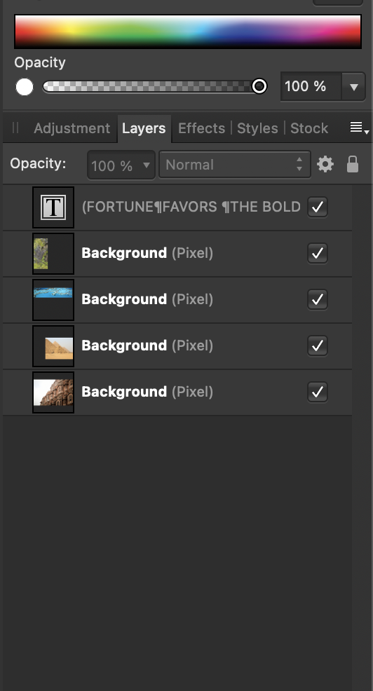
Hello all!
I'm trying to have multiple images "bleed" through just the text but not the white background.
Can anyone provide some options on how to do this?
Thanks in advance for any help!

-
Oh wow, thank you guys!
On 12/8/2019 at 7:27 PM, v_kyr said:- Levels & Curves adjustment
What curves adjustment did you make?
On 12/8/2019 at 7:27 PM, v_kyr said:For a RAW file (had just the JPG for tryouts) exposer compensation would enhance things too. - BTW you can switch for Affinity Photo on Macs the underlaying RAW engine to use, so you can use on Macs instead of Affinity's the Apple RAW engine as default. Look under the "Settings-Assistent" there then the button "Development Assistent...".
That's super cool. Thank you for this!
On 12/8/2019 at 11:02 PM, Fixx said:+ sharpening: In Develop persona Details: Detail refinement for basic sharpening, and probably unsharp mask after develop depending usage.
This made a world of a difference. I started shooting RAW not really knowing the purpose of it but this alone makes a big difference, especially with portraits.
-
I'm not sure if this is the right place for this question - can anyone help me with what edits I can make to picture A so that it looks like picture B?
Picture B is actually Apple's RAW algorithm on my RAW file while viewing it in the file explorer and picture A is just my RAW file. I'm only a photo editing novice so I'm wondering if anyone else can help.
Main thing I'm looking for help on is the face. Somehow Picture B looks very naturalistic, smoother, crisper, all at the same time while bringing out details that don't really even seem to exist in the RAW file.
Thanks in advance for any help
-
Somehow I missed these replies, but thanks a lot @Mithferion! I appreciate the time you took to take screenshots and work with the object.
Let me send that over and see if that makes any difference in what he's seeing on his end.
Once again, thank you!
-
4 hours ago, Mithferion said:
By any chance, are you applying any kind of effect to said text?
Best regards!
Hi Mithferion,
No, I checked and am not applying any effect to the text. I've also attached the file I'm attempting to export in this post.
5 hours ago, walt.farrell said:Can you provide us with a sample .afphoto file, and the exported version, so we can see what's happening?
Hi Walt,
I've attached the .afphoto file below.
Thank you!
-
My print person is using Illustrator and basically no matter what file format I send to him, PSD (converted text to curves), PDF, EPS, it always ends up small, even at 100% zoom with the text pixelated.
Either I'm missing something or there's some incompatibility between Affinity and Illustrator
-
Hi Toltec -
I originally exported it as an EPS and he said that even at 100% zoom, it was showing up as a tiny picture (like half of what the size should be). The full resolution file is 24 MP. I guess I exported it in the wrong format though so I'll try PDF.
Hi Mithferion,
I originally sent it as an EPS. I only chose that format because somewhere online, I read that EPS was a good file format for printing, no other reason.
Thanks to both of you for the insight
-
Hello all,
I'm trying to create a photo with a text overlay for print, however, the print person I'm working with says the files I'm sending over don't scale properly. I suppose that means that the text graphics are not vector.
Is there a way to do this in Photo? It's just two words inside a rectangle border.
Thanks in advance!
-
Hi Callum,
Thanks for the link!
Does that mean that when opening a RAW file, even if I make no changes in the Develop persona, Affinity photo is applying some kind of compression when I hit the Apply button? Just curious
-
When I look at the different personas (Develop/Tone Mapping/Develop), I see that many of the same features are available or can be achieved using all three.
Can someone explain to me why I would want to use, let's say, the Tone Mapping persona for saturation/blackpoint/shadows/highlights instead of the Develop persona?
I have an HDR merge that I'm working on, for example, and wondering if it's better to make the destructive changes in the tone mapping persona vs. the non-destructive changes in the Photo persona.
-
Toltec -
Woah, thank you!! All those points really helped me understand how to use the Clone Brush. Once again thank you so much. This is a really crazy tool!
-
Update:
I'm not sure what I changed with the Clone Brush tool but for now I'm getting the pattern and color of the flower.
However, I've noticed that after selecting a source, I can drag the Clone Brush selection across the field and it will sometimes give me a red flower and sometimes give me green.
Do you know how Affinity determines what parts should be colored in and which ones shouldn't?
-
Hi firstdefence,
Thanks for the reply. I'm having some trouble using both of these tools.
So, following the article, when I start either of these tools, I select the Source and then clone it on another part of the picture. However, using the example of the picture above, I only see the texture of the flower kind of ghostly on top of the green grass to the left of the picture. Is there some setting I'm missing or is this clone tool only for texture and it's up to me to color it properly?
Should I create a Duplicate of the master layer and then clone it on there and then do the coloring if that's required?
-
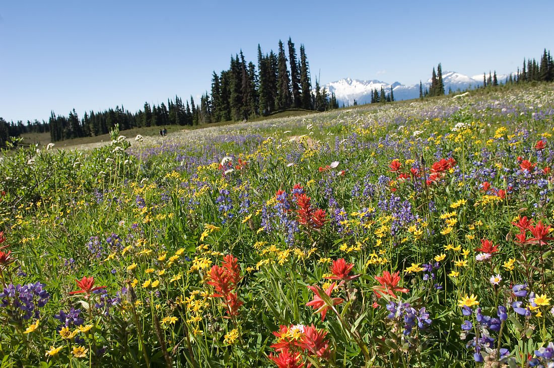
Hello all,
Let's say I've taken a picture of a field of flowers and I want to add more red flowers on the left side of the picture where there are none.
Is it possible to use the red flowers on the right and "clone" them or use another technique to copy them onto the left side realistically?
Thanks in advance for any help!
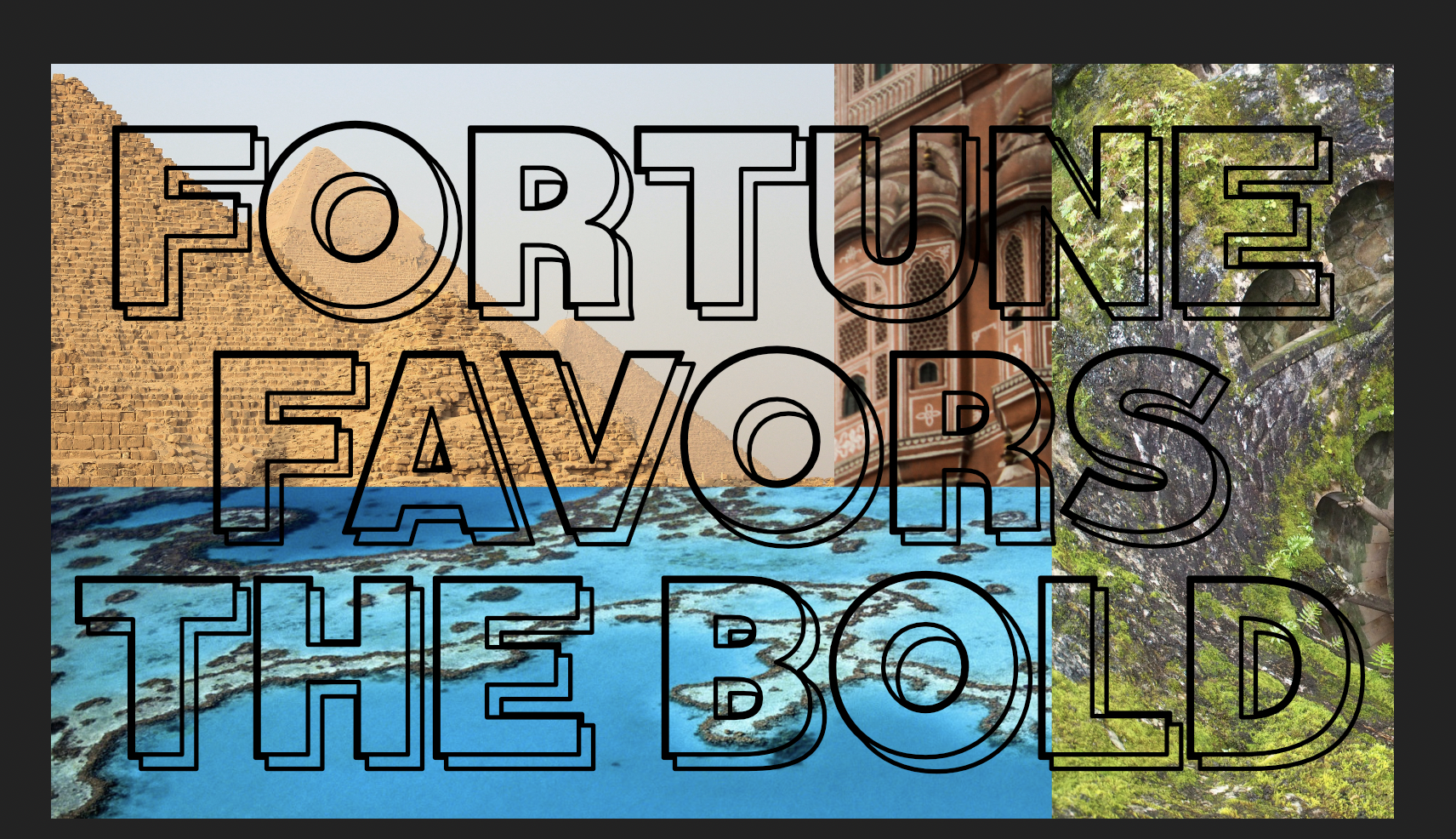

How can I show multiple images through text?
in Pre-V2 Archive of Affinity on Desktop Questions (macOS and Windows)
Posted
Hey v_kyr,
Thanks for helping!
I tried that and got something different but I think that was because of the block lettering font. Only the black shadow part was showing the image, but the other parts stayed white.
Instead, I tried to find another font and then added an outer shadow to it to simulate what the other font looked like.