DavidMac
-
Posts
438 -
Joined
-
Last visited
Everything posted by DavidMac
-
 After over two years of working with AP I am really finding ways round some of it’s quirks and limitations. But a couple of things still have me stumped. 1) It is easy to convert a path or shape to a selection. However has anyone found a way to convert a selection to a path? 2) One of things I really miss in AP is the ability to easily combine selections to produce ‘compound’ selections. The commonest is adding individual selections to get a single combined selection. In PS this is a breeze just Cmd click the mask or layer thumbnails one by one while holding the Shift key. (Other key combos will subtract and intersect as well). I use this in PS all the time. It’s incredibly quick and useful. Sadly this doesn’t work in AP as the Shift is otherwise assigned. The best work around I have found is to load the selection from each layer or mask and then save it as a spare channel one layer at a time. By right clicking on them in the Channels palette one can then combine them as wished and then delete the channels. To call this slow and convoluted qualifies as masterly understatement. So has anyone found a better way? I seem to remember, many moons ago, there were promises from the development team of introducing killer linking. Is this a figment of my imagination or is something on the drawing board? This app is so, so good. But it could still get to be something really amazing. Please keep up the great work!
 -
Yes of course. I agree with all you say. The team are splendid. Quite exceptional. AP is a new kid on the block against an experienced twenty year veteran. That's a tough call indeed and what they have done is nothing less that remarkable. I am utterly delighted to leave Adobe behind but not necessarily to leave Photoshop itself behind. AP is a terrific app, but I have been using it a long time and the longer the tiny omissions niggle, the deeper they niggle. It has a long way to go and I am definitely sticking with it to see if it does, because I really want it to. But I can't say goodbye to PS yet. PS does stuff I need that AP doesn't - just as AP has stuff that PS hasn't. In the end the truth is I can work faster in PS (which may of course be nothing more than old habits not wanting to die) but I don't ....... I always open AP as first call because I want to give it the chance and get to the stage where it's second nature to me. But sometimes it just won't let me ..............
-
Wow this is old topic! On the other hand it shows how long nothing has been done to resolve it. In the end I have got so used to it I just use the mouse without thinking. I have been a loyal Affinity user since its inception. But this is one of a long list of tiny unfinished niggles which infuriate me. Things like deselecting the layer you are working on if you apply a filter so you have to go and find it again for the next operation or not remembering my palette even though it's set as application default, no simple way of combining selections, & ...., & ......., &, ...... It's the tiny things that drive you mad - especially when they are so basic and avoidable. It's a great app but it could be great deal better mannered!
-
An even more Confused Copy Cat
DavidMac replied to DavidMac's topic in [ARCHIVE] Photo beta on macOS threads
I never encounterd it any other way! Well until now of course .......... Thanks Chris -
I posted on this five days back and, to my surprise, have had no feedback from the folks at Affinity who are usually so wonderfully prompt to respond. In fact the only feedback was another user confirming the same problem. My original post was made concerning the previous beta however it is still unfailingly present in 1.6.5 and gets even more bizarre. If I create a selection with any selection tool and then perform a Copy/Paste (or Cut/paste) the pasted image is severely offset from the original Copy. In the attached images I have shown the original cat in magenta together with the selection. To make the paste clearer I have re-coloured it yellow. Now here's where it gets stranger. As long as the top part of the selection does not intersect the object being selected then the paste occurs correctly but as soon as the top of the selection intersects it offsets. This never occurs in 1.5.2. I still have this loaded and have done direct side by side comparisons. So I then tried copying and pasting between 1.5.2 and 1.6.5. It works fine in both directions. The problem only occurs when 1.6.5 is pasting to itself. This is seriously bizarre and seriously irritating as it affects Affinity Photo's usability to a very severe degree. Any thoughts please from the experts?

-
I am having a totally weird problem. I have never had it happen in 1.5.2 but it happens unfailingly in 1.6.4 (beta 4). If I create a selection with any selection tool on a pixel layer and then perform a Copy/Paste or Cut/Paste a new layer is created containing just the selection as one would expect. However it is NOT pasted in the same place as it came from. On a an A4 300dpi document, for example, the paste is made about 425 pixels 'north' of the origin. I have attached a demo image. I have reduced the opacity on the pasted layer to make the problem easier to see. Now what is puzzling me is that a problem of this magnitude on an operation so frequent and common should have generated a slew of posts here. But searching for them I haven't found any. This implies something particular to me. However all previous generations of Affinity for two years have always worked perfectly on my system. Nothing has changed in the meantime. I still have 1.5.2 installed and in simultaneous tests 1.5.2 works perfectly and 1.6.4 does not! So this begs the question am I doing something silly or missing something? Is there some setting somewhere that could be causing this? I am totally baffled at present. The big problem is that it makes 1.6.4 completely unusable. Any ideas anyone ........ please ....... ?
-
Lasso tool
DavidMac replied to mitch33's topic in Pre-V2 Archive of Affinity on Desktop Questions (macOS and Windows)
Next best thing ............ -
Lasso tool
DavidMac replied to mitch33's topic in Pre-V2 Archive of Affinity on Desktop Questions (macOS and Windows)
I find I definitely go through personality change when I speak French or English. I am English by birth but worked a lot in France and have for the last fourteen years lived in Brussels, Belgium. Like you I learned by ear. When speaking English I use body language less and vocabulary more - in French the reverse. This to some degree reflects the physical structure of the languages. French has less vocabulary and more intonation whereas English relies much more on play of words. But language is a mirror of the culture that created it and so I find my actual mindset changes according to which I am speaking. I have two perfectly bi-lingual French/English sons and they switch back and forth from one sentence to the next with no discernible reason or logic other than some things can be better expressed in one and some in the other. The switch however, they tell me, is completely unconscious and instinctive. Often they don't even realise they are doing it. Brussels, as the capital of Europe, established in a country that itself speaks two languages, has a multi national population representing just about every European language. It is common at a dinner part of as few as half a dozen people to have several languages batting back and forth across the table at the same time and we all take it completely for granted. I think language is the best gift we can give our children ......... How's that for off topic .......... ? -
I am sure that nothing like this exists for Affinity Apps. I love Configurator but it was dropped by Adobe a good few years ago with the start of the CC series.
-
Sadly there is no cylindrical distort filter so mesh as detailed above is the only option. Pity because it's rather fiddly and tedious. I find this strange because there is a spherical warp filter and a cylindrical warp is the same geometry applied to a single axis. I put in a feature request long ago to have this added to the spherical warp filter. No idea if anyone has taken it seriously. From a totally ignorant armchair view I can't believe it would be hard to code. Keeping my fingers crossed for next release.
-
Can you edit layer masks like a normal layer?
DavidMac replied to a topic in [ARCHIVE] Photo beta on macOS threads
We do that sometimes. Er ..... quite often in fact ...... ;) But your post is still AP relevant. It is odd that the tool sets of photography and film/tv are so different. I don't do hands on movie grading myself - I sit beside a professional colourist. I have two really first class colourists I work with whenever I can - one for TV and one for Screen. I have total respect for their skill and their fineness of eye far exceeds my own. So when Da Vinci Resolve became available for free download I grabbed a copy to play with on my MacPro so I could better appreciate what they do. Best fun I've had out of bed for a long time! ....... and it increased my respect for them even further ........... -
Can you edit layer masks like a normal layer?
DavidMac replied to a topic in [ARCHIVE] Photo beta on macOS threads
Thanks for the info I will take a look at Capture One, DxO and RawTherapee, they sound interesting. I was delighted when I found that AP has a vectorscope. I infinitely prefer it to the more common histogram. Are you a colourist or do you simply know the colourist's terms from somewhere else? -
If you have come from Lightroom then AP is probably what you need. I have both and swap to AD when I need features (such as text on a path) which don't exist in AP. You can swap live between the two apps and each can also open each others file formats. They are wonderfully interchangeable.
-
Can you edit layer masks like a normal layer?
DavidMac replied to a topic in [ARCHIVE] Photo beta on macOS threads
"Qualification" is a term I haven't heard used outside of movie grading apps such as Da Vinci Resolve. Interesting to hear it used here. -
If have understood your question correctly, go into Preferences > User Interface and check Show Selection in Layers Panel. This will make the Layers Panel scroll automatically to anything you select on screen even if it was previously scrolled offscreen. Hope that's what you meant. ;)
-
The free Adobe Bridge can be configured to open files in AP by default so it works fine for me. But there is a limitation in that it can't thumbnail AP or AD files. (This applies to Mac. I don't know if it holds true of windows as well.) I don't think many DAM's or photo organisers can thumbnail AD & AP unless they use the default system thumbnail. (Again I am speaking for Mac here.) Often I will use Bridge to organise the material for a project into a project folder and then use AP's own Media Browser dragged onto a second monitor to access them and open/import them while I am working. This means that intermediate files I save out from AP during the course of the project have visible thumbnails because Media Browser can view them.
-
Took the words from my mouth ......... ;)
-
Yes. Very good point. I have allowed myself to be seduced into the wrong argument. I have no problems with the icons. I really don't care if they are stylish, or modern or old fashioned. To this extent I agree with Nezumi that we should be using the app and not agonising over the stylishness or otherwise of its icons. But I do care deeply whether those icons are legible, whether they tell me instantly and effortlessly what I am selecting and using, or whether I am struggling to read them. In this respect it not the icons as such that give me difficulty, but the low contrast of the interface of which they are part. They are, to me personally, not as nearly clear as they could be. This is not their intrinsic design,. It is their implementation within the general UI which to me lacks clarity. To my mind the key reason for this is poor contrast. When I work at night in darker ambient light this is not a problem. But when I have to work in brighter ambient circumstances (especially on the move with my laptop) then I have real problems with legibility. 'Nuff said ....... ;)
-
Not quite Nezumi. I agree there is room for all sorts of improvements but the interface is the way we communicate with AD & AP and they with us. It's far more than the colour of car, it's the steering wheel and throttle with which we control it. I think they are quite important! I work on AP every day for several hours and I find AP's interface difficult and fatiguing. Basic functionality matters more to me than missing tools however much we may like them. I know I am not alone in this. User expressed difficulties with the current interface is one of the things that provoked the light one. It's far more than cosmetics - it's a very real concern.
-
I can't quite agree with the force of Orphyidian's complaint ........ but I can agree with the principle. For whatever reason I do find AP's interface harder to read than PS. I am using CS6 and I think it has an exemplary interface. I find the CC interface rather primitive and less comprehensible by comparison. There is no doubt in my mind that AP's interface is, by far, the most subtle and attractive but sadly, for me, it is too subtle. It lacks clarity and contrast for my less than perfect vision. It is one of the reasons that, despite my longing to love it, I find AP more tiring to use than PS. For example the simple difference between selected and unselected tools could be much clearer. Such things should not be subtle they should be instantly and effortlessly evident! Good interface should not be about subtle and beautiful - it should be, first and foremost about legibility. There has been a lot of of brouhaha about the new light interface solving this for critics such as I. I am sorry, I don't subscribe to this! I don't want a light interface, I want a clearly legible dark one! Its wonderful that AP is so stylish looking, but the interface is a key element in usability and I am tempted to suggest that the design of AP's interface is one of form over function instead of form deriving from function. It gives me the impression that it was developed by designers sitting in semi darkened rooms specifically adapted for long hours in front of the screen. User life isn't like that! We have to be ready to use your app in a wide variety of less than ideal circumstances. A 'good' interface should be ready to cope with that, even if it means sacrificing elegance for brutal functionality. The examples posted by Orphydian are pretty brutal and dry - but they are instantly and clearly readable in a way that I would find very hard to ascribe to AP's interface. Somewhere between the two there surely must be a proper compromise ............ ? I fully appreciate that we are discussing probably the single most completely subjective aspect of AP here. So my opinion is little less than that - completely subjective. But I have sincerely tried to be objective in my comments and I do genuinely believe that Serif might better serve their customers by prioritising clarity before style.
-
Free version absolutely does not have vector export. I just tried your print suggestion. You can print as PDF or PostScript. In both case the result is an image in a clipping layer. This applies to opening in AD and Illustrator.
-
One of the major differences in the free Sketchup Make and the professional Sketchup Pro is export. The free SM 2017 which I am using at present exports 3D in Collada .dae or Google Earth .kmz and 2D in jpg, png, and tiff (the latter two with or without transparency). That it! Very, very limited. There are some plugins available which will extend the export range of SM but they are mainly 3D printing formats. There is very little else because obviously that would trample on the paid SP's extra capabilities. I am afraid I don't know what the SP formats offered are. So I can’t really help you more on this. If you cannot find details on their website, ask in their forums. Sketchup is one the forums that can seriously rival Affinity's for sheer helpfulness and friendliness from some very experienced users - although slightly less of the tongue in cheek asides which can make it such fun here! ;) I use SM's axonometric capabilities for two things - dimensioned technical drawings and the basic constructions for photographic 3D illusions which often rely on the appearance of perspective but without vanishing points. For technical drawing I work completely in Sketchup and then export png's in both isometric and orthogonal views. These are usually exported as simple Tiff images without transparency. I then use AD or AP to annotate them if necessary. For my illusion work I export isometric tiff's with transparency. Sketchup has a system called Layers which is quite different from AP or PS layers but which enables the drawing to be classified into different elements whose visibly can be turn on and off. By turning on and off these layers I am able to export selected parts of my drawing which can be re-assembled as AP or PS layers for texturing and compositing with photographic elements. This needs careful planning and discipline but works fine for my purposes. Working in axonometric projection (or in this case isometric) enables me to join together elements at different distances from the 'camera' which are not in fact coplanar but which can be made to appear so thus tricking the viewers perceptions. This is a bit off topic but how I do this might be of interest in a forum full of photographers and designers. I can’t put this in the gallery (which would be more appropriate) because it is not Affinity created. It was done in Photoshop before I had started using AP. So I will have to strut my stuff here. It was our new year’s card for the start of 2015. The first image HexStructureElement is a composite of about twelve layers constructed entirely in Sketchup Make and exported as Tiff’s with transparency. Using rotational symmetry and some very devious manipulation of layers these were assembled into the second image NewYearIllusion a convoluted ‘Escherian’ hexagon that could not possibly exist in real 3D space. The isometric lettering and lampposts also originated in Sketchup. All the texturing was done in Photoshop and the light and shadows were also done by entirely by eye and hand painting. The final step was to take the photographs of my wife and I from very precisely judged camera angles and carefully matched lighting so as to drop seamlessly into their pre-planned positions. To suppress too much perspective in the figures I shot from quite far back with a longish focal length. Odd ………. ................. but fun!! :)
-
There is real dearth of decent software for drawing axonometrically. Those that do exist tend to be expensive architectural apps. When I want to draw axonometrically I use the free Trimble Sketchup 3D and simply ignore the third axis and draw on one plane. It's one the easiest and quickest apps to learn. You can switch between orthogonal and axonometric and draw easily in either mode. It has scaleable dimensions. The nice thing is if ever you want to extrude a plan vertically it's a piece of cake because you are working in true 3D.
-
This is what the Draw plus site has to say. http://www.serif.com/drawplus/ AD is described as an alternative. Which is quite correct. But with DrawPlus a no longer supported legacy programme mstein has a fair point when he describes AD as the 'successor'. Serif are certainly not being misleading ............. but I think I would probably have supposed similarities and envisioned AD as a replacement. :unsure:
-
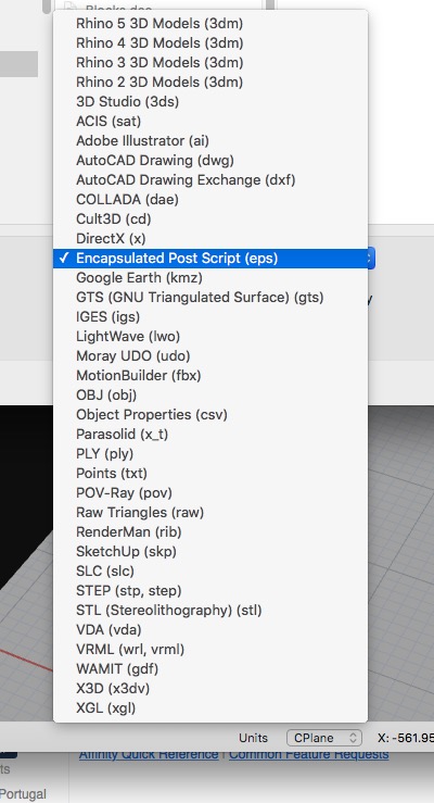
Here is the EPS export from Rhino. I can't find a PDF export from Rhino. See attached. I am not familiar with Rhino so I can't really answer Rhino related questions. I have been promising myself to try it for ages. This post prompted me to install it and try for the first time. ;) Test.EPS.zip