Eugene Tyson
-
Posts
156 -
Joined
-
Last visited
Everything posted by Eugene Tyson
-
I think the default should be to link the image. Embedding the image is a bit counter-intuitive to how other applications work, Quark, InDesign, Scribus etc. all Link be default, and embedding is an option. Plus, emedding images can cause issues, if you edit an embedded image and the file becomes corrupt, you lose that embedded image with the edits.
- 6 replies
-
- 1
-

-
- resouirce manager
- embed
- (and 3 more)
-
I think they can make it better! InDesign's way is good, but not intuitive, and it's not easy to know off the bat. It's kinda a hidden secret. Which things shouldn't be. I reckon the place panel being updated by affinity to allow the addtion of grid alignment would be great and an obvious way to place images as a grid. Would also like the option to add captions via metadata, maybe the place panel could offer a space to insert a caption too before placing, which would add the metadata to the files?
-
You can also make a grid the same way in InDesign, just drag out the frame box and use the arrow keys to make multiple frames in a grid. This is a useful feature. But yes, a make grid feature for images would be nice.
-
Hi Not sure if reported already or not. But, when placing more than 1 image the Place panel opens, however, you can't hit Esc to close it if you change your mind. You have to hit the Tool panel arrow tool. Also, if you place an image, and hit undo, it doesn't reload it back to the Place panel, you have to reload it into the Place panel. It would be better, I think, if you hit undo then it would reappear in the Place panel. Maybe also have an option to remove images. Make a grid. Choose a shape etc.
-
Paragraph rules
Eugene Tyson replied to EddCh's topic in Feedback for Affinity Publisher V1 on Desktop
I think decorations is a terrible name for it though! -
GREP find/replace
Eugene Tyson replied to garrettm30's topic in Feedback for Affinity Publisher V1 on Desktop
Hey - it's me Eugene! Enjoying the Beta I see! -
Story editor - mandatory
Eugene Tyson replied to Jowday's topic in Feedback for Affinity Publisher V1 on Desktop
I disagree, a galley view is essential for finding overset text, or seeing what paragraph styles/char styles or hidden characters are in the text. I think it's vital. I use it all the time in InDesign - and I am an InDesign Community Professional on the Adobe Forums, I've used Quark for 21 years and InDesign for about 15 years. I believe this to be an essential tool for anyone typesetting long documents. -
Packaging files is a must!
-
Just wanted to put this up again as it didn't get any replies. Is it just me, or should this menu be reorganised and split?
-
I suggest having the CMYK swatches as default for all print docs.
- 11 replies
-
- 2
-
-
- cmyk
- default black
- (and 1 more)
-
Well then tha'ts the issue - they should be.
-
Master Pages assigned to pages
Eugene Tyson replied to Eugene Tyson's topic in Feedback for Affinity Publisher V1 on Desktop
Would never have thought to look in the layers panel for info on the master pages. Surely text above the thumbnail identifying the maste page is ideal Thanks though! -
Defo a panel would be better! Even better - put an icon on the control bar to allow you to open the resource manger - or use a command key and double click, like Alt double click.
-
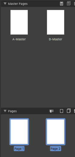
There's no way of knowing what master page is assigned to which page. See screenshot - I have 2 separate master pages, and 2 pages, but you wouldn' know visually which one is has B-Master applied.

-
Come to think of it - could make the "Zoom" into sub menus. Seems counter-intuitive to have the zooms lots of options, and important tools in sub menus.
-
I think this should be a menu all by itself, import tools hidden in sub menus is not a good UI
-
Drop cap
Eugene Tyson replied to Roberto.Bargagna's topic in Feedback for Affinity Publisher V1 on Desktop
Ah right - didn't realise these were related to text styles! Suggest the text styles be named Italics, Bold, Bold Italic - instead. They are very web defined names. Cool text styles loaded by default - didn't notice. Can these be removed before starting a new doc? -
I have a print file, setup in the document from scratch. The swatch is reading as 100% black in Publisher. Exporting to PDF, even PDF x4a is turning the 100% black to 4 colour black. Any ideas? Thanks
-
Getting the same result. Even when exporting via PDF X4a which should leave all colours as they are. Huge miss here, for text this would be a disaster on a litho print.
-
Agreed - Excel files don't import either. I would say this would be normal workflow. And it would also need to bring in bold/italic etc. where possible.
-
Setting up a document
Eugene Tyson replied to Muscateer's topic in Feedback for Affinity Publisher V1 on Desktop
Well I suppose on how Affinity handles colour profile and it doesn't convert the profile, but only assigns, then that would be best - as most profiles are stripped out at the RIP anyway. Would be interested to hear Affinity's take on it. -
Images linked or embedded?
Eugene Tyson replied to Zbigg's topic in Feedback for Affinity Publisher V1 on Desktop
It would be better to have them link automatically, then if editing to choose to do it insitu (prompt for embed). Or have embed/link toggle in the toolbar. My preference would be to link automatically. -
Spanning Columns
Eugene Tyson replied to captain_slocum's topic in Feedback for Affinity Publisher V1 on Desktop
Defo I agree with this - I spent 8 years trying to get Adobe to put a "Span Columns" for their footnotes. Finally there now. -
Drop cap
Eugene Tyson replied to Roberto.Bargagna's topic in Feedback for Affinity Publisher V1 on Desktop
Also, the use of strong, emphasis, these are web words - better to have Bold, Italics etc. better for typographical references especially for print docs. -
Sync Word Files with Publisher
Eugene Tyson replied to Terrier17's topic in Feedback for Affinity Publisher V1 on Desktop
I can't even get a Word file to place in the doc... is this possible?