MichaelG
-
Posts
27 -
Joined
-
Last visited
Everything posted by MichaelG
-
Thanks Carl, Yes that does indeed work in Publisher, thank you. But as you say I can't use that in Designer or Photo. Mike.
-
Photo V2.1.0, Designer V2.1.0, Publisher V2.1.0 on Windows 11 Professional. If I place a raster graphic (JPEG, PNG or TIFF) in any of the desktop apps, then the stroke options are available in the control panel at the top of the screen, and I can apply a stroke. But if I place a vector graphic (EPS, PDF or SVG) then the stroke options are not available in the control panel. I also cannot apply a stroke using the stroke panel. I did discover that I can add a stroke by using the Outline Layer Effect, and this works in each app. However the Outline control lacks a Mitre setting, so I can't have a stroke with sharp corners using this approach. I'm not sure of this is the intended behaviour, but it seems counter intuitive. Surely it should be possible to stroke any placed graphic in the same way regardless of the file format? I have attached three files to illustrate the problem. All graphics are embedded. Thanks, Mike. Stroke Vector Problem.afdesign Stroke Vector Problem.afphoto Stroke Vector Problem.afpub
-
I had a similar problem which is now resolved but I'm not sure why. Windows 10 Pro V21H1 with all current updates at time of writing. Started with Designer, Photo and Publisher V1.9.2 all installed and working. Downloaded and installed V1.10 for all apps. After updating, Designer and Publisher would launch. However Photo would show the splash screen for a second or two and then crash as described in other posts. Tried a repair of Photo but did not fix the problem. Uninstalled Photo and reinstalled V1.9.2. This worked OK as before. Downloaded Photo V1.10 again and updated. This time it launched OK and worked perfectly. So I did encounter a the same problem as others here. but after the above steps I now have all three apps working at V1.10. Not much help but other may get be able Photo working with the same approach. Mike.
-
Affinity Publisher V1.7.2.471 on Windows 10. I am hesitant to call this a bug as I'm not sure what the expected behaviour should be. However the attached file should illustrate the point. This example is a replica of a project I'm working on. However I have replaced the text and graphics for the purposes of the example. Here we have: A three column text frame. In each column there is a section title followed by some text. Each paragraph is aligned to a baseline grid. The section title paragraph has the "Keep With Next" parameter set to 1. This is to ensure that it always stays with the paragraph below. There are three embedded graphics pinned to the title paragraphs. The native size and proportions of the graphics are different in each case. In the real-world example, these graphics are logos. The graphics are set to "Float". Each graphic has the text wrap attribute set to "Jump" The vertical align parameter in the Pinning panel is set to "Outside Above" of "Line". Where possible I like to have the section titles line up across the columns. With InDesign I would place these graphics as "above line" frames. In AP, I have pinned the graphics and set text wrap. In order to get things to line up, I would normally use the arrow keys to "nudge" the graphic down the column. As I move the graphic down, the text to which it is pinned would move down the column. However if I nudge the graphic down in AP, then eventually the section title jumps "above" the graphic. The requirement here is that the graphic always sits above the text to which it is pinned. In the example, I want to move Graphic 2 & Graphic 3 down the column until all three section titles line up horizontally. But as soon as there is enough room above the graphic, the section title jumps above the graphic. Try nudging graphic 2 down and see what happens. I have been able to get some control over this by: Adjusting the "Distance from Text Bottom" setting in Text Wrap. Setting the "Use Space Before" the paragraph attribute to "Anywhere" and dialling in some space before. But this gets very time consuming with over 50 sections to play with, each with a different size graphic. I just want to force the graphic to stay above the line below. It is possible that the secret lies in the pinning panel options. However it is not clear what the various options for vertical alignment mean, and the "help" doesn't really explain. For example, for Vertical Align I have options for "Outside Above", "Inside Top", "Inside Centre" & "Outside Below". But what do they mean? The tutorial on pinning does not explain the details. So am I missing something here? Is it possible to anchor or pin a graphic and ensure that is always stays above the line to which it is pinned? Thanks. Mike. Pinning Problem.afpub
-
Hi Jon, I have had another play with this, and I am now unable to reproduce the problem whereby the picture frame disappears when I place an EPS or PDF graphic in it. I tried with five different EPS files and one PDF and it worked perfectly. So I cannot explain what was happening previously. I will continue with the project I was working on when I tripped over this and see what happens, and let you know if the problem returns. Thank you for escalating the "Convert to Picture Frame issue, and for your support on this matter. Kind Regards, Mike.
-
Thank you Jon. I have attached a sample Publisher file with four embedded graphics, which you may recognise. From top to bottom the file formats are PDF, EPS, JPEG and PNG, and they are all embedded. On my system if I right-click on the PDF or the EPS graphic, the Convert to Picture Frame option is not available. On the two raster formats it is available. Hope this helps, Mike. Convert to Picture Frame.afpub
-
For my workflow, I usually want my graphics to be in a picture frame. However I do not always know the size or proportion of the graphic before I place it. So I use File > Place first to import the graphic, and then I use Layer > Convert to Picture Frame to place a frame around it. Then I resize it and pin it as required. This approach works fine with raster formats such as JPEG or PNG. However if I place a vector format such as EPS or PDF, the Convert to Picture Frame option is not available. Furthermore if I create a picture frame first and then try and place an EPS graphic inside it, the frame seems to disappear. Am I missing something, or is this a bug? Thanks, Mike G.
-
Place Image and Picture frame suggestion
MichaelG replied to Vaaish's topic in Feedback for Affinity Publisher V1 on Desktop
I have also stumbled over this issue when trying to re-create a publication in Publisher that was previously done with InDesign. As previously noted, with ID when an image is placed, it always creates an image frame. These two objects can be manipulated separately, and this can be done in Publisher too. My publication is a conference guide, and consists of a number of exhibitor profiles. Each profile consists of a logo and some text. The logo goes at the start of the profile and the text follows. Therefore the logo image has to be anchored (in ID) or pinned (in Publisher). The logos are supplied to me in many different formats; some JPEG, some PNG, some PDF and some EPS and even some AI, and the native size and resolution may vary considerably. Also, some supplied logos come with varying amounts of white space, either above or below the logo, or sometimes all round. With the "image inside a frame" model, I can resize the frame to eliminate the white space very easily. I may have upwards of 50 logos in a publication, and therefore a streamlined workflow is highly desirable. With ID, my procedure is: Use File > Place to import the graphic into the layout. The graphic is imported and a frame is automatically created. (With ID, a graphic object cannot exist without a frame). Check the "Auto Fit" option on the toolbar, and then transform the graphic to have a width of 160 points, which is the width of my columns. (The "Auto Fit" option ensures that the image is transformed with the frame). Finally, I make the graphic an anchored object to ensure that the graphic moves with the text, and set the options to be "Above line" and "Centred". I can also set the "Space Before" and "Space After" at the same time if necessary. With Publisher I think I can achieve the same result, but it seems to take more steps and clicks, and is therefore more cumbersome. So far I've tried this approach: Use File > Place to import the graphic. The graphic is placed in the layout without a picture frame, and I therefore cannot use the frame to "crop out" any white space. I then use Layer > Convert to Picture Frame to place the graphic in a frame. (Note I can't easily create the picture frame first because I don't know the proportions of the graphic until I place it. I guess I could create a picture frame first, then place the graphic inside it, and then use the "Size frame to content" button on the context toolbar, but that's even more steps). Now I can use the transform panel to make the picture frame 160 points wide. I can now adjust the frame height to crop out any white space. Then I use the pinning panel to anchor the graphic to the text. Finally I have to open the Text Wrap panel and set the wrapping attributes to "Jump". This is quite a quite more effort to achieve the same result, and with a large number of graphics to place and limited time, it can be frustrating. Now it may be I am missing a trick with Publisher and there is a more efficient technique, but if there is I haven't found it yet. (We really need that workbook). So here's something to consider. When the File > Place dialog is presented, how about a check box at the bottom that says "Create Picture Frame". Make this setting persistent so that next time an image is placed, it remembers the setting from last time. Perhaps there could be a second check box to set the text wrapping options at the same time. Finally, something in Preferences that allows me to "Always create a picture frame when placing graphics" might also be useful. I believe that something like this would streamline the process, especially when placing multiple images with a single operation. Such an arrangement would satisfy those like me who always want their graphics in a frame, and also those who don't. With Kind Regards, Mike G. -
Global Colours unavailable as text frame fill or stroke.
MichaelG replied to MichaelG's topic in V1 Bugs found on Windows
Ooops! Thank you Carl123. I didn't notice the Swatches or Gradient tabs. (Should've gone to Specsavers!) Thanks for sorting this out for me. Kind Regards, Mike. -
Affinity Photo for Windows V1.7.2.471 on Windows 10. From time to time I am given a print-ready PDF and asked to turn it into an HTML email. The PDF is usually an A4 or A5 flyer. My usual approach to this is: Open the PDF in Photoshop. PS rasterizes the PDF as part of the import process. All the type is rasterised too. Save the document as a JPEG. Create an HTML "wrapper" and upload to a bulk email service such as MailChimp or Provoke. I realize this is not ideal, and certainly not as good a solution as creating an HTML document from scratch. However, that is what the client wants sometimes, and it works. And of course, it is always a "rush job". I do not ned to change the content in any way, and I certainly don't need to edit the type. I just want a "snapshot" of the PDF at 72 DPI. So as part of my migration from Photoshop to Affinity Photo, I need to perform this simple task. The problem is that, when Affinity Photo opens the PDF, it insists on keeping the type editable. Furthermore, if the PDF is created using proprietary corporate fonts, they are converted to another font, usually Arial. As you can imagine, the original look of the document is lost. I have attached three files: The original print-ready PDF as supplied. A JPEG created after opening the PDF in Photoshop CS6. A JPEG created after opening the PDF from Affinity Photo. Just have a look at the type on the Affinity version. I think you will agree that this is unusable. So, how can I open a PDF with Affinity Photo and have everything rasterized? Thank you, Mike G. A4 Flyer Original.pdf

-
Affinity Publisher for Windows V1.7.2.471 on Windows 10. When creating a new document with Publisher, I start by creating a few Global Colours, some process colours and some spot colours. I now create a text frame, and I want to fill it with a colour from my swatches. But when I open the Text Frame studio and click either the fill or stroke, I am not offered "swatches" as a option. I only get the various sliders, HSL colour wheel etc. This is a quite serious omission, as many projects need the text frame fill and/or stroke to be one of the "corporate" spot colours, or a tint thereof. As a workaround, I found that I can create a rectangle with the rectangle tool, fill it with the required spot colour, and then convert it to a text frame. However even when I do that, the colour is converted from a genuine spot colour to a CMYK mix. Therefore if I was creating a document with a view to printing with just two plates, say a spot colour and black, then I've just blown it. This of course, will increase the cost of the job when printing litho. I suppose one way around this would be to create a rectangle with the required spot colour fill, and then lay a transparent text frame on top of it. But this would be very tedious. So, it would be great if the team would consider allowing anything in the document swatch list to be used as a fill/stroke for a text frame. Thank you, Mike G. P.S. I think that the text frame studio would make a very useful addition to Designer.
-
Long application launch times with large number of fonts.
MichaelG replied to MichaelG's topic in V1 Bugs found on Windows
Update: 20th August 2019. Same hardware as above — Core i7, 6 cores, 12 logical processors, 16Gb, SSD. Windows 10 Version 1903 Build 18362.295. Affinity Publisher for Windows V1.7.2.471. Number of fonts Installed: 4693. I have some additional information on this issue if it helps the developers. Since my initial post I have had another font culling exercise and further reduced the number of installed fonts. The good news is that the "missing fonts" issue does seem to be fixed, so thanks to the team for that. Although I am reporting this as a Publisher issue, exactly the same problem affects Designer and Photo too. All Affinity apps are at version 1.7.2.471 at the time of writing. The key times recorded for all apps is roughly the same to within a few seconds. I will therefore only give the timings for Publisher. (Time format is mm:ss). For the purposes of this post, I have broken down the launch process into phases. Phase 1: The application splash screen appears and displays the "Loading fonts..." message. Phase 2: The application splash screen disappears after 01:10. The main app windows pops up at this point. However the splash screen is still underneath the main window, but it does not show "Loading fonts…" message. The main window is not responsive at this time. Phase 3: The Welcome screen appears after 04:20. That is considerably longer that I recorded in my initial post with an earlier version of Publisher. Phase 4: Now it gets interesting. In my initial post I reported that the app uses approximately 12% of the CPU for several minutes after the welcome screen appears. In fact it uses 100% of one virtual processor. This PC has 6 cores and 12 virtual processors, so there is one compute bound thread taking 100% of one VCPU. This CPU usage continues for 19:20 after launch, so that's about 15 minutes of a maxed out VCPU after the Welcome screen is displayed. There is no significant disk I/O going on, and Microsoft Process Monitor doesn't show any registry activity. What on earth is going on here? Just as before, if I create a new document as soon as the Welcome screen appears, then create a text frame, and then try and lay down some type, I initially have no font previews rendered in the font dropdown list. If I am patient and wait, I can see the font previews slowly appear in front of my eyes. If I scroll down a little way, the font previews gradually trickle down through the list of fonts from A to Z. After approximately 20 minutes after launch, all font previews are visible. I have only observed this behaviour with the three Affinity apps. If I close the app and launch it again, the same thing happens. Mighty tedious. So much for the facts, now for the guesswork... This is an issue with FreeType, correct? Once the app is launched, FreeType gets to work to generate the font previews. Furthermore, FreeType is not multi-threaded. Nothing else I use makes use of FreeType, and that's why I only see it with Affinity apps. I hope this helps to identify the problem, if indeed the developers consider it a problem? Please let me know if you need any further information. Kind Regards, Mike G. -
Affinity Publisher for Windows V1.7.2.471. Windows 10 Version 1903 Build 18362.295. Having installed the latest Publisher build, I have started working on a "real" project. One of my first steps when starting a new project, after setting the document size etc, is to create the swatches I will need. These will generally consist of some PANTONE spot colours, some process colours, and maybe some tints. So far I have some across the following issues... Adding Global Colours: When creating Global Colours... Having opened the "Add Global Colour" dialog, selected a PANTONE colour and clicked "Add", it would be very useful if the "Global Colour" dialog remained open so several colours could be added without having open the dialog again. At the moment the dialog disappears when "Add" is clicked. When adding PANTONE spot colours, it would be great of the name of the colour was taken directly from the PANTONE colour name by default. This will save much typing, and the colour naming in the Swatches panel will be clear and unambiguous. It would also save time if, once the PANTONE library was open in the Add Global Colour dialog, that I could select more than one colour by holding down the control key. They could then be added all together. Taking care of the previous point and automatically using the PANTONE name would facilitate this. Having selected some PANTONE colours to start with, I may want to add some more during the project. It would therefore be great if, when I return to the "Add Global Colour" dialog, it kept the settings from last time instead of always reverting to the HSL Colour Wheel each time it is opened. When choosing from any of the PANTONE swatches, with the exception of the CMYK libraries, surely the "Spot" attribute should be applied by default? For anything from the "PANTONE Solid Coated-V2" swatch library is by definition a Spot colour. Working with Tints: I usually create a few tints, usually of black, and add these to my set of swatches. I'm still finding my way around Publisher, so my methodology may not be correct. However in ID, I would select the BLACK swatch, and then choose New Tint Swatch from the fly out menu. With Publisher I have tried the following approach: Add Global Colour and choose "C:0 M:0 Y:0 K:90" using the CMYK sliders. In the swatches panel, I then "Rename Global Colour..." and then change the name to "Black 90%" (I find this much easier to read in the Swatches panel than the colour recipe). Right-click my new swatch and choose "Make Copy". Problem: The duplicate swatch has the same name as the original. Perhaps there should be a "(Copy n)" suffix? I now have two swatches called "Black 90%". I click select the lower of the two, and then right-click and choose "Rename Global Colour...", and then type in my new name of "Black 80%". Problem: It is not my selected swatch that gets renamed, but the one above it. Surely a bug? So I drag the renamed swatch below the copy, and the finally I can use "Edit Fill..." to change the tint to "Black 80%" I'm guessing that these issues apply to Designer and Photo too. I think that streamlining these swatch management issues will accelerate something that people may do several times every day. Thanks, Mike.
-
Affinity Photo V1.7.1.404 on Windows 10. This problem was reported in another thread against Affinity Photo V1.6. However that thread is now locked, and I have encountered the problem with the current version. In the Affinity Photo Workbook section 7 of Chapter 3, entitled "Mother of Millions", describes how to create a focus merge. I have encountered the problem using the sample images supplied to accompany this section. There are a total of 41 sample JPEG images supplied for this exercise. Each image is 6000 x 4000 pixels at 240dpi. This would give a print size of 25.0" x 16.7" without resampling. If I go through the steps in the workbook and create a focus merge, the resulting image is 6000 x 4000 pixels at 96dpi. Therefore the native resolution of the source images has been changed. In fact, the same problem occurs when merging any two of the source images. If just one of the JPEG images is opened, then the native resolution of 240dpi is maintained as expected. In addition, the supplied file mother_of_millions.afphoto has a resolution of 96dpi. I realize that I can change the resolution back to 240dpi by using Document > Resize Document... option and switch Resample off. However my expectation is that, when merging a number of images with identical dimensions and resolution, then the original resolution of the images is maintained. (This is what happens when creating a merged images with Photoshop CS6). Is this expectation reasonable? Of course I don't know if this is the expected behaviour or not. However the earlier thread implied that on versions of Affinity Photo prior to 1.6, this did not happen. I won't bother uploading any supporting images as I'm assuming that the development team has all the material required to reproduce this problem. Please let me know if you need any further information. Thanks, Mike.
-
Dear Affinity Team, First of all, congratulations on the release of Affinity Publisher V1. Great job! I am now running the official release and I'm looking forward to using it. I did post a topic on this subject on the Affinity Publisher Beta forum. Things have improved somewhat since then, and my understanding of what is going on has improved too. However, I do feel there is still an underlying problem. I have done a considerable amount of research and testing, and I am sharing the results here. I have gone into as much detail as I can, and as a result this is quite a long post. Problem Summary: With a large number of fonts installed on my computer, Affinity Publisher, and other Affinity apps too, take significantly longer to launch than other design apps. System Details: Fujitsu Celsius workstation. Core i7, 6 Cores, 16Gb, SSD, Windows 10 Pro Version 1903, OS Build: 18362.207. Fonts Installed: 4862. Prior to performing any tests, the following actions were performed: I performed a major cull of installed fonts, and removed several hundred since I performed this test on the beta release. After the cull, the Windows font cache file was deleted. (C:\Windows\System32\FNTCACHE.DAT) The Windows font management service was stopped. The contents of the folder C:\Windows\ServiceProfiles\LocalService\Appdata\Local\FontCache were deleted. All Adobe font cache files were deleted. (AdobeFntnn.Lst) The computer was restarted. Each application used in the test was launched once to allow any caches to be rebuilt. The application launch times recorded were as follows: Adobe InDesign CS6: 0:25 Serif PagePlus X9: 0:08 Affinity Designer V1.7.1.404: 3:00 Affinity Photo V1.7.1.404: 3:20 Affinity Publisher V1.7.1.404: 3:10 In each case, I deemed the application launch to be complete when the welcome screen appeared. Each app was launched separately to avoid any risk of the apps interfering with each other. No other foreground apps were running other than Windows performance monitor and the stop watch app. It can be seen that the Affinity apps have similar launch times to each other, and these are significantly longer than either PagePlus X9 or InDesign CS6. I believe the prolonged launch times for the Affinity apps is due to a font enumeration and/or font caching issue. Application Readiness: As stated, when the welcome screen appeared I consider the application to be ready for use. However this is not the case with all apps. For InDesign and PagePlus, as soon as the welcome screen appears I can create a new document, then create a text frame, and then select a font from the font selection drop down. In both cases, the font list was fully populated with font previews, and there was no perceptible delay in scrolling trough the font list. However with Affinity Publisher (and Designer and Photo too) when the welcome screen appeared I could create a new document and create a text frame, but when I went to the font selection drop down, the font previews were not yet rendered. If I waited with the font drop down open, I could see the font previews slowly appear. (The apps opened with Arial as the default font, so the font list open with the fonts beginning with "A" visible). Now if I tried to scroll through the font list, Publisher became unresponsive. However patience pays, and eventually the font previews progressed downwards through the list. Eventually all the previews were visible, and at that point I could scroll back and forth through the font list without any further problems. However, to completely render the font previews takes in the order of 12 minutes. If I launched another app, such as MS Word, whilst the font selection drop down was open and the font previews were being rendered, then the font selection list would always be on top of MS Word. This continued until the font previews had been rendered. Conclusion: Affinity Publisher (and other Affinity apps) is not fully ready to use when the welcome screen appears. Background CPU Usage: After Affinity Publisher (and other Affinity apps) displays the welcome screen, it continues to consume approximately 4% to 6% of the CPU for a period of approximately 12 minutes. After this time, the background CPU usage drops off. If I launch Affinity Publisher and then wait for the CPU to become quiescent, I can then create a new document, create a text frame, and open the font selection list. Now all the font previews are present, and I can scroll back and forth through the list without any delay and without the app becoming unresponsive. Conclusion: Only when the app gets to the welcome screen does it begin rendering font previews. On this machine with this number of fonts, this operation takes approximately 12 minutes. Only when this is done is the app fully ready for use. It is my belief that after Affinity Publisher is launched and the welcome screen is displayed, it then gets to work rendering the font previews. Moreover, it does this each time it is launched. There would not appear to be a persistent font cache. Adobe Font Caches: The Adobe suite creates and maintains a number of font cache files in various locations. They usually have a names like AdobeFntnn.lst. As part of the preparation for this test I deleted all these files, and after a system restart they were all rebuilt. What builds them I don't know, but I believe these files play a key role in how fonts are managed with Adobe apps. However this does not explain why PagerPlus X9 doesn't suffer from any of these issues. It launches like lightning, and is ready to go as soon as the welcome screen appears, font previews and all. Go figure. Summary: OK, that's about all I can tell you. This issue is an annoyance rather than a show stopper. It doesn't appear to prevent me from using the app, it just takes a while before it is fully ready to go. But if I were using this app every day, I think it would quickly become tiresome. The fact remains that InDesign CS6 is ready to go in 25 seconds, but Affinity Publisher takes just over three minutes to give me a start screen, and a further 12 minutes before it is fully ready to go. Therefore there is some work to do with font management and optimization I think. PagePlus manages very well however, and this is a Serif app. What is its secret I wonder? If the development team would like any further information or clarification, please do not hesitate to ask. Thanks again for a great value design suite. Please keep up the good work. With Kind Regards, Mike G.
-
Two font selection problems.
MichaelG replied to MichaelG's topic in [ARCHIVE] Publisher beta on Windows threads
Just a quick update on this one. I've just installed the 1.7.0.145 build and this problem is still there. Sava Pro doesn't show in the font drop down at all, and there are only four members of the Arial family. Everything is fine in Designer. Let me know if you need any further information. Thanks, Mike. -
Two font selection problems.
MichaelG replied to MichaelG's topic in [ARCHIVE] Publisher beta on Windows threads
Hi Chris, I upgraded my installation with build 58 but the problem remained. So I then tried: Deleting the Windows font cache. (C:\Windows\System32\fntcache.dat). Restart the computer & verify that the font cache was re-created. Uninstall Affinity Publisher. Preform fresh install of build 58. Unfortunately the problem remains exactly as described. I only see 4 members of the Arial family and I don't see Sava Pro at all in the font selection drop-down. I don't know what others might be missing. Everything shows up correctly in Nexus Font. My gut feel is that Publisher is struggling with the number of fonts installed on my machine, but I have no concrete evidence of this. I'm running Windows 10, 64-bit, Version 1803, Build 17134.285. Is there any more information I can provide for you? Thanks, Mike. -
I also think that calling Publisher a "massive fail" at this point is being both unfair and unrealistic. I don't know where Serif is pitching the Affinity suite, and whether they intend to rival Adobe products eventually. But even if that is the goal, Rome wasn't built in a day. I think when we look at the Affinity suite overall, and Publisher in particular, we should remember that: Adobe Illustrator first shipped in 1988. Therefore at the time of writing it has had three decades of development effort with a big engineering team and a big budget. Photoshop first shipped in 1990, so again almost three decades of development, and probably an even bigger budget. And they have Thomas Knoll! InDesign shipped in 2000, so we have 18 years of development on this product. All these products have a huge user community, and they have been providing feedback for decades. So are the Adobe products more refined and more capable? Of course they are, and it has taken Adobe 20 or 30 years to get there. I have worked in software development (also for decades) and I understand how long these things take. Hats off to Serif for even starting this project. Its always easier not to. What we are talking about with Affinity Publisher is a beta of a V1 product. So yes, it is going to have bugs and shortcomings compared to a product that has been shipping for 18 years. Even if the development team want to eventually build something to rival InDesign or Quark Xpress, that isn't going to happen with V1, or V2, or probably not V3. If they tried to do that it would never ship anything, and Serif wouldn't sell anything and they would be out of business. This is a work in progress, as is all software. Nothing is ever finished. The same applies with Affinity Photo and Designer. They are "finished" products (i.e. they are shipping as V1.*). But to expect them to be a feature for feature matchup for their Adobe counterparts at this stage just isn't going to happen. I for one would love to see an "Image Trace" feature in Affinity Designer to match AI, and also better "Content Aware" technologies in Affinity Photo to match PS. One day perhaps, but give them time. With any software product from any manufacturer, V1 is always about "time to market". You have to establish a revenue stream to fund further development. They are trying to build a suite of products. I'm sure they know we need a file browser to stand up to Adobe Bridge, and a RAW processor to match Lightroom. But one step at a time. It has taken InDesign 18 years to get where it is today, and Publisher will also mature over time I'm sure. For what its worth from my first look at Publisher I am encouraged. But its a beta, and that's why we are all here, to contribute to the development effort. Yes I have posted some items and made comparisons with InDesign. but that's because I'm used to that product. I don't expect a feature for feature matchup on day one. Thanks, Mike.
-
Tables inside text frames - mandatory
MichaelG replied to Jowday's topic in Feedback for Affinity Publisher V1 on Desktop
I agree with everyone on this one. I have just tried creating a table in a text frame with Publisher and assumed that when I couldn't make it work, I must be doing something wrong. But no, when I get rid of the text frame, then I can create my table. Just look at any corporate document, such as an annual report. You will always see lots of text, with tables scattered throughout with the numbers, and also few pie charts and/or graphs. And as another post has identified, theses object must move with the text, and therefore be anchored. For the record, with InDesign a table behaves like any other character in a text flow. Therefore a table is anchored by default. With PagePlus. a table is first created within a text frame and then it is anchored to the text as a separate step is required. The table therefore becomes an anchored object like a graphic. Thanks, Mike. -
I have been testing the procedure for creating a collection of swatches for a project, and have come across some issues that I think could be improved. For the purpose of this exercise, I am working in CMYK, and I need a collection of swatches that include both CMYK mixes for global colours and some Pantone spot colours too. I accept that I may be missing something basic, and if that is the case then please correct me. When starting a new project for a customer, I usually start by building a collection of swatches using the client's colours as dictated by the branding. Job 1: Build a set of CMYK swatches. Let's start with a simple set of Cyan, Magenta, Yellow, Black and a Rich Black too. In the SWATCHES palette I choose Add Global Colour. I get the Global Colour dialogue with the HSL colour wheel. Problem 1: If I am working in CMYK, then the HSL colour wheel is of little use to me. I'm working with INK (or toner if you want), so I want the CMYK sliders presented as the default. I now choose CMYK Sliders and dial in my first colour. In this case its C:100 M:0 Y:0 K:0. I name it Cyan and click Add. Problem 2: The Global Colour dialogue closes when I click Add. However I haven't finished yet. It would be helpful if the dialogue were left open, so I could add more colours. OK, I now want another colour, so I go to Add Global Colour again. Once again I get the Global Colour dialogue, and once again I am presented with the HSL Colour Wheel. Problem 3: I can forgive that fact that, when I add the first Global Colour, I am presented with the HSL colour wheel. However having made the choice to use the CMYK sliders in step 4 above, I expect this preference to be persistent within a session at least. (Maybe there is a preference that I have not found yet?) OK, so I go through this sequence to add each of my CMYK swatches, and now I have a few global colours in my Document swatches panel. Now I need some spot colours. Job 2: Add some Pantone spot colours to the document swatches. I choose the Pantone+ Solid Coated-V2 library from the drop down in the Swatches panel, and I type 7421 in the search box. Sure enough, I am presented with PANTONE 7421 C, which is what I want. I double click the swatch. I now expect this spot colour to be added to my set of Document swatches. Why do I expect it to work this way? Because that is exactly how it works with Affinity Designer. With Designer, you just call up the spot colours you want, double click, and they are added to the Document swatches. Problem 4: With Publisher, double clicking a spot colour doesn't seem to add the swatch to the Document swatches as is the case with Designer. Instead I have to double click the spot colour to make it the current fill, and then click the "Add current fill to palette" button. Tedious. Problem 5: Assuming that Designer exhibits the correct behaviour, whereby double clicking a spot colour adds it to the set Document swatches, there is another issue. The spot colour is added as "Global Colour nn" and not PANTONE 7421 C. I expect spot colours to be named as such in the Swatches palette. As it is I have to rename them, which is a drag. And finally, lets assume I want to make a 50% tint of PANTONE 7421 C. First I need to make a copy of the swatch, then I need to set the tint. So I right click my PANTONE 7421 C swatch and select Make Copy from the pop-up menu. Now Publisher crashes. Problem 6: When I try and make a copy of the swatch, Publisher throws an Unhandled Exception error. (See error message below). Ooops! OK, that's about it for my adventures is swatch land. I have some questions if anyone can help me: When adding a CMYK swatch, I get a "Spot" check box in the Add Global Colour dialogue. What is this for? There is also an "Overprint" check box. This implies that overprint is a swatch attribute, and not an object attribute. So if I have two objects with the same fill in a document, and I want one of them to overprint, how is this achieved? Is there a built in safeguard to prevent setting a white swatch to overprint? Or maybe something in Pre-flight? This is always a killer. (Designer creates artwork. An object is filled with a colour and is set to overprint. Just before going to press, the customer says "Actually, I would like that object to be white." Designer changes the fill, but forgets to remove the overprint attribute. Result: Object disappears when printed. Designer gets fired, or has to pay for the re-print!) If I want to make a tint of a spot colour, I can right click a copy of the colour and choose Edit Fill. I can then use the T slider to make my tint. However, I also get a Noise slider? What does this do, and when would I use it? I am used to adding noise in raster effects such a glows and shadows, but I don't understand its relevance for a tint of an ink. Thanks, Mike.
-
Hi, Thanks to everyone for all the feedback. I accept that using a font manager may be a way to alleviate the prolonged launch times. I do actually have NexusFont installed so I may try that approach. However I have not used a font manager in the past to activate a only subset of fonts, simply because that has not been necessary for acceptable launch performance with my existing apps. The fundamental fact here is that InDesign launches in under 30 seconds and Affinity Publisher Beta launches in approximately 4.5 minutes on the same computer. (Let's leave Photo and Designer out of it for the moment, as I suspect there is a common code base for many components). I make that an increase of approximately 900%. I therefore suspect that there are some optimization opportunities that have yet to be utilized, and others have alluded to this too. Remember also that PagePlus X9 launches in 14 seconds, and that is Serif technology. My purpose in making this post was to make the developers aware, so they can consider whether or not this is an issue worthy of investing some development time. For me its not a show stopper, just a moderate inconvenience. Kind Regards, Mike.
-
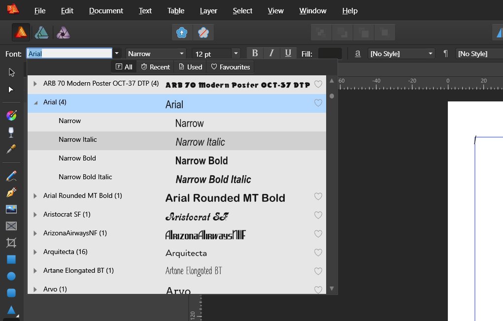
I have identified two font selection issues with Publisher as follows: 1. Not all font variants are available in Publisher. In Publisher, when I select the Arial font family, only 4 variants are available. However when using Designer on the same machine, nine variants of Arial are shown, which is correct. The following two screen shots illustrate the problem. 2. Some fonts not shown at all in Publisher. The second problem is that some installed fonts are not showing up in the drop down at all. However, everything is OK in Designer. The fonts in question in this particular example are Sava Pro and FF Meta Pro. Here are more screen shots to illustrate this issue with Sava Pro. You can see it is missing from the list in Publisher. Sava Pro is available in Designer. But it is missing in Publisher. Thank you, Mike.
-
Hi, Since my original post I have upgraded both Affinity Photo and Affinity Designer to V1.6.5.123. The launch times for those apps now are: Affinity Photo 1.6.5: 8m 50sAffinity Designer 1.6.5: 8m 50s So not much change from the earlier versions. So the observations are: Affinity Publisher launches in approximately half the time that Affinity Photo or Affinity Designer do. Publisher is significantly slower to launch than either PagePlus X9 or any of the Adobe CS6 products on the same computer. For what its worth, Adobe seems to build its own local font caches for each product. Each product folder has one or ore AbobeFNTnn.lst files, which are the local font caches. This may be why the Adobe apps can enumerate fonts very quickly. However, PagePlus X9 is also very quick to launch, and comparable to Adobe. Thanks, Mike.
-
This was a big problem with PagePlus and Affinity Publisher looks like it has the same problem. My argument is that the "B" and "I" control buttons are unnecessary. We have a drop down to select the font family, and another to select the required member of that family. That is all that is required. The "B" and "I" buttons are not only unnecessary, but will potentially will cause problems. For example, In Affinity Publisher I set some type in Avenir Next LT Pro Regular and then I perform the following sequence: Select one or more words that I want to be in italics. Press the "I" button. My selected text is changed to Avenir Next LT Pro Condensed Italic. It is unlikely that I will want the condensed variant. If I then click on the "I" button again, the text is changed to Avenir Next LT Pro Condensed, and not back to Regular which is what I started with. I then change all my text to Avenir Next LT Pro Condensed Italic. Select some text and press the "B" button. The selected text is changed to Avenir Next LT Pro Bold Italic, and it is no longer condensed. So it seems that the "B" and "I" buttons are making the wrong choices, which is hardly surprising. They will probably work with simple font families like Arial, but for professional OpenType fonts it will end in frustration. In the case of the Avenir Next LT Pro font family, there are a total of 24 fonts. Myriad Pro has 50, and Minion Pro has 74. Two buttons will never make the correct choice with so many variants. The big problem with PagePlus is that there is no dropdown to select the member of a font family. Therefore one had to use the "B", "I", "U" & "O" buttons, and the results are always unpredictable with large font families. Now we can choose the member of the font family with Affinity Publisher, we don't need the buttons. I'm coming at this as a long time InDesign user. My preferred approach is: Set all the type in the required font, say Avenir Next LT Pro Regular. Create a paragraph style based on that. Select a one or more words that I want in italics. Change the font for the selection to Avenir Next LT Pro Italic. Create a character style called Emphasis Italic and apply it as required. Now select some text that I want to be bold. Change the font to Avenir Next LT Pro Bold. Create another character style called Emphasis Bold, and apply it as required. If necessary, additional text styles can be created, such as Emphasis Bold & Italic to combine both text attributes. This approach eliminates all the guesswork, and once you have created the styles, everything else is easy. InDesign does not have the "B", "I" or "U" buttons for this reason. Thanks, Mike.
-
If I create a CMYK document, then I get CMYK sliders in the colour panel as expected. However if I then create an object such as a rectangle, and then go and alter the fill or stroke properties, then I get the RGB sliders initially. Surely the sliders offered initially should follow the document colour mode, either CMYK or RGB. Thanks, Mike.