Wireman
-
Posts
25 -
Joined
-
Last visited
Everything posted by Wireman
-
It still does. Kerning is the space between two glyphs (characters). It's best set without anything highlighted. Strictly, it is "kerning override", as the space between letters is a factor of the font's internal kerning table (assuming the font is proportional and comes with one). If you want to bring two glyphs closer together put the cursor between them and adjust the kerning. If you highlight, you're adjusting the space behind and in front of the glyph. In that case, AD will only allow you to select Auto (obey the kerning table) or 0 ‰ (ignore the kerning table). This is a sensible restriction, as it saves you from being shunned by Right-Thinking People. If you want to see a kerning table in action, type the word TRAVEL in Arial Regular: The size doesn't matter.. With the arrow keys, step your cursor along the word, letter by letter, and watch the Kerning box in the Character panel. It will read (0 ‰) between T and R and R and A. But between A and V it jumps to (-74 ‰). It's back to (0 ‰) for the rest. Now type Travel and do the same thing. Now the space between a and v is (0 ‰), but between T and r is (-37 ‰). Those numbers are embedded in the font. You can change (override) any embedded kerning value, but only if your cursor is in the space between the two characters you want to bring further together (or push further apart). Change Travel (or TRAVEL) to a different font. The numbers will be different. The parenthesis tells you it's using the font's kerning table. The ‰ means 1,000th of an em. If you need "em" explained, you shouldn't be setting type. If you want to bring all the letters closer together ("tighten"), use Tracking. That will affect the space between all the characters you have highlighted. If you adjust tracking without highlighting, it will affect all the characters in the word your cursor is in. Tracking is best applied to entire lines, otherwise visible Crimes Against Typography occur; and they make the Baby Jesus cry.
-
Is your text two separate paragraphs? Did you create the container with the Frame Text tool or the Artistic Text tool? You have 194.6pt leading on that, applied as a percentage (Auto) of the 32.7pt type height. That can happen with inadvertent mouse/trackpad action. Also, the (194.6pt) is a leading override, because it is applied in the Character panel. True leading is set in the Paragraph panel. If your text is actually two paragraphs (can't see because AD doesn't show "invisibles" in text), the inter-par spacing may be playing a part as well. I find the best method to use (and I do this in InDesign too) is create a paragraph style for your text. You can set font, size, spacing, etc in the paragraph style dialog, in a way that the paragraph panel doesn't allow. That way you can see all the attributes affecting your text without having to flip between panels.
-
You can achieve the same thing by highlighting the text and right-clicking (or ctrl-clicking) on Base. The first option – Apply "Base" to Paragraphs* – will clear all other styling. You also have the option to apply "Base" without clearing character styles. * "Grundlage" auf Absätze übertragen in German. You can do a special Find/Replace to search for all text in italics and replace with Emphasis character style. See the help pages under Text | Checking Text | Find and Replace.
-
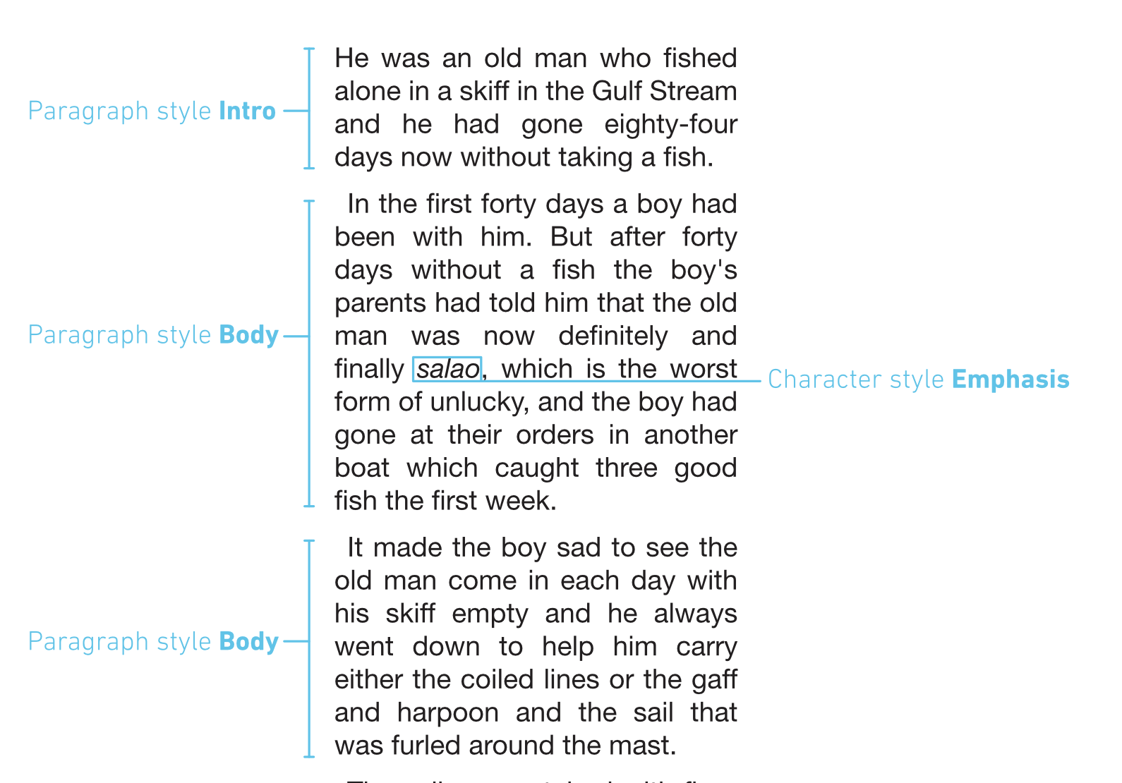
If I understand you correctly, when you refer to "text style" you mean Character Style. That is not how I approach the task. Like @Old Bruce, I would set all my body text attributes in Base (Grundlage). Then create a Body Paragraph Style and base it on Base. Change only the first line indent (in the Spacing tab) to 2mm. Then create an Intro Paragraph Style and base it on Body. Change the first line indent to 0mm. Now create an Emphasis Character Style. Tick the Italic box in the Font tab. I've used the above styles in the attached screen grabs. Paragraphs 1 and 3 have no character styles applied. Paragraph 2 has character style Emphasis applied to one word only. Emphasis italicises whatever font is applied to the paragraph it is in. I don't need to apply character styles to anything else because the paragraph style provides the font. The advantage of working this way is that to change the whole text from serif to sans, all I have to do is set the font in Base from Baskerville to Helvetica. Everything – including the Emphasis word – follows the change made in Base. Similarly, if I want to change the size of the whole text from 12pt to 10pt, I simply do that in Base. If I want to change the indent of all body paragraphs from 2mm to 4mm, I would do that in Paragraph Style Body. In summary, you only need character styles ("text styles") to change the appearance of text that doesn't follow the style of the paragraph it is in. It could be italics, bold, underlining, even colour.

- 8 replies
-
- 1
-

-
- affinity publisher
- styles
- (and 1 more)
-
She does not have a valid criticism.
-
The internal APu help pages give much more information than the tutorials (unfortunately, not in German). Menu: Hilfe | Hilfe zu Affinity Publisher then navigate to Text | Text Styles. I am also an InDesign user and struggled at first with the structure of APu text styles. I think because they are similar to InDesign but – crucially – not the same. It is important to recognise that [No Style] is not a Style, but only indicates that there is no Style applied. So it is not the case that Arial Regular is "allocated" to [No Style], just that Arial Regular is the default font for the application (probably because Arial is pre-installed on every computer sold). One of the crucial differences between APu and InDesign is that InDesign will let you set an application font with no documents open. In APu, all typography settings are greyed out (non-selectable) when no document is open. However, in APu, you can set a default [No Style] font for the open document by activating either of the text tools (Artistic Text or Frame Text) and - without drawing or selecting a container - setting the face and font in the Context Toolbar. The font you select becomes the default for every new text container you draw in that document. In APu v1.8, you can retain your setting by exporting that document as a template. Going further, you can also set default paragraph level attributes – indents, spacing, justification, etc – by using the same method. These will become the "settings" for the paragraph [No Style]. Again, these can be retained (in APu v1.8) by exporting the document as a template. Imported text: Only plain text (from a .txt file) will be imported in the [No Style] format. Importing any rich text (.rtf, .docx, .odt, etc) will respect the typography applied in the imported file. It may also import any Styles applied in the imported file. I suspect that is where your "normal" comes from, as there is no style of that name in off-the-shelf APu. If you want to strip all unwanted styling from imported text, highlight it all and apply both character [No Style] and paragraph [No Style]. This should render all the imported text as default. I have got into the habit of converting all files to .txt before importing. That way I know that any typesetting is applied by me, deliberately. Also that any bad typesetting is my fault. 😐 Base style: (Assuming this is "Grundlage" in German). If you consider Base as the "parent" of all styles, then its own "parent" must be [No Style], otherwise you risk circular "based on" style inheritances, an inevitable way of causing application crashes. Body style: (Assuming this is "Körper" in German) This is supplied by the developers to "get you started". You don't have to use it (though why wouldn't you?). It is not "connected" with [No Style] because it is a Style. Remember, [No Style] means "not a Style". The regime I stick to (in both APu and InDesign) is use Styles for everything. There should be no text that is locally formatted – I call it "hand-knitted" – where you select some text and apply a face, font, weight, etc, manually. Always use a Style. And always delete Styles that appear with imported text. Then there are – or should be – no surprises. Remember that any glyph can be affected by two Styles – Paragraph and Character. And possibly more, depending on what those Paragraph and Character Styles are based on. Sorry this is so long. But the subject is complex (and I'm trying hard to keep my English non-idiomatic). I'll attempt to answer any follow-up questions if I can.
- 8 replies
-
- 2
-
-
- affinity publisher
- styles
- (and 1 more)
-
Yep. Just tried using Sidecar for the first time and this was a stopper. Pencil pressure sensitivity needs to be adjustable globally.
-
iPad operating system 13.1.2 RAW File opening
Wireman replied to Wilburn50's topic in V1 Bugs found on iPads
Settings>Photos>Optimise iPad Storage is ticked. And, as far as I know, has always been ticked. I could untick it, but I'd need to know that the 20-odd thousand images in my stream aren't going to render my device full to bursting. -
iPad operating system 13.1.2 RAW File opening
Wireman replied to Wilburn50's topic in V1 Bugs found on iPads
Most likely because you uploaded your example pic to Photos on Oct 16. My problem is that pics I uploaded to Photos before the iPadOS upgrade won't import to Affinity in Develop mode. ie: Try scrolling back in your Photostream and importing a RAW image uploaded to Photos a month ago or earlier. -
iPad operating system 13.1.2 RAW File opening
Wireman replied to Wilburn50's topic in V1 Bugs found on iPads
This is my experience (iPad Pro 12.9, Affinity Photo v1.7.3): 1. I always upload RAW(.dng)+jpg to Photos from a card reader 2. In Affinity Photo I import from Photos (I am using CloudPhoto) 3. During Import, all pictures in Photos open dialog show the RAW badge 4. Pictures uploaded to Photos after upgrade to iPadOS open in Develop (RAW) mode (this is what I want/expect to happen) 5. Pictures uploaded to Photos before upgrade to iPadOS open in Photo (jpg) mode tl:dr. The only thing that's changed between 4 and 5 is the upgrade to iPadOS. -
@JamesRitson The tutorial videos are excellent. Really well done. I have a question about the Inpainting one. You remove the right-hand bird but not the wire it's sitting on, despite some of the wire being covered by the bird. Is that an effect of the non-destructive layer method, or does inpainting create bits of image that aren't there in the original?
-
Like this?
-
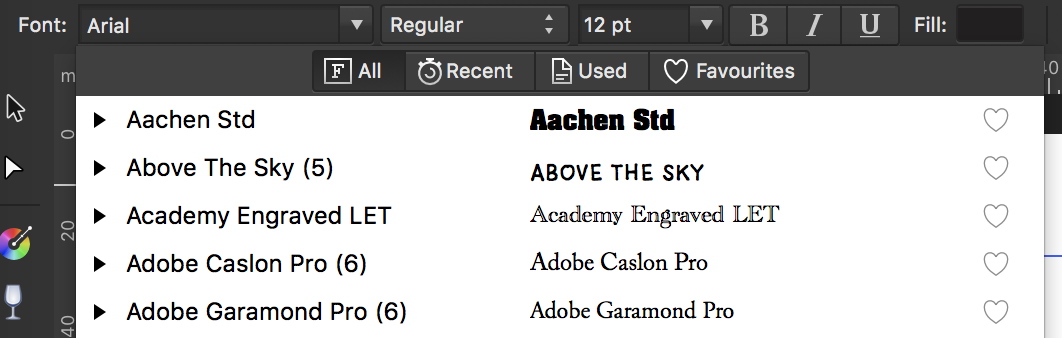
On the top line of the font selector there are four options: All, Recent, Used and Favourites. I think the fourth one might be what you are looking for.
-
Affinity Publisher Tutorials
Wireman replied to 10157's topic in Feedback for Affinity Publisher V1 on Desktop
I'm afraid that this statement just doesn't stand up to examination. The Designer and Photo workbooks are exemplary and I have no reason to doubt that there will be one in the pipe for Publisher. Additionally, I have found the video tutorials for both those apps enormously helpful. -
Object Styles
Wireman replied to Colin_Fredericks's topic in Feedback for Affinity Publisher V1 on Desktop
Was poking about in ~/Library/Application Support and found this... Here's hoping.
-
I'm quite pleased that they have included some sample text styles. It's useful to be able to see how they are constructed and fit together, since there are some significant operational differences to the way text styles work in InDesign, which I am much more used to. I've already modified a couple to suit my needs and am grateful that I didn't have to build them from scratch. Any that I don't currently see a use for are easily removed.
-
Cannot "crop" a photo once it's placed
Wireman replied to Phil Martin's topic in [ARCHIVE] Publisher beta on macOS threads
The Vector Crop tool is what you want. Two down from the Place Image tool. -
Object Styles
Wireman replied to Colin_Fredericks's topic in Feedback for Affinity Publisher V1 on Desktop
Haha. Absolutely. -
All good. Addresses "templates". Doesn't address "folks are gonna want". #justSaying
- 10 replies
-
- 1
-
-
- text styling
- paragraph styling
- (and 4 more)
-
That's good, but I'm still thinking folks are gonna want templates. #justSaying
- 10 replies
-
- 1
-
-
- text styling
- paragraph styling
- (and 4 more)
-
Object Styles
Wireman replied to Colin_Fredericks's topic in Feedback for Affinity Publisher V1 on Desktop
Yep. That doesn't seem to be implemented. Unless Assets can do that. Full disclosure: I'm a huge InDesign object styles user. I'd love there to be an already existing equivalent in AfPub - largely because I know that retro-fitting that kind of functionality can turn a brilliant app into Adobe-bloat. There's a bunch of stuff available in AfPub text styles that would require object styles in InDesign. Maybe we should all explore what has been implemented before demanding changes to the functionality. -
Object Styles
Wireman replied to Colin_Fredericks's topic in Feedback for Affinity Publisher V1 on Desktop
I've not had much chance to explore it, but I think Symbols might be made to behave like object styles. -
I'm not seeing any pulldown for the replace field. Or am I missing something obvious?
-
Like you can with swatches - create as Document, Application or System level.
-
GREP find/replace
Wireman replied to garrettm30's topic in Feedback for Affinity Publisher V1 on Desktop
Happy about that. Count me as a +1 for GREP support - in Styles as well as Find/Change.