garrettm30
-
Posts
1,560 -
Joined
-
Last visited
Everything posted by garrettm30
-

Custom text variables
garrettm30 replied to Ash's topic in [ARCHIVE] 2.4, 2.3, 2.2 & 2.1 Features and Improvements
A proof of concept is all I needed. Thank you so much for explaining. Now I understand how to have multiple instances of a “running header.” With that improved understanding thanks to Old Bruce, back to my feedback… So for the most part, it seems like the functionality for multiple dynamic variables is already there, with the exception that they cannot be named or edited with in the Fields panel in any way other than individually. The way it is presented seems to be a misfit. For one thing, the name “running header” seems off, because although very often they would be used in that way, apparently it can be used anywhere anytime a dynamic variable based on a text style is desired. But what led most to my confusion is that the Running Header section in the fields behaves differently than (I think) all of the other fields—well, date also. For all the other fields, they will always behave in a consistent way across the document. For editable fields, such as Author, if you edit the field, it edits it everywhere in the document at once, but not so with Running Headers and Date. I made a video to illustrate the difference, but I changed my mind thinking no one would want to watch it. The gist is that I think Running Headers and Date should work globally like all the other fields, so that it works consistently and therefore works in an expected way, but also gives a convenient way to edit those globally. I would move both “Running Header” and date down to custom section. Currently the new custom variables/fields of a text type, just as Author, Comments, etc. I suggest making possible other types of custom variables, such as the “Running Header” type based on style (it should probably be renamed), date and time, and probably there could be others, such as sequential counter, whatever. To illustrate, let’s take the date field. Let’s say I use the date many times throughout the document, but as time goes on, I decide I wanted the date syntax done slightly differently. If it were like the other fields, I could just change its property once and it would update everywhere. But with date, I have to select each instance and then make the changes one by one. It would be better if I could have defined one date custom variable set up the way I wanted, then I could change all of them later if I wanted to. Or maybe I have two: longDate and shortDate each as custom variables. A slight variation to this idea is to leave Running Header and Date where they are rather than move them to custom, but make it still behave globally. And so that users can add more than one, add an option to add additional fields of the same type, maybe Date 2, Date 3, etc. This option would also solve the double problem of making this discoverable and providing the same convenient global editing that the other fields already have. I hope this makes sense—maybe I should have just posted the video. Anyway, there may be some better ideas, but I think the current behavior of the Fields studio where two of the fields work in a completely different way than all the others invites rethinking. -
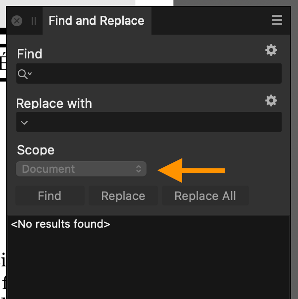
That’s good to know. Maybe then it is nothing more than a simple bug. This is what I see on Mac: And it is not just the look: indeed the scope cannot be changed in that state.

-
Custom text variables
garrettm30 replied to Ash's topic in [ARCHIVE] 2.4, 2.3, 2.2 & 2.1 Features and Improvements
I did not know you could have more than one instance of the “Running Header” defined each to a different text style. The Fields studio leaves the impression that the Running Header can be configured to only one text style. Do you happen to still have that sample document so you could share it and I could play with it a bit? I don’t understand how to do it, or how to edit the running header parametiers field if there is more than one. -
Custom text variables
garrettm30 replied to Ash's topic in [ARCHIVE] 2.4, 2.3, 2.2 & 2.1 Features and Improvements
Maybe this feature is yet to be expanded after the basic functionality is sorted out, but I had expected that the custom variables would have basically the same dynamic nature as the field called “Running Headers.” Sometimes a book might need more than one dynamic variable, and I am not sure this is possible even in the new beta. Sometimes even actual running headers need more than one dynamic variable. For example, for in the Bible that I did the layout for a few years ago in InDesign, the running headers had to use two different dynamic variables based on text styles: a book name and a verse-chapter reference (a very common feature in most Bibles, similar to the headers in a dictionary). As I understand it, it still does not seem that this is possible in Publisher. I’m in no hurry, but when the time is right, I suggest you consider allowing custom variables to be defined with the same or similar functionality as the existing “Running Header” field type. Of course, this would not be to exclude the possibility of variables with a fixed value as in the current beta. Perhaps the “Custom field properties” is so named using the plural because it is in anticipation of additional features for custom fields even though currently the only property there is the field name. -
This is a welcome change. One minor point: is there any reason why one can’t select the scope before search parameters are entered? If the search field is empty, and no find by format is select, then the scope drop down is disabled, retaining its previous selection. It just seems arbitrary, because scope, while a very welcome addition, is also a common point of user error where we forget to set it to the correct scope for a given search. So imagine this scenario that sounds like just the kind of thing I would do: Begin a new search. Notice that scope is still left at a previous setting that is not fitting for the current task. Normally I would wish to change it when I notice it, but I cannot do so with an empty search string. So, I start working on the search string. Often it is regex, so my mind is fully occupied in working out the desired regex, maybe even hopping back and forth with some tool such as my beloved regex101.com. My mind has moved away from the question of scope, as I have forgotten to come back and change scope. I run the find (and maybe replace), and the results weren’t what I expected. It is not an end-of-the-world scenario, because often I would notice, fix scope, and run again. Occasionally I might miss it, with consequences showing up only later when my scope was larger than I thought, or things not fixed that I thought I had fixed because the scope was narrower than I intended. The point is that I would like to be able to set scope as soon as it crosses my mind, because I cannot be sure that it will cross my mind again until it is too late.
-
I too have tested a couple of documents where the nonbreaking hyphens do not work in the release and do work (i.e., is fixed) in the beta.
-
I hope I don’t sidetrack this thread, as it is supposed to relate to scripting. But just to answer you, I am in fact a WordPress developer for our organization; I could make a plugin for this if it were needed, but in this case it is not the WordPress side but the original source text that I would need. I can easily get the text by copying, but the text loses a lot once it leaves Publisher. Most of the formatting I would not need, but I would need what effectively amounts to semantic markup. This could be accomplished on Publisher’s side, since within Publisher the text still has text style information that I can map to markup. Note I am not really asking for Serif to implement anything regarding this example. I am simply responding to the request for ideas about how we might use scripting.
- 655 replies
-
- 1
-

-
- automation
- scripting
- (and 3 more)
-
I would be afraid of piling on to an already quite long thread, but since you asked! … My first thought would be the ability to automate tedious series of find and replace. Presently, I use the automation tool Keyboard Maestro (which, by the way, I learned about a few years ago after seeing it mentioned by others on this forum) to run through a few tasks for me on a regular basis: A set of 15 typographical replacements that are used for most of our publications. I have Keyboard Maestro offer me the choice of which replacements to make on a given run: Keyboard Maestro then operates Publisher to apply a set of find and replace strings (mostly regex) that I have configured. I have Keyboard Maestro export to PDF our various publications in the formats that they require with the final print files. Different kinds of publications require different settings, and in most cases we export for both a PDF intended for web and a print-ready file imposed for our own equipment. Some of these documents can have PDFs made directly from the Publisher file, while some need to be imposed in a different way. In the latter case, I have Publisher templates prepared wherein I can (or Keyboard Maestro) place the original document to create a ready-made imposed form. In other cases, such as booklets, I export the PDF pages from Publisher and then process the files further in Create Booklet 2. I have configured Keyboard Maestro to automate all of that process, so that I pick a Publisher file and select one of my preconfigured formats, and then I let go of the controls and let Keyboard Maestro operate the computer for me until I have PDF files properly named and saved in their proper locations. Those are two typical examples. I am glad for Keyboard Maestro, but sometimes you have to get creative to think about how to get it to operate a user interface designed for humans. Things like menu items are foolproof, but things requiring clicks and visual interpreting a UI are trickier, and the setup can be very precarious and easily broken. The ability to add scripting in Affinity could really help in these cases, if I understand correctly. As for the Find/Replace routine, it might be possible that I could do it entirely in a script, although I do not know whether there will be (and here is perhaps my first actual suggestion) an interface for the script to pause to get user input, such as for configuration of parameters, like in my screenshot above. But even if not, I can have each find/replace pair to be saved as a script that Keyboard Maestro would be able to access far easier via menu item versus trying to operate the FaR Studio that was designed for a human. I don’t know whether you currently have in mind for scripting only to be from within Affinity, or whether there will be an API that 3rd-party apps could access. I know I have seen some requests about that. For me, scripting within Publisher will be great already, and access outside of the app would be even better. A couple other ideas that scripting might be useful for in my needs: I would like to make more efficient the process of taking text from a Publisher document to be put online in WordPress. I can imagine I might be able to make a script that could copy a text thread as raw text but with markup, where I might have carefully matched up text styles with HTML markup: for example, the text of a paragraph with the paragraph style named “Subheading” might be wrapped in <h2> tags in the final copied text. And then I could just paste the resulting text into the HTML editor in WordPress, rather than manually going through and reapply the various formatting elements that didn’t come automatically in the current method. And if the script can pause for user input, I can pair styles at runtime rather than carefully set up my style names. Antidote integration, which a few of us have been interested in, might well be possible through this. It is a grammar checker (among other French and English language resources), and really its integration needs are pretty simple: it just needs to be able to receive text and send it back with edits. The trick will be to do so with formatting intact. Once the feature is available, I’m sure more ideas will start popping up of how I could make life easier in various aspects of using Publisher. I am very excited about it.
-
Haha! Inflation is to be seen everywhere these days, even in our idiomatic expressions. By the way, welcome to the forums, Vladstudio. (In case it is not clear, my joke above only relates to the typical expression “my two cents,” not to any criticism on the value of the feedback.)
-
I found this problem as well and prepared some files to start a thread, but having searched and found this thread, there is no need to start a separate thread. But one element I can add to the discussion is that this problem is new with Publisher 2.1. I restored a copy of 2.0.4 via Time Machine to test. Here is a sample file non-breaking_hyphen.afpub when viewed in 2.0.4: The same file when viewed in 2.1.0: This is not the typical missing glyph substitution where a fallback font is used, but rather this happens at the Unicode level within the same font. The decomposition mapping for U+2011 is defined as: I don’t want to pretend expertise in fonts and Unicode here, so someone else who does know these things can confirm or correct, but my understanding is that it means that unless U+2011 is explicitly defined with its own character form, it should use the form defined in U+2010 with the noBreak value applied. I tried it with Apple Pages and Microsoft Word. In both cases, the non-breaking hyphen using the same font (here Arial) does show a hyphen and does retain its non-breaking quality. As far as I am able to determine, this is standard behavior for Unicode.
-
I agree with the others requesting this change. I’ve commented on this issue before in other threads, but the current Affinity UX in this regard continues to be a friction point in my work.
-
2.1 GM Build (2.1.0.1799)
garrettm30 replied to Ash's topic in [ARCHIVE] 2.4, 2.3, 2.2 & 2.1 Features and Improvements
I’m that way too. For me, it is not often an issue with Affinity apps since I generally don’t work with many different projects at the same time, but in principle this default behavior usually is an annoyance with Safari. I click on the Safari icon in the dock because I want a new window, but it insists on opening a minimized window instead. If I had wanted that minimized window, I would have moved my mouse mere inches to the right on the dock and clicked the minimized window instead of the main app icon. Instead, I must click Safari and then minimize the existing window and then make a new window. But that is Apple’s annoying convention. As a general rule, I prefer apps to follow the conventions of the host platform where reasonable. A few oddball apps that go in a different direction make for a confusing experience where habit gets befuddled by inconsistency and itself leads to frustration. So I guess I would suggest it would be better to do like Apple default rather than try to override Apple’s annoying convention. But, if it were me, I would be in no hurry to spend much time on this issue. -
Thanks for clarifying. That is my expectation as well. My comment was me just getting mixed up by reading this thread in bits and pieces over several weeks and reacting to the post of Max Danger demonstrating a case where it is not working (which your team is looking into) and Hangman’s post that we should not expect balanced dash strokes to work in exported PDFs (which he has since corrected). I see we are on the same page, so I am sorry to complicate the thread.
-
If the PDF spec does not support balanced strokes, shouldn’t Affinity automatically expand any stroke with balanced activated when exporting?
-
For what it’s worth, I regularly use multi-level inheritance. I should note, in case it is not already clear, that there is nothing about inheritance in terms of document results that cannot be achieved without using inheritance. (Bold for the main point, in my view:) It is an organizational convenience for those who chose to use it. I am not sure that the grandchild relationship changes anything in principle as compared to the simple parent child inheritance, except that perhaps it magnifies the convenience for those who use it. In my preferred approach, I start with a “Base” text style, where I deliberately define everything, which serves as my document defaults. All of the other styles are children of that, although I do on rare occasions take advantage of more than one base style as I feel it may be convenient. Then I usually have a “Body” style where the main story settings are defined—usually just a few attributes that distinguish it from the base text, things like indent for paragraphs, etc. Then the other main story styles are based on Body with only a few settings each. Block quote, for example, is simply “Body” + changed indents. Below I have the Text Styles Studio displaying my current document styles, where I have the studio sorted by hierarchy (my preferred display of that studio). Beside it I have the Edit Text Style dialog open to Numbered List. Notice this hierarchy is 4-deep: Base→Body→List→Numbered List. This last style itself is a Body text style of the List subset, so it naturally looks like a body text style. The List style is for bulleted lists, but it also serves as the parent for Numbered Lists, because I like these two styles to generally be styled the same except for the difference in bullet versus number. And you see in the style definition, it is List (which includes Body, which includes Base) + only those settings that pertain to number. If I think, for example, that I want to change my lists from justified (as defined in Body) to left-aligned, or I do not want hyphenation, I just change the List style, and the Numbered List follows along because of inheritance. If I want to change space after paragraphs, I change Body, and almost every style based on it follows along, except those where they have their own space after setting. If I want to change leading, I make the change to Base, and almost everything changes at once, except, again, those styles where they have their own leading defined. Some of those examples of settings I mentioned do not use checkboxes. The point is that [No Change] can indeed be useful, and the “intermediate” state of the checkbox is how the [No Change] option is enabled for that input type. Mike, I do not mean to argue that you should work this way; I don’t suggest that my way is better; I definitely do not mean to suggest that my document results are better than yours because of this; I don’t even mean to suggest that you ought to give this a try. This is just the way I think and work, and clearly you have a way that makes sense to you from your experience from years of practice; and my recommendation, if you were to for some reason ask for it, would be to stay with what works best for you. My only point in this post is to point out that I do use multi-level style inheritance “in the wild,” as the above is not some document I created to prove a point, but in fact it is just the document in front of me this week, and that organizational style is representative of most of my other work.
-
Checking on or off in a child style is a deliberate decision to be different from the parent, and it will not be affected by subsequent changes to the parent for a given setting. I keep one foot in the web development world. My terminology is probably influence by that, notably, CSS in this case. We all understand what we mean: the intermediate setting means “follow whatever parent settings.”
-
Sometimes dragging an asset onto a document causes the asset to get locked inside the master page. This has seemed to be sporadic, but I have finally discerned at least one scenario where this always happens. A demonstration video is below. Here is the recipe I have found: 1. Start with the attached document: insert_asset_test.afpub 2. Drag an asset over the text in the document. (Probably any asset will work, but I have included in the top left corner of the test document the object that I am testing with, so you can add it to your assets if you want. It is the purple “insert comma” object.) 3. Pin that object into the text below. 4. With the pinned object still selected, drag another instance of the same asset somewhere else over the same text frame. Result: the new object is locked because it was added into the master page. Whether or not a pinned object is selected when a new asset is dragged in seems to a key part of the recipe. In the video, I am testing with release Publisher 2.0.4 on macOS 13.1, Intel iMac. I have also tested the same procedure in Publisher beta 2.1.0.1736 with the same results. inserting_assets_get_locked.mp4
-
That’s fair. I am indifferent on whether the default state of default styles have ligatures turned on or off. I always use my own styles with settings that I have deliberately chosen. My comment only relates to what should happen if the ligatures are currently turned on for the given text. In such a case, I would expect it to produce ligatures if they are available in the font, regardless of whether it is an OpenType or legacy feature that is being used. If you are talking about paragraph & text styles, the three options are indeed helpful. The third option, neither off nor on, is needed for the benefit of child styles. The unchecked means to turn off given feature, no matter what the parent does, while the checked state means to enable the given feature, no matter what the parent does. Both of those overrides the inherited value. The “–” indifferent setting means to inherit the setting of the parent. Inheritance really simplifies a set of styles.
-
I don’t think I get the point: as I understand it, if ligatures are available, then I would expect Publisher to use them if the user has enabled ligatures, regardless of whether it is a legacy or OpenType feature in the font.
-
It does seem to be similar behavior; however, I have now tested the original poster’s test file in the latest beta, and it no longer manifests the problem, whereas my test file still does manifest the problem, so I take it that there is some difference. I have therefore decided to take your advice and create a new thread.
- 15 replies
-
- 1
-
-
- move pages
- add page
- (and 8 more)
-
I initially added my report to this thread, because it appeared that my problem was the same. Perhaps it is related, but since that time, I have tested the original poster’s test files in the recent betas and found them to no longer manifest the original issue, whereas my test file still has the same issue even as of Publisher beta 2.1.0.1736. Therefore, I am following Walt’s advice and reposting here as a new thread. ----------- Problem: moving a page from right to left of the spread results in the main text thread disappearing (evidently deleted). I first noticed it when I needed to reposition a page and later I happened to notice that some entries were missing from my table of contents. I backtracked and then eventually discovered the TOC items disappeared because the source text itself was wrongfully deleted in the process of reordering the pages. In case it may be helpful, I am uploading a cut-down version of the document I was working on earlier as well as a video demonstrating the issue. The video was recorded of Publisher 2.0.4 (release) on a 2019 5K iMac running macOS 13.1. Page Moving Problem.afpub Page Moving Problem.mp4
-
This is not fixed as of 2.1.0.1736, but it does depend on how wide the studio is: Leading display.mp4 (I am on macOS 13.1 Intel)
-
Indent to here tab used with drop caps
garrettm30 replied to garrettm30's topic in V2 Bugs found on macOS
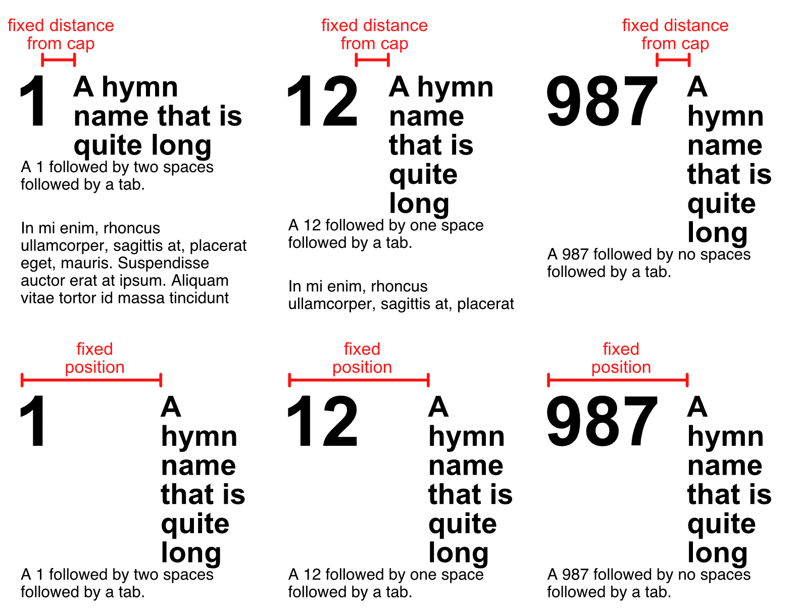
Thank you for your kindness in taking the time to come up with an example. I was attempting to use the intent to here tab because I was aiming for a fixed distance between the drop cap paragraph indent rather than a fixed distance between column edge and paragraph indent. To illustrate what I just wrote, I was looking for the top row of examples rather than the bottom. If the indent to here tab took into account the drop cap’s “distance to text” value, then it would work. As it is, I abandoned precision, and I can get somewhat close to my idea with three drop cap styles, each with a separate paragraph indent position, and I think that will be good enough. I don’t know why you can’t see the video, but here is a screenshot of the video that shows the issue. Notice that the end of story symbol (when Show Special Characters is active) is about two lines above where it should be.
-
Perhaps this is rather a feature request, but I am starting with it as a bug report because it involves the combination of two existing features yielding an unexpected result. Simply put: the indent to here tab, when used following a drop cap, does not take into account the distance to text setting of the drop cap. Here is a video demonstration: indent-to-here.mp4 In the video, I was using Publisher 2.0.4 (release) on Intel iMac running macOS 13.1.
-
This ought to be a good convenience to us to help beta testing. Thank you. However, I have found shortcuts do not seem to have been migrated when I clicked the “Copy Settings & Content From Release App” and allowed it to be restarted. Is that expected? I even tried twice. Curiously, the message that popped up stating “additional disk space required” showed a different amount. The first time, it showed around 176 Megabytes, while the second time it showed 916.8 MB. I am attaching an export of my Publisher 2 Release keyboard shortcuts that I hoped would be imported into the Publisher 2 beta. The shortcut where I noticed it is that the “home” key on the extended keyboard should have gone to the first page in the document according to my settings. Afterward, I imported the shortcuts in the older way, and here they were all copied as expected. Then, I tried the new setting migration again, and it replaced my shortcuts again (with I don’t know what) so that the home key no longer worked as I had defined. Could it be that the migration is importing from something different, like maybe one of the other Affinity apps? I am expecting Publisher 2 to Publisher 2 beta. AffinityShortcut.affshortcuts