garrettm30
-
Posts
1,559 -
Joined
-
Last visited
Everything posted by garrettm30
-

Variable fonts support
garrettm30 replied to Athanasius Pernath's topic in Feedback for the Affinity V2 Suite of Products
I really want variable fonts myself, but your example is unfortunate and I am afraid doesn’t help the cause. The font of these posts is Inter, and while it is now available in variable form, this forum software is requesting the static forms from Google: <link href="https://fonts.googleapis.com/css2?family=Inter:wght@300;400;500;600;700&display=swap" rel="stylesheet"> Edit: the above is mostly true, but it may still be delivered from Google as variable anyway (see next post). I would delete this post, but as some may have already seen it, I need to correct it instead. -
Span Columns
garrettm30 replied to 3darkman's topic in Feedback for the Affinity V2 Suite of Products
I don’t think I have given my “+1” to this feature request since the archived V1 feedback, so I would like to here repeat that I am (still) very interested in this feature. I don’t mean that I am impatient: I like a number of other new features that have since been released, and I continue to use Publisher with sometimes cumbersome workarounds for column span, but whenever it does come, I will rejoice. -
Find and Replace panel improvements
garrettm30 replied to MikeTO's topic in Feedback for the Affinity V2 Suite of Products
I am a heavy user of Find and Replace. All of the suggestions are good. A simple X to clear formatting would be my top request of this list. I find myself seeking to reduce clicks as my wrist wears out. For some reason I am often aware of that extra click in that context. -
I finally managed to upload the screenshot. For some reason, the PNG could not be uploaded if I ran it through ImageOptim as I always have done before for this forum. I do not understand why it now won’t work. If anyone wants to look into it, here is a zipped copy of the optimized image that could not be uploaded. The forum software just fails with this message: “Sorry, an unknown server error occurred when uploading this file. (Error code: -200)” state_studio_cutoff.png.zip
-
It may just be a different way of thinking about it. I made a video where I try to demonstrate why I think about it the way I do, but it is fine if you or others may not like to think about it in this way. In the video, I try to show why I think of query states as smart selections defined according to chosen criteria to which we can apply numerous operations, especially “show all” and “hide all,” but others as well. If nothing else, I have come to realize what a powerful feature this is. Thanks Serif! State queries.mp4
-
It could just be semantics, but I don’t really think a query is ever really on or off. It seems it is just a definition of a group of objects, to which you could reapply either all on or all off regardless of what their current state is. Maybe you don’t have to think about it that way, but it does at least work that way in my test. However you wish to think about it from our standpoint, I suspect that internally each query does not track its own state as “visible” or “invisible.” It is really just a different kind of pre-defined object selection across a whole document. This discussion also made me notice the “select” option, which I appreciate. The visible and invisible buttons seem to be a shortcut to version to clicking select and then clicking one of the selected objects as visible in the layers studio, which will set all of them the same. It’s not exactly the same because of altering the currently selected items, but it is helpful at understanding what is happening. And the “select” option means that this feature has application beyond setting visible and invisible, as it is essentially special smart groupings of objects for multiple purposes.
-
Not really: the query still exists, and all of the objects matching the query still exist and still match the query criteria. It’s just that they no longer have uniform visibility settings. Or to put it another way, even if the query is “disabled” (I am not sure what that actually means in this context), then it would be nice to have both buttons to “enable” it again, either to reset all matching objects to visible, or to reset all matching objects to hidden.
-
This is kind of an ongoing theme, but I recommend testing the Font UI Size set to Large with the new States studio. Unless Laver taɑ is a new feature. 😛 Tested on Publisher Beta 2.4.0 build 2222; macOS 13.6

-
At first I thought your observation made perfect sense, but upon reflection, I do think there is a need for both buttons, and that is because the visible state of the different objects that make up a query could have their visibility changed from the layer panel. For example, let’s say that you have some objects matching a state query that are currently invisible, and some others matching the same query that are currently visible. In that case with mixed visibility, which state should a single toggle show? In the current implementation, the two buttons are effectively “make all visible” and “make all hidden,” and they will both have an effect when the objects have mixed visibility settings.
-
I do welcome this change, but it really strikes me as a hidden feature, and although I don’t know what to suggest that would make it discoverable, it does merit some consideration. In this case, this new feature relies on two different pieces of knowledge that unless one has been informed about outside of the software (and can remember when it is needed!) there is no way to discover it by usage of the software except by sheer accident: 1. That there is such a thing as a “key object” and how to designate it. 2. That designating a key object changes the behavior of the distribute options (spacing horizontally and vertically). I don’t think that including it in the software manual is sufficient. To give an example, I read this thread yesterday. Today I decided to try it out in the beta, but I could not figure out how to do it even though I read the thread yesterday. It was not until I went back and read again that I was able to identify what steps I had missed. If that happened with just one thread in the space of one day, what about those few people who actually do read through the manual entirely? When they read about such a feature that is a little bit on the niche side, will they remember that it even exists when it may be many weeks later before the opportunity for its use presents itself? I did not even know that “key object” existed in 2.3. As a follower of betas, I probably read about it when it was new, but clearly it didn’t stick because I did not then have a use for it. And although there have been occasioned since where I would have found it useful in my work, it was as good as non-existent to me because I did not know it existed and therefore I did not go looking for it. It may be that there is no way to make it more discoverable, and I certainly don’t mean that the feature should be removed if so. Now that I do know that there is such a thing as a key object, I recommend that the concept should work not only for alignment, but also for transform operations, as I would use it for that as well. That is a separate feature request from this feature, so I don’t mean to derail the discussion, but I do bring it up because if a procedure is used more broadly throughout the software, it becomes somewhat less hidden, and that is at least a partial solution to discoverability.
-
I am writing to confirm that the issue appears to be resolved when I follow my original recipe when using Publisher beta 2.4.0 build 2222 on macOS 13.6.
-
Ability to lock insertion target
garrettm30 replied to Ash's topic in [ARCHIVE] 2.4, 2.3, 2.2 & 2.1 Features and Improvements
That’s what I was thinking: as the software becomes more capable, many of its features also become less discoverable. My suggestion would be to implement double-clicking to lock it, following the paradigm established by caps lock on mobile keyboards. Furthermore, perhaps this is a bad idea, but my first thought is that it might be worth considering whether to implement all three alternatives: opt-click, long press, and double-click. That way, the user can achieve what he is looking for by whatever method he happens to remember or try. For my work, this is a feature I would almost never use but really be glad for on those occasions where it would be helpful, and I would hope I could remember how to do it. -
I am doubly appreciative: Of this approach to get fixes out in a patch rather than waiting for the next feature update (which itself is more likely to have issues). That you have been giving us an estimate of upcoming progress.
-
This is an old bug, and I had thought that it was fixed, but I am seeing it again. Is it merely my imagination that it was fixed or has there been a regression? I can provide a new sample file if needed, but of course, no point in wasting anyone’s time if this is still an open bug.
-
This may be easier to just see in the video, but I’ll try to explain. If you try to edit the character used for a bullet point in a text style that is a child of another bullet style, and you want to use the character picker (the ellipsis button), the text that gets inserted as the “bullet” is the literal text “[No change].” Start with the A4 document preset. Create some text with the paragraph style “Bullet 2” Edit the text style “Bullet 2” by going to the “Bullets and Numbering” section. In that section, clear the “Text” field and then try to enter a new character using the button with an ellipsis on it. Result: instead of the character you picked, it will be the literal text “[No change]” as the bullet. Note that this same procedure works as expected with the style “Bullet 1,” so I understand that using a child style is a relevant part of the recipe. bullet_char_propblem.mp4 Environment: Publisher 2.3, macOS 13.6, 2019 iMac 27”
-
When I open a file that has a missing resource, and that missing resource is placed multiple times, if I select the option to relocate the resource, it fixes some of the instances but not all. I have prepared a pair of demonstration files used in the recipe and video below: Relink Problem.zip Recipe Open replace-linked-problem.aftemplate that I provided. At the “Missing Resource(s)” notice, click Yes. Select the provided renamed_file.afpub and click Open. Wait a moment for preflight to update, then consult the preflight errors. Result: There are several errors of missing resources, but the exact number is different each time. The same file was placed 9 times. Some of the instances of the linked file are fine, while some instances of the same file are still missing. Demonstration relinking-problem.mp4 Environment This was tested on a 2019 27″ iMac, 3.7 GHz 6-core i5, 24 GB RAM, macOS Ventura 13.6. Publisher 2.3.0 was used in the demo video, though I know the issue dates back at least as far as 2.1.1. I have an automated workflow that this has affected that used to work properly, but it started to have this issue continuously sometime in the earlier versions of Affinity 2.
-
I do agree. I appreciate that approach.
-
Not to negate the request for some sort of multiline composer (which has been a long-time desire of mine for Publisher), but in the interest of being accurate, it seems you do not have hyphenation configured to allow hyphens in Publisher, whereas I see multiple hyphens in the InDesign specimens. Notice that the worst lines in the Publisher examples are followed by very long words. Allowing hyphens would greatly improve the results you get in Publisher. It might also be interesting to turn off hyphens in InDesign and see how it compares to Publisher without hyphens. In theory InDesign ought to do better than Publisher on average in such a case, especially with such long lines to work with.
-
Another page moving problem with master spreads
garrettm30 replied to garrettm30's topic in V2 Bugs found on macOS
I would like to report that this bug appears to be resolved as of Publisher beta 2.3.0 (2139). This may have been fixed earlier, but I came back to test again when I saw the following in the list of resolved issues in the latest beta: Although the situation is a different than what I described in this thread, it seemed to be regarding a similar part of the code. I can’t know for sure, but what I can confirm is that when I download my original sample file and try the action of the video, the bug does manifest as in the video when I try in release Publisher 2.1.1 (to confirm I am following the same recipe as reported) and does not manifest in the latest beta with the exact steps. That seems to suggest that page flow changes, whether adding or moving pages, may now be more reliable, and that is quite welcome. -
Issue with drop cap on numbered list
garrettm30 replied to garrettm30's topic in V2 Bugs found on macOS
Hyphenation is surely part of the line-width calculation that Publisher contends with, and it is probably involved here. But turning minimum score to 2 all but turns off hyphenation. In the actual document of 8 pages, a setting of 2 results in exactly one hyphen through the whole document and tons of unsightly gaps that could have been solved by hyphenation. Minimum score of 0 is a legitimate setting and in itself not the cause of lines overlapping. Turning off hyphenation does cause the problem to not manifest in this case, but so does turning off drop caps, or turning off the numbered list. I suspect it is somewhere in the combination of those things. As I said, I have already worked around the issue for this document; I am just reporting of the issue to Serif, and Dan C was right to log it. -
I recently encountered an issue in one of our documents that made use of a paragraph style that combined drop caps and numbered list. It worked in most occasions, but it appeared Publisher had some issue calculating when to break for the next line if the line was at a certain length. I was able to work around the issue for our publication, but I have copied one of the problem paragraphs and reduced a lot of the formatting choices to narrow it down. Attached is a sample document with this problem paragraph in cut-down form pasted multiple times. For comparison, here is what I expected the cut-down example to look like: And below is a brief video of what I am actually seeing. In the video, I first try changing the text-frame dimension, and then I try changing the horizontal character scaling. In both cases, I can find combinations that work and do not work. Sometimes when it doesn’t work, it is just a wrong indent, while other times, we have a collision of two lines in the same space. dropcap numbers oddity.mp4 Here is the file from the video: drop cap numbered list.afpub Tested in Publisher 2.1.1 on macOS 13.4. I have also tested in beta 2.2.0 build 1931 with the same results.
-
Move data entry
garrettm30 replied to Ash's topic in [ARCHIVE] 2.4, 2.3, 2.2 & 2.1 Features and Improvements
This is a nice feature also. As I consider this together with the object creation with data entry, I see that you are on the way to creating something like an on-demand version of features in the Transform studio without needing to keep the studio open. I would be interested in that to free up some space, because otherwise I personally have the Transform and History studios with tabs sharing the same space on the sidebar. But it is lacking a couple of data points (absolute position, width/height sizes) to fully achieve that. Another way to think about it is that it is now an interface for the power duplicate feature. But here too, it can’t handle everything that power duplicate can, such as resize and (as was mentioned above) rotate. It may not make sense to take it all the way for full feature duplication of transform and power duplicate, but maybe some of these things could make sense to add, perhaps even with an expansion triangle for more options. -
Object creation data entry
garrettm30 replied to Ash's topic in [ARCHIVE] 2.4, 2.3, 2.2 & 2.1 Features and Improvements
Unless I missed something, what I see in your video is the behavior I would expect. The shape is supposed to move around based on which origin point is selected. The absolute X & Y position of your click should stay fixed, but which point on the object that the absolute position relates to is what you are selecting. For general feedback of the feature, I would add an X and Y field, prefilled with the clicked position if in canvas (i.e., the position that is used currently in this beta). I would suppose the main advantage to numeric entry would be precision versus the imprecise nature of clicking and dragging, but the same would be true about the position of the initial click (though snapping does really help). As an added benefit, this numeric entry makes automation through solutions such as Keyboard Maestro more achievable. -
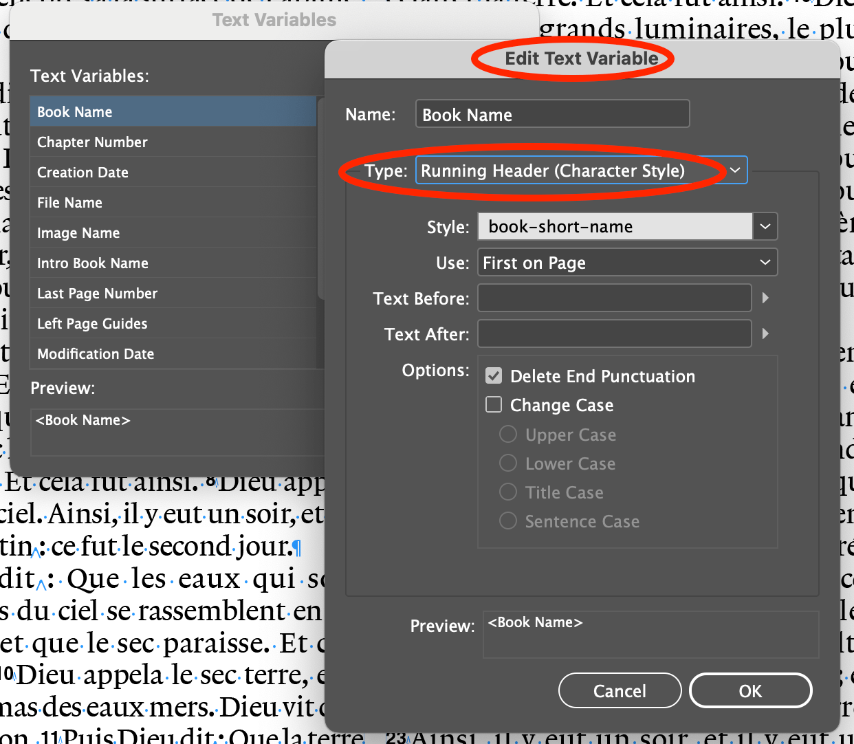
Custom text variables
garrettm30 replied to Ash's topic in [ARCHIVE] 2.4, 2.3, 2.2 & 2.1 Features and Improvements
That is basically my point, and you have illustrated it from a different perspective. Thank you. Perhaps it is not about custom text variables as they are currently implemented, but as we are discussing feedback about the current implementation, I do think it is important here. I would like to point out that what we are talking about are indeed text variables, as many of the people who are coming from InDesign who are making the request for text variables have this in mind. To illustrate, here is a picture of InDesign’s text variable interface as I used it for running headers in that Bible project several years ago. I also do not think InDesign was inaccurate in using the term “text variable,” as it indeed is variable text that will be inserted at a given location. When InDesign folks are going to see that “custom text variables” are a new feature of Publisher 2.2, they may end up disappointed when they see it is more limited than they were expecting. Having said all of that, I recognize and can appreciate that what we are looking at in this Publisher beta may not be Serif’s end goal for this feature. I only mean to leave feedback about the current form. However, as far as functionality, it seems that Publisher has basically already got what it needs; it is just the interface is a bit clunky here.
-
Custom text variables
garrettm30 replied to Ash's topic in [ARCHIVE] 2.4, 2.3, 2.2 & 2.1 Features and Improvements
A proof of concept is all I needed. Thank you so much for explaining. Now I understand how to have multiple instances of a “running header.” With that improved understanding thanks to Old Bruce, back to my feedback… So for the most part, it seems like the functionality for multiple dynamic variables is already there, with the exception that they cannot be named or edited with in the Fields panel in any way other than individually. The way it is presented seems to be a misfit. For one thing, the name “running header” seems off, because although very often they would be used in that way, apparently it can be used anywhere anytime a dynamic variable based on a text style is desired. But what led most to my confusion is that the Running Header section in the fields behaves differently than (I think) all of the other fields—well, date also. For all the other fields, they will always behave in a consistent way across the document. For editable fields, such as Author, if you edit the field, it edits it everywhere in the document at once, but not so with Running Headers and Date. I made a video to illustrate the difference, but I changed my mind thinking no one would want to watch it. The gist is that I think Running Headers and Date should work globally like all the other fields, so that it works consistently and therefore works in an expected way, but also gives a convenient way to edit those globally. I would move both “Running Header” and date down to custom section. Currently the new custom variables/fields of a text type, just as Author, Comments, etc. I suggest making possible other types of custom variables, such as the “Running Header” type based on style (it should probably be renamed), date and time, and probably there could be others, such as sequential counter, whatever. To illustrate, let’s take the date field. Let’s say I use the date many times throughout the document, but as time goes on, I decide I wanted the date syntax done slightly differently. If it were like the other fields, I could just change its property once and it would update everywhere. But with date, I have to select each instance and then make the changes one by one. It would be better if I could have defined one date custom variable set up the way I wanted, then I could change all of them later if I wanted to. Or maybe I have two: longDate and shortDate each as custom variables. A slight variation to this idea is to leave Running Header and Date where they are rather than move them to custom, but make it still behave globally. And so that users can add more than one, add an option to add additional fields of the same type, maybe Date 2, Date 3, etc. This option would also solve the double problem of making this discoverable and providing the same convenient global editing that the other fields already have. I hope this makes sense—maybe I should have just posted the video. Anyway, there may be some better ideas, but I think the current behavior of the Fields studio where two of the fields work in a completely different way than all the others invites rethinking.