

deebz
-
Posts
75 -
Joined
-
Last visited
Posts posted by deebz
-
-
Currently the selected colour changes on a tool by tool basis.
For example I choose a blue while I’m using a paintbrush but I switch to the fill tool and the colour changes to orange, which was the last colour I used to flood fill a layer 3 documents ago.
I don’t personally understand the logic of making the active colour tool driven, rather than context driven.
Mask layers are a case in point. The context of working in a mask or on an adjustment layer is that you are working in black, white or grey, yet the active tool and whatever colour you selected dictates the colour in this context.
I appreciate I might be missing the grand plan here, but surely I’m not alone?
-
Hi @MEB thanks for getting back to me with the info. The concept learned from years of retouching in PS of adding masking to adjustment layers is hard to shake!
The built in mask does make more sense, so I’m glad to now know it’s there.
-
On 12/16/2019 at 11:47 AM, loukash said:
Stop adding features for a moment and fix the bugs instead!
2021 and I back this! The suite is packed full of features but unfortunately with new features come new bugs. Bug fix and UI/UX improvements should take precedence
-
-
Hi @MEB
I’m on Mac (big sur) running photo 1.9.1 purchased directly from affinity rather than via the App Store.
I’m happy to provide the afphoto file and my psd exports if it helps
-
When I export a psd with layer adjustments the masks get stripped out.
I’ve tried both export options, preserve editablity and preserve accuracy but the result is exactly the same.
Am I missing something?
-
@walt.farrell you sir, know your oats and your publisher!
it was set to language unknown (US) selected English and sure enough my problem went away!
weirdly this was an imported idml. On a fresh document the language defaults to British English. I should have known it was adobe’s fault! 😂
thanks Walt!
-
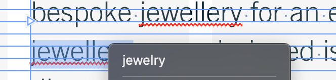
capitalisation makes zero difference and affinity on right click wants to suggest American spelling

-
21 minutes ago, walt.farrell said:
The Concise OED is not the dictionary that @Old Bruce mentioned above, though. He mentioned the Oxford Dictionary of English. What does that dictionary say about "jewellery"?
And, by the way, does it like "jewellery" better than "Jewellery", perhaps?
Also: If you're a Mac user, Publisher is possibly using the dictionary supplied by Apple.
Not sure about the capitalisation of the word Walt. Will check. However this should be working on a case insensitive string match.
As for Mac dictionary. It isn’t being used as the Mac dictionary recognises both jewellery as being the British spelling suggesting or offering the American spelling as an alternative.
-
1 hour ago, beast said:
I agree wholeheartedly.
UK English should mean the OED (the number or choice of volumes is irrelevant).
At the very least, this should be an option, especially from a British company (of which we can otherwise be very proud).
Even a simple word like jewellery is in the concise OED.
I respectfully disagree with Walt, it is not the onus of the user to fiddle around with dictionaries in the background, especially for English/French/German/Spanish... I could understand it if we were expecting Affinity Publisher to ship with dictionaries for Taushiro or Bahing.
-
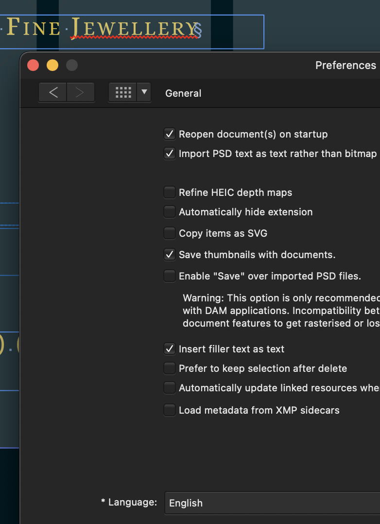
I think a different model for the dictionary needs to be used than the Hunspell. It's flagging the british spelling of jewellery as incorrect. Even though my system prefs are set to British English and publisher likewise. For a british company to favour american spelling.... tut tut tut 😂
ps. I've also tried the workaround posted elsewhere about downloading and adding a new dictionary. Still no joy
-
-
19 minutes ago, thomaso said:
these jumping buttons were reported
Apologies I didn’t realise that, just spotted them dancing around and wondered if related. I’ll have a look at grids next time I’m in front of my desk.
-
In the second video - did you noticed your close minimise expand buttons (top left) jumping around? Wonder if it’s related?
-
@v_kyr I didn’t know of this approach. I’ll a try and and report back. Thanks for sharing.
-
Maybe it’s a Big Sur/direct purchase from affinity issue then?
-
It’s called save as package under the file menu
https://affinity.help/publisher/English.lproj/pages/Publishing/creatingPackages.html
-
For some reason by default PSD's are associating with publisher on my mac and not photo. Even using open with other and the "always use checkbox" doesn't change anything.
It's not a massive issue, just seems quirky, but don't know if this an OS level issue or an app level issue?
-
On topic... why publisher doesn’t default CMYK documents to a default set of CMYK colours is a mystery. I created and shared my own here
-
16 hours ago, Jowday said:
This is a usability issue - one of many - in Affinity. Inconsistent layouts or/and missing feedback.
But shhh don’t mention/criticise anything about UX/UI on here.... you’ll get the “windmills don’t work that way” defence!
For me the UX/UI is really letting the software down. It’s a quality issue - details matter. I wish they’d prioritise the UX and bug fixing before releasing new functionality.
-
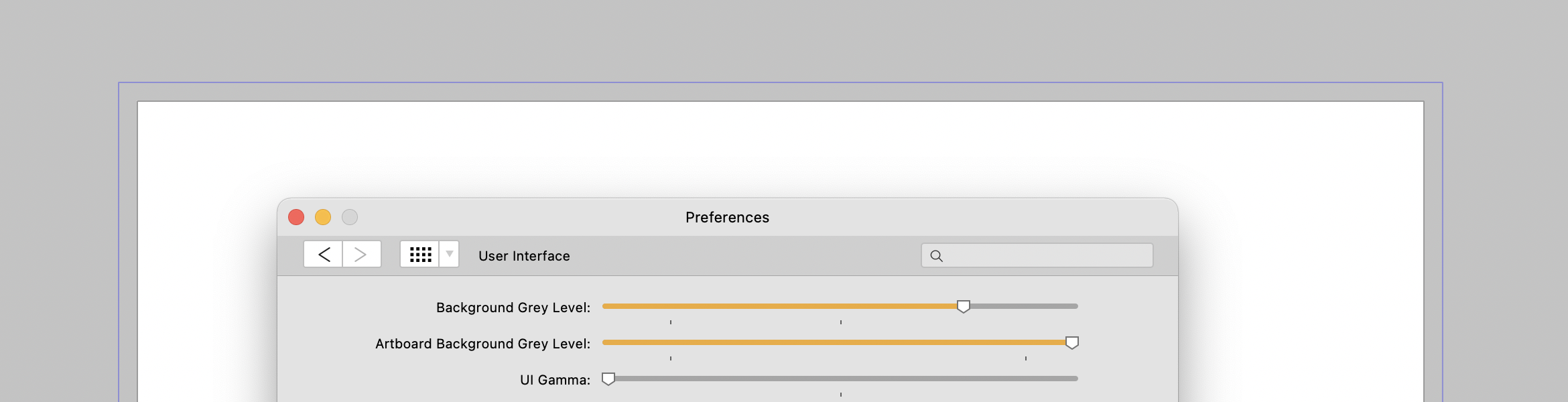
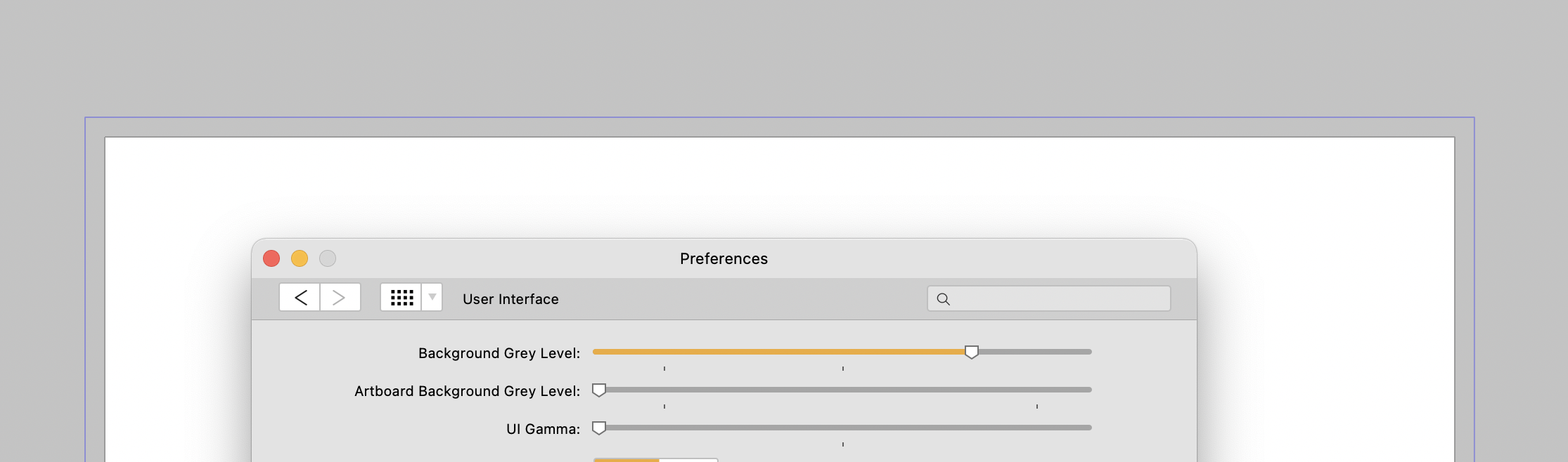
In Publisher on Mac in both the light and dark theme, I see no difference when using the Artboard Background Gray Level slider. Am I missing something? Or is it superflous?
-
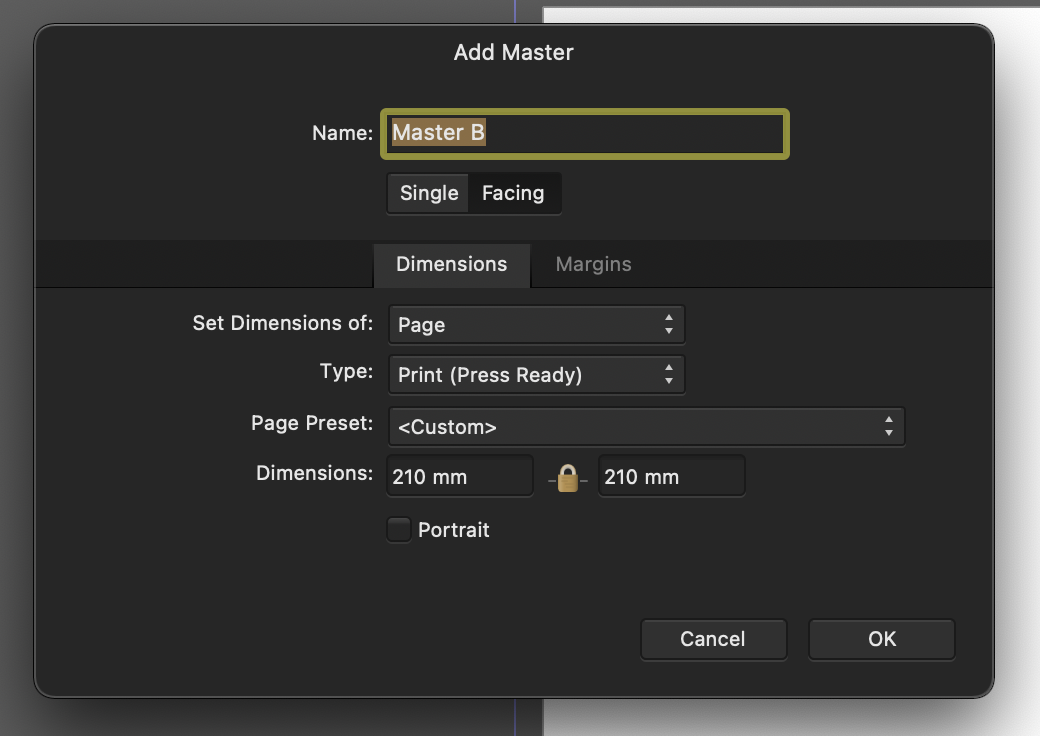
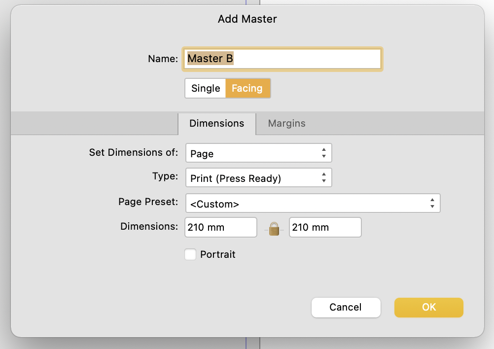
I noticed this a couple days ago and thought it was a bug. So raised it in the bugs sub forum initally, but have since removed it.
I first came across this in the New Master Page Dialog when you have dark theme on MacOS selected either in app or at an OS level.
The visual feedback for the selected state of Single or Facing page toggle is ambiguous with the dark theme, but is reinforced through OS accent colour in the light theme.
Dark theme: Relies on pushed button metaphor, yet the control - to me at least - looks/looked like a segmented control, suggesting that Single is highlighted. The context informed my opinion as the Dimensions Tab below is lighter and selected. I assumed that Lighter = selected.
This "pushed button" metaphor is fine where there are more than two options using it and where one option has more than two choices.
As seen in the preferences pane (below) the control with three options shows clearly which is selected. Not only does the wording of the context help but the selected option is the odd one out. From this I can infer which choice is selected in the control above which only has two options.
However, when light mode is enabled (see below) ambiguity is reduced as the selected choice is reinforced through accent colour.
TLDR: Could the colour accent used in the light theme be applied to the Dark Theme too please?
- GaryLearnTech and RNKLN
-
 2
2
-
@wonderings couldn’t agree more re: default palette
for what it’s worth I shared a new default palette that’s a little bit more sensible for print designers over in resources
-
I find publisher takes ages to cold boot ever since the 1.9 update
My purchase route was direct from affinity and not the MAS
Big Sur 11.2.1
iMac (Retina 5K, 27-inch, Late 2015)
3.2 GHz Quad-Core Intel Core i5
32 GB 1867 MHz DDR3
AMD Radeon R9 M380 2 GB

Affinity Publisher Customer Beta - 1.9.2.1014
in [ARCHIVE] Publisher beta on macOS threads
Posted
I noticed in the first beta of this series of releases that a bug regarding the application of guides on masters – which i originally reported here – has been addressed - thank you.
However in this latest beta I have noticed that the guides on a master page aren't being applied to the first page in a document now.
Thank you for all the hard work