

Dazzler
-
Posts
216 -
Joined
-
Last visited
Posts posted by Dazzler
-
-
After spotting this in the new features for 2.3 I thought I'd give it a try. Had to open all three packages (because the updates text doesn't mentoin which package it's in) and do a google search before I found how to show the Move/Duplicate dialogue using the keyboard shortcut! Fine once you know it's there, but easily forgotten and not easily found without instructions to look at. I think there should be some way to access this via the menus or icons.
Secondly, the angle confused me a lot before I realised it's for offsetting the position at an angle at a certain distance. But easily mixed up with the rotation. I intially thought it might have been to correct the object you were duplicating, so for example if you wanted to put numbers on a clock you'd make a text box then offset the origin to the centre of the clock and rotate 30 degrees with 11 duplicates, which works great but you might want to keep the numbers upright, which then means going to each duplicate and twisting them all back around. Would be great if there was checkbox that enabled rotating the object positions around the origin but keeping the orientation the same. I spent a while putting -30degrees into the angle field and wondering why the angle of the object wasn't changing at all. It might be worth grouping the Horizontal, Vertical, Distance and Angle into a group (or having a empty line after Angle) then having the rotation and scale in a separate group to avoid confusion? -
Because you have the chain in there that contains some of the same tonal range as the background it's making life difficult. You can either do what others have suggested and improve the original shot using a light box or similar, or alteratively go down more of a greenscreen style technique where you actually use a coloured background with the intention of having something that is then different to the foreground making selections easier - just make sure it's not reflecting that colour on the front side (which it shouldn't so long as the colour is behind it).
You could probably still make a selection with what you have but you'd have to use the Flood select tool set on add mode and click into each of the individual holes. I tried the normal refine method and it sort of works but it's not 100%. With the flood select you're getting more the effect you want with it stopping at the edges of each ring. Sounds horrendous to do but it's actually not too bad in practice ... took me about a minute or two to select all the holes on one of the earrings, and if you have a higher res image available then it should be even easier to do if you zoom in. -
hmm I see your issue - you'd think there would be a preference for that, but I can't find one. It seems to just be altering the dimension rather than rescaling the object when you paste it in.
As a workaround, what you could do is set up some assets libraries with the assets resized at the various scales - so you could place all the assets on a page, resize them all as a whole and then add them to the asset panel in a library named for a particular scale (say 1:10 assets). A little bit of a job setting that up I know, but adding items to the assets panel is incredibly easy and you can actually just grab all the items at once and chuck in there, so long as they are all individually grouped into their items. So really it's just a matter of placing all your original elements to a page, select them all and resize them all to the scale (/10 for example) then drag them all the the assets category you make for 1:10 scale. Also as you are creating your assets make sure your stroke settings have 'scale with object' ticked so that the lines don't get ridiculously thick when you scale them down. -
I've been playing around with the new warp layer tool, which is great and a much needed addition to the suite, but I'm just wondering if there is any way to adjust the initial orientation of the warp without affecting the layer you are warping? Or do I need to do all the warping with the shapes straight first and then rotate them into place?
So for example, if I had some text aligned to a shape that was at 30 degree angle and I want to push the middle part of the text up (up as in the direction of the ascenders of the text, not up as in the canvas direction), currently if I choose the bend horizontal I end up with an odd result because my object is at an angle to start with and the warp isn't aligned to that angle, so adding new nodes to the warp doesn't really help either as those are initial aligned to the canvas direction not the shape I'm trying to warp.
Also, with the ability to add shapes into the warp layer afterwards is there any way to expand the edges of the warp field to include a new shape (if it's running further outside of the original warp area)?
-
I'm wondering if your iPad is running low on memory due to the number of undos ... I've not tried Photo on iPad as I only have an iPad Air 1 and it doesn't run on that at all, but if there are preferences like on the PC version then try reducing the undo limit down to something like 10 or so undos and see if that makes any difference? If that solves it then you could try gradually increasing the value back up to see how many undos your iPad is happy with. Of course if you don't often use undos, then you can leave it on a low setting and enjoy the extra RAM that will free up.
-
Retina screens are a bit of a pain when it comes to this stuff. When our designers do screengrabs of our web pages they are grabbed at retina resolution so are twice the size, then they work over the top of them with new designs which are then twice as big as they need to be. We then have to scale everything back down to do the exports. It's not great and causes a lot of confusion with the designers, as if they resize the screengrab themselves it looks half the size on their screen compared to the web page. On a retina screen everything gets scaled up in the browser, and where possible it will substitute retina images for regular images, giving a much sharper result. If you are creating images for a retina screen on a webpage then you need to be exporting both regular and retina images and these are set up in the stylesheet of the page to use the correct one.
So first of all, check your document setup DPI setting. Web pages on a non-retina screen generally display at 72dpi, sometimes 96. But in terms of basic pixels 72dpi should be giving you a 'normal' size on the webpage. When you export check the pixel dimensions there. A dpi setting on the document doesn't necessarliy carry across into a web graphic. Pixel dimensions are the key thing there. If you are using the export option then check those pixel dimensions are correct for a 72dpi image at the size you want. If you are using the export persona then you can set up both regular and retina sizes from there (1x, 2x etc). I'm on PC so can't duplicate what happens when you change the document dpi on your machine, but I would imagine it would display smaller than you would expect? Using the pixel and retina view modes on the top toolbar should help you to see how the final images will export at the two sizes, presuming the origination is some form of vector.
-
What Bruce Said above ...
or for a quick and nasty option, just hide them by dragging the map lines layer inside the boundary layer? I guess it depends on the use case though as to whether having those hidden lines is an issue. Hiding them won't give the most efficient file size, but you can export to an svg and the 'clipping' should remain. -
You'll probably need to make it huge so everything is readable, then save as a .png ... which should, in theory, have a smaller filesize than a jpeg as you are using flat colour as opposed to photographic content, and flat colours with a .png often make a much smaller filesize as png is a palleted system. Saying that I don't know if .png files are compatible with the social media platforms - worth a look though.
-
@LaraJ Sorry, couldn't seem to reply again there... not sure if the forums are working quite right here.
As Hens has now said, You need to be using the gradient tool in the left toolbar (looks like a rainbow circle with a line on it). Using that will show the tool handles that allow you to position the gradient and rotate it, and indeed set the length of the axis in both directions on the eliptical gradient. The top toolbar is for tweakng really, best to use the gradient tool as a first step ... if you haven't used it, you'll love it, it's so fast and easy and you get the realtime preview as you drag it around, so much better than working with a little dialogue box. -
The eliptical one has an extra handle that enables you to squash the gradient on one axis. However, be aware that there is a little 'Maintain aspect ratio' toggle on the tool menu that makes the handles the same, so uncheck if you want an eliptical gradient.
-
You can actually do this in Photo.
Select the layer with the two rectangles on, and then from the top menu select Layer > Geometry > Separate Curves. That will give you the rectangles on two individual curve layers.
Now select both of those and select Layer > Geometry > Add. That will combine the two shapes into a single object that you can then fill with a single fill.
Obviously you lose the editability of the individual rectangles, but you can still move the points around if you wish.
Edit: and yes this is much easier to do in Designer! -
I'm not entirely sure why they haven't put this tool on the tool panel by default. It's a great tool and actually allows some quite complex stuff that other software doesn't do, so why they've left it hidden away is a mystery!
Also, note that you can move the centre point around and then pivot/scale/transform the rest of the shape around the pivot, but with the added bonus of the point you drag snapping to other objects. So, for example, if you have a rectangle that you want to fit into the inside curve of a circle , you can drag the centre point to one of the nodes, then drag the shape up to the curve until it snaps, then select another node and drag it around the centre point (hold CTRL for no scaling), and then when that node is brought over the curve it'll snap too. Now you now that both points are snapped exactly on the curve. If you want to fit a shape into a specific gap you can just let it scale by not holding CTRL. -
If you use the point transform tool you can get it to do this. Oddly, that tool is not present on the toolbar by default, so add it in (View > Customise Tools...). It looks like a center point with a diagonal dotted line leading out to a red cornerpiece. When you use that tool there are a lot more neat things that happen! It's useful for aligning things to other objects (angles etc).
-
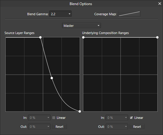
I've just had another thought, which may be a much quicker method. Simply click on the cog in the layers panel (Blend Ranges) and in the Source Layer Ranges box drag the right hand node right down to the bottom. That seems to do a fairly decent job by itself.
You might also find that moving the left node across to the middle of the top gives a stronger contrast and leaves more ink showing. You can also turn off the linear tickbox and drag another point between the other two to get a curve that will give you a lot more control.

-
You can achieve the same type of thing without using an extra channel. If you set up an adjustment layer to adjust the levels (or whatever) you can then use the gradient tool directly on the adjustment layer to make it affect the picture in different amounts according to the gradient. It's very a very similar technique to what you are currently doing in PS, just with a hidden channel built into the adjustment layer. You can also paint onto adjustment layers and the effect is fairly identical to painting on a channel in PS.
-
Another way of doing something similar to what firstdefence said is simply putting the layer mode to 'screen'. This makes the darker shades transparent leaving the lighter shades opaque.
-
Ah I see, I think Photo is the only Affinity app that offers anything along those lines. Of course, if you want to really get into doing some 3d stuff then you could always grab a copy of Blender (free), but be warned there's a bit of a learning curve involved!
-
If you stop and think about it, a generic bunch of evenly spaced lines coming from the two vanishing points wouldn't be that useful. What you actually want are lines coming from the extremes of your verticals within the scene. So you'd only want a basic setup to start with (the two vanishing points, horiztonal and lines for say for top and bottom of a building) , then you'd add your own lines for things like windows and tops of doors etc. So for perspective you're better off using your own handmade guides anyway. Also, if you want to get a feel for the perspective you can stretch your guide layer horizontally to move the vanishing points outwards (you can go right off the sides of canvas area) giving a less extreme perspective or inwards to emphasize the perspective. Less is better here I think.
-
Whilst I don't think Designer supports perspective guides like that, you can easily make your own just by using a standard layer as a 'guide' layer, drawing your perspective lines on it and then locking it. With the snapping options set up to snap to other objects you can use the underlying 'guide' layer as a method of snapping. This way you can make yourself any 'guides' you like.
-
I've always found the stabiliser to be very good. I can even draw lovely smooth lines with the mouse. Try both modes - Rope mode and Window mode, and adjust the length to suit what sort of detail level you need.
-
Hi Abulail,
Go to
File > Document Setup > Colour tab
There's a checkbox for Transparent Background. Make sure that's ticked. You should then see the checkerboard pattern in the background. If you export as PNG now it'll have the transparency.
As for the pixels, that will depnd on your resolution. A PNG is a raster format and so your design will be pixelated, however you can solve this issue by changing the DPI of the document (back in the dimensions tab of the same dialogue box), choosing 'Objects will: Rescale' to prevent them from changing size on the page. Note that you can type a DPI into the box as well as choosing a preset one if 400 DPI isn't high enough.
Use the pixel view mode (buttons along top of the window) to preview how pixellated your shape is going to be.
Hope that helps! -
I think you're right R C-R, selecting nodes prior to joining seems to make no difference to which nodes are joined.
So the results of joining those two lines on your test file in different orientations is :-
Top line red node on left, bottom line red node on right = Joins left side
Top line red node on right, bottom line red node on right = Joins left side
Top line red node on right, bottom line red node on left = Joins right side
Top line red node on left, bottom line red node on left = Joins right sideI'm on Win10 version 1.8
-
I think the search may happen on the raw text input rather than it's post wrapped state in the text frame. It seems it will only pick up things that are physically placed into the text, such as paragraphs, frame breaks, line breaks etc. You can see a list of these if you click the search magnifying icon > Special Characters, when typing your search terms. I can't get it to detect any of the automatic formatting at all.
-
Thanks for taking the time to write this Tony. You could've just gone and said nothing, which leaves nothing for the dev team to work wtih. At least they will know why now.
There are gaps and a few bugs in the Affinity suite, but it's still fairly early days for Affinity, and hopefully they are making the right decisions and prioritising the stuff that really matters, building it in a way that is intuitive and sensible. I applaud them for taking on the challenge - it can't be easy to walk into a market that has such a strong industry leader, and bring products that are on par with that. I am completely happy with Photo as it suits all my personal needs and gives pro-level editing capability for hobby-like prices.
- emmrecs01 and jmwellborn
-
 2
2
Affinity Designer 2 for Windows - (2.4.0 & 2.4.1)
in News and Information
Posted
One new feature that I love is the new 'Size / Rotate objects to same'. That is an excellent addition to the tools and makes a lot of sense, especially for those doing web design with responsive sizing! Sometimes it's those seemingly small additions that make all the difference. I love this journey, watching the Affinity suite growing more and more powerful with each update. Looks like there might be an issue with the example in the 'Layer States added to Affinity Designer and Affinity Publisher' example ... it's not playing.