Dazzler
-
Posts
216 -
Joined
-
Last visited
Everything posted by Dazzler
-
So working with three images whereby I've loaded the same image twice and then chosen a different image and put them into a stack, the median does exactly as you'd expect and disregards the image that is different. However, hiding one of the duplicated images, leaving just two images that are different seems to reveal a picture whereby some pixels are selected from one image and some from the other almost like there's some weird masking taking place (which is kind of expected to some degree). So it looks like it's choosing one or the other image to show for each pixel. How it's deciding that I'm not sure, but a true mathmatical median should be taking into account that there's an odd or even number of samples, and if it's even, taking the two middle ones and doing a mean between those to arrive at the result. Would that be useful from an imaging point of view? I'm not too sure, but it's kind of interesting what is happening - could be useful as an effect maybe?
-
Interesting. Looking at the docs, it suggests that median removes content that is not consistent in each image - suitable for object removal and noise reduction. So I wonder if there's some extra calculations in play there that makes it more suitable for that. I expect they've taken a median calculation and expanded it to suit that purpose? I'm only guessing though. Not sure how it could really work properly with two images.
-
The Affinity apps are excellent for web design - that's my primary use for them. Not sure I'd want the 100% default thing, but it wouldn't hurt to have as a preference tucked away somewhere.
-
Murfee's suggestion is probably the best, but if you don't want to group you can just re-rasterise the layer once you've rotated it and it will reset the orientation of the bounding box controls.
-
What I really like with the corner tool is that it stays 'live' so you can manipulate the points along the path afterwards and the curves adjust themselves to suit the radius in each case.
-
Just to prove what I just said, I took the green channel view and pasted it over the combined channels and just 'un-normalised' (squashed) it down to the same size it was and you can see it's the reason that area of combined colour exists.

-
That's the green channel's edge - the green is behind the transparent blue channel. You can clearly see it joining the green unobscured layer on each side. It's also doing the same nearer the middle. Remember that the individual channels on this are normalised to the height of the chart, so when you view the green channel it gets stretched upwards, but it's the same shape as it is in the combined view (make sure you click the fine view - it looks slightly different in course view) - just stretched.
-
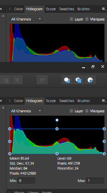
The layer checkbox just shows the histogram for the layer you have selected, so depending on what that is it may be blank, or might just be normal looking histogram. I've found an image with varying heights between the normalisation, but still my graphs match well with the levels ones. I pulled one out of unsplash using the stock function - https://unsplash.com/photos/q3o_8MteFM0?utm_source=Affinity Photo&utm_medium=referral How does that one work for you?
-
I would refer you to R C-R's link to the cambridge tutorial in his post above. That explains a bit about it. There are some uses, mainly to detect clipping and contrast issues.
-
Ok, on mine the graphs are hitting the top so any normalisation is having no effect so they match my composite one exactly. As for the levels histogram ... mine are matching up well - obviously my levels one is a wider window so is slighly stretched in comparison and I did click on the little exclmaimation mark in the normal histogram to make it render more accurately (if you don't do this you may see an extra spike or two that shouldn't be there as it only renders a course histogram for speed). Comparing the master to all channels or individually mine are matching as far as I can tell and my eyesight allows! Maybe there's something else at play here? You don't have the layer tickbox selected on the main histogram do you?
-
All I was trying to say by flipping between the channels is you can clearly see the way the edges lie for each channel, then when you compare to the combined 'all channels' view you can match each to it's repsective colour chart in the combined view, then you'll see there is no imaginary fourth area, it's just where they overlap. If you don't believe me take a screen grab of each individual colour, then composite them together with some transparency and you'll get the combined view - stacking them red at back, green in middle, blue on top. I agree a luminance value would have some use, I'm not saying it wouldn't, and probably more so than the individual channels, but it's definitely not the same as the white area that looks like it used to highlight where all three regions were combined which is somewhat misleading to say the least. I can see why they removed it.
-
I see the edges, and yes the combined colour makes a light blueish colour, but if you did as I said and flipped through the channels you'd see there is no fourth value being presented there. The reason for the transparency is so you can see all three channels against each other. The histogram is something I've had great difficulty with when teaching people how to use Photoshop. It's not that I don't understand it, it's that it doesn't actually make a lot of sense unless you know what exactly you're looking at. People see is as some sort of brightness curve, but it's not that at all. It's a screen estate measurement. It's really hard to explain becuase really there's not a lot of point in that information apart from to tell you if you have no values happening at the ends which could suggest a lack of contrast in your picture, and as I said previously, not all pictures need a white and a black point. It's not a case of the ends should definitely be at the bottom either. As I said read the y-axis as 'amount of screen taken up with this value' and you see how weird a measurement is actually is. It's easy to calculate from a programming point of view which is why it gets added.
-
No there isn't a light blue. It is simply the overlay of the colour channels. The dip you are talking about is clearly the blue channel. Just open Photo and grab a photo and flip between the three colour channels in the histogram and you'll see that it is simply a transparency on the three channels and where they overlap you get the combined colour. Nothing more than that. Luminosity is roughly going to be the chart ranging from left to right, not upwards in the histogram as you might expect. ie. A full white image would simply be a spike at the very right hand side of the histogram, that would be full luminosity across the whole image - not a line going across the top of the histogram as you might be expecting.
-
Here's some things to try if you are wondering quite what the histogram shows. 1. Fill the entire screen with a flat colour (make a rectangle and choose a fill colour). Now look at the histogram. You'll see three peaks at the RGB values for that colour. Now adjust the contrast quite a bit - what happens to the colour and the histogram? 2. Fill the entire screen with a black to white gradient in the same way - now look at the histogram. Should be a fairly even line across the top of the histogram. 3. Place a colour image - then convert to black and white and compare the histograms. Now, on the black and white picture up the contrast to max. You'll probably notice gaps appearing in the histogram where the values are getting pulling apart from each other. What happens when you do a threshold adjustment? Now flatten the image and gaussian blur the result. How does that look? 4. Take a photo, look at the histogram and then do a colour balance whilst looking at the histogram and see how it affects it. This may be more apparent if you do it on a black and white image. 5. Take a few really nicely shot stock photos and place in and look at the histogram. Do the histograms appear as you expected or not? I'm not saying there's no point in having a histogram, but you need to know what it's showing you before making decisions based on that info. It's literally counting pixels that have that Red or green or blue value depending on which channel you are looking at and at what point along the graph. Simply doing levels or contrast to pull the values to just inside both ends of the histogram is not always the right thing to do. It's generally a good idea to do this but context is very important. Not all photos should have a white or black point, most should but not all.
-
As pointed out by James Ritson, there is no light blue, it's merely an overlap of the three channels that is producing that colour - the old method of showing white where they overlapped has been removed. As far as I can see the overlap means nothing at all.
-
...and there's the question that's actually kind of hard to answer. It's showing you the amount of pixels present at any particular intensity value for that particular channel, where the intensity value ranges from 0 - 255 across the graph (presumeably normalised in some way to fit the graph height nicely). Is it that useful? debateable. It can show you potential clipping issues (large spikes at ends of image) - but that's not necessarily always the case (space scene example), or lack of contrast issues where most of the graph is present in the middle portion of the range (again could be you took a picture of some grey fabric that doesn't have a lot of contrast. It can show you colour casts where there appears to be a stronger presence of one channel against the others - only useful if you know there should be a neutral tone present - grey tones for example. Having said that, in general (but not always) it's good to have a nice spread of values across the entire histogram, so that you have some presence in the light areas as well as the dark areas but not falling off the ends. It seems scientific, but it definitely needs to be used with commen sense and an appreciation of what any particular image SHOULD look like in it's representation. The space scene is probably the best example of how this can be mis-leading. Because there is a lot of dark in the picture you'll get a massive spike at the dark end, and a spike at the other end where the stars are represented.
-
I do think people spend too much time worrying about histograms. They can be really misleading at times .... consider a space scene where you are looking at a bunch stars ... it's going to be a massive peak all at one end of the histogram, and not a lot everywhere else - doesn't mean the photo is wrong or badly exposed - it's just the nature of the shot. If you're looking at a picture of something fairly small on a lawn then the green channel is going to dominate somewhat - doesn't mean the colour balance is out. Relying on a histogram is like putting your camera in full auto mode - a lot of the time it'll give you give you a decent shot but occasionally it'll completely mess up and prevent you from getting a shot that looks right.
-
Surely that's just the overlapping area? Or is that what the luminance channel represents? Flicking through the three channels all I see is an overlap.
-
I think I'm going blind ... I don't see a light blue curve on that screenshot?
-
I've recreated what Murphy did in Photo, so yes it's defnitely possible.
-
If you convert your points to 'Smart' in the context bar then you get a similar type of thing happen when you move them - not exactly the same, but closer at least?
-
I'm not a massive blender fan (Modo is more my bag, and I used 3ds Max before that), but maybe for a newcomer it would make more sense when you don't have a predefined thought pattern for how things 'should' work! It feels laborious in many ways compared to the methods I'm used to, but this is probably just an education thing - I'm just used to working in a set way and I just find myself getting lost with blender really easily - the interface feels a bit alien to me. But then, it is free, and the features it has are very impressive when you consider the fact it is free - it has features that are on par with many commercially available programs. I've seen some spectacular things coming out of it. For the purposes of creating a moon it would be fine - not too much to learn there.
-
The best way to do this is going to be using 3d software, as it's going to be quite difficult to mimick the way the light catches on the craters, but in the 3d world that becomes fairly trivial, creating a ball with a texture map and bump map - job done! Of course, in 2d, if it's just the overall shadow you want then you could use the above suggestions and maybe paint a few shadows into some of the obvious craters get some extra sense of depth. It's never going to be quite as good or easy as doing it in 3d though. I know 3d software tends to be expensive but there are some available for free that may tackle this easily.
-
I'm also wondering if I'm missing something ... I'm able to do this fairly easily, unless there's some requirement I'm missing?! I've tried to read the original post several times but every time I get to step 3 I'm like 'What?! why?' followed by 'WTF?' at stage 4 and 5. So, here's what I've tried and it works fine for me:- Type some text. Add stroke (two ways to do this - either use a character style and add the stroke to that which means your text statys 'live' whilst you adjust the stroke, or convert to curves and add stroke after - your choice). You convert to curves after if you used a character style. Then using the layers panel, select all the curves within the group that gets created. Then Layer > expand stroke. Then Press the 'add' boolean. Works for me, with all letters whether they are closed or open letters. I end up with a single outlined text shape that includes the stroke width that I put on. However, maybe there's some exceptions with a particular font or something? or maybe I'm not understanding the problem correctly?
-
Talking of dithering ... I've just found a 'dither gradients' option available in the preferences under the performance tab, but turning this off made no difference - still got the same dithered result. Maybe a bug?