Dazzler
-
Posts
216 -
Joined
-
Last visited
Everything posted by Dazzler
-
I am struggling to replicate this in the same way as you are showing in the OP. I'm not sure quite how you are adding to an existing layer that is rotated. Certainly if I create a rounded rectangle, duplicate it, rotate one to get some aliasing on the edges and then merge that with the other using 'merge visible' in the layers panel, then the one that isn't rotated looks exactly the same as it did before the merge. However, I'm thinking this may be down to the non-destructive nature of the Affinity products, and the nesting of layers etc. but even nesting a few things I'm struggling to end up with that same level of distortion that you show in the OP. Depending on what you are doing you may find Designer a better package to work with as it is much more vector based meaning you don't get any pixellation until you export to a raster format at the end of the creation process. If you are working with a lot of flat colours and graphic shapes then certainly designer will be a much better choice IMHO. Plus with Affinity Designer you still get the luxury of having pixel layers to add texture etc. to those graphic shapes so for illustration it's a great choice.
-
@Kurb if you hold Alt + Right Mouse Button (keep them held then just tap the Left Mouse Button) - that's the new behaviour that allows you to switch between different modes - once on the mode you want keep left mouse button down and drag up/down or left to right to alter the two parameters. Pretty sure that's what you've accidentally discovered!
-
Also, to keep things clean it's probably best to 'Divide' the outline once you've expanded it (using the geometry tools at the top, or Layer > Geometry > Divide), then delete off the layers containing the inner parts (letter holes etc and inner edges of the outline), just leaving the extremities of the outline. This will get rid of the internal stuff which isn't necessary for the outlines once you've gone beyond the initial few stages and filled the internals of the letters with coloured outlines. It will make the file size smaller too.
-
@Diane Window 10 Desktop AD I think I've just realised that you may have mis-understood what 'expand stroke' does in Affinity. It's the equivalent of Path->Outline Stroke in illustrator. It takes the stroke and makes it a shape in it's own right. With that shape you can then add another stroke (thereby making the shape bigger - which is how you expand outwards, not with the expand stroke as you might be thinking). You can alter the stroke thicknesses to gain the thinner black lines if you like.
-
There are probably a few ways to do this. One is to use the appearance panel and add multiple strokes to the text in different colours and sizes making sure the larger sizes are sat at the bottom of the stack in the appearance panel. Or you can do as you said convert text to curves with a stroke. Then expand stroke, then select the stroke and put a new stroke on that, then repeat. (see below for proof!)

-
Great, thanks Dan. It wasn't really an issue as such, I'm just playing around, but I can see that could be a really useful thing where you have lots of nodes all in a tight spot. I've mapped my keys manually as you said - works like a charm.
-
So I'm testing out the new version (1.8.0.585) on PC WIN10, and just running through the things in the what's new section of the help. It mentions I can jump through a curve's nodes with the square bracket keys but that doesn't seem to be working for me. I'm on the node tool, and I can see a node selected on my curve, but pressing the sqaure brakcet keys does nothing at all. Anyone know what I'm doing wrong? or is this functionality missing?
-
I've just tried this out. So, you can have a symbol and make it an asset, and it still behaves like a symbol after you drag it into a document, but it looks like the symbol synchronisation is limited to the document - changing the symbol in a document doesn't have any effect on the one in the assets panel. I actually think that's probably the best behaviour. Like you said Garry, you wouldn't want to make changes in one document that affect things in another.
-
Node editing
Dazzler replied to pekranodon's topic in Pre-V2 Archive of Affinity on Desktop Questions (macOS and Windows)
I presume this is Designer? You can do this using the align tools as you mentioned. Just select the top three nodes (the apex and then the nodes on each side of it, using the shift key to select multiple nodes) then use the alignment tool and choose 'Space horizontally', using 'selection bounds' as the Align to setting. That will centre the top point to the two side ones. -
One thing you can try is to use the export persona to export. I find this can give a different result sometimes. For example I did a quick test where I added a mask in Photo to a layer, exported as PNG using the export option and it came into Photoshop as a white background with no transparency. However, if switch to the export persona, then choose the layer with the mask and create a slice from it, then export the slice as a PNG, then bring that into Photoshop I see it with transparency. If you need to make a mask for the transparent areas this can be done easily by using the Select > Alpha Range > Select Partially Transparent. Then invert this using Select > Invert Pixel Selection, then click on the Mask Layer icon on the bottom of the layers panel to apply this as a mask to your layer. This doesn't come into photoshop as an alpha channel though (you just get the transparency built into the original layer), so not sure if that's an achievable from Photo, as Photo doesn't use channels in quite the same way as Photoshop.
-
Something else I've thought of that goes with the previous idea ... you could use a bitmap fill (using the gradient tool then selecting bitmap in the context bar dropdown) on a couple of rectangles (one for highlights, one for shadows) to create a grid of stitches without duplicating them all separately.
-
Here's a couple of files to show the idea I'm getting at. There's a single cross stich file with the original cross stich in it (with layers etc.) which I quickly created in Photo using a couple of rounded rectangles and a background square. This would ideally be duplicated up into a grid before exporting as a sheet of stitches for both highlights and shadows. I've also attached a test file which shows a pixellated image with the stitches exported and placed into a grouped item with the layer modes applied. This allows them to be placed over the pixellated image and create a similar effect to what you had but without having to recolour anything (I've imported a single stitch image and duplicated it here, but an entire sheet could be exported so that this could happen in one step). Obviously, I've done this super quick as a demo, and you'd need to carefully match the sizes better than I have here, but it should give you the idea. cross stitch test.afphoto cross stitch.afphoto
-
I'm thinking you're on the right path with the pixellation, although I think rather than recolouring the stitches individually you could try using the blending modes to achieve the same effect and just use a large grid of identical stitches that overlay the colours? You may need to experiment with this, and perhaps have two layers of cross stitch pattern - one for the stitch highlights using 'screen' mode, and one for the stitch shadows using 'multiply' mode. These can then be layered over the pixellated image which will supply the colour. You'd need to ensure the stiches were the same size as the pixellation effect, so that each stitch fits into a pixellated square exactly. To remove the colour area outside of the actual stitches then you could have a white surround for the stitch on the highlights layer. It would probably be a lot easier to make the stiches using Designer as you can utilise the smart duplicate feature to create the grid of stitches a lot faster, but it should be achievable using Photo alone.
-
Looks like tonemapping to me, and yes you can do this in Affinity Photo very easily using the tone mapping persona - you can use the contrast and local contrast sliders to get this sort of look.
-
If you use Chrome browser there is a great addon called Muzli (by InVision) which showcases some of the great stuff on other sites like dribble, behance etc. There's often very inspirational stuff on there.
-
They are actually positioned correctly, it's a visual thing that happens due to anti-aliasing of the edges of the layer. To solve this, click on each of the green layers and click the cog icon at the top of the layers panel. Then in the dialogue that pops up, select the coverage map and drag the left hand point up to make a straight line across the top and it'll solve your issue.
-
Direct Select
Dazzler replied to hidemat's topic in Pre-V2 Archive of Affinity on Desktop Questions (macOS and Windows)
You can use the divide tool on that curves layer to end up with two separate curve layers. I think that's what you're looking for. -
If it's placed images you're talking about rather than actual picture frames, then make sure you're not holding down the shift key as this has the opposite effect that you might expect and allows it to lose it's original ratio rather than constrain it (There's an option for this in the preferences under the tools tab - Move Tool Aspect Constrain).
-
Another method similar to Murfee's is to duplicate the layer you want to clip for each element in the group and nest those duplicated layers inside each item in the group so each is clipped by the item you've nested it within. You can then use the 'lock children' tickbox in the context bar to prevent them moving. that way you can move the elements around within the group and it would work in a more 'live' way. Again, not ideal but it would work.
-
I'm not sure if there's a way to do the same thing in Photo. Here's a workaround that might help though? 1. Ctrl + click on the thumbnail on the group layer - this should give you a selection around the edges of the items in the group. 2. Select the pixel layer that you want to clip. 3. Choose Layer > New Mask Layer - This will mask the pixel layer with the selection. I know that will not be live updating thing, so if you adjust the items in the group and move them around you'd have to delete the mask and repeat the steps. It's only a few seconds of extra work though.
-
Odd, the method I said should work, as I did exactly what I said in a new document to make sure ... worked fine. Make sure you create the artistic text first, then switch to the gradient tool (make sure it's the one from the tool bar on the left (looks a bit like a cd with a diagonal line running out of it). Garry's suggestion is equally valid, although maybe has an extra step in creating a rectangle. Clipping is simply a term used to describe a mask that cuts off some of the image. So in Garry's example there's a gradient filled rectangle, which has been placed inside the text layer (this can be tricky if you are new to Affinity, but you drag one layer into another - but depending on where the blue highlight sits when you are dragging tells you how it is going to combine those two layers - you want it to sit to the right and just below the text layer) - doing this makes the text into a clipping layer - only reveealing the gradient below where the text is.
-
Easiest way ... 1. make your artistic text 2. Select the gradient tool in the left hand tool palette. 3. With that tool selected drag across your text to decide the angle of the gradient. 4. Choose colours at the points along the line - it starts with two but you can add new ones by clicking on the line or select existing points, then choose a colour from the colour palette. 5. Enjoy your rainbow text!
-
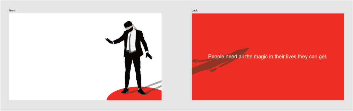
To make an even more realistic shadow you can use Photo to soften the furthest parts of the shadow using Field Blur and setting two nodes within that with one node near the feet and the other at the extremes of the shadow. the node near the feet would have minimal blurring, whereas the furthest one would have more. That mimics the way that shadows are more diffuse when they are further from their source. For the job in hand it's probably better to not do this and keep the sharp edges as stylistically it fits better with the flat graphics.
-
This is it with a black colour overlay FX and then the layer opacity (not the colour overlay opacity) set to 34%. The colour of the red comes through naturally that way and it looks more realistic.
-
There are some great suggestions here. One thing that I often see done and disagree with though is the use of grey as a shadow colour. Unless it's for stylistic purposes, shadows are never grey - they are black with an opacity to allow the underlying colours to show through (the result may be grey if they lie over a white surface - which is presumeably why people use grey). Stronger shadows have a higher opacity, softer ones are more transparent. Using grey brings an unrealistic look. Putting a grey shadow across a black background actually lightens the black, something that doesn't happen in real life - shadows should never lighten anything.