Smee Again
-
Posts
461 -
Joined
-
Last visited
Everything posted by Smee Again
-
Yes! Like the mixture of contrasting / complimentary colors. Tack sharp right where it needs to be. What method are you using to get the separation from the background? Again, like this image a lot. Thanks for sharing.
-
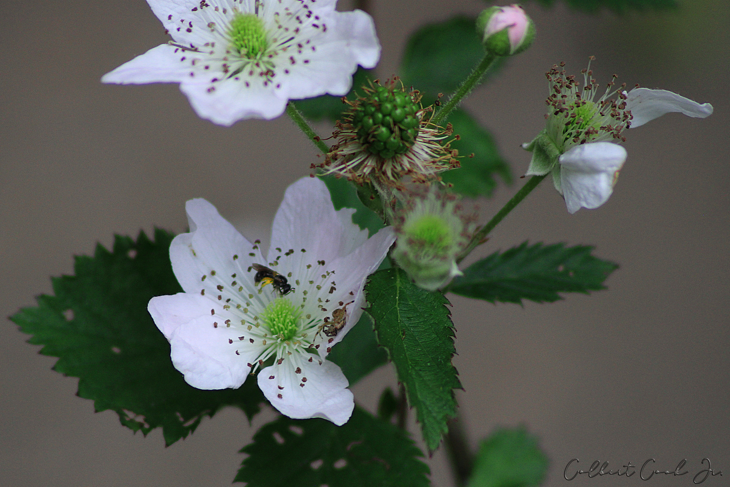
Got our for a few minutes today to do some macro shots in our garden. Didn't see what was going on in this one until I pulled it into Affinity. I mean, I could see the fly and was trying to focus on it but didnt notice the spider.

-
Very well said! Wholeheartedly agree.
-
I like it. Does make the flower the star of the image. Most of the time I post images to the web they go to my 500px account like this one: I will get several requests wanting to know how I accomplished the image and then they think I'm holding back on the facts. The image above is straight out of camera but resized for forum. As my late friend Don used to tell me all the time, "Even a blind pig finds an acorn now and then." It was simply, right place and right time combined with my camera accidentally doing what it was supposed to. Shot with Nikon L340 which is totally auto except that you can choose the ISO. Early Sunday morning, bright sunlight hitting this honeysuckle bud on the end of the bush while the rest was in shadow. Also, it was processed with another photo editor which is why I never posted it here. Love Macro photography regardless of who does it. Not preaching, but I see God's hand in the tiniest details of the things around us in nature. BTW, it isn't spamming. Love to look at your works.
-
Go for it! Just don't let all "the eyes staring back at you" from the clover be a distraction. Looks like there's a crop of green Peeps growing in there.
-
Thank you Patrick. Will try a bit more contrast perhaps the next time my brain is clear enough to do this. My pain meds and chemo really mess with my thinking some days. Between you and I, I just post photos here to mess with the folks who believe that only "drawings" are art. Capturing images of all creation or creating a unique image are all art in my book. Some of us are just not as good at it as we wold like to be. Drawing and painting are both fun. I was first published in "Design" magazine (international artist magazine from the 1970's) while a sophomore in high school. The following year as a junior, I was commissioned by the state I lived in to do the cover for their "Index to Music Teachers". In various jobs and at educational institutions I have created line drawings for technical illustrations used in their text books. I see art as being a lot of different things, but mostly I see it as huge a challenge once you begin to lose vision quality. Diabetes destroys your eyesight. While I don't consider myself an "artist" with the camera, I do enjoy it more than painting or sketching today. Gives me a chuckle when someone here looks at a photograph (mine or someone else's) but doesn't consider it "art" because it wasn't "drawn" in a vector art program. Be well. Hope to see more of your images in the future as I always enjoyed them.
-
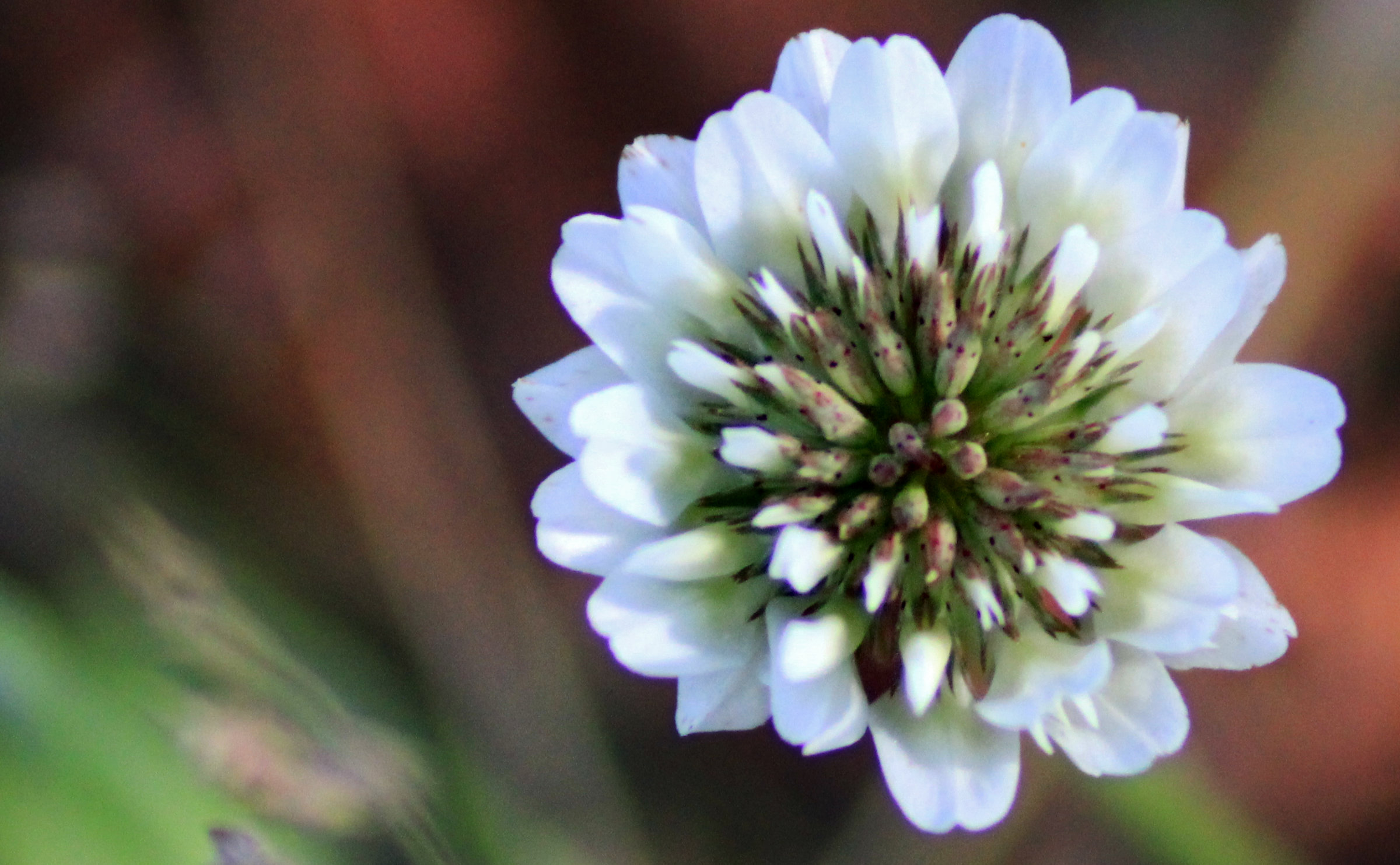
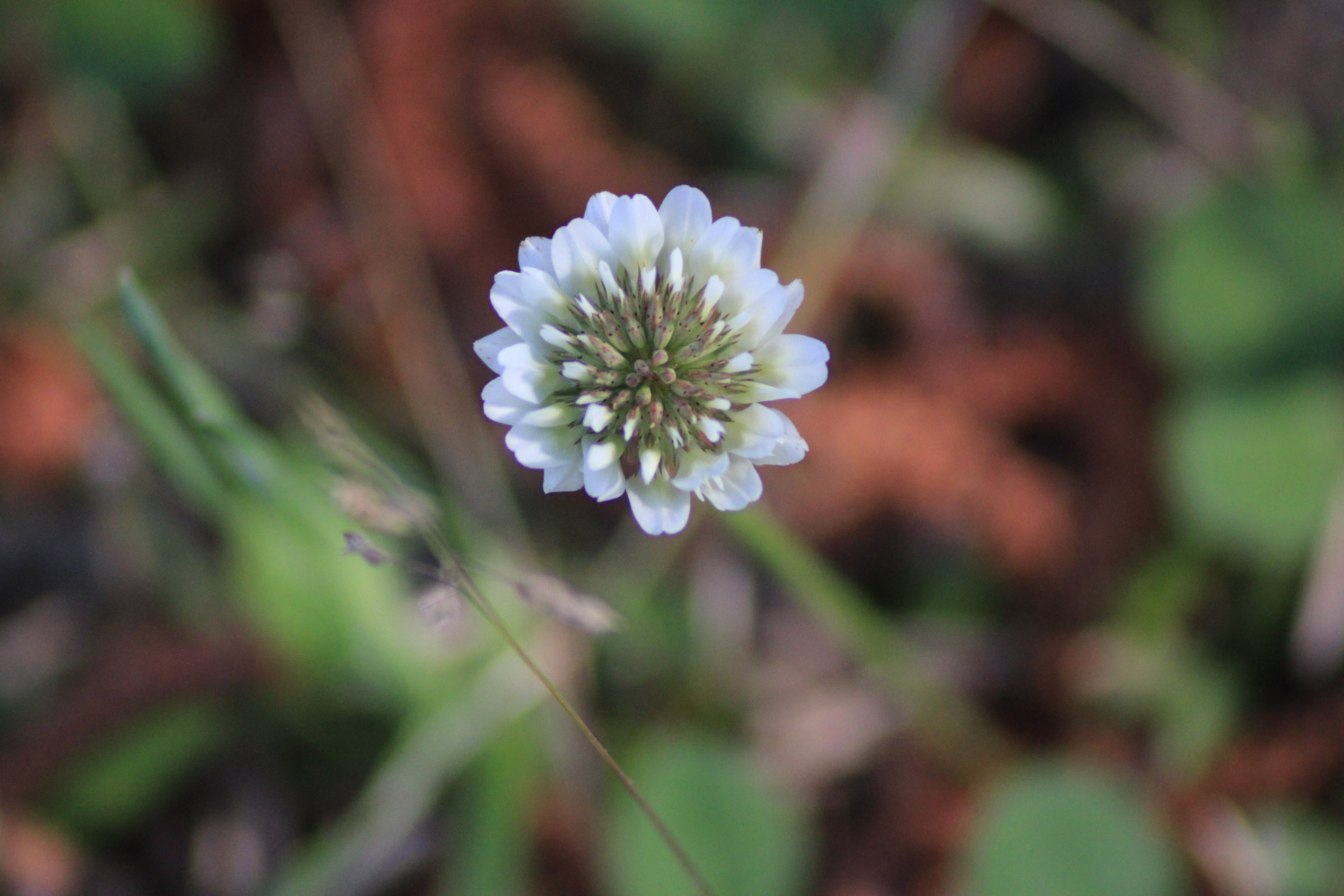
Final image of a clover flower Original image (size reduced for forum) Cropping, obviously (to my taste). Duplicated original image, cut out flower. On this layer I used "levels" adjustment to boost the black on flower. Next I used "shadows and highlights" adjustment layer to add some contrast. Finally used the "shadows and highlights" live filter to make final adjustments. On background, simple "curves" adjustment layer.
-
affinity designer Artwork for greetings cards
Smee Again replied to William Overington's topic in Share your work
Don't know that this will help, but couldn't you export as a high resolution PDF and then import into Affinity Designer? Might be worth a try. -
affinity photo Easyrider Hopper reproduction
Smee Again replied to Bencher's topic in Share your work
My generation, here in the U.S., are quite fond of these. Why? It's because of what they represent: Freedom. It's as close as you'll ever come to flying without leaving the ground. Loved my motorcycles, every last one -- including the one that threw me in 1978. I rolled almost 300 feet on the blacktop, but as soon as I stopped, gathered up my ride and rolled it off the highway. As far as photos, they are art the same as vector drawing is art. Not normal to get that quality straight out of camera, it takes a bit of adjusting. As with all art, beauty is in the eye of the beholder. What has been done? Perhaps the OP will grace us with his before images, maybe not. Personally, I'll just enjoy the beauty of what they shared, wishing I was a young man again and able to ride a beauty like that down the highway, on the back roads, and through the switchbacks. -
Four images to make a point. Remember, the vivid light mode is one of the "special blend modes". This is by no means "artistic" but I did use a particular color to make the difference easier to see. Also, it isn't a true "fill layer" but a workaround to simulate it. Here is the original image. Here is the fill color. Copy both of the above images for use in your experiment. With the opacity of the fill layer set to 30% opacity, using the "Vivid Light" blend mode, here is our image. Now, here is the same image with the same fill color layer applied as a "layer fill" by means of the above method. Does anyone see a difference between the layer opacity and layer fill? Now, depending on the color used or even the use of gradients, gradient maps, etc. you can do a much better image color grade than this. The ugly color was chosen because it actually helped to visualize the difference, as was the opacity and fill.
-
That "Cogwheel" is the symbol for "Blend If" in Affinity -- which is totally unrelated to layer fill, although it can help with opacity. However, have you tried the method shown HERE by anon2? While not exact, it is as close as I've seen Affinity come to offering "layer fill" ability. Takes a bit of effort, but the results are much better than without. It's a workaround, but I was impressed that someone helped with this missing part of Affinity Photo.
-
I sure hope so . . .
-
Layer opacity vs. fill
Smee Again replied to mso1977's topic in Feedback for Affinity Photo V1 on Desktop
Let's try to bump this thread. Apply boot to post . . . BUMP!!! -
Are you sure you know the difference between :layer fill and layer opacity? I can tell from your video you have never used "layer fill" to your advantage because you do not understand it. All you are doing is knocking the color out of text and imagining that it is the same thing as fill. Dead, full on -- WRONG! 100% WRONG. Original Image (Layer fill is for PHOTOGRAPHS, not text or shapes) The second image has used the "work around" that comes close (but not exactly the same) to simulating "Layer Fill". Your "fill opacity" will NOT accomplish anything close to this. You are trying to convince others that "fill opacity" is the same as layer fill. You are misguided even though you have good intentions and you are missing out on a beautiful way to color grade images because as long as inexperienced folks keep settling for a nomenclature error on the part of Serif, well, Serif won't make the simple addition of a layer fill slider. At least Tommy had the pinball machine.
-
It does work perfectly when the user isn't dealing with effects of chemo. I had not made adjustments with the brush. Chose pressure to moderate both size and fill . . . then left both sliders set to "Zero" which isn't going to do anyone any good. No defect in software, only in this end user.
-
Have Huion H610 that I would really like to use as it fits my desk and my hands well. It has the latest Huion drivers installed, latest firmware installed, and while it works even with Corel's Paint Shop Pro (I am the guy in the Corel forums who solved the pen and tablet problem for all the folks who were having the same problems with different tablets) but I cannot make it work in Affinity Photo come he** or high water. As far as Affinity Photo is concerned, I'm still using my mouse. All the shortcut keys work, the movement is tracked but Affinity completely ignores pressure. Makes it nearly impossible to do some of the touch up (read dodging and burning) I need to do. Is this something that is going to be addressed, or do I need to go out and buy another tablet? If so, when will you forward the cash?
-
I would definitely choose another border. Perhaps use the entryway to the building as a border, mask out the unwanted parts then add your images. Are you wanting to make a flyer or a poster?
-
is this the same place? If so, a sketch of their building or even a better photo would work to start. Text probably needs to read: "Welcoming back members and visitors starting May 2, 2021"
-
affinity designer Artwork for greetings cards
Smee Again replied to William Overington's topic in Share your work
First off, I'm a debt collector and skip tracer by trade -- so I'm not the most popular guy in town, or even on the block. Was looking at those glyphs(?) again a couple of nights ago. Wife walks in and looks at the screen for a second, then says: "Oh, someone you know from work?" Then she points at this one: "Must have made an impression on him. He flipped you off with both hands and circled it!"
-
booklet printing
Smee Again replied to floortester's topic in Feedback for Affinity Publisher V1 on Desktop
I am interested in this post as I do produce catalogs for one of my customers, and was thinking of making a pocket sized version for the current iteration. Currently, the end user downloads the catalog from her website and prints it for themselves. Has worked great for full size sheets, but this post has caught my attention. When I look at your PDF (from the original post) in Adobe Acrobat Reader, I don't detect any differences in page size as I scroll through. Does it not show up except while actually printing? -
booklet printing
Smee Again replied to floortester's topic in Feedback for Affinity Publisher V1 on Desktop
Why try to reinvent the wheel? There is an A4 template that you can download for free entitled "occy-designs-cookbook_a4-aftemplate" which should get you on the road to where you want to be. On the upper right of the publisher UI there is a little green outline of a person. When you mouse over it it says "My Account". Click there and avail yourself of the free templates. Should be able to customize it to fit your needs. Edit: One more thing . . . why print to a PDF printer? Export as a PDF first. Then, if you still want to print to PDF, things should work as the export should be correct. -
Very nice shot. Here in Arkansas we call them "lady bugs" and are good to have in the garden -- if memory serves.
-
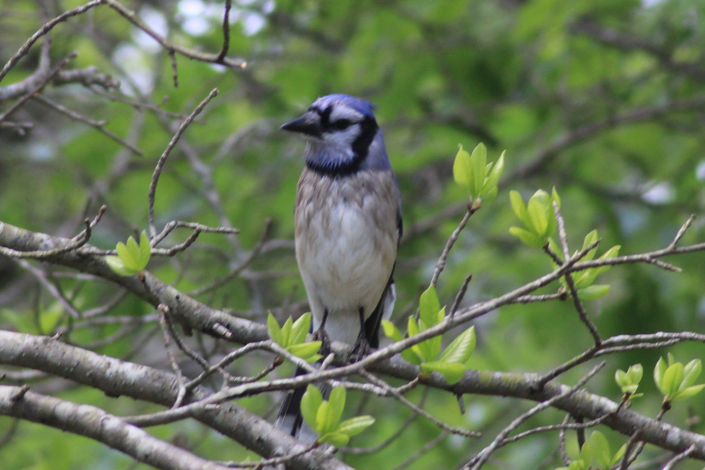
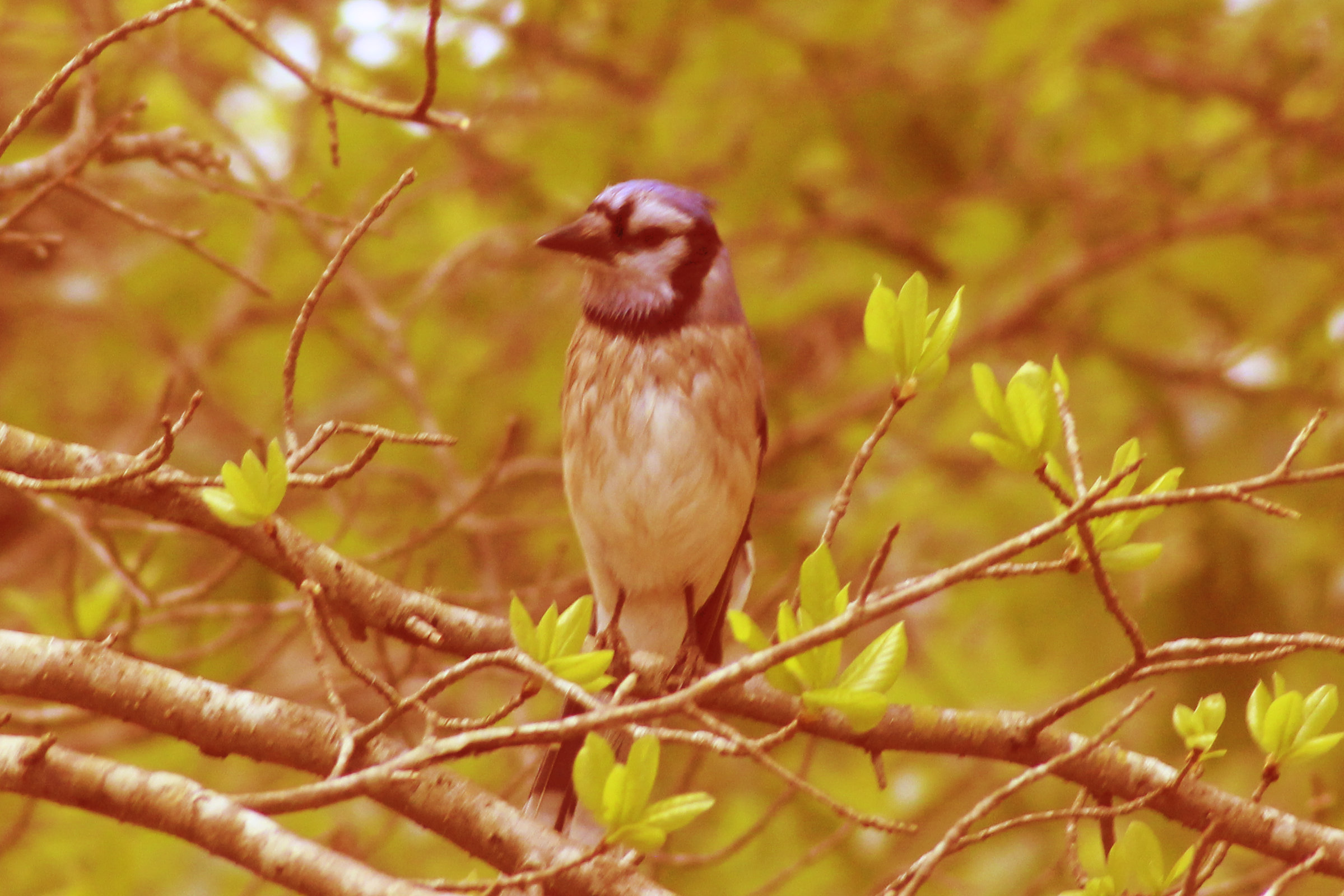
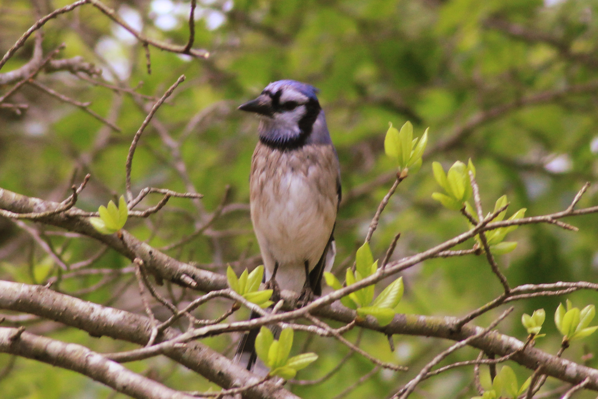
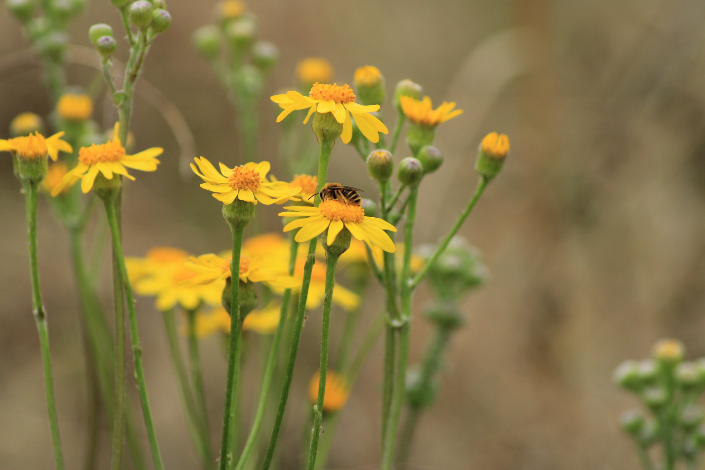
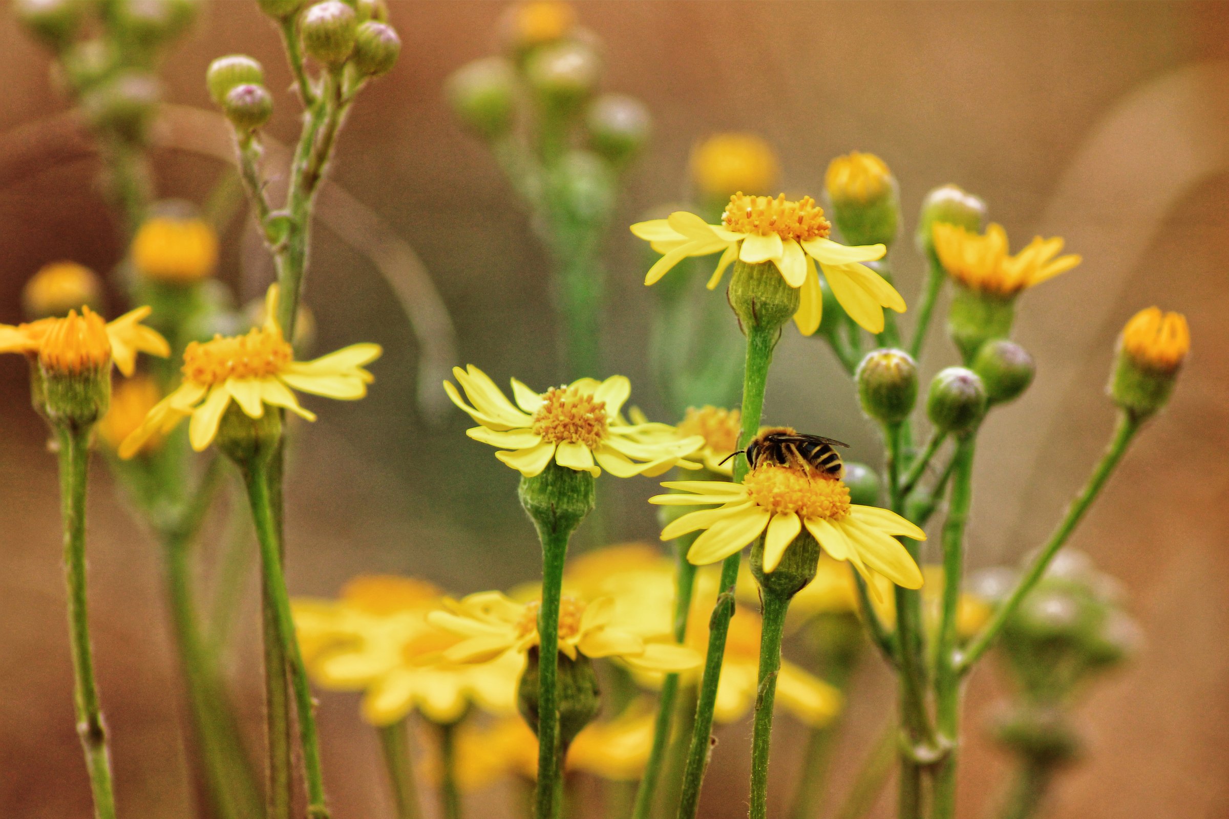
A Few Floral Pics - Before And After Affinity Photo
Smee Again replied to Smee Again's topic in Share your work
Thanks. I love honeybees, in fact, I do a website for a beekeeping supply business as well as their annual catalog. This was a young bee, likely one of his first flights. It was kinda cool that day and he was barely moving once he landed. -
I really wish we had "Layer Fill" in Affinity Photo, but fortunately, one of our members has devised a way to "almost" match the results for use in color grading images. Thought I would show a few examples of the my recent work before editing and after. All was done using Affinity Photo ONLY. I like to use color to change the mood of an image, and the use of a color layer with control over the fill (NOT the opacity - different animal) really helps. I wish Serif would bring that ability (and not a workaround that "almost" does the same thing) to Affinity Photo.