

woefi
-
Posts
363 -
Joined
-
Last visited
Posts posted by woefi
-
-
What I'm seeing is:
-
Affinity, Publisher works right
(and has the list in alphabetical order) -
Affinity Designer doesn't work
(and the list is not sorted properly)

-
Affinity, Publisher works right
-
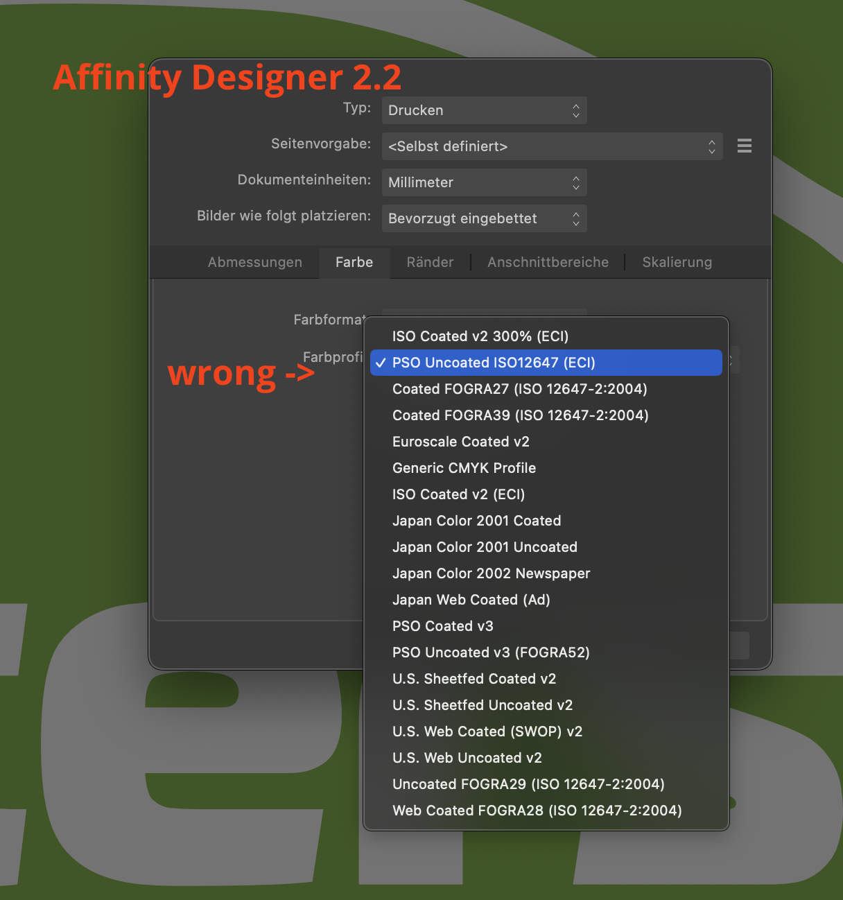
Yes, today I totally ran into this trap when I tried to "quickly finish up" a 99% done job which was a leftover from yesterday...
As it turns out after tearing out almost all my hair: AfDesigner has a problem with the list of ICC-Profiles. It displays them in the wrong order. So behind the curtains it selects the one underneath.
-
FYI, there are some icons which
do not change colour-> EDIT: are in fact transparent when switching to light mode...This is when no document is loaded.
...this was fun...
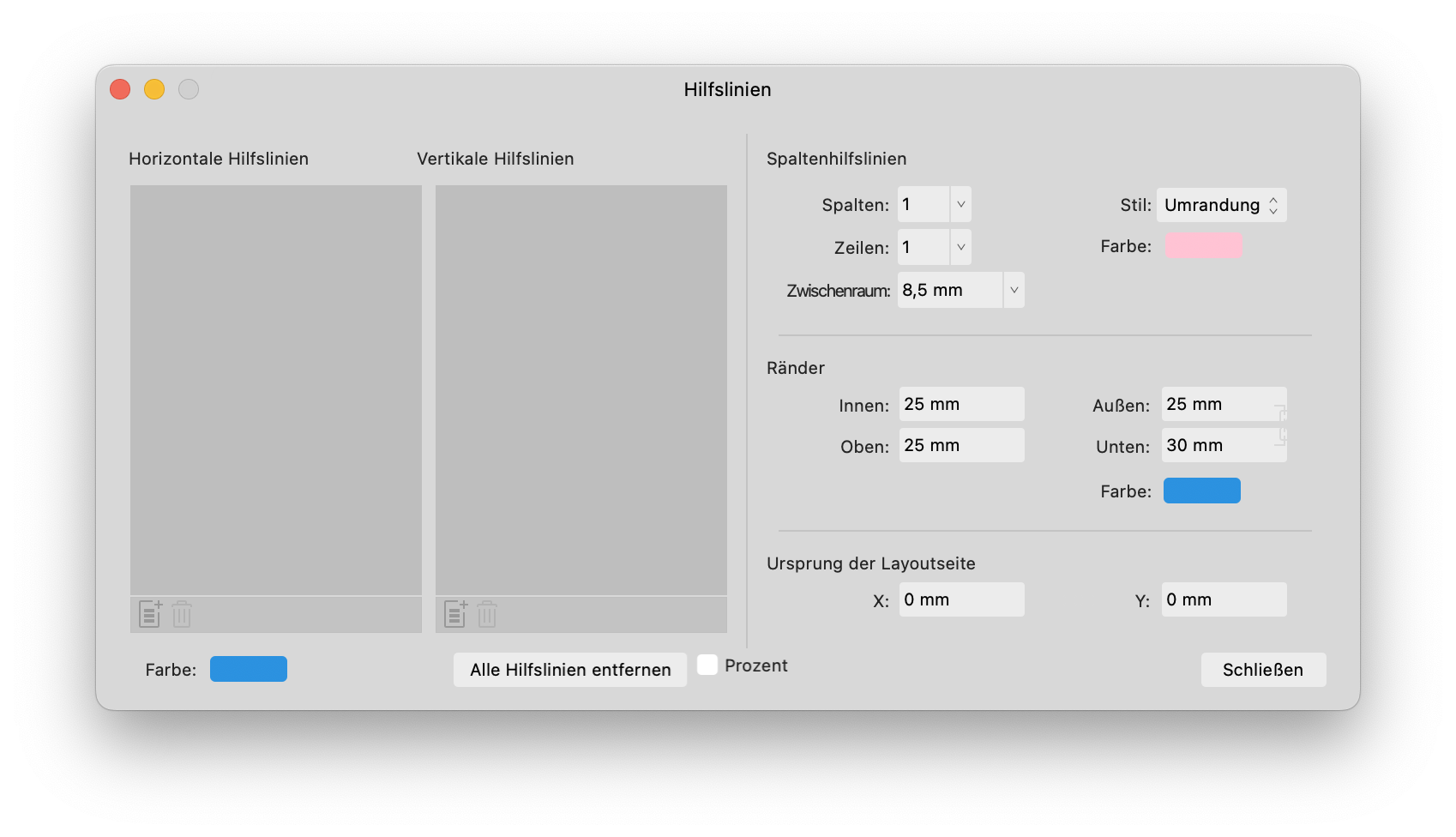
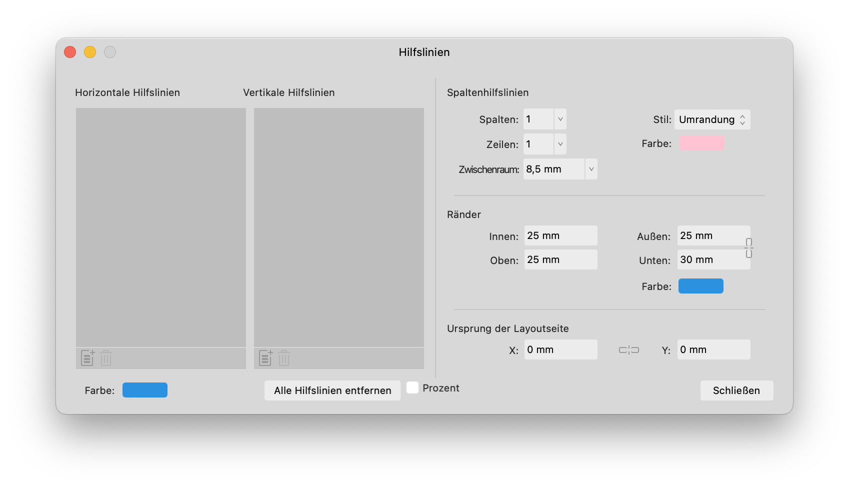
Also, in the guides window, there are (the usual) hidden lock icons when using light mode. (maybe because they are hardcoded in light gray to be seen in dark mode)
They are also misplaced I would say.
-
I can replicate this issue on my intel mac. there are several icons, which surprisingly do not react on click-drag but especially the one where the wrong value changes...
Does this maybe have to do with undocked panels? In the past there were (and iirc still is) inconsistencies with the <tab> order when undocked, for example...
see video:
-
-
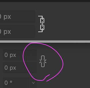
Have to say, the linked chain icon is definitely an improvement in the latest 2.1 beta.
And if you just look at it side by side it's clear what it means. The thing is, in real life you will never see it side by side, so you have to judge each icon on its own.
Only seeing the "loose" chain, I sometimes have to think twice what the current state is.
My tiny suggestion would be a reminiscent to the old classic MacOS times, where those loose chains would have tiny diagonal lines, indicating that there is a member missing.
A little bit like that:
-
-
I have now uploaded one of the files (including linked logos) which have these characteristics.
I included a screenshot out of indesign and the result in AfPub, and also a correct PDF created from indesign so you should see how it's supposed to look like.
-
Hi,
IDML import in v2 is pretty awesome. One thing though, that is not handled well is if you made multiple layers on a InDesign master page.
AfPub seams to treat objects on master pages as a "Layer". If you import documents with already layered master pages, it gets confused.
Situation:
I have an InDesign brochure with master pages, which have a layer for objects that should always go in the background and a second layer which should always go in front, like a footer or a page header. All text and pictures are in placed on the normal pages and either lie OVER the master background or UNDERNEATH the master "header/footer".
On import, these OVER and UNDER objects get flattened. So this is not right anymore...
Would this even be possible with the current state of master pages in Affinity Publisher? -
57 minutes ago, stokerg said:
I'll get this thread moved to the Feedback/Suggestions section of the Forums
")
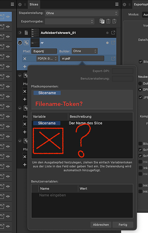
This would be wonderful!
Any idea if it'd be feasible to also consider some other tokens, like there already are for pixel formats? (e.g.: size, resolution, maybe some metadata,...)
This single token "Slice name" looks so lonely... 🥺 -
Hi!
I think, back in 2017, someone asked, if there would be some other tokens to choose from...
So we have the awesome 2.0 release and I want to do some clever multi export as pdf of several artboards using tokens, but... only one <slicename> token??
Where are some other tokens I can use? For example, width, height, dpi, pdf-version, date,...But most of all: I need a filename token, please!
-
I know this feature is only to help us public beta testers duplicate our settings for a better "real world test"... (*)
...but just to be picky 😉:
Should it not also copy the toolbar arrangement and customized tool box?
(*) I also ask, because it would be great if you some day could save these settings externally as a backup in case of a computer crash or just to sync settings between two workstations.
-
16 hours ago, Chris B said:
Can you try the recipe that we are doing which we confirmed fixed:
- New doc
- ...
No that doesn't work as it's another issue.
I observe the cut off panel immediately after creating a empty doc or when opening any other file in Publisher or after creating the first rectangle in Designer.
-> If I change the width of the panel to fix it, it stays fixed for other documents until I restart the app.
see screen recordings:
-
-
3 hours ago, EmT said:
it should be fixed in the next beta build
Well, fyi, I just tried and it is NOT fixed in todays build 2.1.0.1732.
-
3 hours ago, Serif Info Bot said:
If you still experience this problem once you are using that build version (or later) please reply to this thread including @Serif Info Bot to notify us.
@Serif Info Bot Yes this is still an issue in todays build 2.1.0.1732.
After loading the "release settings" into the beta.
-
42 minutes ago, Tim France said:
The dashed lines is strange. If you can send me the file, I'll take a look,
I'm sorry, but this has to be an oddity with this CAD file. I now tried it with some older dxf-files, that I myself exported in the past directly from Illustrator, and they are fine.
So Thank You, and never mind!What is still a bit annoying, is the workflow, or workaround, when opening 3rd party DXFs of which you have no influence how they were created.
One needs to be able to enter a corrective import scaling in AfDes for getting a decent sized starting point to work with.
-> Remember, with DXF, these files would sometimes be huge like landscape outlines for maps and such and the other time it would be a tiny shape for a 3d printer...
-
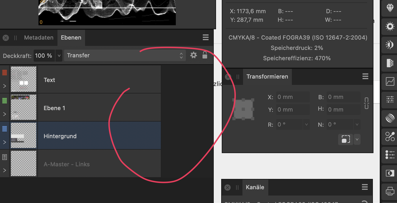
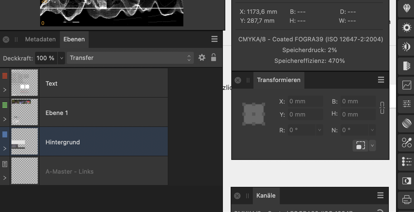
Maybe it has to do with importing my studio presets from the retail version, but ever since build 1730 I get a UI drawing bug with the layers panel.
I use detached panels on a second monitor in all my affinity apps.
See screenshots and video:

-
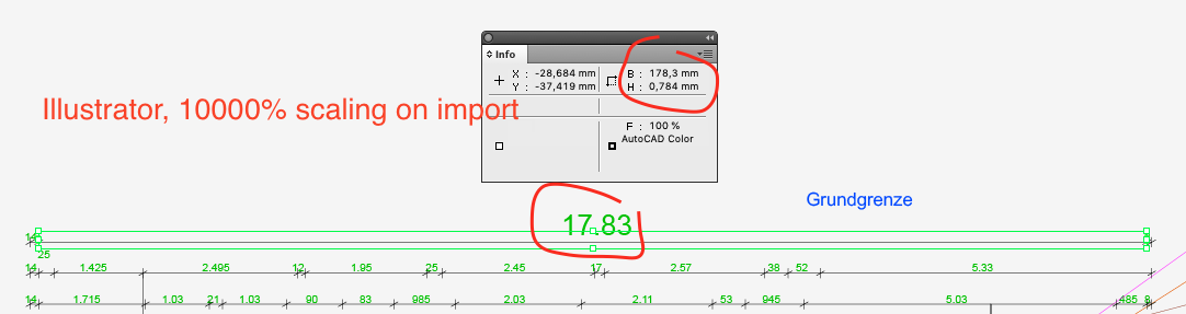
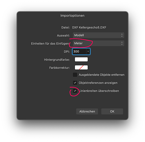
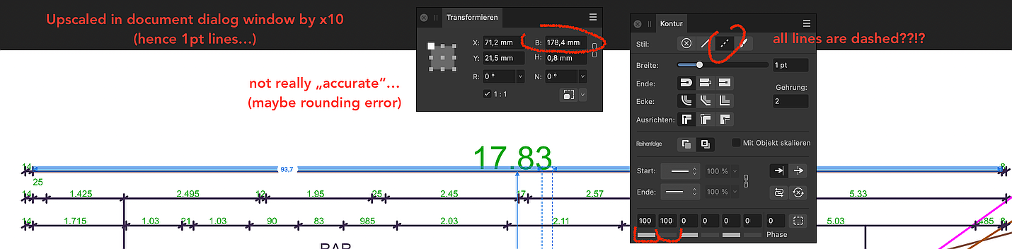
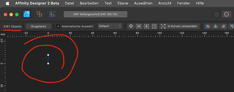
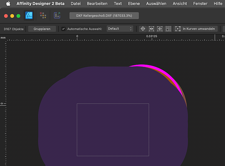
I know now that the draftsman (in this case draftswoman) made the error of not choosing the right scale when she exported it for me.
So now I have to resize it either by scaling the object or by resizing the document. Additionally, I set the Unit to the biggest possible, which is meters.So, now there are other DXF import problems:
- All Lines are now dashed (why?)
- When using the page dialog to blow everything up, the scaling is not really accurate, maybe they are rounding errors because of the tiny small measurements?
- If I scale it using SELECT ALL, then TRANSFORM by entering 100000% then it's the correct length. But I then have to increase the page size afterwards too, which is annoying...
-
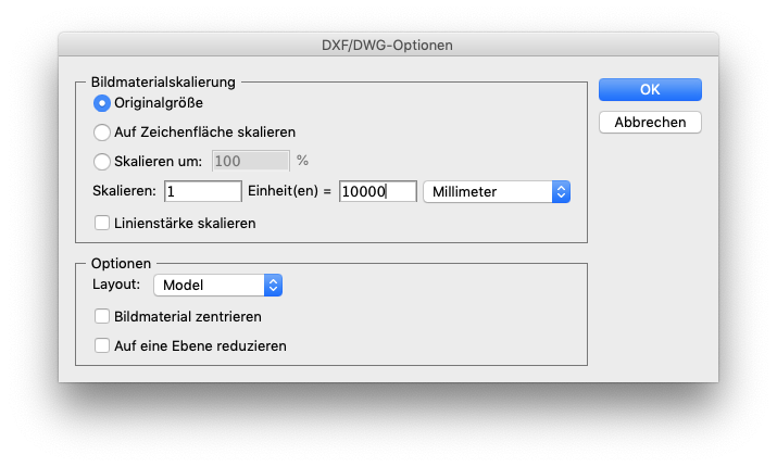
1 hour ago, Tim France said:
the "Fit Model to Page" option would apply an arbitrary scale to your drawing
In this case you are right, as this is a construction plan from a house, I don't want arbitrary measurements aka "scale to page-size". In other scenarios, where it's only about a shape it would be very handy as it saves you many steps.
But here, the main problem is, I am not the architect. I just received this file from the building company so I have no influence on the scale or line widths of the source file. Is there no way to specify a scale _on import_ ?
See Screenshot of my attempt in Illustrator CS5:
This 10000% scaling gives me a reasonable (1:100) working document for a typical house or flat, 20 meter is 20 centimeter, which fits on a sheet of paper. -
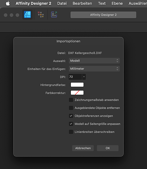
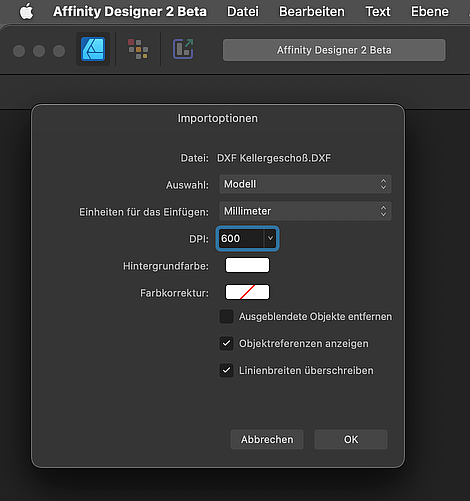
Hi!
If I try to open a .DXF or .DWG drawing in Designer or Publisher 2.1.1730 I now get a simpler dialog box with a few options missing.
The resulting document is very tiny, less than a millimeter and therefor the stroke is way to fat to see anything.
The same DXF opened with 2.0.4 opens just fine.
See screenshots:
-
1 hour ago, Dan C said:
I'll get these logged with our devs now, thanks again
Thank You!
But I have to say it: There are (and were) several UI discrepancies related to docked vs undocked, light vs dark UI. Missing (but not really missing, just hardcoded white colored) icons, ...
Please try to test this more on your end, maybe build some automated test suite for these circumstances.
-
On 1/5/2023 at 11:19 PM, N.P.M. said:
"clear fill on populate"
Coming from Indesign and Quark, initially I didn't get it either:
For whatever reason Publisher has this standard behaviour that when you populate an already coloured rectangle (picture frame) with an image it would "forget" about its background colour/outline.
You just have to click on this tiny and bland icon which is labeled as "clear fill on populate".However I would suggest this "toggle"-button should get a visual "state", to show whether it's activated or deactivated...
-
10 hours ago, loukash said:
the export preview should be optional.
I, too, think it would help to "firewall" the preview from the rest of the export feature. I can imagine, from time to time, there will always be some rendering problems and this should not take the whole export window down.


Designer 2.2 : Transparent UI Element when no document open
in V2 Bugs found on macOS
Posted
-> Obviously you are not seeing the video but instead just a still picture.
Are you browsing on Windows? Seems to me that some browsers have problems playing videos from MacOS screenrecordings which are usually ".mov".
I usually drop my screen recordings onto Handbrake to convert to MP4 before posting here.
Just to check on this off-topic forum/video-issue: Are you able to play the video in this linked bug report: