EducationPrinciples
-
Posts
78 -
Joined
-
Last visited
Everything posted by EducationPrinciples
-
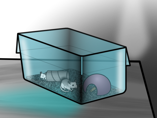
They are not Pinkie or the Brain. Took a little bit to figure out how to create translucent curves. I created this illustration to use in an eLearning project I designed.

-
It looks like you learned how to create the bottle from this great tutorial and then went in a different direction with the bottle contents. Your variation looks great.
-

affinity designer Radioactive Tears
EducationPrinciples replied to EducationPrinciples's topic in Share your work
I can not take credit for the music. Similar to the most recent version of Affinity Photo, LumaFusion has access within the application to a stock media source called "StoryBlocks" and that is where the music came from. There are a number of free photos, videos, and music within StoryBlocks. With a subscription to StoyBlocks, there is access to a much larger selection of resources. -
affinity photo Gutsiest Move I Ever Saw, Man!
EducationPrinciples replied to BHP's topic in Share your work
Cool composite. I would recommend removing the stars that are in front of the aircraft carrier. -
This video is made up of vector elements drawn in Affinity Designer. I then imported them as separate layers in LumaFusion video editor. I applied various effects to the layers separately. The waving and moving lines were created using “Warp” and “Seurat” with keyframing and moving the effect focus.
-
Garry, you are absolutely correct. In the analog days so many additional steps were required and so many technical skills were needed. Now it’s accomplishable on a tablet computer without the need of environmentally destructive chemicals and trial and error attempts that would be put into trash. Your published work looks great. Thanks for sharing the steps that you used to complete this work. Keep it up.
-
affinity photo A Great Dog
EducationPrinciples replied to EducationPrinciples's topic in Share your work
Layers and filters
-
Used Affinity Photo.
-
affinity publisher I designed an art book in Publisher Beta
EducationPrinciples replied to nina_paley's topic in Share your work
The step by step process of how you created your animation is most impressive. https://www.awn.com/animationworld/dancing-goddesses-how-nina-paley-animated-stone-sculptures-seder-masochism -
DuchShader, I really like your idea.
-
affinity designer Halloween Pumpkin Asset in Vector Design
EducationPrinciples replied to Jhonatan S's topic in Share your work
Really impressive and showcases your abilities. As a tutorial it is very challenging to follow. I really hope that you would turn on the "Show Touches" feature in the Affinity app and add screen captions explaining what you are doing. Taking advantage of the features of Techsmith's Camtasia would help others learn from your videos. If you want to save money or don't have a desktop to run Camtasia consider using LumaFusion on iPad ($20) to add captions to your videos. -
affinity designer Political cartoon
EducationPrinciples replied to Phil_rose's topic in Share your work
Bri-Toon, Last year I was watching a tv show called "Superior Dounuts." One of the characters was an art student who's assignment included the need to draw hands. He and his teacher talked about the difficulty of drawing hands. Your comment reminds me of the episode. -
affinity photo collage of a couple of leaves
EducationPrinciples replied to ianrb's topic in Share your work
Very inspiring work. Thank you for sharing. -
Kapuan, That first image you created really looks good. Very creative and fun. The evolution into the last image is fantastic! I really like what you did with the water in the last image. The details you added to the foreground in the last image are really inspiring. I do wish you continued the triple line border from image three into the final image. I think they help with the feeling of a PC board. The images and your composition feels like "Art Deco" which I like a lot. I hope you continue to post your creations to this forum. I suspect newbies like myself will learn a lot from studying your work. Thank you.
-
affinity designer Political cartoon
EducationPrinciples replied to Phil_rose's topic in Share your work
Phil, Thank you for providing the clarification. I would recommend making the 'people' representative thinner and wearing working clothing. Also consider making the individual smaller and maybe even have several additional figurers representing working 'people.' (that is a technique I have seen with other political cartoon artists. Also consider using the traditional logos for Dems and Repubs on their buttons. The idea of the 'people' not having any champagne makes sense. -
affinity designer Political cartoon
EducationPrinciples replied to Phil_rose's topic in Share your work
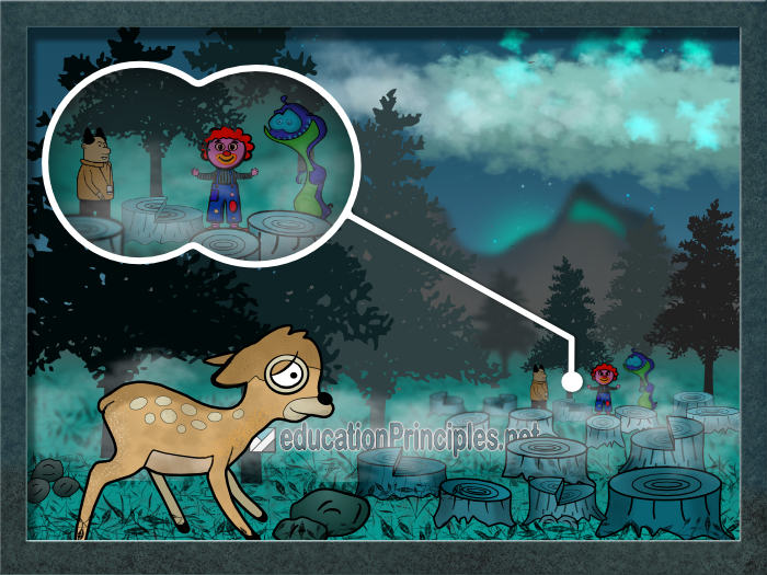
That is a really cool image. The cutout technique is really neat. What is the symbolism of the turned -down wine glass? I have also been using political cartoons as inspiration for drawings as I learn to use Affinity Designer. This image is combining elements from several other images that I have been learning to draw. This cartoon resonated with me since I live in a development that used to be a forest and we still have deer in the area.
-
affinity designer my illustration with AD
EducationPrinciples replied to murattanhu's topic in Share your work
Very nice and work. -
I was inspired by a cartoon I have seen on the internet. I used Affinity Designer to create my own version of the character and created soccer field for him. I then animated the sweat using Pixaloop. I added sound effects in LumaTouch.
-
I was inspired by an Affinity Designer tutorial from Afzainizam Zahari. I also used Affinity Designer with my own subtle spin from the tutorial. I added water and moving light animation effect using Pixaloop app. I moved the car and added sound and music using LumaFusion. Then I published the final project to YouTube.
-
Please take the interface features from Designer and add them to Photo. The Trash Can that will delete layers or objects in the Designer app is fantastic. The Magnate button so that things can be aligned in Designer is also great and would be wonderful if it can be added to Photo. The double tap to 'undo'; and the triple tap to 'redo' is great as well. Its only been a week of using Designer and I have developed muscle memory of having those features in Designer and end up trying to use them in Photo.
- 1 reply
-
- 1
-

-
affinity photo My First Digital Painting In Affinity Photo
EducationPrinciples replied to Gecko1993's topic in Share your work
Mithferion, Your revision demonstrates that less is often easier on eyes. -
Jaguar XK-140 and Mike [German Shepherd]
EducationPrinciples replied to S.R.Jarratt's topic in Share your work
The finished product looks fantastic. Is there any chance of seeing what the original image looked like? As a way to demonstrate my image editing abilities to clients, I have found that they like seeing the before and after. -
Looks fantastic and reminds me of the Palm II that I used to have.