David
-
Posts
402 -
Joined
-
Last visited
Everything posted by David
-
Great atmosphere and use of the cave to illuminate Uncle Creepy.
-
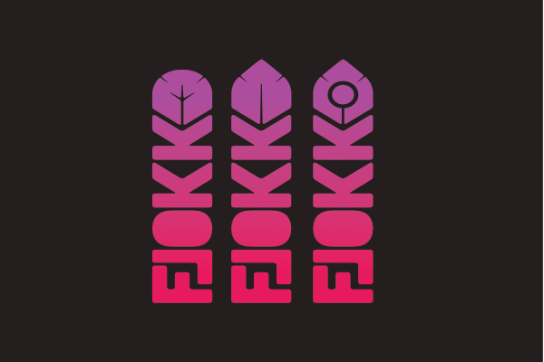
If anyone is interested, I went with pretty much the logo I had in the first place :P ...only with the bird 'put down' and a negative space feather in the 'O' (along with some tweaks to Ks). A long way round to get to where it is, I had an attachment to the bird which was not helpful and it had to go one way or another. Happy with the result, now I can just use the one logo rather than a mix of different silly arrangements. Now on with proper work.

-
you will all be please to know I went with non of these ......hehehe :P
-
In print conditions you are absolutely correct, so its been made so it can be one solid colour too. For social and web use Ive been a bit indulgent and used all the colours ;) just for fun really.
-
That why I went with all the colours...lol
-
I do get you point about the inverted L, but it messes the feather up when the correct way, I tried several ways to make it work (I went feather mad yesterday, 12 different variations) I actually did have a pen tip one end in a first round, but it looked terrible when used landscape.
-

affinity designer Beardly Morris the Pirate
David replied to Frankentoon Studio's topic in Share your work
wow, love this- 11 replies
-
- 1
-

-
- pirate
- character design
- (and 4 more)
-
Thanks...opinions are what i need :)
-
Between work this week, I've been playing with a new logo...partly because my bird doesn't work in printed applications but mainly because I'm a fussy idiot who cant stop tinkering. Anyway, Ive whittled my designs down to three feather designs, but cant pick which one is best. Earlier designs were way over complicated and way over engineered, so I have cut some fat and tried to keep an element of readability....the first rounded one although looks great also looks like a 'D' so the middle and last have a more feather look. (The logo will be used landscape and tower as it is now)
-
really really good
-
Two very different characters indeed....Oxford is just down the road from me. Atomic Burger a being favourite destination of mine
-
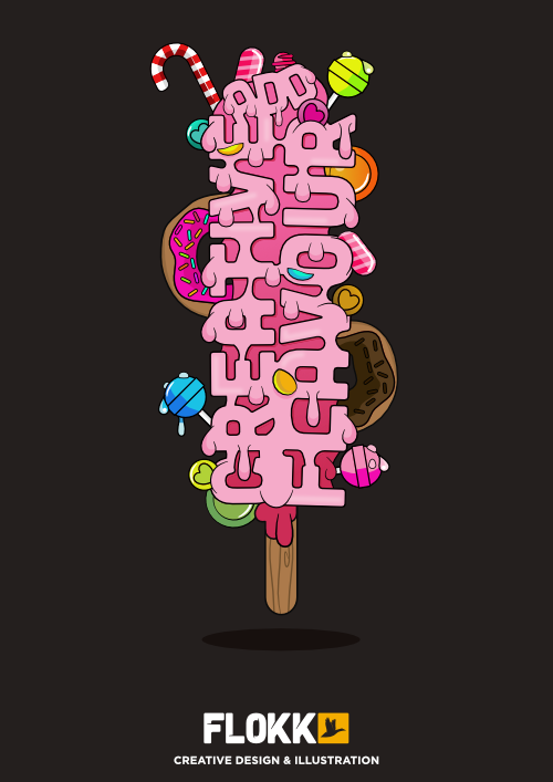
Indeed all Affinity Designer. I'm working the monster idea into another piece at the moment, as I'm pushing for work from this i went for sweats and tasty treats so a not to put anyone off. I love monsters and zombie stuff but its not everyones taste.
-
Good work, interesting to see you've put the outline work on a top layer. I do a similar thing when I work in illustrator, in Affinity you can place outlines directly on shapes and then keep all shading and colouring inside the same object using layer mask options. Which makes shading super fast. Great illustration though very neat :)
-
Yer I'm not sure why you do that? virgin copy is usually imported from a word file then formatted ready for print, so usually you would have all the copy to begin with. Im not even going to mention footnotes... I completed a book so heavy with footnotes last year that it drove me to the edge of insanity :wacko:
-
Problem work with PDF
David replied to Giack10's topic in Pre-V2 Archive of Affinity on Desktop Questions (macOS and Windows)
Photo is treating the letters in the PDF as individual objects, hence all the layers (which is more helpfull if you want to make changes) - If you want a flattened image go to Document > Flatten -
Very neat, good work.
-
Nicely done, that must take you ages to make all the points on the fur jacket.
-
affinity designer Dragon for Illustration Friday
David replied to Craig Deeley's topic in Share your work
Excellent piece, love the brush work it looks so natural. -
Ha, thats a fun idea :)
-
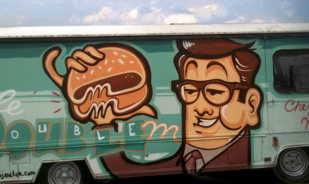
Love the Graffiti on the truck....would look brilliant turned into a vector in Affinity too
-
Away from the flyer thingy majiggy heres the final artwork....loads of "sweets" less monsters and most definitely no "sweat"
-
Hehe I wouldn't be surprised if that is the original.
-
Hahaha yes it does...Spellcheck on my computer hates me.
-
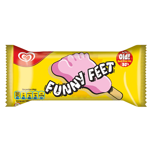
Ah we have Funny Feet Ice Lollies here :) ....I thought you had them too?