Timber
-
Posts
135 -
Joined
-
Last visited
Everything posted by Timber
-
Affinity Designer Customer Beta (1.6 - Beta 2.1)
Timber replied to MattP's topic in [ARCHIVE] Designer beta on macOS threads
Affinity Designer Beta 2.1 Mac reliably crashes every time I go to switch between light UI and dark UI. Just like clockwork. 2.5 ghz Intel Core i5 with 8 GB ram. -
Hi all, since a tutorial for doing this magnificent work hasn't been made, that I'm aware of, I wanted to point out this video of a similar design that covers some of the techniques for realizing a car in Affinity Designer. Take a look at this: https://www.youtube.com/watch?v=c_-ZViQZwWQ Perhaps it will help some of us looking to up our game and achievement with AD. :) Cheers – Timber
-
bleduc - thank you! It wasn't apparent that there was a skew control via the cursor.... it's great to know! – Timber
-
Affinity Designer Customer Beta (1.6 - Beta 1)
Timber replied to MattP's topic in [ARCHIVE] Designer beta on macOS threads
Also, as noted in AP Beta forums, when I place some Artistic Text and then apply a gradient, and if I try to manipulate the gradient, most of the time I can get AD Beta to crash hard, it's worse IMHO in AP Beta, but I can reproduce it with fairly good reliability in AD Beta. Cheers - Timber -
Affinity Designer Customer Beta (1.6 - Beta 1)
Timber replied to MattP's topic in [ARCHIVE] Designer beta on macOS threads
Bug report: Love the new Font features... when one selects All fonts, there's a blue outline showing that it's selected. Moving left to right, selecting Recent, Used and Favorites, this blue outline does not appear to indicate they're selected. Though interesting, moving right to left from Favorites to Used to Recent, highlights the All incorrectly! Note: the selection is much more apparent otherwise in the Light UI vs the Dark UI. Also, I really feel that the fonts should autoscroll as one's cursor hits the bottom or top of the font lists, as if one is trying different fonts in a long list of fonts, you'd have to scroll and auto-scroll via the cursor is far more efficient and expected. Additionally I'll join the voices asking for more contrast or visual cues when a tool is selected, or especially things like the close box on open documents - again mostly a problem on the Dark UI. Cheers - Timber -
Bug report: If I place some artistic Text on a layer over a photo layer background and then try to use the gradient tool on it, the program crashes. I've been able to do this every time I've tried it. Cheers - Timber
-
Note, followup: I see the selection contrast in the fonts menu list is better in the Light UI vs the Dark UI. The blue outline of All... Recent, Used, Favorites would help in the Dark one if implemented correctly. – Timber
-
Bug report: Love the new Font features... when one selects All fonts, there's a blue outline showing that it's selected. Moving left to right, selecting Recent, Used and Favorites, this blue outline does not appear to indicate they're selected. Though interesting, moving right to left from Favorites to Used to Recent, highlights the All incorrectly! Also, I really feel that the fonts should autoscroll as one's cursor hits the bottom or top of the font lists, as if one is trying different fonts in a long list of fonts, you'd have to scroll and auto-scroll via the cursor is far more efficient and expected. Additionally I'll join the voices asking for more contrast or visual cues when a tool is selected, or things like the close box on open documents. Cheers - Timber
-
I've had two successful printing jobs now using SpotUV with Affinity Designer. The results are exactly as I envisioned and setup in AD. The key thing I needed was the suggestion above from MikeW to export as a PDF/x-4. Now one needs to setup the file as the printer specs, i.e., create a spot overprint color for the SpotUV, create a top layer for the SpotUV elements and duplicate or trace the object(s) one wants in SpotUV in this top layer and fill them with the SpotUV color. And export as a PDF/x-4. Many thanks and kudos to the wonderful Affinity Forums and members for help in this matter. Cheers – Timber
-
[APh] Add My Own Stock Provider
Timber replied to maxim's topic in Feedback for Affinity Photo V1 on Desktop
On the issue of the Stock studio palette in Affinity Photo – Yes, it'd be great to be able to add other vendors/sources for stock searches! Yes, it'd be a great palette to have in Affinity Designer too! Yes, it'd be great to have the option to return more than 50 results as I find often what I settle on is not in the top 50 returned searches, if I go to the stock provider's website. All terrific ideas that would make this a truly useful and powerful Studio palette. Cheers – Timber -
It would be nice if the item selected would then highlight the color swatch used, if it's in the recent used color swatch palette. - Timber
-
Great feedback Mike! I downloaded another font from Font Squirrel - "Milkshake" and can see additional Stylistic Sets with this font. Also from Mike I learned that some of the sets are grayed out unless certain character pairs are selected and can be modified with these sets. One could in theory have a stylist set on some characters and another stylistic set on other characters and character pairs. There's quiet a bit of options in AD when one has an Open Type Pro font with lots of options/alternatives. Very cool! Thanks – Timber
-
Odd, screen shot didn't post... try again!

-
Hi, I downloaded a font (via Font Squirrel - Lobster) to see if I could access the ligatures, alternatives and special features in Affinity Designer and I'm puzzled that in the Show Typography palette it shows selections, but some are grayed out. Can someone who has an Open Type font with a bunch of alternatives, and stylized sets, tell me if they are all accessible in Affinity Designer? Not sure if it's the font... or AD, at issue? See the screen shot below for grayed out selections.
-
When i close an Affinity document, either Photo or Designer, if there have been changes, it prompts if I want to save it. That's fine and expected, but then after saving, it doesn't close, I have to select "Close" again. Seems to me the expected behavior would be to Ask - Save - then it would Close. Is this the way it should be? Does anyone else think the way I do on this? Not a big thing, but it seems counter-intuitive to tell it to Close twice. Cheers – Timber
-
MEB, MikeW and Hokusai - again, thank you very much for the feedback and images!!!!! I'm resubmitting the files on Monday and I think/hope they will work for the printer. I will update this posting. It would be great to see both an auto-tracing capability added to Affinity Designer AND the ability to convert selections in Affinity Photo to paths! Both I think would be very useful in day to day activities and further these wonderful products. Cheers – Timber
-
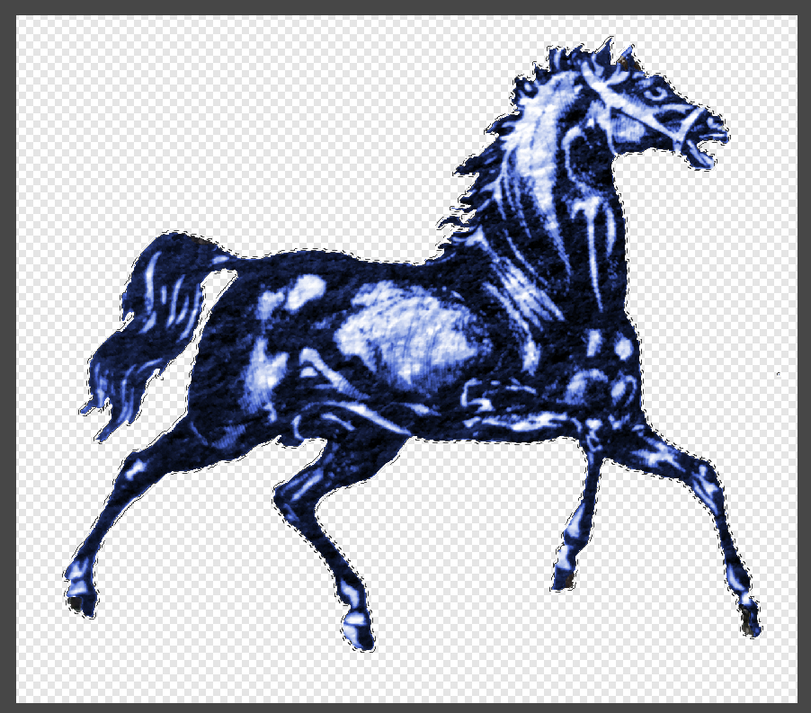
Mike is there any way you know of, in Affinity Photo, to select the background of the PNG, reverse the selection so that only the horse is selected, then save the selection and use that for the outline in AD? See attached screen shot of marching ants that really capture the outline closely. Until we get a trace tool in AD,,, don't have AI for tracing ;-( – Timber
-
Hi Mike, you did the outline, fairly quickly, with the pen tool? Thank you! It makes me think it's not that difficult or an investment in time to do so as/when needed. The background fill was short for bleed and fixed in the current file. Good eye to catch that too. I am most appreciative of your advice and suggestions, I'm hopeful I can supply files that the printer can utilize. I'll post back later. Hopefully your contributions here will enlighten and help others trying to produce files for SpotUV needs from Affinity Designer. Cheers – Timber
-
Mike, if I read your question correctly ,,, The only part of the (business card) design we're spec'ing to be SpotUV is the horse logo and the text - company. Everything else should be flat/regular. They have a 'flood varnish' option, if that means the glossing the entire side of the job, we don't want that. Just spot areas. So I'm still left thinking - seems the SpotUV overlay images have to be the same shape as the underlying objects - therefore if it's a placed png raster object from Affinity Photo, how best to create an outline of it's shape. A simple rectangle is quick to draw/outline, the horse logo pictured has a lot of detail to try and outline by with pen tool. Cheers – Timber Back2.pdf
-
Thanks for the responses so far... still hopeful I can supply workable files for the printer to do SpotUV. I will try sending a PDF/X4 export file. Meanwhile, I think I see another issue... I'm assuming anything drawn in AD can be duplicated into the SpotUV layer and it's color fill simply changed to the specified SpotUV color the printer wants. Now, one of the images I'm using is a PNG file exported from AP, and placed into this AD file, so that it's has no background when placed. When I go to fill it with the SpotUV color, it produces a rectangle... so I'm thinking the SpotUV - if we get it to work - is going to cover the rectangle of the image and NOT the image's shape, the shape is where I want the SpotUV applied. You can see the text is correctly spotuv color filled at the top, just barely visible with the rectangle fill of the PNG image placement. How best can I produce an outline of the image so that I can fill it with the SpotUV color? Am I thinking this through correctly? See files attached. – Timber
-
Recolorize
Timber replied to Timber's topic in Pre-V2 Archive of Affinity on Desktop Questions (macOS and Windows)
Good point, see attached screen shot, magnified, the forward ear of the horse has some cloned areas in to fill it in. Even though I cloned the colorized area... they appear black and white and not colorized. Yes... it's a rough pixelated image.
-
Hi, I've been trying to prepare a file to send to states side printer Zoo Printing, they have an instruction sheet how to do in Illustrator/InDesign (see attached PDF). I can replicate the steps in AD - but their prepress department tells me my exported PDF doesn't have the SpotUV layer. I've gone over this dozens of times, the layer is selected by exporting. If anyone has wrestled getting files to work for SpotUV, especially for Zoo Printing, please advise. Thanks - Timber SPOT UV indesign Tutorial 1.pdf
-
Hi, I cut out an image that I wanted to separate from a background so I could make a PNG file out of it to use as a logo mark. I think recolored the whole image a dark steel blue. I found a couple of areas that I wanted to clone some of the existing image to, and a few areas I wanted to erase. Cleaning up details and edges. When I did this, the replacement color was the original almost black and white color, the image looks fine, what I wanted, but it did not pick up the recolor hue... how do a spot reapply this to the areas of the image I've added via cloning tool? Thanks, Timber
-
Hi, I don't seem to find how I can view the file path of an existing placed image. There's the "Replace image" button but it doesn't take you to original directory. Cheers – Timber
-
I've been playing around with the Half-tone filter and it's interesting... however it makes me really wish that a filter for doing engraving/etching effects would be incorporated into Affinity Photo. I know there's some Photoshop Plugins that do this, not sure if they work with AP, I do see that they cost more than AP itself. And I see Adobe Photoshop Actions that do this and some are free. Again, it'd be terrific to see this capability native in AP. – Timber