.jpeg.1b727463d44a0d52bc3499597e28d11c.jpeg)
James Ritson
-
Posts
855 -
Joined
-
Last visited
Everything posted by James Ritson
-
.thumb.jpeg.6f143e8223547aba974205ef53397036.jpeg) Hey Ian, the best way to achieve this is to: Use a Channel Mixer, Curves or Levels adjustment (depending on how you want to blend). On these adjustments, you can set the colour model to CMYK or LAB if you're working in RGB (and vice versa). So you could add a Curves adjustment, switch to LAB, then tweak the Lightness curve. This method is completely non-destructive. Alternatively, if you wanted to emulate the Photoshop approach, you could: Edit>Copy, then File>New From Clipboard to duplicate the image into a new document. Document>Colour Format>LAB to convert to LAB16. On the Channels panel, ignore the Composite options and find the layer channels below them (usually Background Lightness, Background AOpponent etc). Right click Lightness>Create Greyscale Layer. Select this greyscale layer, Edit>Copy (or CMD+C), then paste it into your original RGB document (Edit>Paste or CMD+V). If you wanted the composite Lightness channel pixels (rather than the isolated greyscale channel), do the same as above, but look at Composite Lightness instead, right click it and choose Load to Pixel Selection. You can then Edit>Copy this and paste it into your original document. Hope that helps!
Hey Ian, the best way to achieve this is to: Use a Channel Mixer, Curves or Levels adjustment (depending on how you want to blend). On these adjustments, you can set the colour model to CMYK or LAB if you're working in RGB (and vice versa). So you could add a Curves adjustment, switch to LAB, then tweak the Lightness curve. This method is completely non-destructive. Alternatively, if you wanted to emulate the Photoshop approach, you could: Edit>Copy, then File>New From Clipboard to duplicate the image into a new document. Document>Colour Format>LAB to convert to LAB16. On the Channels panel, ignore the Composite options and find the layer channels below them (usually Background Lightness, Background AOpponent etc). Right click Lightness>Create Greyscale Layer. Select this greyscale layer, Edit>Copy (or CMD+C), then paste it into your original RGB document (Edit>Paste or CMD+V). If you wanted the composite Lightness channel pixels (rather than the isolated greyscale channel), do the same as above, but look at Composite Lightness instead, right click it and choose Load to Pixel Selection. You can then Edit>Copy this and paste it into your original document. Hope that helps!- 1 reply
-
- 1
-

-
Scope
James Ritson replied to Searcher1851's topic in Pre-V2 Archive of Affinity on Desktop Questions (macOS and Windows)
Power spectral density represents the document view in the frequency domain, so it will give you an idea of the frequencies your image is made up of. It's useful for examining the complexity of your document - more "noise" and scattering on the graph represents more high frequency detail; so sharp pixels, noise, etc. It's also useful for identifying FPN (fixed pattern noise) and periodic noise, which you can remove with the FFT Denoise filter. Outside of some edge cases like astrophotography star stacking, image cleanup, etc it has somewhat limited use, but it's handy for analytical purposes. You could theoretically use it to gauge pre-processing for images to increase compressibility; for example, examining the results of denoising and other convolutions. Hope that helps! -
Hi, have you tried checking the Texture Only option on the context toolbar? The patch tool does tonal and textural blending by default, and in this case it's not producing the expected result. Even with tonal matching, the result you're getting looks quite odd - have you got any other work going on in this image/document? What does your layer structure look like? Also, if you try right clicking the layer you're working on (usually named Background) and choosing Rasterise, does this alter the patch tool behaviour at all? Thanks and hope to hear back from you!
-
Hi, it sounds like you've downloaded the trial of Affinity Designer and are watching Affinity Photo videos (Designer has fewer tools in the main Draw Persona). Both apps have all features available for their trial versions, so you just need to work out which app you're after - Photo for image/photo editing or Designer for art/vector/design work. Hope that helps!
-
High Pass Sharpening Tutorial
James Ritson replied to engrgroundzero's topic in Pre-V2 Archive of Affinity on iPad Questions
High pass sharpening isn't covered specifically in any of the official iPad tutorials but I did do a walkthrough of an image edit that uses it as a final step. Check out this video at around 11:50 - It covers adding a live High Pass layer, then setting its blend mode to linear light to achieve the sharpening effect. Hope that helps! -
Hi kazu, You should be able to use ^ as a power operator (e.g. SR^1.2) - is this not working for you? Additionally, you can use other bracketed operators such as sqrt, abs (for rounding), and you can currently use sq and sin as interpolation curves. Hope that helps, let me know if you have any further questions!
-
Cloud references are confusing
James Ritson replied to amazme11's topic in Pre-V2 Archive of Affinity on iPad Questions
Hello, all of the official tutorials typically refer to "iCloud Drive" when accessing files from cloud storage - the ability to add files from other cloud storage services is explicitly covered in the Opening & Saving video here: Photo taps into Apple's general storage support, so all you need to do is have the relevant cloud storage app installed - whether that be Dropbox, Microsoft OneDrive, Google Drive, etc. The above video briefly shows you how to access these at 0:49. You can however always stick with Apple's iCloud Drive, and you can purchase extra space for this by going to your iPad's Settings, then under your account choosing Manage Storage. Although Apple Photos uses iCloud Drive to store your images, Affinity Photo can access the Photos layout separately (via "Import from Photos") as it's more user-friendly. Hope that helps. -
affinity photo (Videos) Shooting Series - Photographic Techniques
James Ritson replied to James Ritson's topic in Resources
... and again to say I've added the latest video, "Portrait Panoramas". -
It's also worth pointing out that the help for both apps is available online (currently in beta) in this thread here, with some improvements including page printing and language switching: Alternatively, you can jump straight to them using these link shorteners: affin.co/designerhelp affin.co/photohelp
-
affinity photo (Videos) Shooting Series - Photographic Techniques
James Ritson replied to James Ritson's topic in Resources
... and another bump to let you know I've posted a new video on using polarisers! -
Remove sun flairs
James Ritson replied to Frank Kloss's topic in Tutorials (Staff and Customer Created Tutorials)
Hi Frank, check out the tutorial on removing lens flares - it uses frequency separation, and you can use the techniques to do the same with some sun flare: Hope that helps! -
affinity photo (Videos) Shooting Series - Photographic Techniques
James Ritson replied to James Ritson's topic in Resources
Hello, just a bump to say I've added "Big Stopper Effect" to the video list -
OK, is there any way you would be able to share the file to see if I can help further? If it's sensitive and privacy is required you could always private message a link on a sharing service (or we can send you a Dropbox link to upload it). Let me know!
-
Hey Alex, have you tried flattening your document before converting to 16/8-bit? The issue might be with an adjustment or live filter behaving differently when you convert the colour format. Are there are other details you could give us? What does your layer structure look like?
-
Hey nimbus, as Lee said, the more comprehensive tools for this sort of job are in the Photo persona - you can however use the Blemish Removal Tool (shortcut key L) in Develop as a quick way of replacing dust spots. Hope that helps!
-
Hey all, I'm really happy to announce that I've just released the first few videos of my passion project, the Shooting Series! What it's about I love photography and video - I'll often go out and shoot specific material for use in the Affinity Photo tutorials to demonstrate certain features, and this has fed into my desire to cover a mixture of well-known and esoteric shooting techniques. It's my goal, then, to produce a video series that looks at all kinds of weird and wonderful photographic techniques - from shooting for stacking (long exposure simulation, noise reduction) to light painting, "big stopper" effects, portrait panoramas, focus stacking landscapes.. the list goes on. I'm constantly gathering material and planning/scripting videos, but I've just put the finishing touches on a few of the videos and felt it was about time to share them. Where applicable, I'll also be providing sample materials to download. Additionally, I've also put accompanying articles up on my website that provide some additional tips and insights. Long Exposure Water - Watch on YouTube - Read article In this video we're looking at the popular technique of using long exposure times to create shots with blurred motion; in this particular case, we're focusing on water. When you shoot water with long exposures, it takes on a smoother, "flowing" and sometimes ethereal appearance. In the video, I cover the use of both variable and fixed Neutral Density filters, as well as square filters with a filter bracket. Burst Stacking - Watch on YouTube - Read article - Download sample images Here we're exploring the use of stacking in post to create a long exposure look from a burst of images. It's a very esoteric technique, but can prove very useful in certain circumstances: you could, for example, find yourself in a situation where you want to achieve a long exposure look to some water, but don't have either a means of stabilisation or any ND filters to cut down the light for a slower shutter speed. I've also provided a ZIP archive with image samples for two of the compositions so you can stack them and see the effect. Big Stopper - Watch on YouTube - Read article - Download sample images In this video we're taking a look at setting up the camera for a "big stopper" effect with landscapes, as well as exploring stacking in post production to both enhance and emulate the effect. Also provided is a ZIP archive with image samples for two of the examples so you can experiment with stacking them. Polarisers - Watch on YouTube - Read article In this short and sweet video we're taking a look at polarisers, examining their benefits and caveats. Portrait Panoramas - Watch on YouTube - Read article Check out how to capture more vertical space in your panoramas by shooting in portrait orientation. --- Hope you find them interesting and useful!
-
Hi vibuboneru, you can do all sorts of work with channels in Affinity Photo. The video you've linked to covers packing greyscale information into separate RGB channels. You can certainly do this in Photo: Channel Packing Additionally, you can isolate individual channels and perform filter/tool operations on them: Editing Single Channels And for a general overview, this is actually for the iPad version but the functionality is exactly the same as the desktop version: Channels (Affinity Photo iPad) Hope that helps!
-
Hi kamone, you can use nearest neighbour resampling which should give you the sharp-edged result you're after (XBR and HQX, whilst useful, won't give you the result you want). Nearest Neighbour resampling is under normal document resizing, so on the resize dialog all you need to do is set Resize to Document - look for the Sampler option and set that to Nearest for nearest neighbour resampling. Hope that helps! Also worth noting is that XBR and HQX both only work as intended with proper 1:1 pixel art created from scratch - that is, every pixel is unique and represents itself. Images that have been downscaled or are "emulated" pixel art end up looking odd and "painterly" when upscaled with these filters.
-
Hey MikWar, the differences you're noticing are fairly expected - Apple Photos applies a slightly different tone curve and it adds some sharpening which you can't control. The SerifLabs RAW engine applies its own tone curve (which you can disable) and adds some default noise reduction which you can also tweak. It doesn't add any additional sharpening - that's left up to the user. You should find if you move across to the Details panel and play with the Radius and Amount sliders under Detail Refinement you'll be able to make your image "pop" a little more. Alternatively, if you'd prefer the result Apple's RAW engine gives you as a starting point, you can change the RAW engine through the Develop Assistant - click the "tuxedo" icon on the top toolbar and you can change the engine from SerifLabs to Apple Core Image RAW. Any RAW files you decode in the future will then use the Apple engine and you'll get much closer to the results you see in Photos. Hope that helps! If you're interested, here's some additional video material that covers accessing the Develop Assistant and gives you a bit of insight into what to expect from the SerifLabs engine: Raw Development Quality Maximising Raw Latitude Salvaging Underexposed Images
-
Hello all, just a bump to let you know the first post has been updated with three new videos: Changing Eye Colour, Panoramas and Hiding Tricky Skies. The new videos are of course available in-app too!
-
Loading OCIO configs on iPad
James Ritson replied to alexfry's topic in Pre-V2 Archive of Affinity on iPad Questions
Just to add to Lee's post, have you tried adding the .ocio extension once the files are actually on your iCloud Drive? The Photo iPad app actually registers ".ocio" as an extension with iCloud Drive, so you should be able to dump the folder onto your cloud storage then rename and convert it to a package. Apologies as I only realised this after doing the video (I only added the extension once the folders were in the iCloud folder). I'll have to look at revising the video or adding an on-screen note. -
I can definitely confirm (been using that camera since January!), but I suspect support was just edged in not long before launch, so I'll add it to the list.
-
Hi, the E-M1 mk2 has been supported since Photo 1.5's release in December 2016 (including its High Res Shot RAW format) - are you having trouble opening the .orf files?
-
Affinity Photo iPad tutorial videos
James Ritson replied to Helijack's topic in Pre-V2 Archive of Affinity on iPad Questions
Hey Jacques, thanks for your feedback, grouping of videos (in-app) into categories was something initially planned but didn't make it for release - we hope to revisit the functionality soon. In terms of the forum thread, however, something can be done about that sooner. The more videos are added, the more difficult it will become to read, so that will be revised soon. The newer videos you should hopefully find easier to follow - I've done away with the camera view (which was at an angle and proved difficult to view) and instead used graphics to highlight specific icons, tools and gestures etc. An example is the basic workflow video here: https://youtu.be/P17ai-zxG2I Hope that helps! -
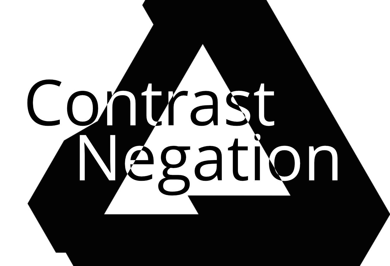
Hi Dave, I'll try and give a quick breakdown, though it has prompted me to think that the in-app help blend modes topic needs fleshing out a bit... Not sure I can suggest practical use cases for them all yet. Reflect darkens the image using values from the composite layer. It's great for selectively enhancing parts of an image like reflections or areas of light. Glow essentially performs the same as Reflect but flips the layer order, so it brightens the image using values from the composite layer. Great for widening the radius of artificial lighting and making it more intense. Average is exactly that: a mathematical average between the image and the composite layer. In most cases it's the same as setting the composite layer's opacity to 50%. Erase will subtract from the image using the composite layer as a "mask" - the strength of this is controlled through Opacity rather than the composite layer's actual contents. Negation is like Difference (which subtracts pixel values between the composite and image layer) but is additive, so pixel values are simply added together from the layers - resulting in brightening rather than darkening. Contrast Negate I'm not sure exactly, but it seems to invert the pixel values of the composite layer based on the image layer's content. Useful for certain designs. I've attached a really rough example to this post. Not sure about Divide's no-show, I'll have to ask one of the developers at some point. Hope that helps!