.jpeg.1b727463d44a0d52bc3499597e28d11c.jpeg)
James Ritson
-
Posts
855 -
Joined
-
Last visited
Everything posted by James Ritson
-
.thumb.jpeg.6f143e8223547aba974205ef53397036.jpeg) Hi Mareck, all I can say here is that if you're looking to export from Photo to TIFF/JPEG or any other 8/16-bit format, don't work in Unmanaged. For the export to match what you're seeing on the canvas view, you must be using ICC Display Transform. If you're simply editing in Photo and passing the EXR to another app (e.g. Nuke, Fusion, Natron, Flame, Resolve), then you can work with an OCIO Transform. Don't forget what I mentioned above about colour space conversion—Photo works in scene linear. If you don't specify a colour space on import, it will assume the document you're importing is already in scene linear. With blender exports, this is the case, but if you have an EXR in another format (e.g. aces) and you're using the appropriate configuration, you can append "aces" to the filename and Photo will convert from that to scene linear. When you're exporting, don't forget to append "aces" to the filename if you need to convert back from scene linear to aces.
Hi Mareck, all I can say here is that if you're looking to export from Photo to TIFF/JPEG or any other 8/16-bit format, don't work in Unmanaged. For the export to match what you're seeing on the canvas view, you must be using ICC Display Transform. If you're simply editing in Photo and passing the EXR to another app (e.g. Nuke, Fusion, Natron, Flame, Resolve), then you can work with an OCIO Transform. Don't forget what I mentioned above about colour space conversion—Photo works in scene linear. If you don't specify a colour space on import, it will assume the document you're importing is already in scene linear. With blender exports, this is the case, but if you have an EXR in another format (e.g. aces) and you're using the appropriate configuration, you can append "aces" to the filename and Photo will convert from that to scene linear. When you're exporting, don't forget to append "aces" to the filename if you need to convert back from scene linear to aces. -
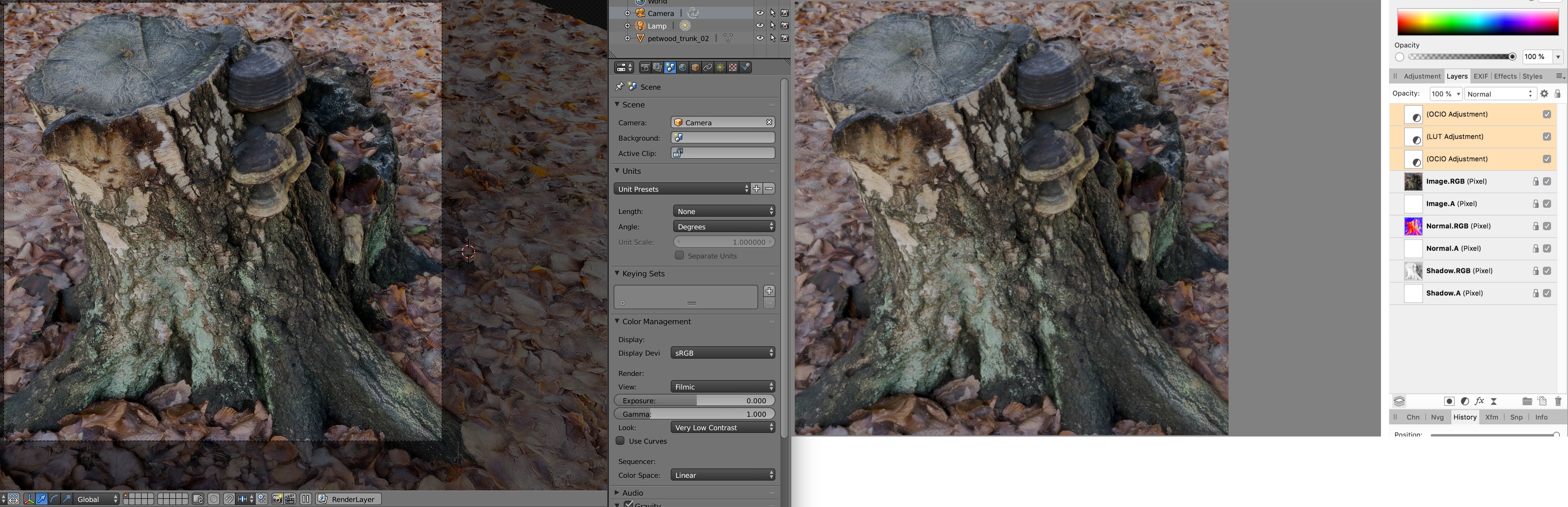
Hi Mareck, I'm attempting to replicate your workflow, but I noticed in your previous thread you were using the blender Filmic config—now it looks like you're using a Nuke config. Could I just clarify what you're actually trying to achieve? Do you want Affinity Photo to be the final destination before you export for web, I.E. are you just looking to beautify your renders? Or is the goal to perform some editing in a colour-managed environment and pass an exported EXR to another app for compositing? Initially, I thought you were perhaps missing a step out of the workflow, which is to ensure that Photo converts from whatever colour space you were using in blender to scene linear. You would do this by appending the colour space to the filename—for example, "render Filmic Log.exr". However, it would seem blender simply exports in scene linear, except if you're compositing in the VSE where you can define the colour space (which I believe is irrelevant for your workflow). Apologies as I don't use blender very often, so I've been playing catchup here. From what I can gather, what you want to be able to do is have your starting point in Photo look exactly like the preview/render in blender when using the Filmic view transform, is that correct? Normally, this is easily achievable by either: a) Setting your view transform to OCIO managed on the 32-bit preview panel, then choosing the correct display output (sRGB) and view transform (Filmic) or b) Setting your view transform to unmanaged (linear light), then using an OCIO Adjustment layer to go from Linear to Filmic sRGB Both of these options work fine (option b effectively "baking" in a transform), I've tested both and they match the preview in blender. They both bypass the typical display transform that's applied (you can see this by using the "ICC Display Transform" option on the 32-bit preview panel). This is how you would work on a 32-bit document in Photo before exporting it back to EXR for use in other software. However, the complication arises when you want to export out of Photo to a 16 or 8-bit format—in this case, it has to include a non-linear transform using the document profile. It's not pretty, but I believe I've found a solution that will allow you to match the preview in blender whilst using the ICC Display Transform—and from then on, your exports will look correct. I've set up a similar workflow with one of my photogrammetry models and am using the default OCIO config that ships with blender (which is what I believe you were using originally). I've copied this config over to a separate folder in order to use it in Affinity Photo as well. Please note that I've only verified this with blender's standard OCIO configuration, which seems to include Filmic? I've tried piecing together this workflow by looking at the .ocio configuration file. Try following these steps and see if they help: In blender's colour management options, set display device to sRGB, view to Default and look to None. Import your EXR document into Photo. First, go to Document>Assign ICC Profile and choose your monitor profile. For example, I profile my monitor and I'm using a custom profile called Dell-D50, so I would choose that. If you're using a standard profile, it's probably named after your display—for example, my Dell monitor's profile is named DELL UP3216Q. You might see a noticeable shift in colour. If you now A/B this against the blender preview set to sRGB with a Default view (not Filmic yet), you should find they match closely. Photo is colour managed and will correctly convert based on the document profile, but if we assign a display profile we're effectively bypassing that and presenting the numbers straight to the monitor. Next, add an OCIO Adjustment layer and go from Linear to Filmic sRGB. Now, either: Add a LUT adjustment. You'll want to find srgb.spi1d in the blender OCIO config LUTs folder and apply that. Or add another OCIO adjustment. Go from sRGB (not Filmic sRGB) to Linear. Normally a Linear to Filmic sRGB then Filmic sRGB to Linear transform would be identity—but we're instead saying that on the transform back, the source colour space is sRGB, causing the numbers to change. If you change blender's view to Filmic and the look to None or Base Contrast, you should find the result in Photo now matches blender. When you're finished editing, don't forget to flatten and convert the ICC profile to sRGB (alternatively, make sure you assign sRGB as the document profile whilst exporting). Not pretty, but it appears to work. Additionally, you may want to apply one of the looks—looks aren't exposed in Photo, but you can still apply them through the LUT adjustment. It requires altering the workflow slightly. Work back to when you applied the monitor profile. Add an OCIO Adjustment layer and this time go from Linear to Filmic Log (not Filmic sRGB). Now add a LUT adjustment and browse for the "filmic" folder in the OCIO configuration folder. Choose the corresponding LUT depending on which look you want (note that you can always find out which looks point to which LUTs by checking the .ocio configuration file): filmic_to_0-35_1-30.spi1d - Very Low Contrast filmic_to_0-48_1-09.spi1d - Low Contrast filmic_to_0-60_1-04.spi1d - Medium Low Contrast filmic_to_0-70_1-03.spi1d - Base Contrast (this will give you the same result as choosing "None" for the look) filmic_to_0-85_1-011.spi1d - Medium High Contrast filmic_to_0.99_1-0075.spi1d - High Contrast filmic_to_1.20_1-00.spi1d - Very High Contrast Finally, either add the LUT with srgb.spi1d or add another OCIO Adjustment layer and once again go from sRGB to Linear. And that should be it. Sorry for the wall of text, but hopefully you'll be able to follow the instructions. I've attached a quick and dirty side-by-side of my photogrammetry render, I used the second method of applying a look (the very low contrast one). It's almost a 1:1 match on my screen. Hope that helps!

-
Hi Mareck, could you check what your 32-bit preview options are set to? Go to View>Studio and choose 32-bit Preview Panel. Because you're using an OCIO configuration the display transform will be set to "OCIO Display Transform". If you could provide a couple of screenshots of this panel and the available options that would help. It's possible you need to be using a different view transform: most OCIO configurations will include linear options like "Non-Colour Data", "Linear Raw" etc, but these aren't suitable if your workflow is simply to edit in Photo and export to JPEG. Unless you're passing the render between different software and need explicit colour management, you may be better off simply using the ICC Display Transform option, as that will provide the best match when you export the result as JPEG with a non-linear sRGB profile. Hope that helps—any info you can give on your workflow would be useful, as we can then help you further!
- 8 replies
-
- 1
-

-
- color profil
- exr
- (and 2 more)
-
Hi Maarten, I'll tackle your last question first! This is exactly what happens already. On the Export dialog, click the More option. ICC profile is usually set to "Use document profile" but you can change this to sRGB or another option. Upon export, the document is flattened then converted automatically to whichever profile you specify. This process is exactly the same as going to Document>Flatten, then Document>Convert ICC Profile. I'm a little confused here—I don't think the Windows GUI should be appearing oversaturated at all. I profile my wide gamut monitors (both for Mac + Windows) using an i1DisplayPro and displayCal and I don't have an issue with oversaturated colours. Affinity Photo is colour managed in that it will use your active monitor profile, but it relies on that profile being accurate. Can I ask how you calibrate and profile your monitor? Hope that helps for now, look forward to hearing from you.
-
Hey all, another video for you, this time covering the lens corrections in the Develop Persona to correct skew (and demonstrating a non-destructive approach using live filters): Perspective Skew Correction - YouTube / Vimeo (New: 20th April) Hope you find it useful!
-
Hmm, unless I'm missing something here, Photo's Panorama persona has an equivalent of control points. In fact, it has two options--source image masking and source image transforming. I had a go with the JPEGs--it took a couple of minutes, but I was able to sort the alignment (as far as I can tell). I've attached a video to demonstrate using the two tools. Unfortunately, although you can stitch EXR files, it seems to be hit and miss depending on the subject material. I might suggest HDR merging and tone mapping each panorama segment, then exporting as 16-bit TIFF, which is not the greatest solution but would allow you to re-align successfully. Out of interest, which drone did you use? (The EXIF data lists a camera model but not the drone itself!) Here's the video file: bridge.mp4
-
Browser autofill. It's a wonderful thing.
-
Hey all, just a small update. I've gone back and revised a couple of videos (one has had a name change!). They are: 32-bit Raw Development - YouTube / Vimeo Wide Colour Profiles vs sRGB - YouTube / Vimeo The wide colour profiles video was previously called "ProPhoto vs sRGB". It's been updated with better information and also to highlight that Affinity Photo ships with a profile called "ROMM RGB" (ProPhoto, basically) that you can use--so there's no need to source and download a ProPhoto profile separately.
-
Hi Darin, the Unsharp Mask implementation on iPad is quite different compared to desktop (it's hardware accelerated using Metal compute). I'm not entirely sure why the developers changed the factor from value to percentage scaling, but I can tell you that the equivalents are: Factor 1: 20% Factor 2: 40% Factor 3: 60% Factor 4: 80% Be aware that whilst these figures will get you in the ballpark for similar sharpening, the Metal compute implementation appears to be slightly tamer, so be prepared to use a slightly higher Factor value (or indeed Radius). Hope that helps.
-
Sharpening filters
James Ritson replied to dkj's topic in Pre-V2 Archive of Affinity on Desktop Questions (macOS and Windows)
Just to expand on this, there does appear to be a slight difference. Clarity has basically always been USM with a Luminosity blend mode (at least in the Photo Persona). The test imagery I was using, however, showed little to no change. I've tried some other images and there is a slight difference, but from memory of previous versions (1.4, 1.5) I was expecting a bigger difference. Applying a live USM layer and setting its blend mode to luminosity should yield the same result as Clarity. The eventual hope is that the Photo persona version will behave like it does in Develop, where you get less edge haloing and the ability to apply it negatively. -
Hey Sebastian, object removal is Median stacking, which should already produce a long exposure effect with the sea - is this not the case for you? You should get both results you're after from the same stack. If not, one approach might be to do a Merge Visible with a Median stack, hide it, change the stack to Mean and do another merge visible. You'll then have two merged pixel layers--one Median, one Mean. You could then add a mask layer to one and blend them together. This might not work if you've got people in the sea though...
-
Sharpening filters
James Ritson replied to dkj's topic in Pre-V2 Archive of Affinity on Desktop Questions (macOS and Windows)
Hi djk, here's a brief rundown of each filter: Unsharp Mask uses the traditional approach of comparing and subtracting a blurred (or "unsharp") version of the image (or pixel layer). It's the most configurable of the sharpening filters as you can control the factor (strength) and threshold (how much to subtract based on the comparison). For most use cases, this is your go-to filter for sharpening. High Pass is a little more straightforward: it simply passes parts of the image (or signal) above a certain frequency and attenuates anything below it. This filter is used as part of Photo's automated Frequency Separation filter for retouching, but you can also use it for detail enhancement. Applying it as a Live Filter layer then altering its blend mode (e.g. to Overlay/Hard Light) allows you to be somewhat creative with your sharpening: use smaller radius values for fine detail sharpening and higher radius values for local contrast enhancement. Clarity has had an overhaul in the Develop Persona, so it now behaves differently compared to its implementation in the Photo Persona. In Develop, it performs quite a strong local contrast enhancement (punchy mid-tones, increase in "perceptual" sharpness). In Photo as a filter/live filter, it's basically Unsharp Mask with a blend mode - or at least it should be. As of the latest release version, it no longer appears to be any different from Unsharp Mask, which is a bug and will be reported... Detail Refinement in Develop is basically Unsharp Mask - the percentage suggests it might be adaptive but I don't believe this is the case, just treat it as the radius. Hope that helps! -
As of the most recent App Store version, Iris Pro integrated GPUs should be supported for Metal compute. No discrete GPUs are supported yet, but you can still run your R9 for canvas presentation whilst the Iris Pro is used for Metal compute. Go to Preferences>Performance and you should be able to check "Enable Metal compute acceleration". Hope that helps. Just be mindful that the brush-based tools seem to have some speed issues with Metal compute. It would be interesting to see if this is your experience too..
-
Hey, on the context toolbar for the Dodge/Burn brush tools you should have a Tonal Range dropdown that allows you to target Shadows/Midtones/Highlights - think this is what you're after? Hope that helps! [Edit] Attached a screen grab
-
What you're seeing is the 32-bit preview panel (this is accessible on Desktop through View>Studio). This is used to preview different tonal ranges of the document and is important for a number of use cases, but for typical HDR merging where you'll be tone mapping straight after it's arguably less useful. In the iPad version, this panel is intrinsically linked to the Hand Tool as its context toolbar in 32-bit: it's a design decision, since adding another studio on the right hand bar just for a couple of esoteric options isn't a great use of valuable screen space The issue is that most tools will have a context toolbar, so switching to another tool won't solve this. If you intend to tone map the HDR image, you should find that it doesn't appear in the Tone Mapping Persona. Once you've tone mapped the image, you could always convert it to 16-bit (unless you really need it to remain in 32-bit) and the 32-bit preview toolbar will disappear. The only other solution I can suggest right now is to select the Move Tool (directly underneath the Hand Tool) and then tap off somewhere on the canvas outside of the image to deselect it. Hope that helps.
-
Hi Conrad, you're referring to the Shadows/Highlights adjustment? This is just for tonal compression - instead, try the Filter version which is under the Filters menu (no subcategory). It behaves very similarly to the implementation in the Develop Persona.
-
Hey Mettsy, apologies if I'm missing something here, but are you just comparing the result you get straight after HDR merging (so no tone mapping)? What steps do you take in Photoshop, do you use 8-bit/16-bit adaptive tone mapping or complete it in Camera Raw? After it's just been HDR merged in Photo, you'd really need to tone map the image before doing anything else. What you're seeing is simply the starting exposure or "point" that Photo has picked - notice the entire image is exposed brighter than the Photoshop result. If you went to View>Studio>32-bit Preview and brought the Exposure slider down by perhaps 0.5 or 1 stop, you might find the result looks more like Photoshop's (don't forget to reset it though before doing any further work). The detail that looks washed out is there, the image just needs tone mapping via global compression/local contrast, both of which you can do in the Tone Mapping persona - top left of the interface, the fourth icon along. Let me know if this does the trick.
-
help Affinity Online Help Resource (Printable)
James Ritson replied to James Ritson's topic in Resources
Hello all, just letting you know that I've rolled out the search for Designer help as well now. English and US should be fully searchable, but I don't believe other languages have been indexed yet - I've submitted them, so hopefully within a couple of days you'll be able to search them too. As always, if you discover any issues let me know and I'll endeavour to fix them! -
remove tone curve in Develop persona?
James Ritson replied to tpf1952's topic in Pre-V2 Archive of Affinity on iPad Questions
Hi Tom, it's available but has been consolidated to the main assistant options for the iPad version. If you open a document, then tap the document menu (next to the close document button, top left), you'll see Assistant. Tap that, and the tone curve option will be near the bottom, along with the bit depth output option. Hope that helps! -
Hi Barry, those are just open documents (I happen to have named them sequentially), you'll get that toolbar any time you have more than one document open. Hope that helps.
-
Hey again, just checking in to offer a new video, this one focuses on creating an HDR result from one RAW exposure (as opposed to merging bracketed exposures): HDR from one exposure - YouTube / Vimeo @Chinderah Have you tried the online help at https://affinity.help ? It's searchable and printable (just click the print icon on the left hand menu), and it works well on tablets/phones so you could have it as a reference whilst you work on your desktop machine.
-
Hey @KyleG, I didn't get a notification that you had replied so I'm sorry I haven't seen your message sooner. I've investigated and haven't found much that would help so far - I've tested on a couple of TVs and a 4K monitor and there's no overscan on any of them. The app itself is basically a bare bones template that Xcode provides, and it's unlikely there would be anything in there to dictate display scaling. The majority of the videos are 16:9 - a few older videos may be 16:10 but they should appear pillar boxed. When you say other Apple TV apps work fine, are you using any other apps where critical content would be displayed outside of the safe area? Most apps design their UI to be title-safe, and video content follows this convention too. Screen capture content is more difficult - short of scaling the entire video down and leaving black space, there's not much we can do to accommodate action and title safe regions. Is there any chance you could take a few pictures of your TV settings and also the Video/Audio settings on the Apple TV menu? Additionally, if you go into the Video/Audio menu and choose Calibrate>Zoom and Overscan, do you definitely see the outer white border near the "Full Screen" text? Finally, what's your HDMI Output set to - is it RGB Low/High or YCbCr? I'm aware some TVs may alter their overscan setting based on the input signal (crudely speaking, they might regard YCbCr as "television" and thus overscan), despite the picture fit setting. I'd like to get to the bottom of the issue and see if it's affecting other users as well, so any further information would really be appreciated. Thanks!
-
help Affinity Online Help Resource (Printable)
James Ritson replied to James Ritson's topic in Resources
It's something I'm trialling, was going to make a quick post about it at some point. From initial tests it seems to do an OK job (better than the in-app search, in fact ) - it's currently in Photo English, US and German. If it seems to be functioning well then we'll probably just roll it out across all languages and for both apps. -
Affinity Workbook Tutorial Basics
James Ritson replied to semih's topic in Tutorials (Staff and Customer Created Tutorials)
Hi, looks like you have inverted the Background (Hintergrund) layer - instead, make sure you select the HSL layer and go to Layer>Invert. This should invert the HSL layer's mask and allow you to paint back onto it. Hope that helps! -
The display acceleration and Metal compute hardware acceleration are two entirely separate things - using Metal for display acceleration just means it's used to present to screen (i.e. the canvas view). It should be faster than OpenGL, but between the final High Sierra beta and the public release something changed and presented some issues with the way Affinity's Metal renderer is implemented. It's hopefully something that will be addressed in the future. In the meantime, the OpenGL renderer was tweaked to compensate (it's noticeably faster in 1.6 than 1.5). Metal compute is hardware acceleration, and is a back port from the iPad development where Metal implementation was necessary to achieve good performance. In particular, equirectangular projection absolutely flies using Metal compute, often hitting 60fps at 5K resolutions and above. Complex live filters like Twirl and other distortions should also redraw much faster. At the moment, however, it's limited to integrated graphics chips which you'll typically find either on MacBook models or the 21" iMacs. You'll notice enabling Metal compute will use the integrated GPU, but you don't need to check "Use only integrated GPU". Photo can still use the discrete GPU for presenting to screen and the integrated GPU for Metal compute quite separately. Hope that clears it up a bit!
- 5 replies
-
- 1
-
-
- metal
- acceleration
- (and 1 more)