276ccm
-
Posts
245 -
Joined
-
Last visited
Everything posted by 276ccm
-
 Hi all, im working on a project for a client in Designer.. I’m vectorizing a drawing for a product that will be CNC and Laser engraved.. and now the engraving company wants the finished file in a .DXF format.. I see that Affinity Designer doesn’t support.DXF. What is the best way to get my document converted into a file that the company can use? I’m using macOS Mojave and iPadOS Thanks in advance! Marius
 -
Yes to DXF!
-
Thanks a lot, Ill see if I can get that! :-)
-
Hi all, just a question I'm not sure anyone can answer, but I´ll try :-) I'm working on a design in Designer, for something that will be laser engraved.. The client said they needed the file in .SVG when it's done. I guess they need the .SVG file to program into the laser engraving machine.. Does anyone know if I have to expand all the lines, to be laser engraved, or can they be like un expanded vector lines. Will the laser engraver understand that all that is black will be cut out? Or is there anything else I have to think about.. The client knows that I don't know much about laser engravers, but he said only he needed the file is .SVG Any tips or ideas? :-) Here is a little screenshot part of the design I'm working on..

-
Can I please send it as a PM as soon as I get home? .. It’’s a work in progress for something that will go in production, for someone else.
-
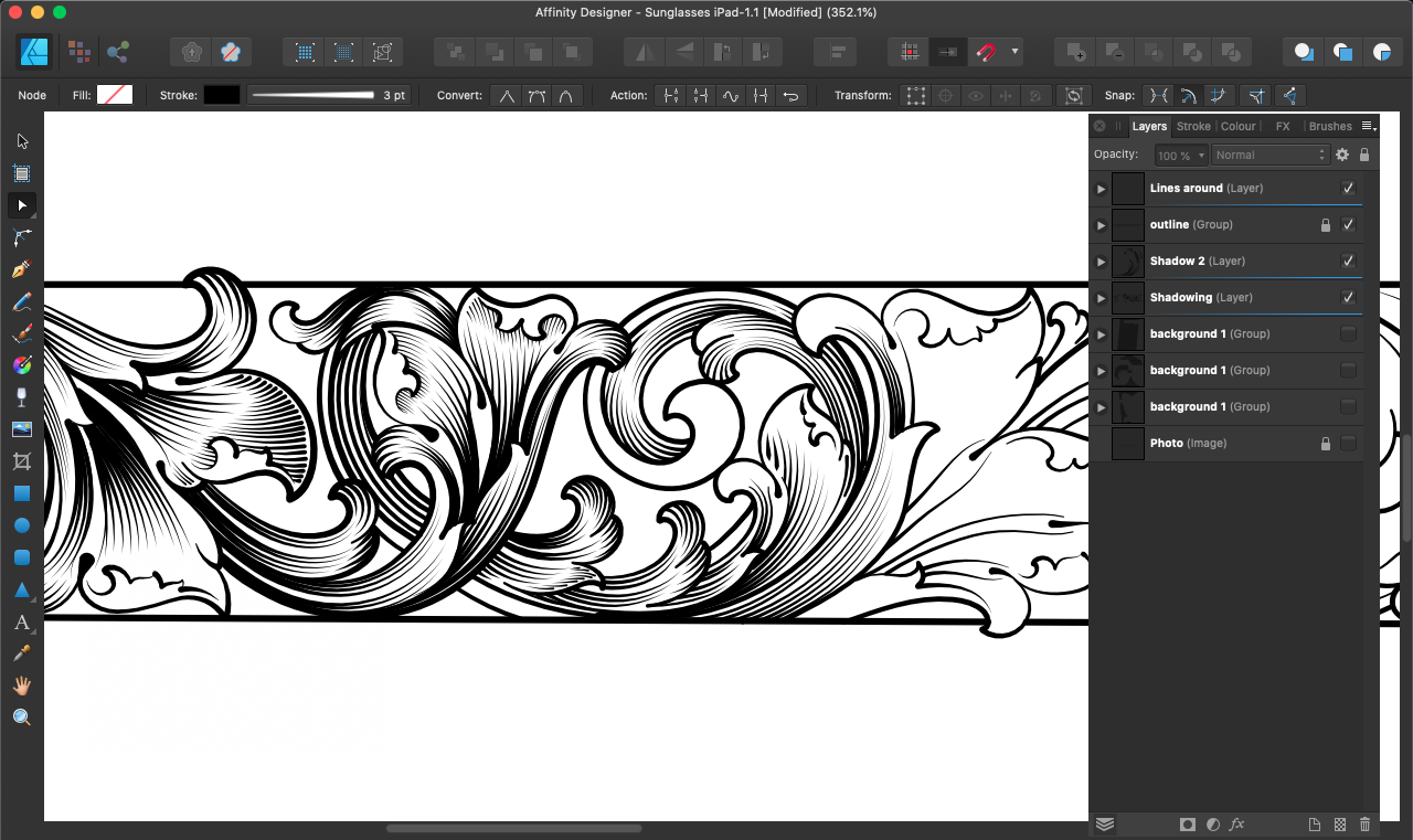
Why is it so extremely difficult to hit the node for some of the lines I have made.. I want to edit it, but some times it's almost impossible to hit it.. I sometimes have to click far outside the line to "activate" it?? MacBook Pro with macOS Mojave and latest version of Affinity Designer Please see video Affinity_click_nodes.mov
-
Hi all, I just took a clean install with macOS Mojave on my MacBook Pro as it started to be really slow and full of old crap I never use anymore and I only wants to use it for creative work anyway.. but it means I don't have Photoshop installed anymore..and I would prefer not to. Can I still install the NIK plugins and use with Affinity Photo plugins, even if I don't have the Photoshop plugin folder on my Mac? If yes, can anyone please explain how? :-)
-
affinity designer Goodbye Procreate.. Hello Designer for iPad !!
276ccm replied to kjs's topic in Share your work
Procreate will support CMYK very soon.. but anyway.. if you are drawing in vector, you can add a node in your line and break it, and then erase the part you don’t want. But there is no eraser.. but then again.. comparing Procreate and Deaigner is a little strange.. it’s two different types of “drawing” couldn’t live without any of them, but for different projects :-) -
The thing is, it happens with different files.. but only on my iMac. Using the same files on my MacBook Pro, it never happens.. (knock on wood) and there are no specific files. :-) And it’s strange, because I always save.. but I’ll look into the crash reports.. :-)
-
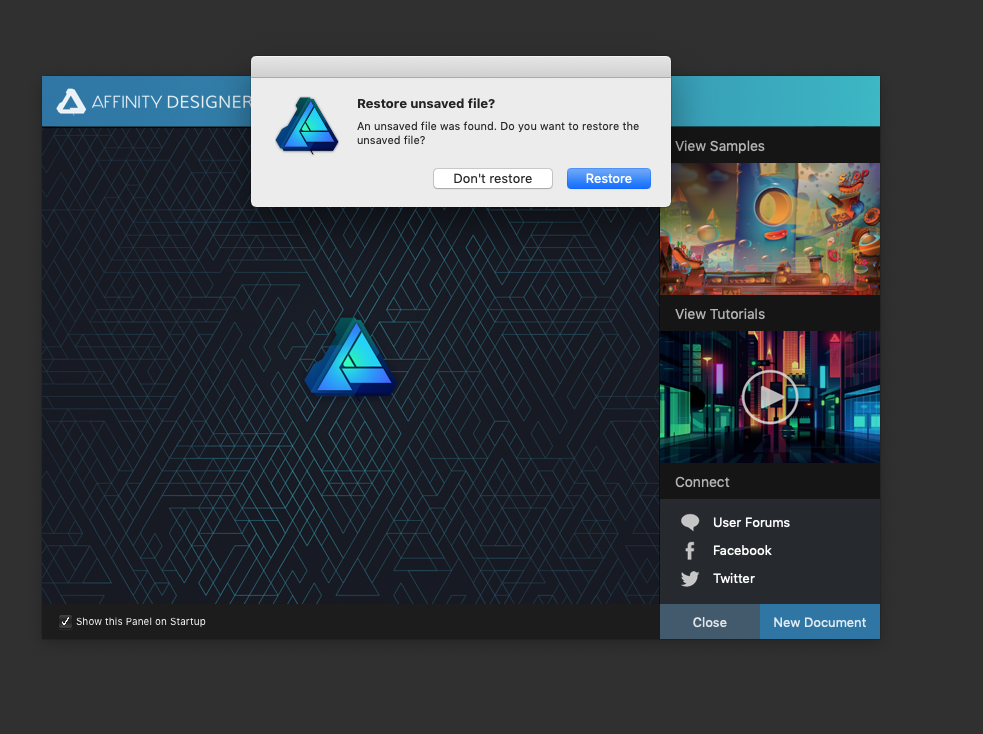
Very often when I'm opening the AD on my 2017 iMac, it asks if I want to restore.. I quit the program in the normal way, and I don't get any crash report.. I'm not sure if its a bug or what happens, but if I get the answer, I guess its because its crashing?
-
Unfortunately not, but I’m working on some new and better ones.. :-)
-
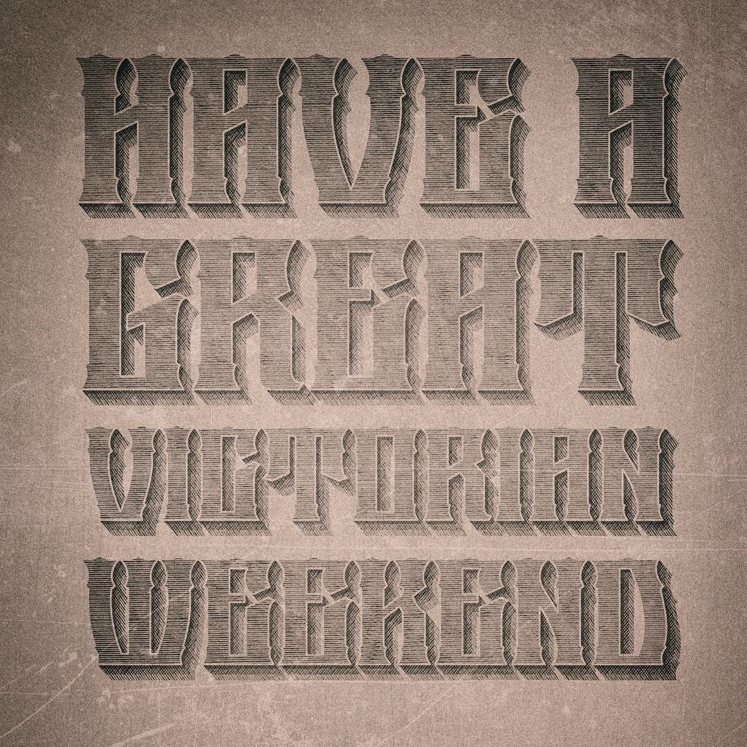
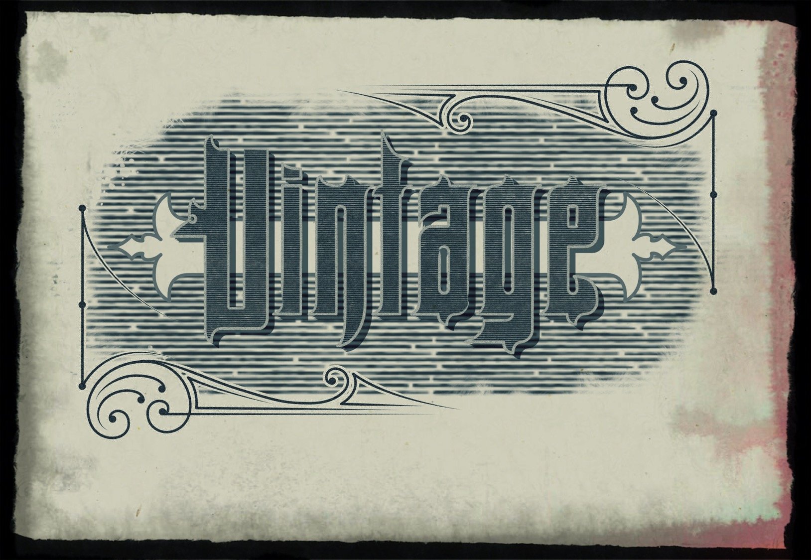
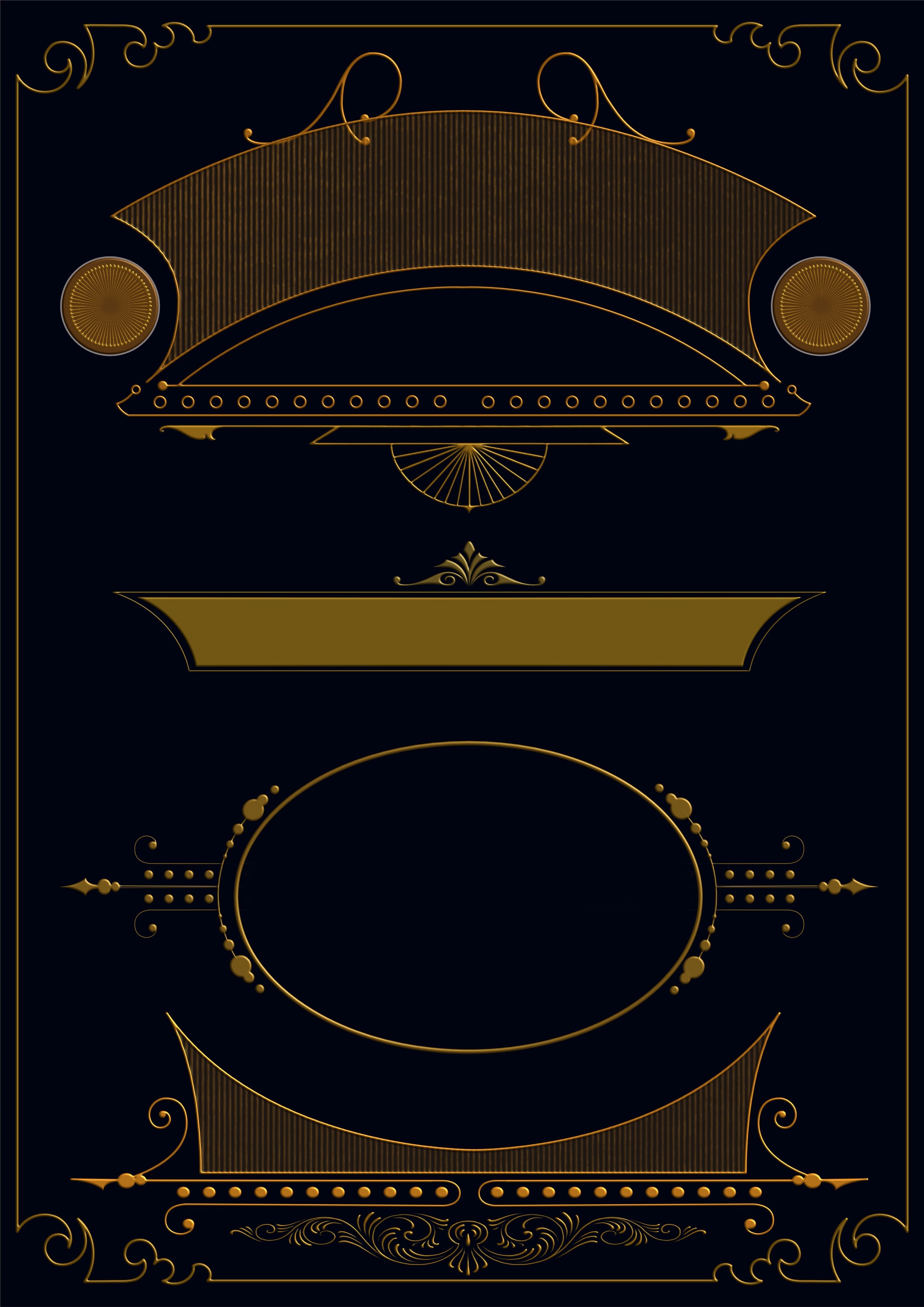
A little more in my research for achieving the Victorian style.. Three layers of different shadowing, but with the same lines.. hatching and crosshatching :-)
-
affinity designer Vintage Poster.. input, not finished..
276ccm replied to 276ccm's topic in Share your work
Thanks @Simon Degay I have thought about it, but I’m not a Designer by profession, and my time to work with these things (what I really want to do) is very limited.. but hopefully I’ll be able to one day :-) I usually have to sneak in some time in my workshop, when wife and client think I’m actually working :-) But mostly I’d say it’s looking and studying old designs. Look at how they are built up, how they use the lines, shadowing, ornaments and stuff.. every nigh when going to bed, I search for inspiration.. But as soon as I get the chance I’ll look into a tutorial video :-) But I’m not going to say anything.. hate hearing my own voice. Anyway, I made another little piece today.. thinking to start a Behance project, for the vector assets I make.. :-)
-
affinity designer Vintage Poster.. input, not finished..
276ccm replied to 276ccm's topic in Share your work
Hi @Simon Degay, I have these brushes, and I used them on the test, two pictures up.. but I think they are too rough and not so very useful. They even have some bugs, and if you make a high resolution, I don't think they look too good.. but then again, they are not very expensive, but not sure I would buy them again.. if I knew :-) For the poster (last result) I made my own brushes. Not trying to brag, but I think they look a lot better and are more useful.. :.-) -
affinity designer Vintage Poster.. input, not finished..
276ccm replied to 276ccm's topic in Share your work
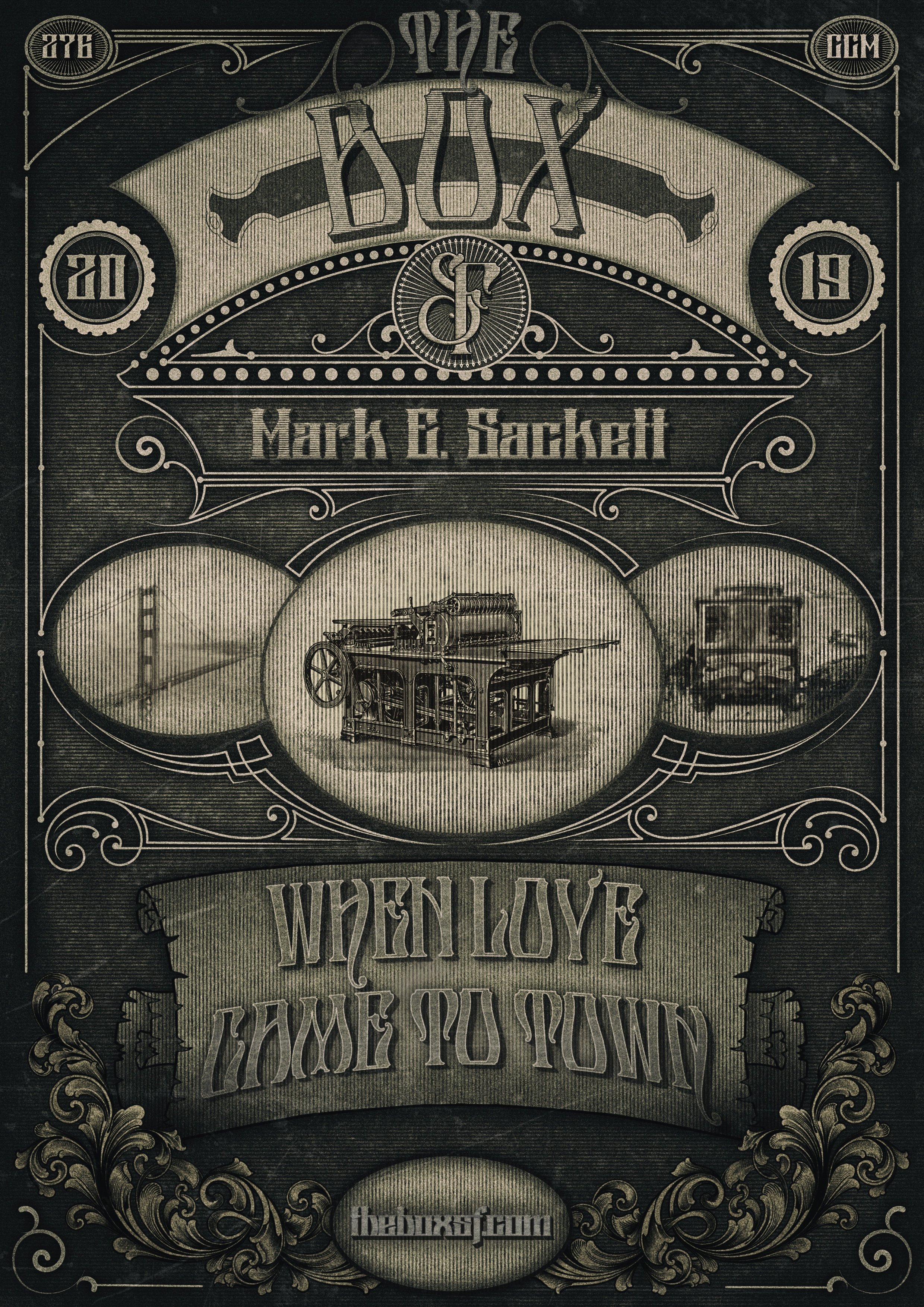
And this is the end result, for now :-)
-
affinity designer Vintage Poster.. input, not finished..
276ccm replied to 276ccm's topic in Share your work
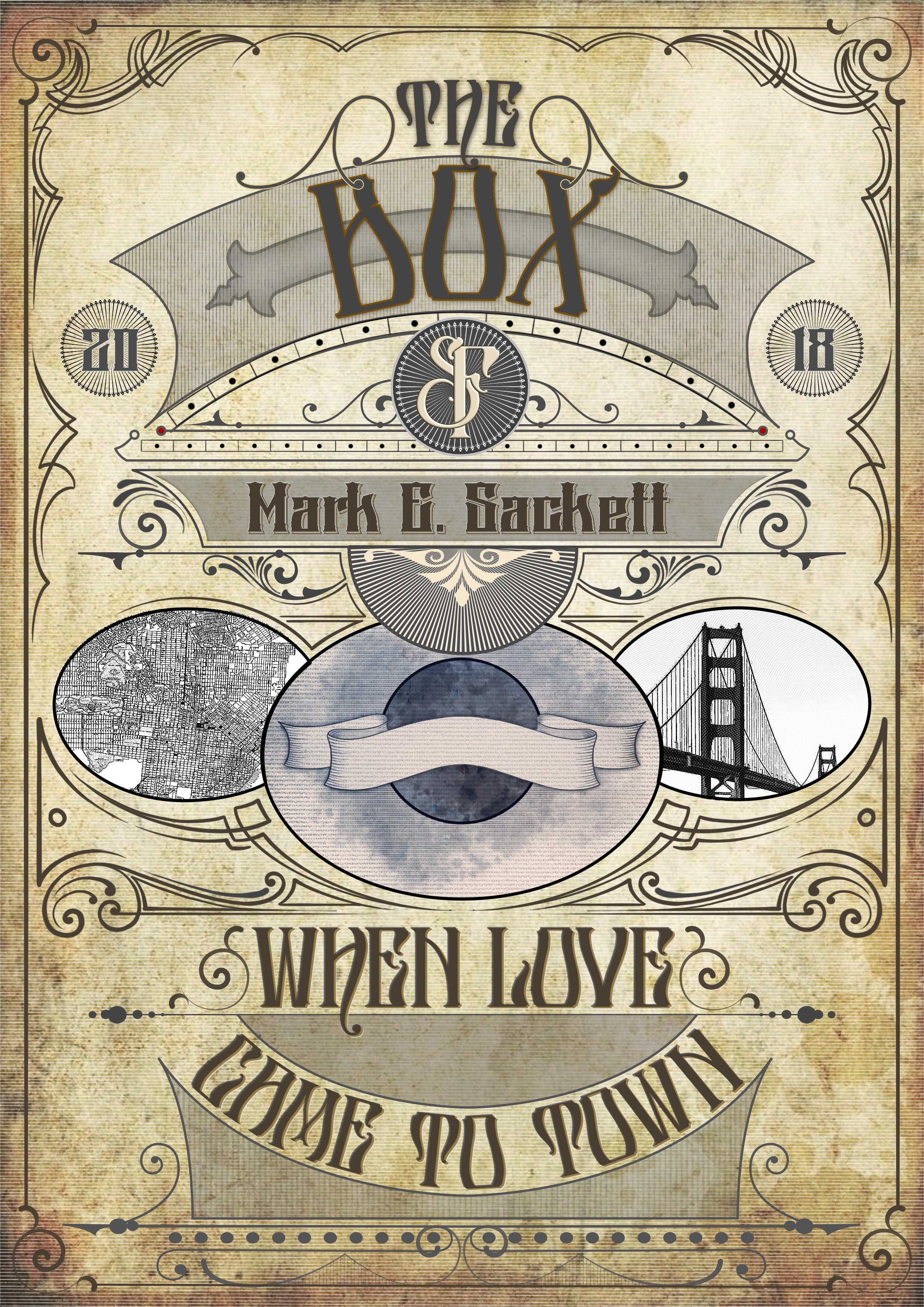
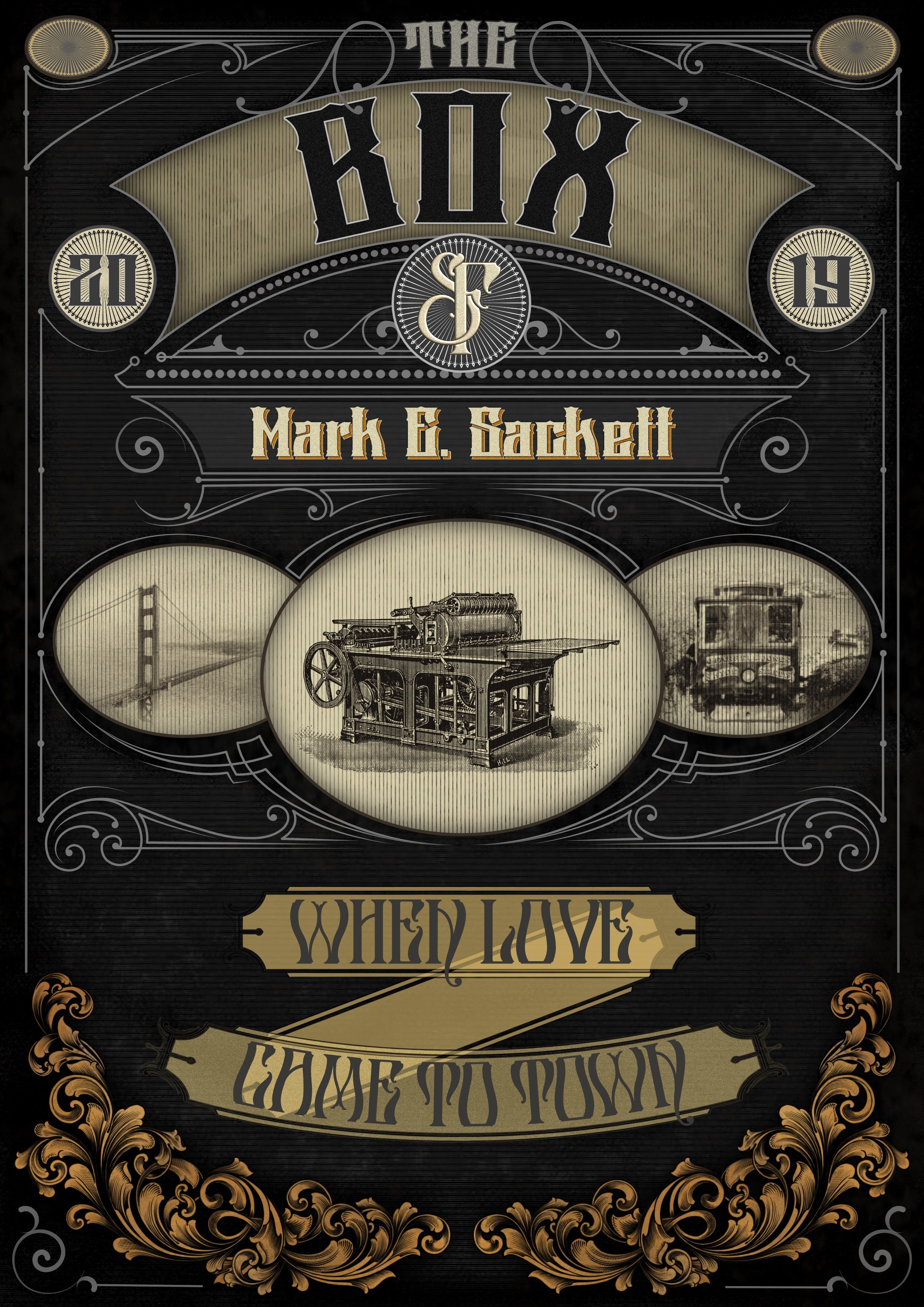
I think I’m on the track of something, or? Any sugestions is welcome :-)
-
affinity designer Vintage Poster.. input, not finished..
276ccm replied to 276ccm's topic in Share your work
Doing many tests to achieve a good vintage look.. and I think I'm getting more close, slowly.. so maybe I´ll start over :-)
-
affinity designer Vintage Poster.. input, not finished..
276ccm replied to 276ccm's topic in Share your work
Thanks for your reply @GarryP the images in the last post, where only for my self.. work in progress, till I found better pictures, like in the dark one. :-) -
affinity designer Vintage Poster.. input, not finished..
276ccm replied to 276ccm's topic in Share your work
This was the «original» colors.. but keep changing and can’t really decide :-)
-
Hi all, trying to work on a new vintage look poster for a friend, but I’m getting a little lost.. been working on it for a while, and done a lot of changes, and starting to be a little blind.. would love to get some feedback on what’s good, and what’s not.. too little, too much, in your opinion :-) the tezt will probably change color and get some shading too. i have some ideas, but.. Don’t pay attention about the bottom part, with the transparent banners, they will be changed and redesigned.. just put there for a test.. :-) Both fonts is designed by me.. wasn’t quite sure which one to use.. anyway, if you have some input, would be interesting to hear? :-)
-
Trying to design some more vintage style assets..
-
And at last.. why is this the only line without capital letter? If it is a continuation of the previous text, I think it should be more close.. but as I said, I don’t understand what is says :-)
-
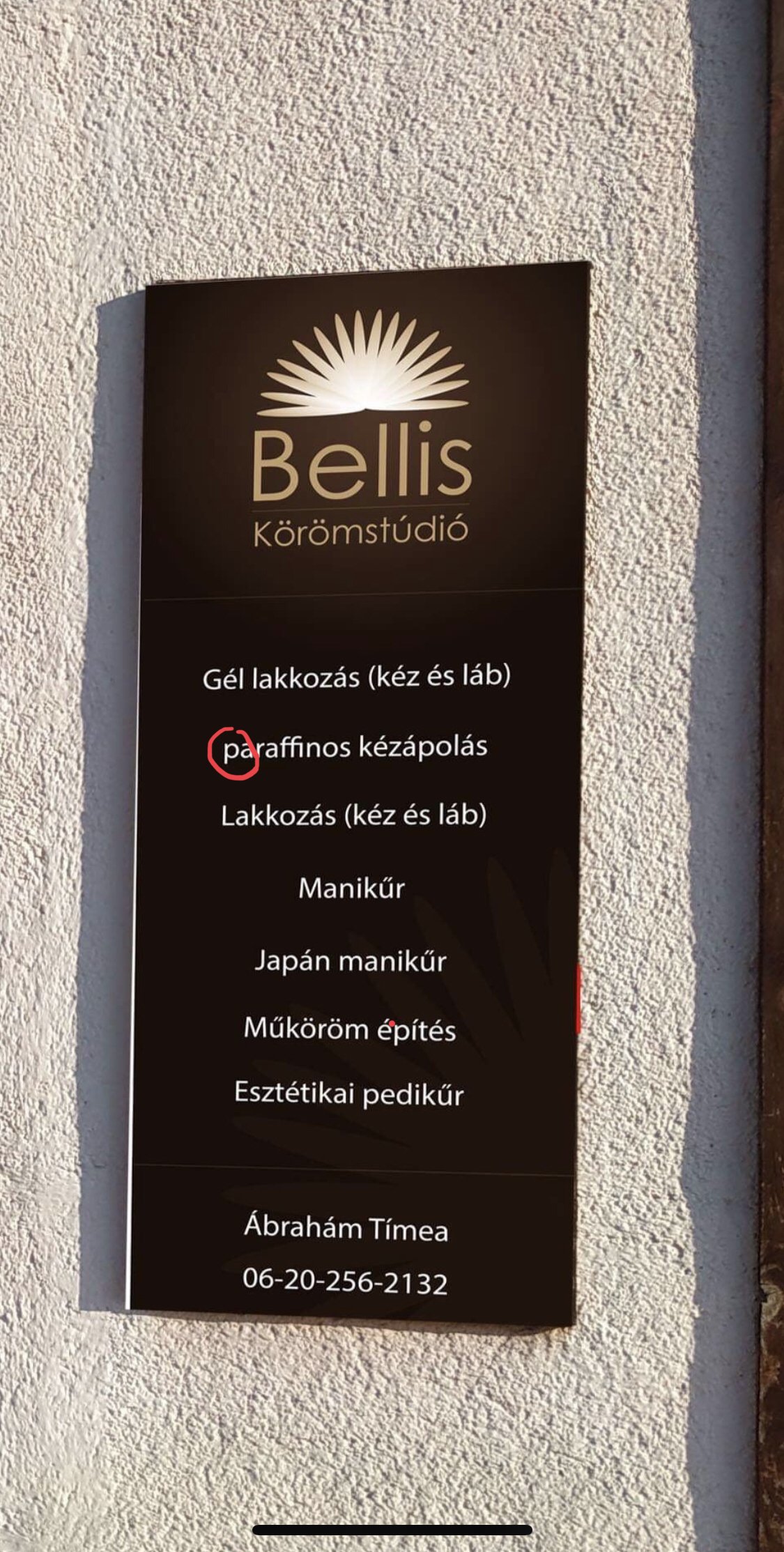
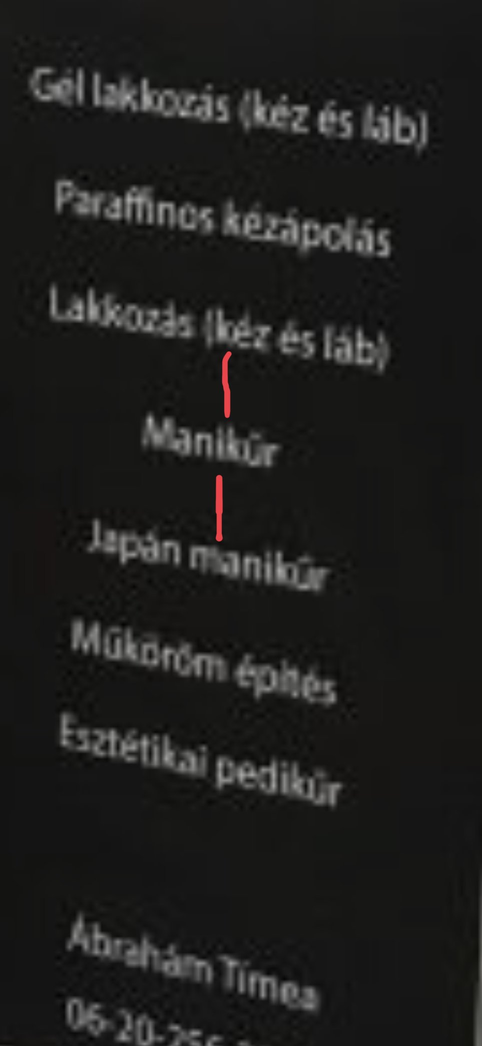
Not sure what all the text says, but my eyes says it’s more space between the text here (look the red lines) than the rest.. but maybe it’s a reason if I understood the text.
-
In my personal opinion, the text isn’t very well placed in the wooden frame.. I think it’s way to close to the frame edge, and the space between the top text and the rest is way too much. The beige part (bottom right corner) takes way too much attention and makes the text and the pictures disappear. For me, the design, even the “nails” (if it is) in the logo, disappear a little in the crowd. I don’t usually go and fix my nails tho, but I’m not sure I would choose this place, if I did.. business cards looks alright tho :-)
-
@VectorWhiz Maybe it wasn’t well explained :-) The font was designed in Procreate, and vectorised in AD, then made into a font in FontLab. Even if I love both AD and AP, some times I prefer to draw something in Procreate.. due to some brushes and tools they have. All the rest of the design is done in AD :-)