Uncle Mez
-
Posts
707 -
Joined
-
Last visited
Everything posted by Uncle Mez
-
Nice, you have my vote for that. Please, make it as better as Behance can be but for affinitizers as you said. thank you for creating something awesome for all
-
Please can you tell me more about ?
-
 Hello, i would like to know if someone here have a kind of documentation regarding the tools in the attached capture. I've discovered them few hours ago and i believe they can be of great help for most of us but cannot find a youtube video nor a pdf explaining those. Also, is there (i can't find it) a list of functions expected to be delivered with Affinity publisher? Sorry for asking here but i just don't want to create post after post. Your help is appreciated.
-
Motion, Animation & Parallax Tool
Uncle Mez replied to G.M.1986's topic in Older Feedback & Suggestion Posts
Thank you so much for your reply that helps. I've tried to make Resolve work but my config is not that hi-tech so i gave up. Now i'm thinking of giving a try to HitFilm Express, it's a free video editor software that (supposed) to enable us making good + they offer the ignite Express pack for free which works with most of the popular video softwares out there. I will stick at learning and doing Arts and will surely improve my workflow in a better and professional way when publisher is out (even need to check the topic about APub and see what will come with for the first public release). in my case i've trashed my Adobe things from all my studio computers (not coming back) to make more space and become a better Graphic Artist. -
Hello Everyone/admins/staffs. i was wondering about this precise thing: is there a way to simplify path or have kind of what the smooth tool on Ai does ? i mean, a design is always better when we have less node used for the drawing. as i said, maybe it's there and i just don't see it or maybe there is another way to do it with other tools or functions and here too i may not be aware of it. Your lights and inputs will be of great help here. Thanks
-
affinity designer Smarty Studio : Our Project (made with Affinity)
Uncle Mez replied to Uncle Mez's topic in Share your work
Oh i see, they don't use the same blending mode and even the transparency percentage used is different. Do you think using the same blending with Zero transparency percentage will make it better ? Just asking it was published already so your advices helps me to see the small missing stuffs in there and i'm really glad to take note of that. -
Hi @Vince42 i'm not an expert using pen tablets but i own a Wacom One CTL-671 and it works very well with both Affinity softwares. As i said, i'm not an expert and i feel like i'm missing few of the precious functionalities or setup tricks but ... you can give it a try by buying one, it's cheaper and just works fine. Hope this help you !
-
affinity designer Smarty Studio : Our Project (made with Affinity)
Uncle Mez replied to Uncle Mez's topic in Share your work
Hi @Wosven Nice to read from you. Yes you are right, i take note of everything you mentioned. 1- Will correct the space between AV & VA (didn't see that ... you rock's man :-) 2- Here i tried to make a kind of progressive design, i used the concept of traffic light (green - orange - red) to say we target the red point but still we consider the preparatory orange step. but there too i will try to make the BG thing you said a bit more present. 3- can't recall but i believe it was a matter of beauty or something like that; give me time to open the project again and try to make it the same to see if i went too fast or just forgot to make it similar 4- Yeah ... the design itself was made with Affinity Designer + Affinity Photo but what you see there (Gradient BG + Shadow + Reflection was entirely made with another software i use for "mock up" (can i say that in this case ???) that software works the reflection and shadow i 1 click (for each) which makes me save a lot of time ... but truly, i forgot to make it reflect and have proper shadow like the previous ones. Thank you so much for these precious points. Blessing ! -
affinity designer Smarty Studio : Our Project (made with Affinity)
Uncle Mez replied to Uncle Mez's topic in Share your work
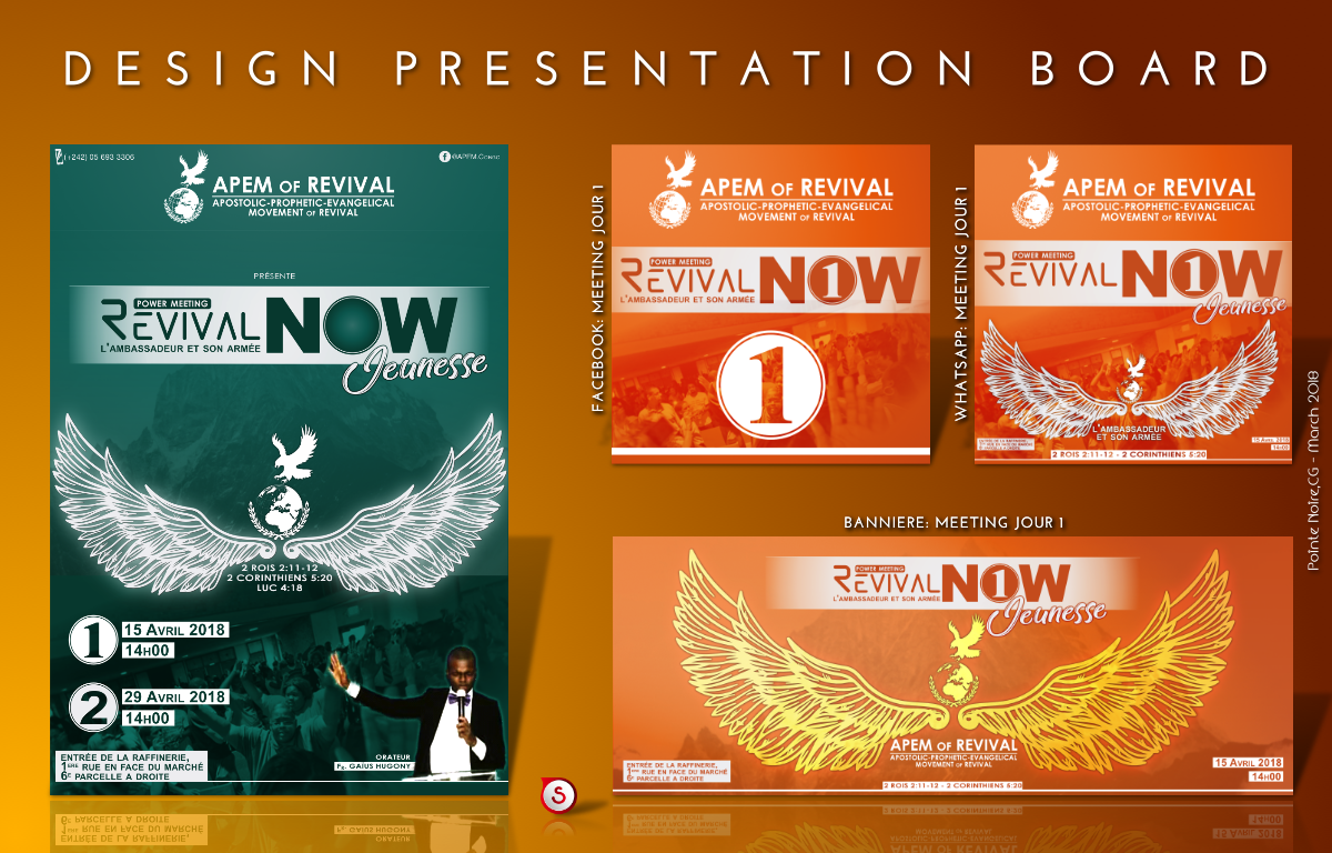
Project: Revival Now (2 days gathering) Location: Pointe Noire - Congo B Date: 3/28/18 #Content made for web use only (including WhatsApp profile and status)
- 103 replies
-
- 10
-

-
- graphic design
- projects
- (and 7 more)
-
Hello everyone, From today i believe i have to start sharing few of our design works (actually i'm working alone but i do build a team from time to time depending on project size ) Most of our client/requesters are Church based and we really enjoy doing stuffs for them but what you will se here is more about Smarty Studio standing with other studio/teams together into what is to become Congolese Design Style. Well each country have it's own style of design but Congo doesn't have a proper thus most of Congolese designers simply clone/copy styles from everywhere. This is a beginning, please your inputs on each design palet/kit will be of great help and will help us improving better. Blessings !
- 103 replies
-
- 2
-
-
- graphic design
- projects
- (and 7 more)
-
Done ! thank you so much.
-
Hello @reglico Oups ! Sorry i didn't though about that. Is there a way to delete the thread ? i totally forgot it was sent to a small number of peoples only. Have to review my understanding of sharing, licenses and other.
-
Just coming back into this. I don't know but i've tested with already existing FB Banner and it's only get sharper online when the output size is doubled or tripled but the issue is: Triple size is 11meg big. When i upload it here, compression is less than FB so you may not see what i see. Any advice for this issue? I mean not being able to post sharper stuff on FB is an issue, right?
-
Hello guys, i'm having the same issue too ! I just don't know what caused that. I'm mostly doing Social Network content with Affinity Designer (and picture work with Affinity Photo); i use to make things in their normal size (actual FB Banner is 820x312px) and just export it as PNG (in my old Ai days). Just put it on internet as banner and it works very well. The with Affinity Designer, i design and everything looks good in the workspace but when i export then things gets blurry and even worst when i upload it on internet ... more strange, the same file exported for print (PNG or PDF) is sharp and nice (and peoples like it). So i though maybe i should not design my banners using the official size but make it 4 times bigger than it should be and export it in recommanded format with recommanded size but using the export function (not the persona) and see if it works well ... but it's still strange to me as i never do complicated work and most of the time o work with vector and make small use of image/pixel content. Someone to help me get it better before i do something that may kill my workflow ?
-
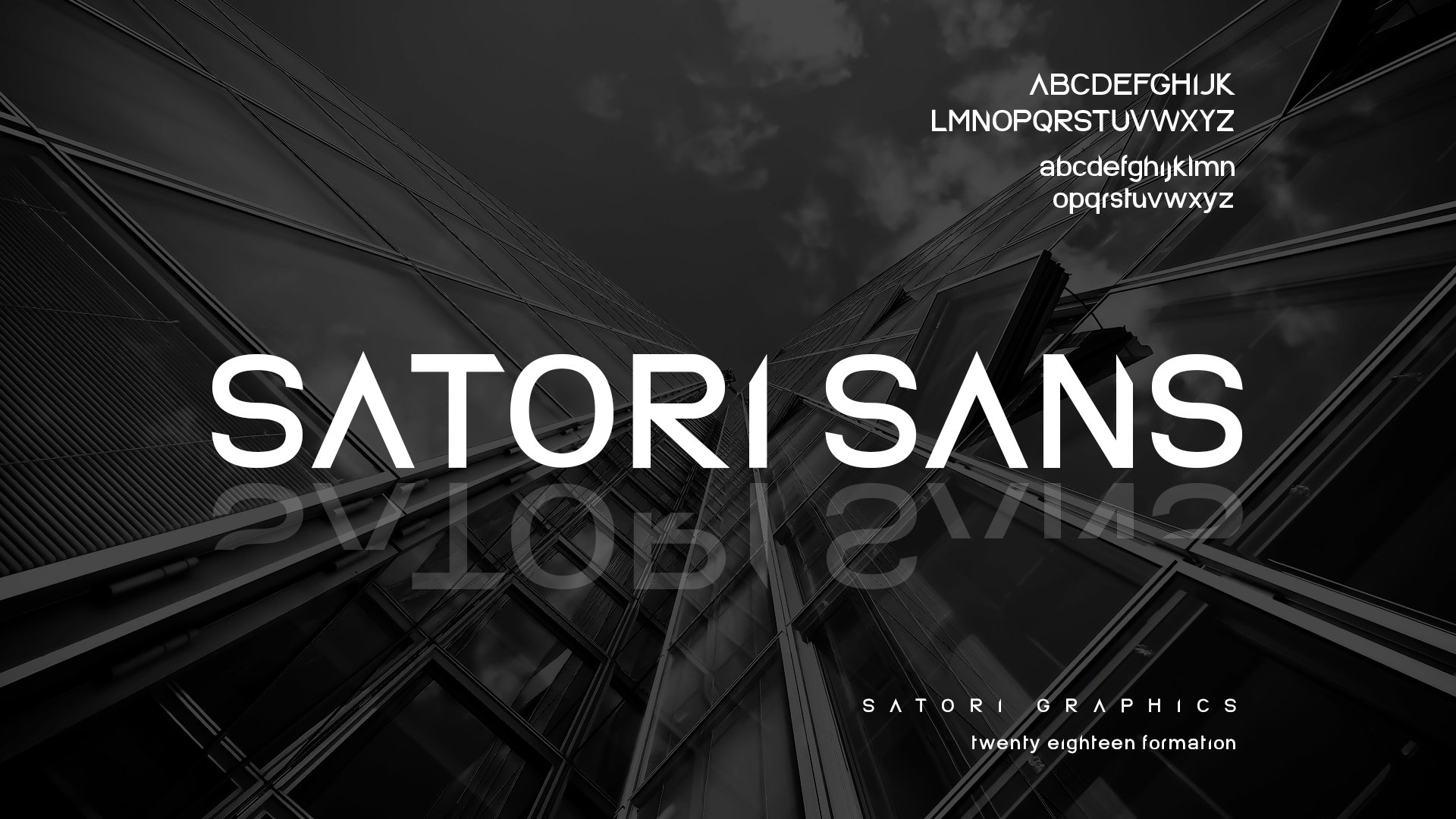
Dear All My dear friend Tom Cargill from Satori Graphics UK designed this great font and gave it for free to his friends network. Because it's Free and i really like his work which have helped me to improve my workflow, i chose to share it with this great community. May you enjoy it and... Design your Futur Today ! Satori Sans.zip
-
multi Silent Ocean - Campaign (2018)
Uncle Mez replied to SalfingerAndrew's topic in Share your work
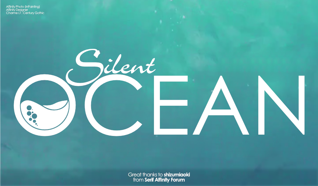
Hello @shizumiaoki first i'm sorry if this frustrate you but i was so impressed bu your design i took a quick Challenge to make something out of what i've seen here and on the website. The challenge to try add into what what you made with both Affinity Desing and SketchApp (in fact desing the same thing using the two software). This really, really helped me a lot to understand more about the Pen Tool from both Software but also to improve with Both software and decide which i would use for what. So... here is the stuff ! to you with great thanks !
- 22 replies
-
- 1
-
-
- maya
- affinity designer
- (and 6 more)
-
Motion, Animation & Parallax Tool
Uncle Mez replied to G.M.1986's topic in Older Feedback & Suggestion Posts
Hello everyone, I'm not making a request to Serif team for a new tool but asking to all Pro here: what motion tool or vector animation software. I want to animate what I create with Adesigner. Your inputs are welcomed. -
Hello @Tchak i've got this one set of 2 Resume in .afdesign for you to use. Hope this will help, text field are editable and color profile is set to CMYK/8 you will find it prepared in 2 Artboards so you can chose and not stick with one that may not please you. Enjoy ! Resume.afdesign
-
TIFF vs PNG
Uncle Mez replied to leoskats's topic in Pre-V2 Archive of Affinity on Desktop Questions (macOS and Windows)
I will give it a try and revert to tell you what i found there. most of my devices (phones and tablets) save photos as JPEG i never dare to try change or check because i didn't care about photo quality before i start with Art (design, photo and other fields included) now i care about so i will give it a good try. -
TIFF vs PNG
Uncle Mez replied to leoskats's topic in Pre-V2 Archive of Affinity on Desktop Questions (macOS and Windows)
thank you my friend. very helpfull but please can you develop about WebP ans SVG ? i really wan to know more about these file format. most internet Designers and even in real world will just tell you: ... Use PNG (16 or 24 or 48) or ... Save it as SVG !!! then comes we bad side of this, you save as SVG then everything fall apart from one software to another and make your life a bad dream you save it as PNG then comes the 16/24/48 ... save as 16 the file is light but when you zoom in ... you see color loss !!! Really i need to know more about all these stuffs. Thanks a lot -
TIFF vs PNG
Uncle Mez replied to leoskats's topic in Pre-V2 Archive of Affinity on Desktop Questions (macOS and Windows)
Guys, this is interesting discussion. I wondered for days what format would be good for my design works. I usually design (combined photo + vectors) for print and web (Facebook etc...) But I end up with bad output when I export as PNG. what do you recommended to me? And why please. There are tons of formats out there (svg, PNG, tiff, BMP, jpeg) but what to use and why? -
Yes, nice point here. Artboard renaming is kind of messy in affinity and a real fix will be of great help but please Devs make it the way no one did before, something purely Serif Affinity. +1 for me.
-
Dream about this on future!
Uncle Mez replied to mcyorian's topic in Older Feedback & Suggestion Posts
Nice one, really nice. -
@carl123 thank you so much for your inputs. Yes surely i take good note of it.
-
Yeah ... i see that ! it was my very first try. is 58MB too much or of lesser quality ? How would you do that ? Please inputs from anyone here regarding this is welcome as i want to better my work.