
TonyO
-
Posts
363 -
Joined
-
Last visited
Everything posted by TonyO
-
 On the pencil settings screen, maybe add an option under the TOOL and DOUBLE TAP ACTION dropdown menus that could be worded: "Double tap enables quick menu by default" - which would gray out the individual TOOL and DOUBLE TAP ACTION dropdowns, and enable the double tap menu on double click for all tools in one action (since doing it one by one for each tool would be a chore and some users might want this menu to come up no matter what tool they're using).
 -
Found a bug in the UI on iPad. From what i can gather, most UI settings are saved between sessions and when the app is closed and reopened. But I am noticing that after the app is restarted, the snapping settings are always turned on by default. And i have to turn them off on every file i open before i start working. Is it possible to save the on/off state of the snapping icon in the top right across sessions so i don't have to toggle it off all the time? I don't remember having to do this in V1, which is why im submitting as a bug and not a feature request. Thanks a million! You guys rock!
-
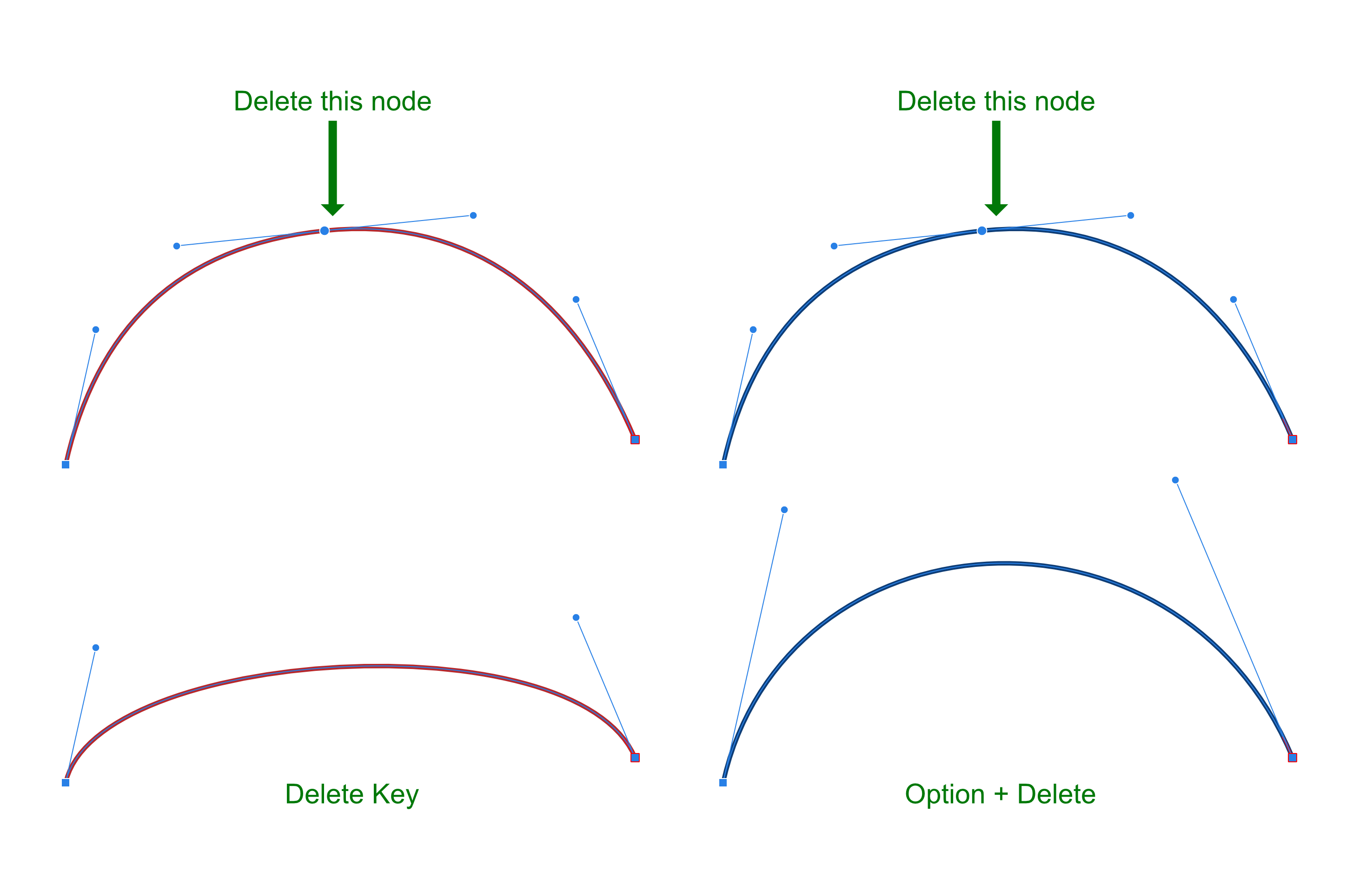
Hi! I have a suggestion that would be really nice for us non-technical figurative illustrators. Currently when deleting a node in the middle of a curve (between 2 other nodes), the default behavior is to maintain the exact direction of the surrounding node handles, often resulting in a warped shape. Designer has a key command to reshape and attempt to maintain the curve when deleting nodes if you alt+delete (windows) or option+delete on mac. It's not perfect but the result is way more useful than the default node delete behavior. This alternate delete function is really good for illustration since creative drawing would rarely have a use for the un-fixed result, but it's an extra step to remember on desktop... and a REALLY unintuitive to perform on iPad. Would it be possible to get a checkbox in the settings menu to "reshape curve on node delete by default" added to the iPad app (and possibly desktop) to perform the equivalent of an option+delete by default when selecting a node and tapping the trash can icon (or hitting delete on desktop)? This would be a godsend on iPad, I always have to reshape curves when node editing my drawings, and allowing the alternate delete behavior by default would save tons of time when editing. Thanks for considering!

-
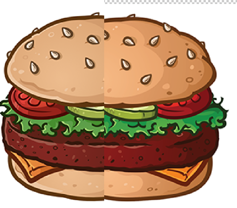
All apps are set to default sRGB IEC61999-2.1. I don't mess with color profiles, I leave everything default at all times, they're too easy to screw up. Might be easier to see the difference if i put them directly side by sliced side. Designer export to PSD on the left, export to EPS on the right. Left is accurate since the color profile carries over.
-
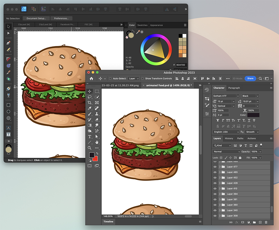
When exporting files from Affinity Designer, the color output per file type is a bit hard to control. I've found that on formats that allow for color profiles to be embedded, such as Jpeg or PSD, the output is generally accurate, give or take a percentage (note the colors between AFD and PSD below)... But when exporting vector formats, such as EPS or SVG, it appears that color profiling is not an option on the export window (likely due to the file format not supporting it? I'm not a color expert). But when an EPS is exported, the colors are heavily saturated when opened in other apps such as AI or Inkscape (see AFD vs AI opening an exported EPS below): Is there a way to enable color profiling on vector outputs from Affinity while keeping vector edit-ability OR possibly do conversions to the hex values to simulate the on-screen colors by baking in and stripping the color profile to change the hex values on export to maintain the onscreen look when importing into another application? My setup is an out-of-the-box Macbook pro, I've never done color calibration to the laptop, as with many mac users, so i can't be the only person experiencing this inconsistency. The colors also look perfect on iPad while editing, havent tried outputting from that version though.
-
Whoops looks like i was still a version back, weird I did a testflight update this morning and it still seemed to be working odd. Works now, doesn't dismiss but doesn't create extra menu instances, works good!
-
Thanks for integrating the double-tap gesture on the Apple Pencil to bring up the new iPad context menu, it's a welcome addition and feels super natural. There is a bug in the implementation though. When the menu is invoked using the pencil double-tap gesture, doing the gesture again while the menu is open will invoke another instance of the context menu, and stack multiple menu instances for every successive double tap gesture. I believe the expected function is that a second double tap gesture would dismiss the menu. This is present in 2.1.0.1703.
-
Three immediate thoughts. 1. I REALLY LIKE DOUBLE TAPPING TO ACTIVATE THIS MENU!! It feels incredible! Such a natural and easy to learn gesture! 2. Found a bug. If you double tap the pencil to bring up the menu, then double tap again, it will keep opening new instances of the menu on top of itself. Then you have to dismiss each one manually. It should probably toggle between opening and closing the menu with each successive double tap. 3. This is off-scope but still kind of on-topic since were talking about pencil double tap. I noticed the dropdown menu for double tap functions includes the move tool, previous tool, undo, zoom and quick menu. Could you add all of the tools to this dropdown (Notably the pen and node tools)? This would let you set specific tool combination toggles and not have to rely on the "previous tool" function. I use the desktop app this way, setting both node and pen tools to the F key shortcut on my keyboard, when drawing i constantly switch between these 2 tools, and all i have to do is tap the F key to toggle between them. It would be great to be able to "lock" two tools together on a double tap in case you have a combination you use often. Edit* I have a fourth thought, haha. It might be a good idea to add a toggle to the settings to "Quick Menu on Double Tap for All Tools" - which would gray out the individual tool double-tap selectors and allow the double-tap gesture to invoke the menu by default on all tools. Some people might want to do this and setting it per-tool in the settings menu would be time consuming. Double tapping has a ton of potential when you really sit down and start listing out ideas, haha! Thanks guys!
-
Cool! I'm going to try this today, thanks!
-
Bump on this, trying to export SVG to use in Tinkercad and the sizing is WAY off. A 51mm wide selected shape in Affinity, export selected only (one single vector shape, filled gray, no outlines). Imports into TC at 88.709 mm wide, also opens in AI at the same scale. A sizing factor of 1.7393921569 (so random it almost seems like RNG), and i cant figure out a proper scale factor. Oddly enough if you copy paste your vectors into illustrator directly from AFD, they paste in at actual size. So you can just save out your SVGs from AI, which is fine if you have access to Abobe like I do through work. I'm guessing inkscape would work too, but I haven't tested it. Shouldn't need the middleman, though. Saving out to EPS also saves proper vector sizes.
-
Export TIFF with bleed?
TonyO replied to Joachim_L's topic in Feedback for Affinity Photo V1 on Desktop
@Dan C You guys are busy! We appreciate you all, thanks! -
I am experiencing a quirk where when the main window of Affinity designer is minimized, clicking the dock icon doesn't return the application to the screen. It leaves it minimized, and it's the only app on Mac OS that seems to have this behavior. I know every install of macOS comes with its own quirks, so it might just be affecting me, does anyone else notice this? Comp 1 copy.mp4
-
Export TIFF with bleed?
TonyO replied to Joachim_L's topic in Feedback for Affinity Photo V1 on Desktop
Old thread, but I'm going to put a bump on it. Appears to still not be working in 2022. Along with the bleed setting, could you also add the option to include marks as well? Bleed is more useful with crop marks. Thanks! -
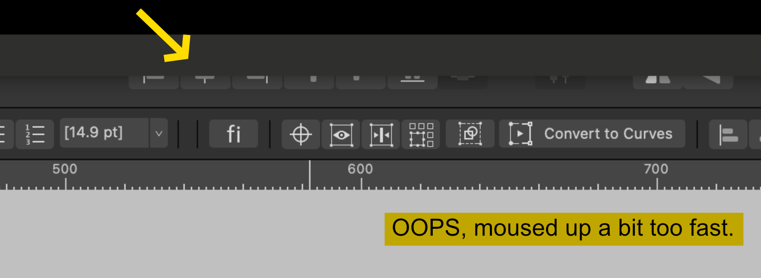
When in MacOS fullscreen, with the option to "never hide menu bar" ENABLED on MacOS menu bar system settings, in Affinity apps when the mouse is hovered over the menu-bar (file, edit, etc.) the stoplight buttons (close, maximize, etc.) drop down in a full width gray bar that covers the top tool bar momentarily. Functionally, it's really easy to accidentally activate the drop down menu bar when mousing up too quicky when intending to use tool bar buttons and personas, the gray bar drops down and covers the icon you meant to click on - which breaks the workflow momentarily. From a visual standpoint, it's weird and distracting. Apple and Adobe apps slide in the stoplight buttons from the left of the toolbar when the menu bar is hovered, and it's much less awkward and visually more pleasing than the slide down bar. Could you implement this behavior in the Mac OS versions of Affinity apps to make it easier to use in Full Screen? As usual with my notes, this is probably super confusing, so I've included a video, haha. Sequence 07_1.mp4
-
The new mesh warp tool is really good, i mean REALLY good. But there is some broken behavior when editing mesh nodes versus standard nodes. It appears that converting between straight/cusp and smooth nodes in mesh editing doesn't do anything. Clicking smooth does not lock the handles, and clicking straight doesn't straighten out the lines. Can the mesh nodes be tweaked to function like regular vector nodes, there are instances where converting to straight lines and sharp curves would be useful/necessary when warping objects - while Smooth mode appears to simply be broken since the handles don't lock together. Comp 1_1.mp4
-
Missing Trash Icon? Harder to delete objects.
TonyO replied to TonyO's topic in V2 Bugs found on iPad
@MEB Thanks so much! It's rare for a service used by so many people to not only interact with their user base, but also value their feedback. I surely speak for most of us when i say you guys are the best! -
Missing Trash Icon? Harder to delete objects.
TonyO replied to TonyO's topic in V2 Bugs found on iPad
My theory is the only conflict that the devs may be trying to avoid is accidental deletion when users try to activate the new overlay button for keyboard shortcuts. Which for new users is entirely understandable. Moving to a universal trash can on the top context bar would alleviate all issues. It's in a space people expect it to be and won't conflict with any existing functions. As for the new overlay button for shortcuts, for advanced users coming over from 1.X, an option to disable and remove the overlay button would be nice. I come from the illustration end of designing in Affinity and extra stuff on my canvas is personally undesirable, I just use multitouch finger modifiers. The new doohickey is activated by default every time i open a file. It's an extra step to turn it off every time i use it. -
Missing Trash Icon? Harder to delete objects.
TonyO replied to TonyO's topic in V2 Bugs found on iPad
Swipe to delete works, it's not a hard gesture to get used to, but a app-wide "delete" inconsistency is starting to form. So here's how you delete different things: Object: 3 finger swipe menu OR swipe the up deselect button (no context icon) Node Tool Editing Nodes: Context menu Trash Can Icon Pen Tool Editing Nodes: Context menu Trash Can Icon Gradient Fill Steps: Context menu Trash Can Icon Transparency Gradient: 3 finger swipe menu OR swipe the up deselect button (no context icon) Vector Crop (when editing with the tool): No trash in context menu / trash can in 3 finger menu deletes object inside of the crop I suggest adopting the trash can in the top context menu bar for any tool that can select an object, node, or otherwise while using the tool. Having multiple on-screen locations for what would be otherwise the equivalent of the single "delete" key on a keyboard can get a bit confusing. Also, the new swipe to delete function isn't documented on the popup help menu, the label should probably read "deselect / swipe up to delete". Just my 2c. I can get used to the new action, but the option to revert in the settings menu would still be really appreciated. I'm not the only person who never, ever uses the deselect function, you can tap anywhere on the document with the select tool to deselect, adobe has trained us for years to do that on the desktop. If there's only room for one icon in that spot, an option to switch it to a static delete button would be super desirable to a large user base. Thanks again! -
Missing Trash Icon? Harder to delete objects.
TonyO replied to TonyO's topic in V2 Bugs found on iPad
@MEB If the devs are set on the new dual function button, I'm pretty sure adding this toggle in the settings would make everyone happy. Can you suggest this please? Thanks so much for talking with us, we appreciate that you guys value our feedback!
-
Missing Trash Icon? Harder to delete objects.
TonyO replied to TonyO's topic in V2 Bugs found on iPad
OR if they are also planning on adding the trash can to the Select Tool's context menu at the top, similar to how the Node Tool has a delete icon, that would be fine. As long as there is somewhere on the screen that we can just delete with without any action that's more complicated than a tap. -
Missing Trash Icon? Harder to delete objects.
TonyO replied to TonyO's topic in V2 Bugs found on iPad
@MEB I get that, and for a newcomer that is likely a better function. But at the same time, taking away a super easy-to-access function that many of us have engrained deep into our muscle memory is a hard change to get used to, especially for us 40+ year-olds who have been using Affinty since the very beginning and are hard coded to the old layout, haha. I'm all for progress when it comes to UI, but a removing the one-tap delete function is so basic that a lack of it will jar alot of users. I would like to ask for us old hats if we could at least have a toggle in the settings menu to just add a simple trash icon back in it's original location. The UNDO/REDO buttons have a toggle, i think a check box for "enable quick delete button" would be a great checkbox to add under it. Pleeeeeaaase? hahahhah. Love u guys! Thanks for considering! -
Missing Trash Icon? Harder to delete objects.
TonyO replied to TonyO's topic in V2 Bugs found on iPad
@MEB Can you suggest to the team to make deleting the default function (tap) and deselect swipe up? Or allow u the option to swap? Its the simplicity of tapping to delete an object that is missing here, adding another non-intuitive step to deleting is undesirable, I think everyone on this thread just wants to tap the pencil on an icon to delete. It shouldnt be something we need to think about. Also, when deleting, Affinity usually defaults to selecting the next layer in the stack, which is useful if you want to delete a few shapes in succession by tapping the icon quickly, which I personally do often. A swipe gesture would slow this down, I personally think the original layout with 2 separate buttons wasn't broken in any way. This new dual function isn't necessary since that whole left tool bar is basically empty staring half way down, there is plenty of room for both. The concept of deselecting is already built into the pasteboard just by tapping on the white area already, I personally have never even used the deselect icon. -
Missing Trash Icon? Harder to delete objects.
TonyO replied to TonyO's topic in V2 Bugs found on iPad
I had thought of this and put in a feature request, didn't get alot of views, but yes double tapping the pencil to bring up that menu would be a godsend. -
Missing Trash Icon? Harder to delete objects.
TonyO replied to TonyO's topic in V2 Bugs found on iPad
Hi @MEB The trash can is missing from the select tool on the context menu, so even if you can scroll, it's not there. It's there on the node tool though, looked like an unintentional omission, there's currently no trash can anywhere in the UI when the select tool is enabled unless you do the 3 finger swipe down for the pop up menu. -
I Vote to lock the thread, nothing productive is happening here.