Lorox
-
Posts
347 -
Joined
-
Last visited
Everything posted by Lorox
-
Is there actually an option in the Affinity apps to set a specific volume or disk partition to be the scratch/temp disk? If there is, it certainly has eluded me up to now... While working with Photoshop I always had set aside a 25–50 GB partition exclusively as a scratch/temp disk for Photoshop. Would be nice to be able to do this for Photo or Desiger as well!
-
Hi there, as of recently I noticed that free disk space on my iMac (OS 10.11.6) gets mysteriously low. Keep in mind here: not on my data partition where all my "regular" files go, but on my system partition where the OS and just the applications as such live. I had a hunch before that I actually seem to notice free space going down when or after using the Affinity apps – just today I had about 1,7 GB less space on the drive after I had worked for an hour on a really small (just 2,9MB!) file in Publisher (and having used Designer inbetween to copy an illustration from there to my Publisher layout file). Even after quitting the apps and hoping to clear some of their (suspected) caches this doesn't change. When I look into my Applications folder I see that Designer, Photo and Publisher are by far the biggest chunks in there: each having just over 1,7 GB (well exceeding the system requirements for installing)! This surely can't be as intended, can it? I'm currently using Publisher 1.8.3, Designer 1.8.2 and Photo 1.8.2. Now I'm actually quite anxious to further use the apps for fear they will eventually eat up so much available disk space that I run into problems with my other apps. Has anybody noticed a similar behaviour on their machines or knows what to do about it?
-
In a way... I'd say, though, that Mesh Warp is a actually bit too "delicate" – you'd be forced to adjust too many handles and or anchors to achieve those rather simple "straight" distortions I was thinking of. Perspective comes nearer but as you always have those 2D planes here (with several points interacting) it appears too difficult – to me at least – to adjust these to the actual (or rather represented) 3D perspective of the image. It would be so easy if for a quick and dirty rule of thumb distortion (or "perspective") adjustment you could just move each corner point separately. I guess anybody who's done this with Photoshop in all those past years will most certainly agree. You don't really want to resort to more or less complicated workarounds once you've experienced ways to do things straight and sipmle...
-
Ah, thank you. I keep forgetting that. Maybe it's also some clashing of nomenclature: ”Quick Mask" and "Edit selection as a layer" – both used in AP for rather the same thing – at least sound quite different...
-
Hi GarryP, thanks or pointing this out, but I actually already knew this is (currently) the (only) way to do it in AP when it comes to modifying just the selection boundaries (and not the pixels). I must say, however, that this procedure seems unnecessarily clumsy to me: going back and forth to the menu and so on... It would really be much more convenient if the function of "editing the selection as a layer" could be accessed by way of a context menu right at your active selection. This way you wouldn't be forced to leave your current area of work to travel across a 27" screen (or even to a second display where your menu bar is...).
-
Thanks a lot – you're right! Seems like I accidentally never hit that sweet spot near the side handles where those double arrows appear... So that sort of works. It can be argued, though, if making the different transformation options directly (and temporarily "isolated") accessibly through a context menu isn't probably a more "general" and/or more easy to learn and eventually more ergonomic way. I always felt that properly equipped (naturally) context aware context menus are such a great help for an easy and effective workflow. They also speed up the learning of a new program as they – in the best case – offer you a good selection of options you might need just where and when you actually need them. In this respect the Adobe apps have done things mostly right, I'd say. Well... that said it should be stated that the whole (free) transformation business is not quite as bad as I thought before. My apologies to Affinity! BUT (as I said before): please add that option to move a selection's cornerpoints individually in order to allow distort freely – this is so useful in many situations! Sometimes you want to be quite drastic at distorting and sometimes you have just to make that little correction at one corner to get a selection aligned properly to some given perspective. It would be so easy IF any corner could be manipulated individually.
-
Yeah, of course it's possible to Scale and Rotate (as basic as it is) – not different as in any design app I know. How to Shear with those handles escapes me, nevertheless. As far as I see I have to revert to the Filter menu to bring up that special Shear panel. Am I missing something here? For anyone who knows what you could do with Photoshop here, the options given by AP must be very disappointing. The workflow to accomplish more complex transformations seems to be really tedious and un-ergonomic to me. If it were just possible to move each corner point of a selection marquee independently to acchieve a free distortion (including "fake" perspective) this would already be a huge improvement over the current status quo. Given all the good features Affinity Photo is offering it's too bad we still have to wait for this very basic function...
-
I – surprisingly – couldn't find anything substantial on this topic here, so I'll start a new one... (and I hope I haven't overlooked some feature of the app that actually would have made this request unnecessary) As it is, I dearly miss something like Photoshops's "Free Transform" in Affinity Photo. In AP the whole transformation business is – to me – rather clumsy and really not ergonomic at all. It can be really tedious to sort of "model" a pixel selection to certain shape by using a combination of scaling, rotating, shearing and distorting (free or in perspective). In Photoshop – which I'd really want to give up in favour of AP – it's all under your fingertips: just press CMD-T and with that context-menu "Free Transform" provides, you can do almost ANYTHING to your pixel selection (either including the selected pixels or not). It's all there under the right mouse button (or just a keyboard shortcut away if you're using a graphics tablet with a pencil) and you can go between ALL the different types of transformations I mentioned above without once returning to the menu bar or some palette. And when you're ready, you hit ENTER and you're done. This is simple, intuitive and just ergonomic and it's been there for years and years. With AP complex transforming is just annoying and unpleasant work to me. I my opinion it's really a strange idea to "hide" transformation options like shear and distort in the "Filters" menu – as these very ARE basic transformations and should be accessible (at least) from the "Transform" panel, if not – as in Photoshop – actually from a context menu on screen right next to the selection you're working on. I personally think it is quite an unreasonable demand in AP that – e.g. – for shearing you have to pull at some abstract lines in an extra panel far from the actual selection on the screen. If this could be adressed some time soon, working in AP would be so much more pleasant for me.

-
Did you already test on version 1.8? I've updated but haven't looked into this again so far...
-
pdf export rasterises simple shape
Lorox replied to woefi's topic in [ARCHIVE] Publisher beta on macOS threads
Exactly! What I brought into this discussion is actually something additional: why does an element (with pixel/transparency-FX) cause another (vector-)element which doesn't overlap and is not even near that first element on the page to be rasterized – obviously ONLY because it is above that second element in the layers’ stack??? For us designer who are designing for print it is absolutely essential to be able to output production ready high end PDFs that enable actual first class print quality and – as well – pass any "normal" prepress checks in Adobe Acrobat or PitStop without any fuss. In my opinion this is a key feature – a plain must-have – and Publisher absolutely must be as proficient and reliable in this respect to be taken seriously as THE InDesign replacement app we have all been hoping for. Well, it's been on the scene not for that long by now, so I really DO hope it'll catch up yet – hopefully sooner than later... -
pdf export rasterises simple shape
Lorox replied to woefi's topic in [ARCHIVE] Publisher beta on macOS threads
I, too, find that PDF export from Publisher (1.7.3 on Mac) is really problematic. Coming from InDesign CS 5 (which is about 10 years old and yet delivers impeccable PDFs for print that pass Acrobat Pro's preflight checks 99% of the time) this is a bit hard to swallow I'd say – given that when using the Afinity apps many designers (me included) want to finally break free of Adobe's claws... With my latest little project I noticed that everything(!) on my page had been rasterized when using a proper CMYK for print setting on exporting – text, vector shapes, everything. I haven't seen anything the like in ten years of InDesign and I'm really disappointed! And I didn't get it, why this strange behaviour occured. As it turned out this will not go away as long as you have any element using pixel FX (drop shadow, glows, the like) on a layer above your vector elements (including any text which you most certainly want to stay crisp and clean in the PDF). It doesn't even matter if the areas of those elements overlap: you can have the element with pixel FX in the upper right corner of your page and a small vector logo in the lower left corner – a hand's width apart – as long as that pixel FX element is above the vector element in the layers panel it will still cause the vectors of the latter to be rasterized in the PDF! You can – of course – try to stack your elements differently (putting all elements that should stay vectors on top of the heap) but this may make giving your layers a logical order (in terms of content) an almost impossible task. So PLEASE, PLEASE work hard on Publisher's PDF export to really produce the quality of PDFs we are used to for so many years now. -
[Photo] Behavior of the snapshot function
Lorox replied to sveto's topic in Feedback for Affinity Photo V1 on Desktop
Hi! It's good to see the snapshots topic is considered worthwile by you! I'm really looking forward to this functionality's further development. Having done some extensive photo editing in AP recently where I needed different states of the file for outputting as separate JPGs I really missed 2 things: – renaming snapshots – updating existing snapshots (while keeping their names) – changing order of the snapshots in the Studio panel Then I was seriously confused for a while when working on my file and sort of "hopping" to and fro in my snapshots I suddenly missed certain layers I was sure I had before and hadn't deleted meanwhile. After a while then I realized that snapshots are definitely NOT comparable to Photoshops "Layer Comps" (which I was obviously thinking) and that in my usage of snapshots I seemed to have mixed them up in my mind somehow. So... If I'm right snapshots are just, well... snapshots and thus strictly bound to the time they are taken (and the document's state at this very time). So when I jump to a snapshot made early in the process I may indeed lose elements (like layers) which had been introduced to the file at a later time. So if I want to modify a certain state of the file that's been saved as a snapshot AND I want to use elements which unfortunately have been added to the document after that snapshot had been taken they just are NOT present in this snapshot and I'm forced to add them all over again. Which very well might pose a problem or be at least time consuming as should be evident. This said I strongly suggest that something like Photoshop's "Layer Comps" should be added to Affinity Photo (maybe even to Designer and Publisher as well). I you look closely to "Layer Comps" you'll see that it is actually quite different to snapshots as when you return to a layer comp made in an earlier stage of editing it always keeps additional elements which were added later but just deactivates them in the Layers panel – so you can just turn them on and integrate them in the "recalled" state you're working on. And you can even then just update your earlier Layer comp and so merge "old" and "new" seamlessly . This just is obviously not possible with snapshots where you actually move your whole document back in time when you restore from an early snapshot... -
Thanks a lot for this example! I wasn't aware you can actually do that in Publisher – so this is really good news. (Guess I really must delve deeper into Publisher...) I do hope now that some of this functionality will be available with underline (and maybe strikthrough) options eventually. In my experience it comes in very handy if you can apply this kind of styling – like mentioned e.g. for a textmarker highlighting effect – to a word (or a couple of words) which are not a paragraph by themselves but rather part of or inside a paragraph. Accordingly you'd need it to be character based (like underline). Anyway, it's good to see this for the time being.
-
It crossed my mind that maybe not all readers/contributors here are familiar with InDesign in general and with what InDesign’s options for underline formatting can achieve. And – that said – why I strongly suggest that similar options should be included in Publisher. For clarification I'm showing a screenshot made using a German language version of InDesign CS 5: The red rounded box around "9354x" is solely made by formatting the underline options as seen at the bottom and the "effect" can be saved as a character style for quick application to other characters, which I find extremely useful. An easier or more elemental application of this technique would (e.g.) be "highlighting" text in some sort of coloured text marker style – with that rounded red box you actually have to add some "hard coded" space like a quarter m-space before and after the text you want surrounded by the red area). You can also do similar things with the strikethrough option, but as the strikethrough is (in z-axis) placed above the text, its uses are certainly more limited. Last but not least (in InDesign) there's also paragraph lines which can be edited accordingly and thus offer a ton of interesting and time saving formatting options (which can be saved as paragraph styles, accordingly). Maybe it becomes a bit more clear now, why I would love to have Publisher offer that functionality as well.
-
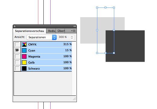
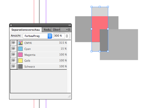
Regarding my post here it has crossed my mind that maybe not everybody has been or still is a user of InDesign and accordingly may not be familiar with the separations and ink coverage preview feature which I described and really would like to see in Publisher in similar functionality. So I'm attaching 3 screenshot which should illustrate what I meant (I hope it becomes sufficiently clear even though the screenshots are from a German language version): BTW: as the mouse pointer/crosshair is not captured in the screenshot it should be said that it had been positioned right in the center where the red and black boxes overlap – the "composite" preview shows all colours (full CMYK) and displays the corresponding ink values for each colour according to mouse position – in the "single" preview M, Y and K have been deselected and only Cyan values are shown in relative grayscale percentage – in the "ink coverage" preview (activated by setting the popup menu to "Farbauftrag" [ink coverage]) you see the same colour values assigned to the individual colours AND you see the area marked in red where ink coverage is above 300% (you can set the desired "warning" percentage on the right) If there was a spot colour used in the document this colour would be listed below the CMYK separations and the values would be displayed accordingly. I hope it becomes clear why I think this a very valuable feature to have in a page layout app. When you're working on print projects and have a palette or "studio" like this, you can check crucial properties of your doccument in terms of colour usage very intuitively and on the fly – you don't have to wait until you export to PDF and maybe just then get some errors you possibly could have avoided if you had been able to inspect your document in a way as such a feature offers.
-
Up to this day I wasn't aware of what is likely to come... I guess, however that it is in fact quite the sort of thing I was thinking of. It remains to be seen how that'll turn out in detail. I'm really looking forward to it! What I said about checking ink coverage and separations is probably not entirely to be seen as part of a final flightcheck but a way of being able to check on those values any time while working on the document. Just like InDesign handles it – more a different way to be able to look at the design and be given "colour warnings" (if necessary) at an earlier stage than at final export.
-
I strongly support the idea of a dedicated preflight check feature as I don't think everybody using Publisher can fall back to a version Acrobat Pro on his or her hard drive to do that job properly. In another discussion on the forum here I also expressed my urgent wish that there should be some panel like InDesign's "Separation Preview" and an customizeable ink coverage checker which will tell you visuallly where in your document objects may have more ink coverage than a certain value which you can set beforehand. (e.g. to spot critical objects when you work with a printer that demands ink coverage in a CMYK PDF shouldn't exceed 300%) Another thing important to me would be the option to change/convert any spot colours which have accidentally found their way into the document (e.g. with some logo placed there) to global CMYK colours from within the colour pallette so as to remove spot colours completely from the document and not just not "honouring" them in the export settings.
-
Thanks, I wouldn't have thought of that... Actually, however, checking ink coverage is quite important for me as many online printers do not want more than overall 300% coverage and I feel much more comfortable when sending out print PDFs if I know beforehand that there won't be trouble in that regard. Say what you want about Adobe InDesign but they've got some features just right there and I hope Publisher will learn from some of those in future updates. All things considered I tend to feel that PDF export from Publisher leaves something to be desired yet as I usually get several error messages when flightchecking a Publisher generated PDF for print in Acrobat Pro. According to some prepress forums I visited I also might not be the only one (which might indicate that it's not just me doing something wrong when exporting those PDFs).
-
Exactly! I especially miss the ability of what in InDesign is called "Separations Preview" where you can check the individual separations of your document before exporting a PDF and you can also check on the ink coverage of individual objects (and even let the program indicate all areas in the layout were ink coverage is above a certain value that you can set individually beforehand). This is so useful in professional prepress work that I DEARLY miss this feature in Affinity Publisher. PLEASE add something like this in a (near) future update!
-
I think this is in fact not satisfactory as I REALLY like to have the option to change/convert a given spot colour to its correspondent global CMYK colour – so to speak on a colour swatch basis – within the swatches pallette. Often when you're doing a print layout (here: in Publisher) you receive logos from a client which are to be used there and which (from their original "ideal" design) contain spot colours that you definitely will NOT use in printing then and in the future as it is all going to be pure CMYK (mainly because of economic reasons as spot colours tend to be quite expensive in everyday printing). To avoid any problems beforehand(!) when preparing PDFs for giving to the printer it has over the years been very useful/effective for me in InDesign to be able to change any spot colours to global CMYK from within the swatches pallette. I really DO wish this were possible in Publisher as well!
-
Hi garrettm30, I agree totally with you when you point at the Affinity apps being (relatively) new as compared to those by Adobe. That said it only seems natural to give Affinity/Serif some time to further improve their already great apps in order to add something like the (possibly advanced) features which have proven to be actually quite useful in InDesign & co. But then Adobe so far has had decades(!) more of time to come up with them... Yeah, we shouldn't forget that to be fair when we compare things. The disparity of features within the same "family" of apps is actually something which has bothered me a lot during the time I've used the Adobe CS(!) apps (which, I admit, I still do for legacy reasons). This is certainly annoying – especially when you observe that those disparities don't get straightened or unified even after several major updates. Instead Adobe has seen it more fitting to add several special – and possibly rarely used in real life – features selectively to one or the other of their apps... I really hope, Affinity/Serif having the benefit of a fresh and more coordinated start in terms of development will see to that things remain very closely related if not identical in handling things within Designer/Photo/Publisher. Talking of this, I recently wondered why there doesn't seem to be a thing like "Snapshots" in Publisher (being the most recent app) whereas in Designer and Photo this feature has been there (I think) from the beginning? Even given that Snapshot’s functionality is IMHO not yet as perfect as it should be, it’s a useful feature nevertheless and it should really be available in Publisher, too... It would be a nice thing to have consistently a your hands in all of the 3 apps.
-
Having looked around a bit more I have to add to my comment/suggestion made above: while it has served me very well in years past, the way InDesign handles the options of underlines and strikethroughs might not be – in respect to the actual specs of the font they are applied to – what should really be expected in ways of font design. At least when you just go for the defaults. Here ( https://www.harbortype.com/blog/the-state-of-underlines-and-strikethroughs/ ) is an interesting blog post on the subject. Yet, in that post Affinity Designer is stated to handle things quite right (but ONLY regarding the default handling, as customizing the appearance of underlines and strikethroughs is not possible so far. As it isn't in Publisher, neither and regrettably). However, as it is there now seems to be a proper chance for the Affinity apps to do things right right from the start, should the developers – hopefully – decide to give users full control over the features in question. Having the defaults right in the first place should be a good place to take off from into the finer aspects of custom designing appeareances here. So I'd say: look what you can already do in InDesign, give us Affinity users these options as well, but make it even BETTER! For example measurements like line thickness, offset and so on should (also) be available in units relative to the character size and not just in fixed units like points or millimeters. When using relative units, changes made to the text attributes (most notably a change of font size) would be immediately reflected in the appearance of the underlines and strikethroughs. This could save so much time as you wouldn't have to adjust everything by hand after making a character/word bigger or smaller (as it is inevitable when handling things like InDesign does).
-
I strongly support the suggestion that there just HAVE to be options to style the way characters can be underlined as well as having similar options for paragraph rulers. InDesign does (has done for years to be exact) in fact a very good job regarding typographic finetuning in these respects and it would be quite a shame if Affinity Publisher continued to fall short of those typographic options. I admit that these are not of the kind of options which you just stumble upon when you begin page layout/design but once you know these are available it opens up a ton of creative possibilities to style your text on the page. You'll never want to miss it again...! I remember very well what true revelation it had been for me when I finally discovered what was actually possible in InDesign by tweaking those options of underlining, strikethrough (on character basis) and paragraph rulers (on paragraph basis) – there is so much more to it than first meets the eye (or mind, at that). So PLEASE study InDesign well in this respect and give users of Affinity Publisher similar control(s)!
-
That, actually, was what I thought in the back of my mind... ;-( (despite making that suggestion)
-
Yes, exactly – same with me! Especially as many of those going for the Affinity apps these days (and for a reason...) often have years of experience with the Adobe apps and their workflow. As said before: it's certainly no good idea to mimick other established programs too closely and ending up with a copy that's just got another name, but besides coming up with convincing and intuitive new fresh concepts to do things it is not a bad idea, however, to closely study the rivals and see where they actually may have a point. Learning from your "enemies" might well increase the chance to beat them eventually... Your idea regarding the representation of a (circular/elliptical) gradient is interesting, but I see the same problems with additional inbetween colour stops. They would have to be on each axis, I'd think, but connected or "mirrored" in a way.