Lorox
-
Posts
347 -
Joined
-
Last visited
Everything posted by Lorox
-
I just tried and maybe I have an explanation: If I create a new file of the original via "Save as…“ the Title (or the "Title" field) of the PDF gets updated – just like you wrote. However, if I copy/duplicate a Publisher file in the Finder and then subsequently change its file name in the Finder, the PDF Title (or the content of the "Title" field) of the original file is actually preserved! I guess that my "new" file (as mentionend above in my original post) had been created by just duplicating it in the Finder and I then used it for the new project – most likely the Title will eventually update if I "Save as…" this new file under an even newer name..
-
I just found the place – but it's so well hidden! WIndow > References > Fields
-
I just came across something I cannot quite explain (or change): I've exported a flyer design from Publisher v2.4 as a PDF for print and when I check its PDF "Info" in my Mac's Preview app (or in other PDF readers) I find that in the PDF’s "Info" an old file name gets displayed as its "Title" – which is the file name the file originally had (from another project) before I redesigned it and then per „Save as…" gave it its current file name. Is there any place in Publisher where you can actually change the "Title" (as opposed to file name) of a PDF you're going to export? I always thought that title would automatically be taken from the file name of the Publisher file in the Export process. Most people will possibly not even look at a PDF's "title" via its ”Info" (as its file name primarily tells what it is), but for anyone who does, this is actually a bit irritating. And as for privacy reasons of authors/designers I don't really think it's appropriate or desireable that anybody can uncover/see an old Title from some completely different previous context – whatever that may be...
-
Hide foreign language fonts
Lorox replied to Jeremy Bohn's topic in Feedback for Affinity Publisher V1 on Desktop
I just happened to be annoyed (again) by the clogged font menus in the Affinity apps (and not only there to be frank), so I once again did some searching the web... 1 If it's to believed what many people say, it boils down to Apple adding all these fonts to the OS and effectively preventing them from being deactivated by any 3rd party font managers in the way you generally activate/deactivate fonts you yourself have added to your mac. 2 However, in Apple's "Font Book" app you have (always?) been able to filter the list of available fonts by choosing "font collections" like "All Fonts", "Favorites", "Recently used“, "English (or whatever OS language you have)" etc. (on the left in Font Book's UI) 3 Only today I've learned that you can actually use these (OS/Font Book related/created) font "collections" in Affinity, too, to slim down your font menu! However, this only seems to work in Affinity's "Character" palette (WIndow > Text > Character). Say you have your Affinity app(s) run in English you should be able to choose "English" in the upper left corner of the Character palette and magically exotic and unwanted fonts like "Al Bayan", "Noto Sans Myanmar" etc. will not longer populate that dropdown menu! For me this is a huge improvement. 4 If you're used to just select/assign your fonts by the dropdown menu on the left side of the Affinity context toolbar, you will not be that happy, though, because this font menu is not affected by choosing "English" as the active font collection (as described in 3) – here all the foreign language fonts you probably will never use are still present... So, at the moment, I see no other way to a more user friendly font menu than to use the dropdown in the Character window/palette with your language chosen as the active collection. If anyone has any information to do it another way, it will be appreciated, but after reading what so many users wrote about the issue I actually doubt that there is a current solution... -
Thanks for asking but the issue has been solved by "Return" (see my answer to his post).
-
Dead on! Thanks a lot – I had actually taken a short look at the diagramm fields (which were "normal") in the Blend Options but hadn't noticed that in that little text input it had indeed been set to 75% there… Looking back I can't say, however, why I had set the opacity there in the first place! Also thanks to GarryP as you pointed in the same direction. I really don't want to blame others for my apparent dumbness, but this thing might nevertheless indicate an issue with the Affinity UI which other users have repeatedly mentioned i.e. that certain more or less closely related settings are sometimes a bit scattered around in various places and you may have a bit of a hard time to remember/visit the all to get a clear view of what's going on with some particular element/object.
-
I just opened a Publisher File (v1) from 2022 to finally edit it for print in Publisher v2 and came across something I cannot really explain how I might have done it when I created that file back then. (It doesn't actually matter, though, if I open the file in v2 or v1 – it's the same in both versions) In that file there is a blue flat colour rectangle which appears to be somewhat transparent or have a reduced opacity but I just can't find the place where it might have been set that way anymore... (so I cannot set it to totally opaque anymore) I'm attaching 4 screenshots from an example file illustrating the phenomenon: – the lighter blue rectangles have been copied from that old file mentioned above and then were pasted here – the darker blue files have been freshly created in the new file with seemingly the SAME settings for color (and opacity (see values in screenshots) – obviously the (original) lighter blue rectangles have a reduced opacity (75% to be precise – as the CMYK colour values show when picked up by the colour picker ) but still have full 100% opacity set in the Colour palette as well as in the Layers palette. Also all the rectangles are in "normal" blend mode. There is no opacity setting assigned by the Transparency tool. What am I possibly missing here? Where do those "old rectangles" get their transparency resp. reduced opacity from, if not from Colour or Layers opacity?

-
As I described in another thread earkier this year I've been experiencing severe problems while preflight checking my PDFs for print with the PACKZVIEW app which before worked absolutely fine with PDFs exported by APublisher v 1.xx With v2-Exports, however, there have been areas (related to transparency used there) in my PDFs, which PACKZVIEW couldn't display properly anymore (and which made these preflight checks quite unusable). Actually only an opaque light red rectangle covering the area in question could be seen there – but only in PACKZVIEW, so far any other app has been showing the PDFs correctly (and they have printed correctly as well...) I've temporarily been in contact with the PACKZVIEW guys and they basically told me that within the PDFs showing that problem the PACKZVIEW app obviously encountered an unexpected or "unknown“ format. ("picture format" that is, if I remember correctly) Seeing just what you wrote almost 3 years ago immediately reminded me of that rather recent "not expected" or "unknown" format in PDFs exported by Affinity v2 apps... As this thread here obviously predates my PDF problems by quite some time and accordingly is related to the v1 apps it might be somethin diffenrent altogehther, but to me it nevertheless seemed to ring a little bell...
-
1 bit TIFF/Bitmap support please
Lorox replied to Chris L's topic in Feedback for Affinity Photo V1 on Desktop
Yes, exactly what I've been thinking... As the 1-bit thing seems so basic (and intuitive) and has proven to be so useful in everyday design jobs (over years of usage in InDesign back in the day) I really don't get it why the guys at Serif seem so adamant of not implementing proper support in the Affinity apps. To be honest: as to my current typical jobs I've generally been able so far to get away with that PNG K-only thing, but knowing there have been ways to use 1-bit bitmap properly and to the benefit of users for decades now it feels more than a bit odd to have find workarounds in modern software which (in many respects rightfully and successfully) challenges the industry master(s) of the past... -
I had no idea what would follow when I started this topic with that little problem I had with aligning objects with the new v2.4 feature... Guys, please don’t get that upset with this – effectively – minor issue that actually seems to be more or less subject to personal preference. What counts is that we actually can get ever more things nicely done in Affinity. And comfortably aligning objects is one of those. Now that I know how it's done I personally don't really care if I have to select that alignment icon or another first to access the dropdown for more specific control. Come on, as to this feature it's just one button to push before getting the desired result! But yes: there are other things in Affinity which are entirely not there yet and which I (and many others, I guess) dearly miss – like blends, image tracing, real(!) vector brushes and the ability to adjust stroke widths at specific places directly at specific points on the path and not via some abstract curve on/in a detached pallette (to name just a few). Let the devs devote their time and effort to these instead of the minor issue this thread seems to have turned to!
-
Ah, look here! I actually didn't remember clearly that it had been different with v1 than it is with v2, but that's possibly the reason why I felt so irritated when the dropdown was greyed out as long as I din't make the actual choice of what alignment I was going to do... Anyway, I actually do understand both lines of thought leading to greying the dropdown out or not – maybe eventually it's just the way you're "wired" personally which lets you prefer one or the other. That being said, once you know what order of actions you have to take, it is in fact very easy to see if you’re getting what you want as the live preview immediately kicks in and you can always choose another operation or just opt out if it isn't at all what you wanted.
-
@Pšenda: Yeah, I guess you're right, when I give it a second thought. Sometimes you're just so focussed on what you want to do at a specific occasion or in a specific place that you don't really think about what another user would possibly want to do actually using basically the same part of the interface where you sort of expect just your options to display. Maybe it's human nature to be a bit shortcircuited at times... But yes, you really cannot blame the Afffinity guys here!
-
Man, thank you so much – you were absolutely right! I actually thought I should be able to change something in that dropdown menu, but as it seems to be greyed out so you cannot change the current entry until you actually make a specific choice of alignment (e.g. top/middle/bottom) for your selection by selecting the corresponding button/icon – which I hadn't done yet – I felt a bit irritated and just left it at "Selection Bounds" and (unwillingly, though) thought it had to be that way... Always good to ask someone who knows... That being said: the feature is great and (now) does just what I hoped it would do!
-
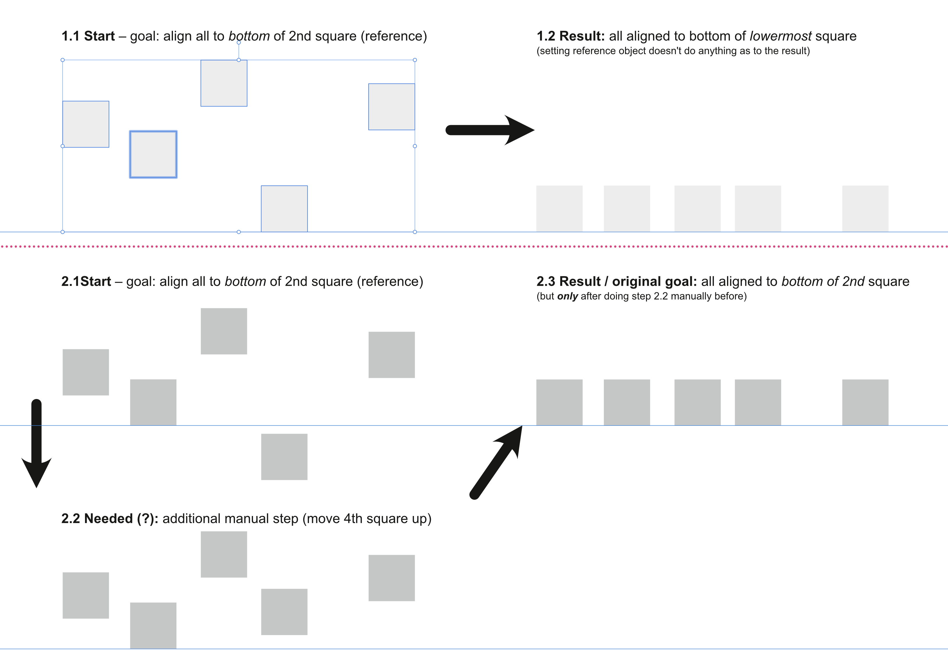
I just installed the updates and I was really looking forward to the new "reference object feature" for aligning several objects. However, while this seems to work with distributing (alt-click one object of several selected ones to have this and the one to the left [if I remember correctly] of it as the reference for distributing/spacing) I cannot make that ”reference thing“ work for simple top/middle/bottom alignments (like it has been a standard in AI since quite a long time). What I mean is: if I have – say – 5 objects distributed in random vertical positions on my artboard and I want to align all of these to the bottom of i.e. the second one, I thought/hoped that I can now alt-click that second one (which as the reference object gets that special selection outline), click the "align bottom" icon and have all of my selected objects aligned with their bottom selection bounds to the bottom of that reference object. (Accordingly, of course, as all other alignment options are concerned). (see attached screenshot) I really did love this feature of reference objects for alignments in AI as it often came in very handy as it didn't make it necessary to manually put some objects in more suitable positions beforehand. I am missing something here or does it really not (yet) work in v 2.4 as I actually hoped for?
-
No document-wide replace font?
Lorox replied to Jeremy Bohn's topic in Feedback for Affinity Publisher V1 on Desktop
@loukash Thank you for mentioning this app which I didn't know up to now! Judging by what’s to learn on its website it actually might be quite promising... Now that FontExplorer X has been discontinued I had been asking myself for a while how to comfortably manage my zillions of fonts in the longer run... Actually I, like you, don't care too much about auto-activation of fonts. I rather prefer to be reminded of what fonts might be missing for a certain document and then activate them myself. I feel like I'm having better control/overview this way (hopelessly old school, I guess...). And yeah, I share your opinion about Publisher's ”Font Manager“ – it's like they stopped somewhat in the middle with this tool/panel. -
No document-wide replace font?
Lorox replied to Jeremy Bohn's topic in Feedback for Affinity Publisher V1 on Desktop
Ah, thank you for pointing out this solution – I guess I never would have thought looking at it this way. Nevertheless, there definitely should be a way in (at least) Publisher to do documentwide missing font replacement via the app’s "Font Manager“ as it is there where missing fonts are listed on the first hand and where you then would naturally want to resolve the issue wholesale (instead of "hopping“ from one incidence within the doccument to the next). In InDesign you have been easily able to do documentwide font replacement for ages... On the other hand I don't quite see an issue with not finding fonts that are actually not installed on the system (or which maybe are in fact present on the drive but not activated by a Font Manager i.e. like FontExplorer X, Suitcase et al.) This seems only natural to me – when you encounter a missing font that's not currently active on the system you'll just have to ensure that it is by installing/activating it. And if you haven’t got it you cannot use it... you wouldn't really expect otherwise, would you? -
As of today I noticed that most EPS files I recently got from Freepik (which would open just as pixel layers in Designer) could easily be saved as PDF from „Preview“ but these (except – miraculously – one or two) still opened (only) as pixel layers in Designer. What did work, though, was opening the EPS files in „Photopea“ (web interface) and then saving them as PSD(!) files. These I could open with Designer and had all the vector shapes, layers and groups (if applicable) intact!
-
Yeah, this reluctance/unability of Affinity Designer to open EPS files like these (and many other from Freepik etc.) correctly as vectors is quite annoying and took me by surprise as well. I wish this could be fixed in future versoins of AD. Strangely enough, when I opened these EPS with „Preview“ (on Mac) I was actually able to save just one or two of them as PDFs which Designer then opened as editable vectors. With others, however, the PDFs saved out of „Preview“ were just pixel images (on one of more layers with masks) when opened with Designer. I tried a couple of online EPS to PDF converters, too, but I only got pixel images this way as well. If you have an (even an old vintage/legacy) version of AI on some machine you can open these EPS with that copy of AI and then save as e.g. PDF, which I found can be opened in Designer with no problems. However, Photopea did do the trick: when opened in Photopea’s browswer interface and saved as PSD(!), Designer could open these PSD files preserving all the vector shapes and their grouping (if there was one). [I didn't actually notice the option to save/export as SVG from Photopea...] Always interesting what you'll learn even after a couple of years with the Affinity apps...
-
@MikeTO Thanks a lot, Mike! This really helps and your Manual is just awesome – really high class work!
-
Is there a way to adjust only the spacing between words while not changing overall tracking? I'm asking because every now and then you have a font where the „space“ character seems just a bit wide and you want the gaps between words to be a bit narrower. I seem to remember faintly that in InDesign there used to be a setting which you could make to achieve this: just narowing the gaps between words and not touching the overall tracking (regardless whether the text was set justified or unjustified) – just like you made the „space“ character generally a bit less wide in the selected text. Can this be done in Publisher?
-
For my part I have to confess that – contrary to using and making Photoshop actions back in the day – I still haven't made use of any Macros in Affinity so far... Maybe it's time now to go for it...
-
Oh... I didn't notice this (or wasn't quite aware you could do it this way). Maybe the slightly stronger jaggedness of the reticulation grainin AP which I seemed to be noticing is possibly connected to a certain setting that had been made or to the resolution of the example? Anyway, I your contribution is highly appreciated!
-
Yeah, nicely done! Thanks a lot!
-
Thanks a lot, @smadell – nice work! It seems, however, that the grain Affinity Photo can produce is looking a bit more "jagged" and not quite as round and "pleasing" as the one Photoshop can achieve using its "Reticulation" filter. But that certainly doesn't take anything away from your work – it’s just AP's (current) limitation...
-
Hi Nuth1n, that's some real nice work! I just watched a YT clip by Brady from Texturelabs (which are always a pleasure to watch, even if you eventually ditched PS...) on the Photoshop side of grainy gradients and I immediately wondered if (and if yes how) you could possibly do something close to that in Affinity Photo. Your file is a very helpful reference here! One would wish, though, it could be a bit less complex in AP and more straightforward as it is in PS, but as Affinity Photo hasn't got that Reticulation filter I guess that cannot be helped. Actually – mostly when doing more illustrative work – I quite often find myself missing some of those effects in AP which PS's Filter Gallery has been offering for such a long time now. But then, we're just in version 2.3.1 with AP whereas PS is currently v 25.4...