Aroni
-
Posts
6 -
Joined
-
Last visited
Everything posted by Aroni
-
Wow, I have so far to go. And thank you for sharing. Aside from the amazing design, I learnt a lot. Thank you again @shizumiaoki
- 22 replies
-
- 1
-

-
- maya
- affinity designer
- (and 6 more)
-
 I'm no expert but it could be that because it is saved on GoogleDrive which makes the file accessible across a network, maybe somewhere in the jungle, some bit of code has a handle on the file? Try work on the files locally then copy them over to the GoogleDrive folder and see if it still happens. Annoying, yes - but I had the same problem with Microsoft products.
 -
Again, amazing response! Solved, solved and sent to the printers. Especially thank you @firstdefence for making such a cute picture of Frank, it made me smile. Thank you @A_B_C for the animated GIF. and again thanks @MEB for always answering everyone's questions - what, are you like 20 people?
-
Sorry in advance if this has been posted before. I suck at internetting. Frank behind the sunshine here is just a cog masking an image (of Frank).Very simple. If you click that picture you can see that Franks hammer isn't quite flush to the edge of the cog. You can see that there is a slight pink edge where his hammer is revealed through the mask. It is especially pronounced where colours contrast. You can see here the printer makes damn sure that you clearly see a fault in the design. Also when using a guide to snap an object to line up, it should, you know... line up. Let's take the guide away: So what I'm asking is... a few things; Is there something I'm doing wrong? If not, is there a kind of practice to follow when designing? (eg. use pixels as measurements and snap, size and move objects by whole pixels?) Is it because I'm designing on a (god forbid) PC? Is it something to do with the aliasing on my graphics card interfering with the program? Is it the zoom?

-
User Interface - picture dimensions in pixels?
Aroni replied to Aroni's topic in Older Feedback & Suggestion Posts
Hello everyone and thank you for answering so soon! @R C-R I'm editing a tonne of those little pics and one saved click/keystroke can amount lot of work time. @MEB Thank you!! @Dan C Thank you!! I'll print out a card to get used to them. -
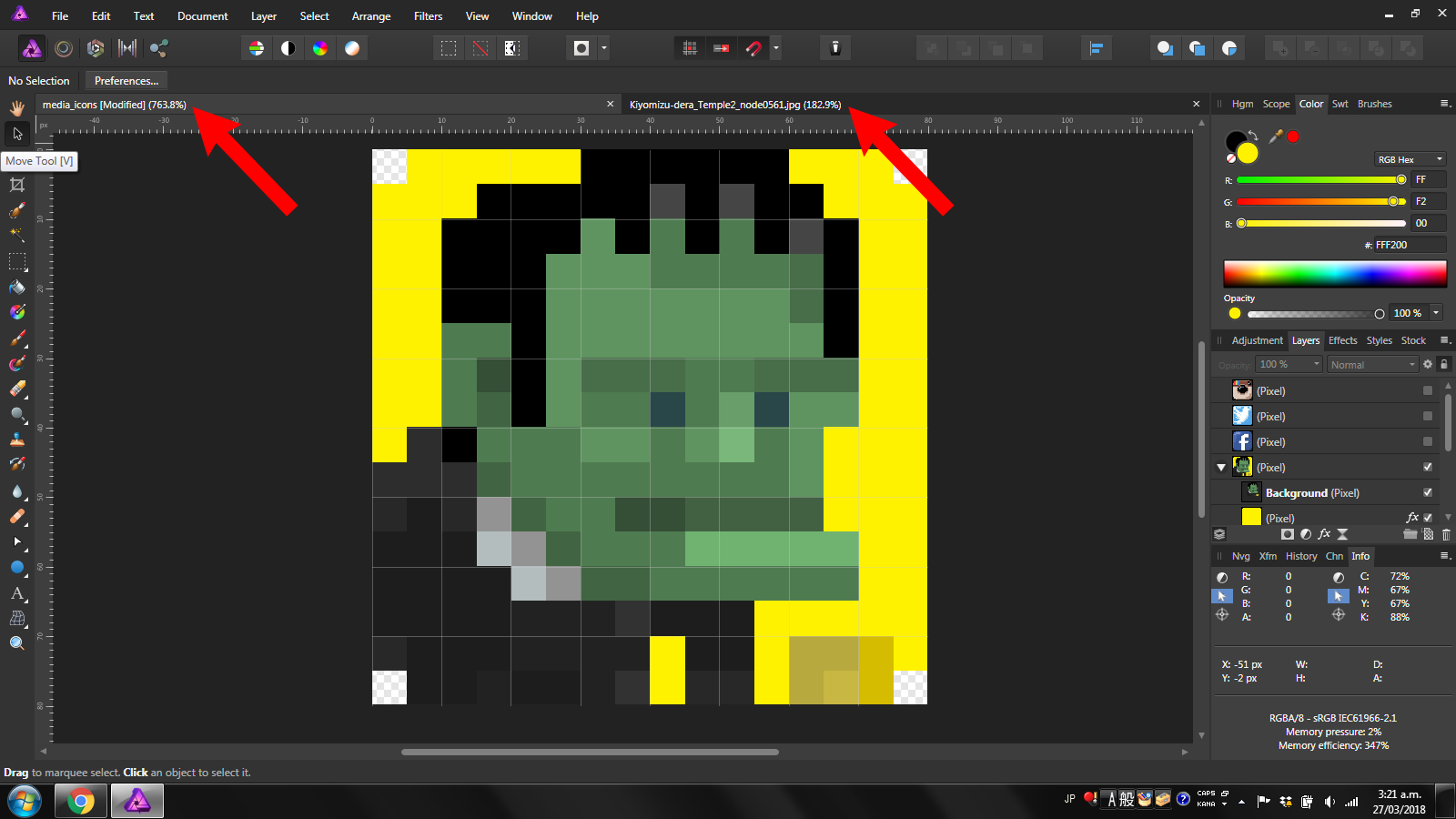
Please help!! How can I see how big my images are without extra clicks? Take a look at the following image: For the life of me, I can't find anywhere that shows the image dimensions except for if I'm using the view tool or if I'm resizing the thing. I mean, isn't that a thousand times more important than knowing how much the image is zoomed in? Hopefully I'm just missing something blatantly obvious because its really late. I put giant red arrows to point where I would like to see them, but then I guess I should be posting that in the suggestions bit. P.S. Any help is super appreciated.