hannah
-
Posts
61 -
Joined
-
Last visited
Everything posted by hannah
-
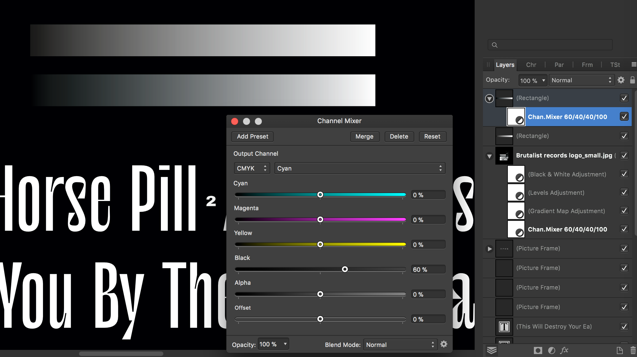
There is a somewhat effortful workaround I found for matching my blacks to a predefined rich black (lets say 60/40/40/100). + You've to start with a K-only image or use the black-and white adjustment layer. + Then you can use the Channel Mixer and give each colour the desired value on the "black" slider. So for Cyan the output channel would be 0/0/0/60. For Magenta it would be 0/0/0/40, etc, etc, etc You can see in the picture that the second rectangle merges now into the background. It solves my specific problem, I hate it though! Otherwise LOVE the programs

-
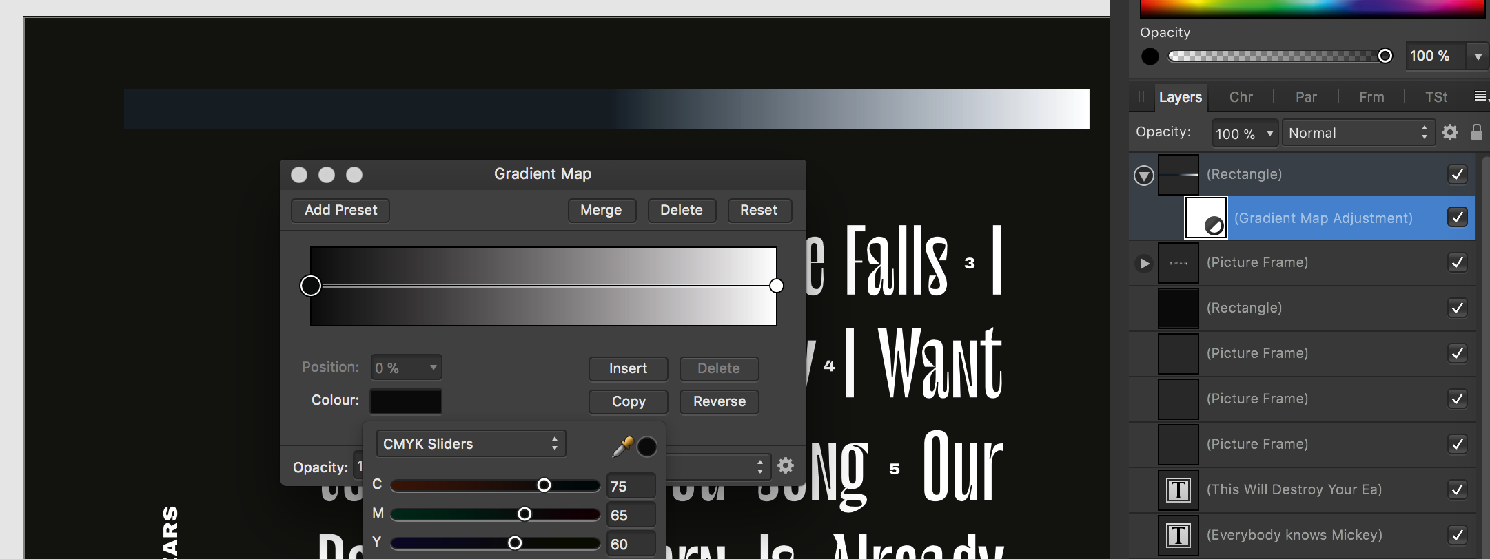
Unfortunately I am still experiencing this painfully persisting problem (MAC, Publisher 1.10.5): Something with the gradient map in cmyk is not working, especially in the blues and greens. It makes some basic graphic design moves impossible: The bar on top of the typo should 100% match the background-black in the dark areas, but it's completely shifted to the blue. It's so frustrating and at best, time-consuming if not impossible to find different solution.
-
Grid less than 4px (Affinity Designer 1.8.1 Mac OS)
hannah replied to Bludocs's topic in V1 Bugs found on macOS
solved it for me! -
Hello! Just here to offer a little workaround and an insight into a funny behaviour of affinity designer: So far I only come across this problem when expanding the stroke of a font in order to make it look just a tiny bit bolder. so more often than not, the strokes I want to expand are less than a point to start with. her the results get very messy. Strangely enough for a vector-program, when I scale the font (scaling the stroke with it), make it way bigger and then expand the stroke the results are good, or at least much much better. (meaning more letters are expanded well, less letters are faulty). Good day! Hannah
-
Change color to white
hannah replied to kina's topic in Pre-V2 Archive of Affinity on Desktop Questions (macOS and Windows)
hahaha, I lost the grain somewhere down the line, you are right of course -
Change color to white
hannah replied to kina's topic in Pre-V2 Archive of Affinity on Desktop Questions (macOS and Windows)
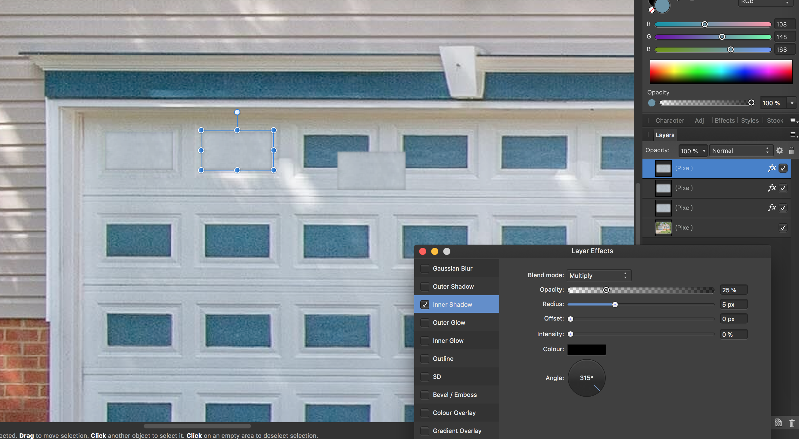
Not a re-colouring-answer : (As the question concerns just the tiles of the garage) so far the nicest looking for me, was stitching together a tile made of the white parts of the garage and putting them above the blue... looks convincing!?
-
Gradient Map - colors are not consistent
hannah replied to SilvRO's topic in V1 Bugs found on Windows
Ah, sorry Wosven, I just saw your hint. Yes, I tried with channel-mixer but can't work it out for the beige at the same time. And no layer-effect is giving me what I want neither. -
Gradient Map - colors are not consistent
hannah replied to SilvRO's topic in V1 Bugs found on Windows
Thank you for replying. I haven't searched for corresponding Pantone colours yet, but I could try, if using spot-colours during the process would yield better results?!? But ultimately it'll be printed in CMYK, and the final product has to "match" what the client already has... I came up with the aesthetics for the client using adobe products and now i cannot reproduce this "simple" effect with affinity. Attached is screenshot of what i try to achieve. I need the same colours to be available within the picture as well as in simply colored areas...
-
Gradient Map - colors are not consistent
hannah replied to SilvRO's topic in V1 Bugs found on Windows
Hello dear people, does ANYONE please know a WORKAROUND here? My work requires me know to recouler a greyscale-image (black should be a specific cmyk colour, white should also become a specific colour, like a bright beige). I tryed to reach this via channel mixer but i cannot make it work... Dearest people of affinity, i so hope that this will be solved. It complicates but sometimes, like right now, makes my work impossible. This problem persists across all affinity products (desktop photo, designer and publisher). (Connected to it, there seems to be an issue presenting any cmyk colour truthfully within the context-menu of the gradient map tool, like along the little gradient bar.). THANK YOU -
Thanks a lot for mac_heibu for sharing this insights and resources. the cleverprinting-PDF is wow :)
-
yes yes yes!!!! Found it, preferences : user interface. Thank you John, indeed what we see is rarely what we get...
-
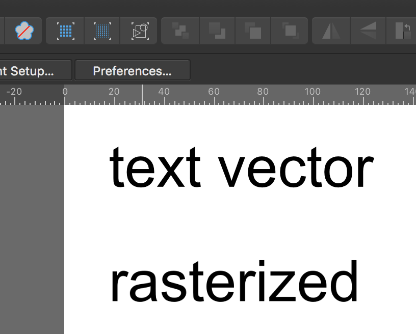
Just for clarification : To export a pdf means, whatever has been in pixel before, stays rasterized. Meaning that exporting something as an pdf is not a way to vectorize stuff. pdf Export settings : So if your text really were in vector, but after the export they are rasterized, then it could be the export setting. If you choose to export a pdf, look under "more" there you find rasterizing options. See which elements are vector and which are pixel : Open your document (should work with a pdf as well) and use Outline-Viewmode (little icon showing some geometrical shapes). See attached screenshots with the icon activated. Everything that is rasterized will appear as an empty rectangle when viewed in this mode. Hope that helps.
-
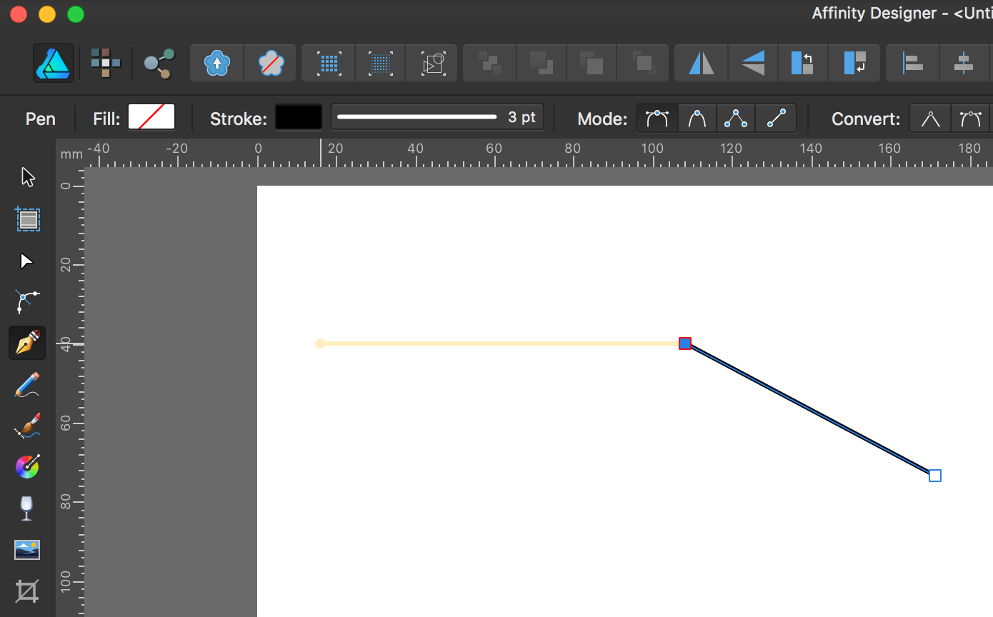
Line Tool
hannah replied to NTune Music's topic in Pre-V2 Archive of Affinity on Desktop Questions (macOS and Windows)
Hello ThettRO Media, I don't think that there is a line-tool like there are shape-tools, but you can simply use the Pen Tool to make a line. If the line should be straight (0, 45 or 90°) click, then hold Shift, move (yellow forcast-line apears) and click again. If you click a third time it continues the line, if that's not what you want, just press ESC after you are done with your line. Like this if you click again you start a new line, not connected to the one you just did. Hope that helps!
-
Dear Affinity-Community, hopefully one of you knows something : My client needs a file (pdf) that requires some lines (strokes) to be RGB-red and have a width of exactly 0.001pt. This hairlines will later define the cutting lines for caoutchouc, so I guess some kind of laser cutting. When i set the stroke width to 0.001point it jumps to zero!?! What do I do? Any work-arounds or solutions? Thank you so much.
-
Hello dear people, I'd like to retouch a bunch of photos (resize/crop/contrast), all in the same way, and then export them efficiently (like not one by one). Is there a trick? With file->New Stack, I managed to do the retouching-part, which gave me a "Live Stack Group" in the layers panel. (Is this a "normal" layer with childs?). Now I am searching a way to export all single images from this Stack Group. efficiently. like not one by one. Is this even possible? Or maybe you would know a different way to go about it? TL;DR : Who knows a way to export several layers as independent pictures with "one move"? Thank you!!!! EDIT : I think I FOUND SOMETHING that works, via export persona and using the layers as slices... looks promising. sorry for the fuzz
-
Engraving Elements
hannah replied to Cp3's topic in Pre-V2 Archive of Affinity on Desktop Questions (macOS and Windows)
Hehe, looking good Cp3, well done! :) -
Engraving Elements
hannah replied to Cp3's topic in Pre-V2 Archive of Affinity on Desktop Questions (macOS and Windows)
Hehe Cp3, I think if you want a real looking effect you have to use AfD and AfP after to retouch (for the shadow-effect of the paper and how it effects the engravings)... LEFT In AfD I have used a very thin line, gaussian-blur effect to make it visually disappear, outer-shadow-effect as lightening (because you can change the direction) and outer-glow for the darker part to give "substance". it's too blurry in my example, but that is adjustable within the different effects. RIGHT Same thin line but with Bevel/Emboss effect + outer-shadow-effect as lightening. I attached my AfD-file for you, if you'd like to go down that road. However, it seems that it requires some heavy retouching in AfP afterwards, to partially remove the effect/play with transparancy... Hope that helps you at least a little bit. engraving.afdesign
- 10 replies
-
- 1
-

-
- engrave
- engrave text
- (and 1 more)
-
thanks for this clever work-around while we wait for proper implementation of bleed preview.
-
magic! I can't stop plying around with it Thanks Tamauro!!! I try to understand how you do that... I can see that one layer mirrors the line and another layer multiplies and rotates it. how do you "record" this actions? would you care explaining the principle behind it???? that would be very very nice.
-
never mind, it's working now. sorry
-
Hello everyone, I downloaded the file and unzipped it. It's a .afstyles file, but I can't open it, nor can i import it from the styles manu (designer and photo). anyone knows what I do wrong? Anyway, Thanks v_kyr for sharing!!!
-
@Sempervivum : I agree, apparently it needs some manual-adjustments or some kind of 2nd action to get a fine result. but the way I see it, the image you've retouched with photoshop is not neutral either but has a very slight green touch. @firstdefence : Pipette? Doesn't do it for me (it suggests that after I've sampled a color I can drop it on another object), whereas "Picker" does what it suggests to me. (my native language is german though).
-
Did you see, right next to the sliders there is an input field. You can type in "0" and then hit the enter-key. Does that help you?
-
smart. laborsome but i'd have never thought about it. Thanks!
-
There is no way, no trick, no nothing?!?!? I refuse to believe that.