hannah
-
Posts
61 -
Joined
-
Last visited
Everything posted by hannah
-
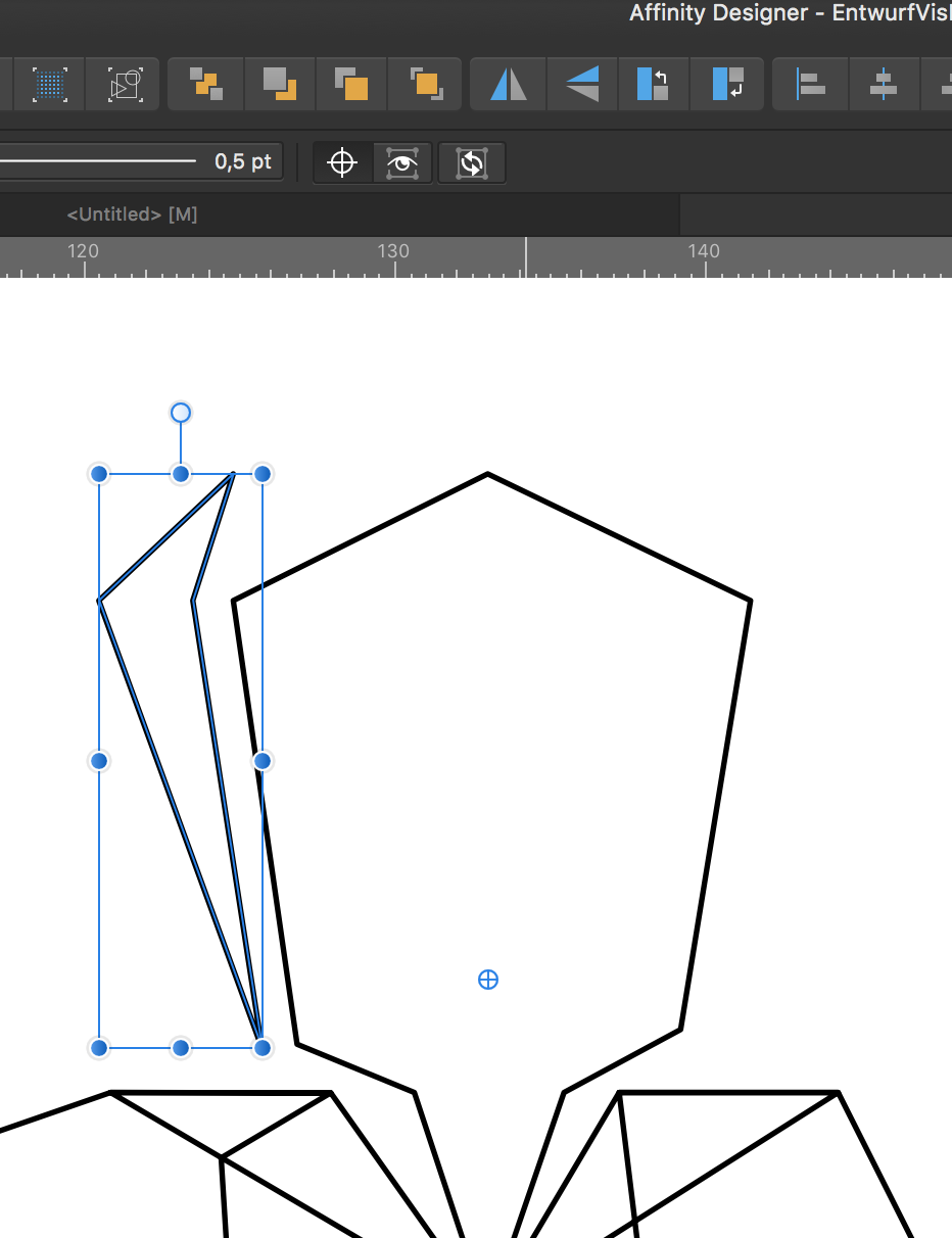
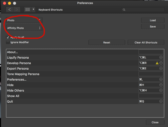
Hello dear people, Would you know how to flip an object/shape through a self-defined point in AfD? "Flip Horizontal" would always flip through center, even after dragging the "center-point" to some place else. (Crosshairs-thingy in the screenshot). Moving this point makes my shape rotate around it, but has in my case no effect on other transformations than rotating). Thanks

-
you guys are incredible! and yessss, @αℓƒяє∂ and @Oval, Layer blend ranges!!!! Whaaam, x-height-font-sizing and this magic was exactly what I was looking for in the first place!
-
hahaha, yeah! reminds me of my programming-teacher : " code it or die! "
-
AHHHHHH, nice!!!! didn't know that i can set the x-height of the font like that (you have to use the character-panel, not the transform panel). great! Seems I have reached todays THANKS-award-limit, but I'll do tomorrow. great!
-
ah, I did see it. maybe my brain is blocked, but that just doesn't explain anything for me. I might find out later. However, thanks @Oval for your time.
-
lol ohhhno, don't laugh, speak! (i know what "x-height" means, just don't understand/see how it helps here, so i think you must mean something font-related, and there is where i am lost)
-
I missed that! Could you tell me what you mean by x-height? Do you mean adjusting x and y coordinates and height and width via the transform panel? (didn't improve results for me) And what's the blend gamma slider?? (couldn't find anything when searching the help-menu). thanks! (I am not ignoring resampling, but it comes later.)
-
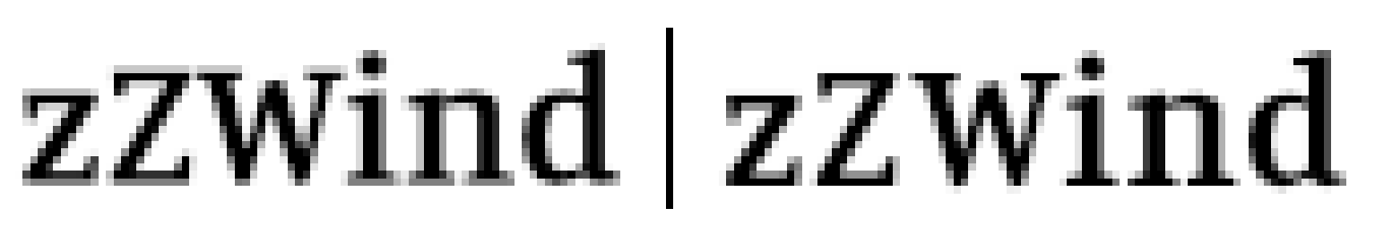
no panic, I never intended to make a "picture" website, it was a thought-experiment to "prove" that (whatever the code and power behind may be), finally you see everything through your screen, and there you see pixels in different colours. Because I have to use the glorious Jimdo-app, I thought I can't pull mouse-over-picture-text off using only css. I could finally, so that's that. I used slightly bigger images, to enhance visual quality for retina-users, but thanks to css-filters I could avoid having to load a second picture for every mouse-over-effect concerning the image. so that was a win-win for me. (thanks again to this forum, that motivated me to find a sleek solution) For people, who come across this later : I was searching for a way to get sharper text-representation in AfP. Where there seem to be no way to alter the anti-aliasing, I could improve my results like this: 1. turn force-pixel-alignment and move-by-whole-pixels OFF 2. Write a "zZ" with Artistic Text Tool 3. Move text around until the baseline is very crisp 4. adjust size (using the top right or left transform-corner) until the top of the "zZ" is also crisp, especially the median-line (top of lower z) 5. See if slightly different letter-spacing (called Tracking in AfP), even some kerning improves what you see. 6. turn force-pixel-alignment and move-by-whole-pixels ON again and write your text. You should be able to move it, keeping the appearance. It's not a different world, but it's an improvement (left: randomly written text / right: adjusted text). EDIT : Thanks to the people here I learned to use x-height sizing for fonts (like "14px/x") and customize Blend-Ranges for layers (Blend Gamma and Coverage Map). (See further down in this topic). Good AfP, good AfP
-
Simmo371
hannah replied to Simmo371's topic in Pre-V2 Archive of Affinity on Desktop Questions (macOS and Windows)
ahhhhhh, thanks! -
I don't know the answer to why they ask for the dpi when exporting a svg, but when choosing eps or pdf it tells me in breaks "Nothing will be rasterised" right next to the dpi-input-field. Would any other format also work for you? Good luck, really hope you can stay out away from the dark Cloud.
-
you can keep taking my words apart, but you never "see" any tags, or attributes or markups, just their interpretation. All you see are colored pixels in a given density. You talk about "What is" and I care, but more interesting for me is what "I see".
-
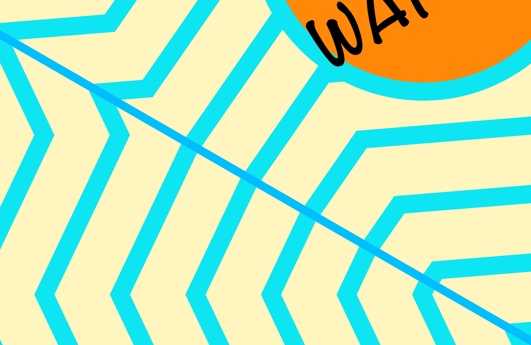
because the zigzag in your file isn't exactly symmetrical. If you mirror the 2nd piece, the two parts match and moreover when closing the beautiful thing, the beginning would meet the end perfectly.
-
That is what I see when I open your file! please open my file and move the ellipe for a whole pixel. how are the edges?!? ohhh I feel I am jinxing it...
-
What is cmd9? When I move my ellipse a bit (like you see in the screenshot from above), my edges are white like polar snow, so what you see in my file can only be an artefact, something not really there. Well I do hope so. so to be honest, I don't wanna jinx it. It works for me, and I just decided, until I have a problem, I will stay away from it, hahaha Fun fact: although seeing nothing in AfP, I very much see the ellipse when watching the preview of my file in Finder.
-
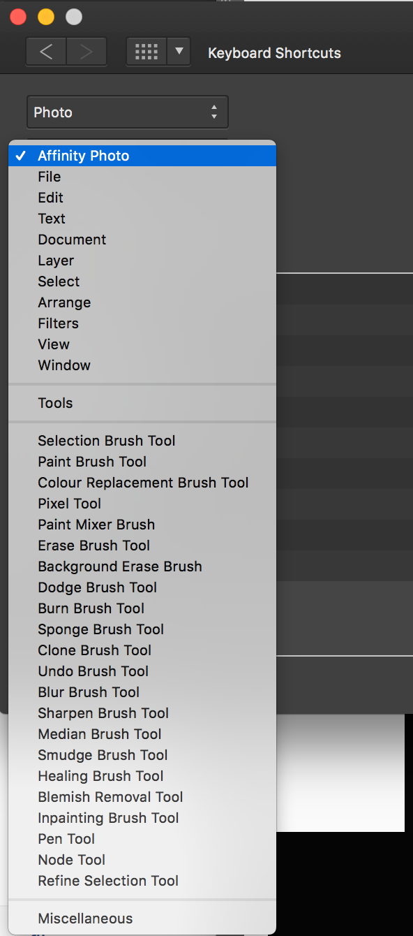
you might have to scroll down, Miscellaneous is the very last menu-point, that might be not visible if your screen-resolution is on the lower side. If that's the case drag the whole Preferences-Window to the top, as high as you can and then open the drop-down-menu again. You find it? I'd really like you to find it
- 17 replies
-
- 1
-

-
- keyboard shortcut
- default colors
- (and 1 more)
-
You are not there yet. Where it says "Affinity Photo", right bellow "Photo", that's a second drop-down menu. You have to set it to "Miscellaneous".
- 17 replies
-
- 2
-
-

-
- keyboard shortcut
- default colors
- (and 1 more)
-
that's weird, myLine is "cleaner" than yours. see the slightly grey pixels around yours in my screenshot? no idea why that is. good luck! myLine.afphoto
-
Simmo371
hannah replied to Simmo371's topic in Pre-V2 Archive of Affinity on Desktop Questions (macOS and Windows)
you can do this by going to Window>Seperated mode. Looks weird though, as if everything is falling apart. But then you can click on your two images and adjust their size. I did it to show you the screenshot and I have regrets, because after, when i go back to "Merge all windows" some menu-elements are not attached where they've been before Hope this helps!
-
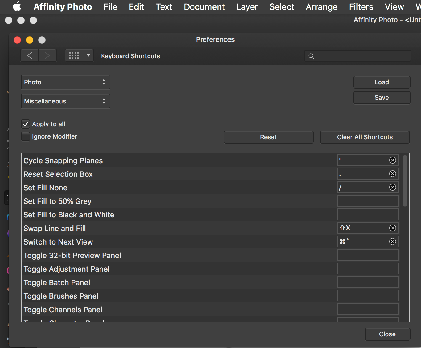
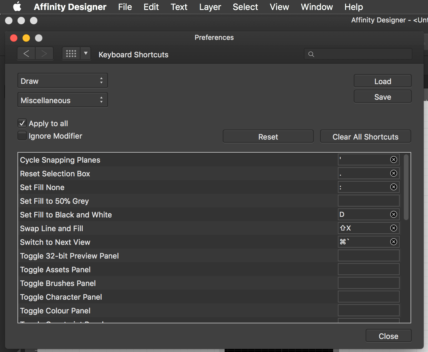
On the right side in the line of the shortcut there is a rectangular box, where other shortcuts are already listed. It's simple, you just click in this box, in the same line where it says "Set Fill in Black and White", and click on exactly the keys on your keyboard that you wanna use later. So for using a point as a shortcut, you have to type this character (a point) inside this box.
-
So, I did it for AfD, but I think I found the same settings in AfP. They have this double-dropdown menus which makes it really confusing, but you can defind your shortcuts for "Set fill to..." and "Set fill None" for deleting a fill. Go to preferences>keyboard shortcuts and select in the menus what you see in the screenshots (one shows AfP, the other AfD). Hope that helps!
- 17 replies
-
- 5
-
-
-
- keyboard shortcut
- default colors
- (and 1 more)
-
ohhhhhhh, I know that! took me so long to find out. I have to check and will come back here. promise. short answer you have to set your key-shorts yourself but the places are tricky to find. give me some minutes...
- 17 replies
-
- 1
-

-
- keyboard shortcut
- default colors
- (and 1 more)
-
I can't reproduce this, when feather is 0 and anit-alias is off, I have no line. wanna share your file?
-
ok, i do follow and like your way of explaining though it seems we might be on same page but in a different book. In my world a screenshot is a one-to-one visual replica of how my device is interpreting and therefor showing me all the tags and markups and attributes. Let's say you make a screenshot of a website, everything but the browser-menu and address-bar. Then you open this image again in a browser. What do you see? If you don't look at the URL and you don't use your mouse (trying to click "a button" or the "scrollbar"), can you tell, just by the look of it, that it's just a screenshot? I dare say, you can't tell the difference between the real website and the screenshot until you try to "interact" with a screenshot and feel stupid. So the bottom line is simple: A pixel is a pixel is a pixel.
-
i know that. I am aware that the image of a bird isn't a bird. but what i mean is, that once all the attributes for a text are set and I want to see it, then I have to look at it through a media (a screen or a piece of paper). And there, every program, device, app, browser, printer has a finite amount of dots/pixels per inch to represent the text to me. Those pixels have to decide whether they wanna be white or black or grey. And I say, the baseline of a text is the edge/beginning of all straight characters and I'd like the app to recognize this too and help me out a bit. By carefully adjusting the size and position of the text in AfP i got m u c h b e t t e r results! best practice for me was : 1. turn force-pixel-alignment and move-by-whole-pixels on (if the font is well designed that should help Affinity establish a crisp baseline, something that i probably haven't done in the fist place, causing problems that where hard to adjust later on) 2. write a "zZ" with artistic Text tool (baseline should be sharp) 3. turn force-pixel-alignment and move-by-whole-pixels off 4. adjust size (using the top right adjustment corner) until the top of the "zZ" is also crisp 5. turn force-pixel-alignment and move-by-whole-pixels on again and write your text I finally solved my problem via css: https://www.androphyne.com/spectacles/
-
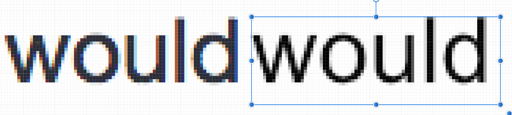
Thank you all for your help and patience, I really appreciate it!!! @ firstdefence / CSS Text Overlay : Good idea, I will definitely try it the css-way, as it would save me time and hassle in the long run. Would you also know an easy way to make this happen as an mouse-over-effect, using the onmouseover? Also thanks for introducing the svg-graphics to me. @ owenr / sharpness of screenshot: Yes, sorry, I got tricked by my screen-resolution and was posting before double-checking the situation. Reality is a bitch. @ Oval / wtf am I missing: Hahahaha, nice summery. Text-size, kerning, line-height etc. are definitely crucial! @ R C-R / Pixels ain't text: Yes, I can accept that, hahaha. But when you say "it isn't really text, just some of the pixels in that image" than I say, that "real text" on a screen is also represented to me as pixels, right? It's the method used of representing and the anti-aliasing; it's the underlying rules, together with the resolution of my device what determines the visual result. By taking screenshots of html-texts and zooming in on them, I come to understand, that there must be some kind of rule, that the baseline of the font and the top of straight font-characters like "z" are always rendered crisp (no grey pixels underneath and above the letter). A job well done in my opinion, as it makes fonts appear sharper even if there is lots of blur in between. So I took a screenshot here on this page of the word "would". When I put the word right next to it in AfP, I have to play around with 0.1pt-adjustments of size, kerning, etc. to achieve a similarly good result. I can get close, but at the top of the "w" and the "u" there is a line of grey pixels I can't suppress. So in my opinion the anti-aliasing method used by AfP is somewhat "low-contrast". Ok, I am splitting hairs here; It's not what I wanted. I was just hoping to be able to adjust the anti-alias method used by AfP... However, thank you very much for your time, I have learned a lot!