VectorWhiz
-
Posts
453 -
Joined
-
Last visited
Everything posted by VectorWhiz
-
Thanks for the heap of work creating this book may have required. Excellent lay-out, by the way.
-
Composition and palette are outstanding.
-
Ornament, created in Affinity Designer. More info in my portfolio blog: https://communicats.blogspot.com/2022/04/mandalas-have-always-fascinated-me-as.html

-
Here are a few examples of book covers I created in Affinity Designer (and used in books created in Publisher). They were all for educational purposes in the advanced composites industry, mainly the aviation and space departments. I also DTP-ed the books in Publisher that contain between 100 and 300 pages, in which hundreds of 2D and 3D drawings, schematics, tables, graphs and formulas, that were made from scratch, were placed. A few examples of the tech art created for these books can be seen in my portfolio blog: https://communicats.blogspot.com/2022/04/book-cover-pages-flyers-and-educational.html Designer and Publisher (apart from the 3D programs I used) are a perfect combination even when the Betas are not recommended for commercial use 😁. The books are all proprietary material. One thing that was something of an issue though, the pdf's generated were really large... Structural Repair training cover for a book about commercial aviation practices Bonded repair curriculum and training cover book Structural repair training cover for a book about the space industry One off cover design for Lufthansa Technical Training department Cover for a (rather dull) SAE report
-

multi Over 450 Affinity videos and counting
VectorWhiz replied to Affinity-Inspiration's topic in Share your work
Epic! Thanks for creating and sharing. Many Affinity users will profit from what is on this channel.- 4 replies
-
- 1
-

-
- affinity designer
- affinity photo
- (and 1 more)
-
Vector portrait of Crystal Reed as Sophia Falcone in Gotham, created in Affinity Designer. Update sequence and more info about how things are done can be seen in my portfolio blog: https://communicats.blogspot.com/2019/05/crystal-reed-100-vector-portrait.html and in my website: https://vectorwhiz.com/Vector.html Vector outline view
-
In this tutorial I offer an oversight of how I prepared a preliminary study, from which I will make a 100% vector drawing in the future, hopefully not too long from now (February 13 2022). I used 3 different photos from which I combined parts, that were clipped in Affinity Designer, that serve to extract the parts of the photo that I need in my composition. In addition I used a horse that I drew in vectors before starting this project. So in the foreground of this study there are 4 components: The falconer The falcon The falconer's right hand The horse Of course there is a 5th component - the background - as well, but that may change over time. In this blog entry I will focus on how the first 4 components were made. 1. The falconer In the image below you see the original photo on the left side and the falconer that I extracted from this image. Clipping of the falconer in Affinity Designer I traced the photo with the Pen-tool (the red outline around the falconer) and clipped it inside the traced curve that I drew, which resulted in the part of the image above on the right side. 2. The falcon In the image below you see the original photo on the left part of the image and the falcon that I extracted from this image on the part to the right. Clipping, flipping and rotating of the falcon I traced the falcon with the Pen-tool, drawing the curve that has a red outline and clipped the photo inside of it, leaving just the falcon visible. I flipped the clipped falcon horizontally and slightly rotated it in an anti clockwise manner. 3. The falconer's right hand Since the composition I had in mind needed the falconer's right hand, that was not available in the photographs shown above, I had to clip the right hand from yet an other photo. Below you see the photo from which the hand was clipped in a way analog to the clippings in the previous paragraphs. Clipping of the falconer's right hand Again, I traced the falconer's right hand in the photo above with the Pen-tool, which resulted in the image on the right side of the photo. I shows the talons of the falcon's left foot, which are in the proper position for the composition. 4. The horse Below you see the images of the vector horse that had already drawn a while ago. In the left half of the image the rendered view is shown, while the outline view is in the right half of the image. The rendered (on the left) and outline (on the right) views of the vector horse In the composition of the preliminary study, the horse is slightly tilted clockwise to obtain a balanced composition. In the ultimate vector drawing parts of the image will be embedded, because working in such a way speeds up the drawing proces, especially if one has a crappy graphic card, like me. The preliminary study composition Below you see the composition of the study that will be used to create the vector drawing. In the end not a single pixel will be contained within the image; it will be a 100% vector drawing. The composition of the preliminary study image Why make the image a vector painting? In a vector painting objects can be made to stand out relative to each other and to the background in a much easier way than is possible with pixel images. This is done by applying a certain sharpness to the object, by changing its colour, hue, contrast, transparency and lightness, which will only be applied to that particular object. Objects can also easily be resized, flipped and rotated than in pixel art. This also is possible afterwards, when artists want to change the appearance of the image at a later point in time. It means that an image can be manipulated more precisely and more to the artist's liking than is possible with pixel images. Besides that of course a vector image can be re-scaled to any size without losing quality. Working with vector images may in some cases require more time than working with pixel images, but it gives the artist more freedom to make changes. Vector working methods Unlike most artists do, this reference image will be placed on top of the Artboard in the Layers panel in which I will draw the parts of the vector painting. This reference image will be made transparent, so that it is just visible and can be turned on and off at any time, its position in the Layers-panel saving me from having to find it each time it needs to turned on or off. Particularly when having loads of curves (I expect to need hundreds to give the vector image a realistic look) in the Layer-panel, this can be a real time saver. The image parts will be embedded in the main drawing, which is a working method that also saves time, because each of the embedded drawing files are smaller than the main file, which means they will load, render and save / export faster. This process basically describes my working method when making a study from which the final drawing will be made. I hope to begin drawing not too long after this, so check in regularly if you want to see the progress sequence of the various stages in a future blog entry. To see the results of realistic vector art that I drew previously, in which I used a similar drawing method, please visit this page of my website. This tutorial was originally placed in my portfolio blog.
-
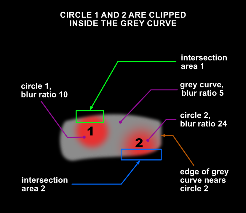
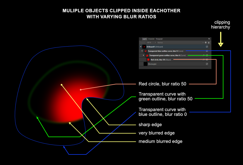
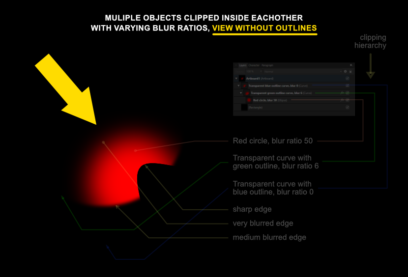
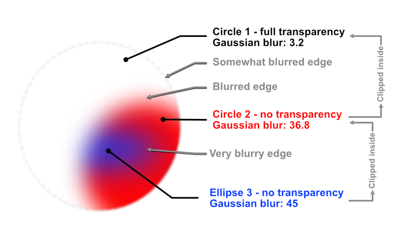
For those prepared to dive deep into the functionality of Affinity Designer offers, I wrote a tutorial on how to create objects that have edges with a varied level of blurredness along their circumference, which is particularly useful when drawing realistic vector portraits or realistic (parts of) objects. This tutorial explains how vector objects are drawn, that have a variety of blur levels along their edges. This technique is useful when drawing realistic images in Affinity Designer, because hard edged objects rarely look realistic. This technique involves clipping of objects - placing one object inside an other - and gaussian blurring, which is applying a controlled blur ratio to objects. In addition gradient colour fills and gradient opacity can be applied to the objects to attain an appearance that makes objects look realistic. Apart from being useful in drawing realistic vector portraits, this technique has many other applications for artists who need to give their artwork a convincing realistic appearance. First some basics. In the image below this paragraph I placed an image in which the basic principle is shown. After that I will go into more complex techniques that are nonetheless based on the same principle. To give an object a blurred edge, click the fx button at the bottom of the Layers panel. In the dialog that pops up after clicking it, at the top of the dialog, the blur ratio can be set in rounded numbers and can even be set as precisely in decimal values. That is rather basic, but in reality most objects have edges that have a level of blur in their circumference that varies in a non-linear way. Circle 1 has a blur ratio of 10 (roughly medium blurry) and is clipped inside a grey curve that has a blur ratio of 5 (less blurry). Where the objects intersect, at the top of circle 1, the intersecting area inherits the blur ratio of the grey curve - blur ratio 5, while the rest of the circumference of circle 1 maintains its blur ratio of 10. So at the top of circle 1, the edge is less blurry than in the rest of the circle. Circle 2 that has a blur ratio of 24, which is more blurry than that of circle 1. Where circle 2 and the grey curve intersect, circle 2 will inherit the blur ratio of the grey curve, so the blurriness at the bottom of circle 2 is far less than in the rest of the circumference of circle 2; there is a greater contrast of blurriness along the edge of circle 2 than there is in circle 1. By moving the right edge of the grey curve, by selecting the nodes at the top and bottom of its edge with the Node tool, closer to or further away from circle 2, the level of blurredness at the right side of circle 2 can be set quite precisely. Basically, the further away the edge of the parent curve is from that of the clipped child curve, the less its blurriness affects the edge of the child curve. When the edge of the parent curve overlaps the edge of the clipped child curve, the latter inherits the level of blur of the parent curve in the area where the overlapping is defined. Below this paragraph I placed an image with a transparent curve with a blue outline (for clarity) that has no blurred edge, in which a transparent curve with a green outline is clipped that has a blur ratio of 6, in which a red circle is clipped that has a blur ratio of 50. The crux is that the parent object in a clip always determines the blurriness of edges. Parent objects can both be given a higher or lower blur ratio than the objects clipped inside of them. If the clipping parent objects have no outline - which is the practical way to work with such a technique - the image shown above would look like the image below this paragraph, indicated by the yellow arrow. The resulting appearance of the clipped red circle becomes clear and this is how clipping and blurring would be used by graphic artists and designers that aim to create realistic objects or parts of objects. In the reality that most people experience, areas that have different ratios of blurriness along their edges, are the majority of what occurs / appears in this dimension. Also objects rarely have one equal colour throughout their shape, which is what in addition to the above, can be applied to the mix by giving objects a gradient colour fill or even clip differently coloured child objects clipped into parent objects to mimic reality even closer. Although what I described in this blog entry is not always an obvious intuitive mode of operation, Affinity Designer is very capable of coming a long way in 2D design. Programs of Designer's competition may have Mesh Fill options, but creating those requires much more time and editing them afterwards even more. In the Vector page of my website you find examples that are created with the techniques described above: https://vectorwhiz.com/Vector.html This tutorial can also be viewed in my portfolio blog: https://communicats.blogspot.com/2022/01/varying-blurred-object-edges-in.html
-
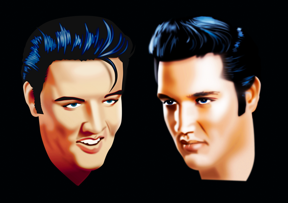
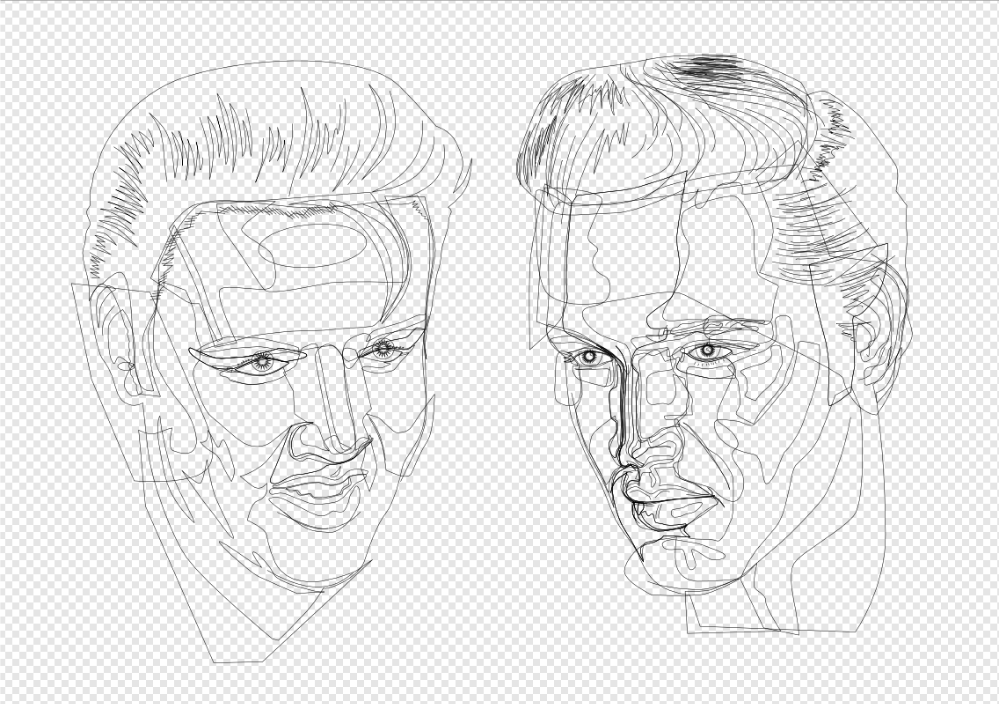
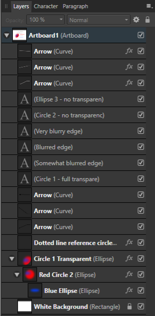
In the images below cartoonish vector portraits of Rock & Roll legend Elvis Presley can be seen. This image was created in Affinity Designer. After having worked with Adobe Illustrator professionally, CorelDRAW privately and Inkscape occasionally for decades, I have come to the conclusion that Affinity Designer is better suited to create vector portraits that do not have hard edges in the face, even if it does not include the Mesh Fill function, that is very time consuming and tedious to work with. The drawing and editing process - particularly when editing the drawing at a later point in time - in this program takes far less time and effort. Progress sequence of the portrait on the right can be seen in an other blog entry: https://communicats.blogspot.com/2020/07/this-is-other-vector-portrait-of-elvis.html?fbclid=IwAR1Yp4CNvlXspX1W_S5LV5Q0UzM1sWsn_TibSegexxHwWyH6C7ayKQ3LJG4 The image below this paragraph is a screen dump of the vector outline of the double portrait. Extensive use was made of Affinity Designers Gaussian blur function, which allows to avoid hard edges in the facial features, as are often seen in vector portraits created in Adobe Illustrator. Many of the curves with which areas on the face were drawn are made by applying multiple node gradient fills and gradient transparency. This method allows to quickly edit (also afterwards) of the drawing which is much faster than while using mesh gradient fill tool that isn't present in Affinity Designer. Personally, I don't miss it. A brilliant Russian artist who works with mesh fills in CorelDRAW once revealed that it took him months to draw a vector portrait, while it is possible in Affinity Designer to make the same effect in much less time. I used CorelDRAW for many years, but only after accidentally running across Affinity Designer I was able to create realistic vector portraits a lot quicker, while making editing afterwards easier and faster. Examples of (more) realistic vector portraits and illustrations can be found in my website at: https://vectorwhiz.com/Vector.html To create (gradient) tints and blurs in the facial area of a vector portrait, it often is necessary to draw curves that have a variable level of blur along their edges, meaning that some edge parts are just slightly unsharp, while other parts are blurred and yet other parts are very blurry. To achieve this effect, I apply the following technique that is below this paragraph: In these vector portraits a Gaussian blur trick was applied in Affinity Designer, as can be seen in the third image. Ellipse 3 is clipped inside Circle 2 and circle 2 is clipped inside circle 1. In the image below you see, Circle 1 is transparent, the other two objects are opaque. Circle 1 has a minimal blur rate, Circle 2 has a higher blur rate and Ellipse 3 has the highest blur rate. The result of these settings are that circle one has an unsharp edge, circle 2 has a blurred edge to the left and an unsharp one to the right, while Ellipse 3 has a very blurry edge on the left and a less blurred towards the right. The blur values are indicated in the third image. The circle with the dotted line only serves to indicate the position and size of Circle 1 that is completely transparent, slightly blurred and used to clip the other objects. In the image below the Layer panel is shown containing the hierarchy of the objects in the image above this paragraph. Objects that are indented to the right are clipped inside the ones above them. The object names correspond with those in the Example drawing. The circles and ellipse are at the bottom of the panel. The objects marked with an 'A' thumbnail refer to the text in the Example drawing. In addition all parts can be given a colour gradient and gradient transparency, all settings that are independently editable of the ones described above this paragraph. In doing so the annoying hard edges of shadows in the face of a vector portrait can be avoided that are almost always seen in vector portraits created in Adobe Illustrator. Affinity Designer allows to create more realistic vector portraits in a much easier way that vector portraits created with the mesh fill function. The added benefit of working in this way is that at a later point in time all the parameters can be edited and tweaked to the preference of the vector portrait artist. Working in vectors with this method allows to resize the portrait without any loss of quality. Of course this technique can be applied to any shape you can draw, not just to circles and ellipses, that I used in the example above, as can be seen in the completed vector double portrait at the top of this blog entry and the vector outline view screen dump below it.
-
- 5
-

-
- affinity designer
- gaussian blur
- (and 5 more)
-
My personal crest created in Affinity Designer and Photo. Brief tutorial on how to draw non-linear texture (the snakes's scales) at: https://communicats.blogspot.com/2021/12/creating-my-personal-crest-in-affinity.html
-
National Poetry Day 2021 #NationalPoetryDay
VectorWhiz replied to William Overington's topic in Share your work
I like to create visual poetry that rhymes. Robert Frost once said: 'Free verse poetry is like playing tennis without a net.' So, here's my Zippo poem:
-
In Designer you may want to try this as well: Go to File - Document Setup.... Click the colour tab in the dialog box. In Colour Format select RGB/16 or LAB/16. Click OK. Also in the Document Setup... I set the DPI in the Dimensions tab to 400, even though some claim this does not help (because I'm a stubborn type probably). Best of luck.
-
Brilliant. I appreciate your skill and the effort that has gone into making this image.
- 6 replies
-
- 1
-
-
- affinity designer ipad
- japan
- (and 1 more)
-
affinity designer Celtic Tree of Life vector drawing
VectorWhiz replied to VectorWhiz's topic in Share your work
In the third paragraph in my portfolio blog entry, I lightly touch upon matters that may have some sort of a relation with what may have incited Serif to create its suit (consciously or not). It is part of the reason I initially chose to apply earth colours to this image, earth being one of the elements of nature, which is life. -
affinity designer Realistic Vector of Wine Glasses by the fire
VectorWhiz replied to burntwoodbobby's topic in Share your work
Saw this drawing on FB recently and this version with the toned down reflection is much better. Kudos! I guess artists are condemned to endless tinkering of their artworks. Concerning the various blur levels in the flames: it is possible to give an object distinguished levels of blurred edges by creating a container object with no blur or very little blur and clipping a smaller blurred object inside of it. By moving the edge of the container away from the clipped object it appears more blurry, while by moving the container object's edge closer to the clipped object it becomes sharper. Just a thought.- 1 reply
-
- 1
-
-
- realism
- realistic drawing
- (and 4 more)
-
affinity designer Celtic Tree of Life vector drawing
VectorWhiz replied to VectorWhiz's topic in Share your work
Haven't tried green yet, but I feel I'm not done yet with experimenting. Perhaps I will just make different versions of the drawing with different palettes. After reading Wosven's comment I fiddled this to make it appear less burned:
-
Ich denke, viele Künstler sind auf dieses Problem gestoßen. Vielleicht gibt dieses Video Aufschluss darüber, wie das Farbmanagement optimiert und in der Angelegenheit Konsistenz erreicht werden kann:
-
affinity designer Celtic Tree of Life vector drawing
VectorWhiz replied to VectorWhiz's topic in Share your work
Yes, I've been tinkering with that and already and tried many different colours. This probably is one of the most challenging and disputed elements when creating any (vector) file, but fortunately the non-destructive approach of the Affinity apps allows to fiddle around with them endlessly. -
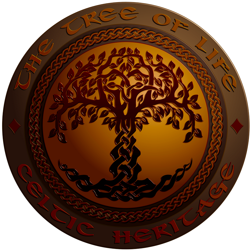
Celtic motive style logo of the Tree of Life symbol. For more info click the link below to visit the related entry in my portfolio blog: https://communicats.blogspot.com/2021/08/the-tree-of-life-celtic-vector-drawing.html
- 9 replies
-
- 14
-
-
affinity photo Comparing Affinity Photo vs Astro Pixel Processor
VectorWhiz replied to Didge's topic in Share your work
The celestial bodies in the Affinity Photo version are distinguishable the best from the 3 renderings. -
The old areas of towns and cities are often the most appealing visually. You're doing a great job capturing these pre-regulate-everything architectural marvels with a stunning palette.
-
affinity publisher Project Brush Thumbnail Poster in Publisher
VectorWhiz replied to StuartRc's topic in Share your work
Do you even have time to get some sleep? 🥺 -
It takes a lot of skill to create such a complex lay-out that does the creative tattoo work justice. It's making a work of art with works of art.