VectorWhiz
-
Posts
453 -
Joined
-
Last visited
Everything posted by VectorWhiz
-

affinity designer Amsterdam - Metro Transit Diagram
VectorWhiz replied to transitdiagrams's topic in Share your work
Nu de Noord-Zuidlijn eindelijk gereed is, kan er een enigszins redelijk uitgebreid metronetwerk worden getekend voor Amsterdam 😎 Hoop dat de verbinding geen schade meer aan de bovenliggende bebouwing zal opleveren... Goed gedaan! -
I see the Caballistic tree of life, the pine cone (reference to the pineal gland) and the all seeing eye or perhaps third eye in a symmetrically balanced spread of rays. It shows Affinity Designer is well suited to drawing accurately. Nicely done.
-
affinity designer WIP Pouting Lady (AD)
VectorWhiz replied to VectorVonDoom's topic in Share your work
The jacket and shirt look absolutely amazing. Kudos! Curious to what the finished product will look like. Vector is the way to go. I suspect with the integration of AI-functionality, drawing in vectors will become more accessible to more artists in the future. But artists such as you who create vector art in the current time will amaze observers in the future who will wonder how this type of art was done. -
Appreciation for the huge amount of work that went into creating the brushes and patterns. I am sure many will find good use for them. One observation perhaps; if in the vector stage (assuming vectors were drawn to create the brushes) the objects are grouped and a circular transparency gradient is applied for brushes that have the same length and width or a elliptical gradient transparency is applied to a long stroke, the brushes can be used to 'paint' almost as when using pixel brushes. Sometimes applying a Gaussian blur to the brush strokes, these can be used to fill in an area or shape, which is useful when creating pores and facial creases in portraits for instance. I may post examples of this technique in the near future.
-
multi Book cover design for a thriller series
VectorWhiz replied to bodobe's topic in Share your work
The Berberblut cover is graphically strong and appealing. The combination of monochrome and one colour works well. This is exactly what a book cover should do. -
APub hangs when applying text styles
VectorWhiz replied to VectorWhiz's topic in V1 Bugs found on Windows
In the screendump below the slider is past halfway the pages (50 pages in total), but the largest part of page 3 and the bottom of the cover page remain visible, while scrolling does not occur. Zooming in and out is also not possible. After saving and closing the document, scrolling and zooming are possible. But the initial inability to scroll prevents to insert (cut & paste) or place the text of a placed document in the proper page. After re-opening the document and placing the text, it contains page breaks that can not be removed.
-
APub hangs when applying text styles
VectorWhiz replied to VectorWhiz's topic in V1 Bugs found on Windows
I tried to compile the book again. After placing the image in the Front cover Master Page and applying it to the first page, Publisher did not allow me to scroll. Closing the program and reopening it, made it possible to scroll again (...?). Placing the docx text created in Libre Office showed page breaks where I did not create them, that were impossible to correct. Copying and pasting the text worked well, as did the applying of text styles this time around. -
APub hangs when applying text styles
VectorWhiz replied to VectorWhiz's topic in V1 Bugs found on Windows
Thank you for checking. I am puzzled. I couldn't cause it to crash either..... I will try importing pasting again (since the document has progressed) and see what happens. Previously Publisher hanged without providing any message and did not respond to any type of input; the screen in which the crash occurred just froze. In Window's Task Manager no unusually high use of resources was visible, the program simply did not respond. -
Realistic vector skin texture brush development
VectorWhiz replied to VectorWhiz's topic in Resources
I use 1.8.0.532 for both Designer and Photo, which would explain the inability to open the files. Beta ugrades are free btw. I don't use third party plugins. -
I don't get it. Sometimes I see excellent works posted in this forum, but no comments. Like this one. Great job! Wir hatten viele Kohlmeisen in unserem Garten, seit wir Samenkugeln aufgehängt haben. Wir helfen ihnen, den Winter zu überstehen.
-
affinity designer Buried! page 1, 2, 3... and 4!!
VectorWhiz replied to giantlobsterprd's topic in Share your work
Nicely macabre. -
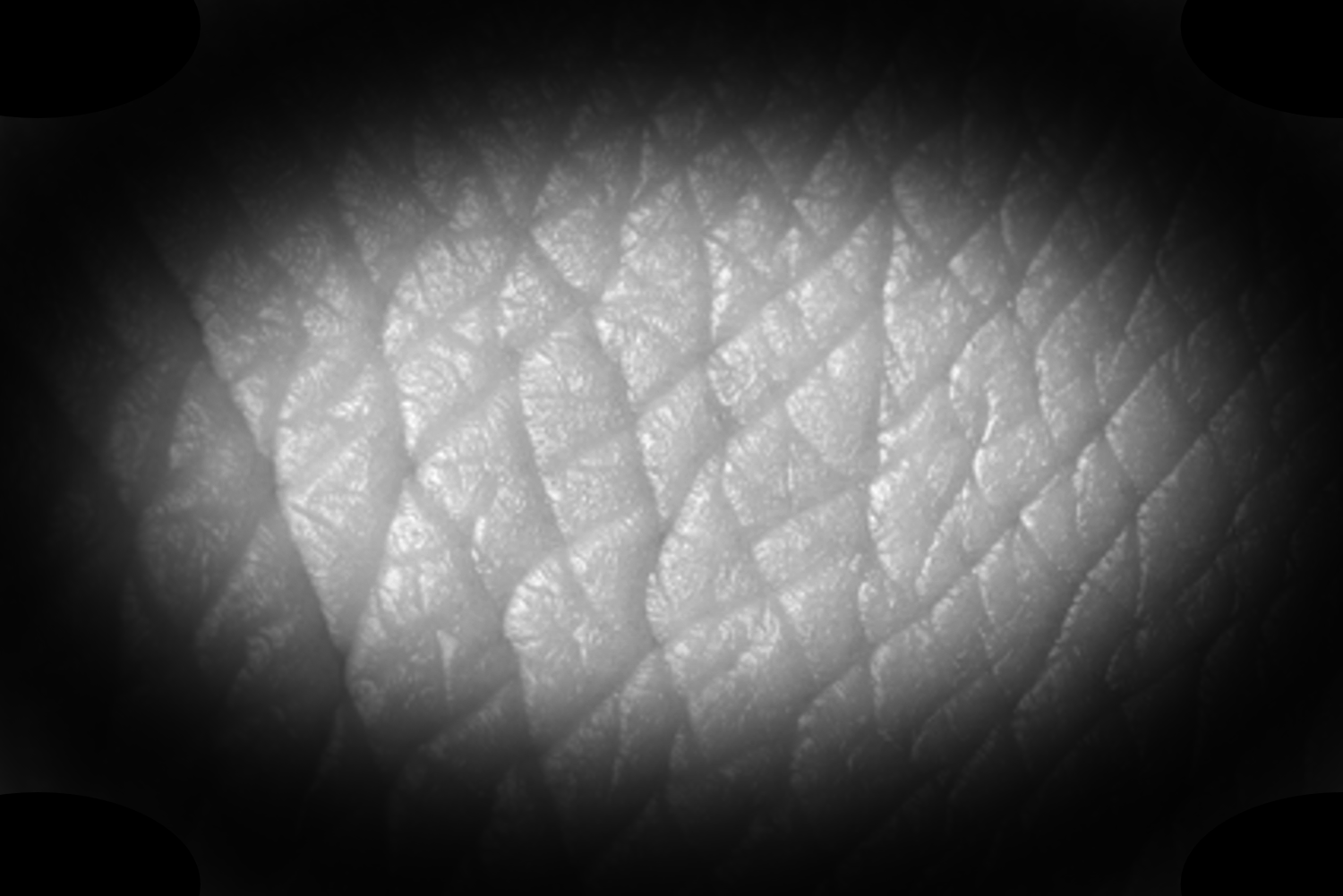
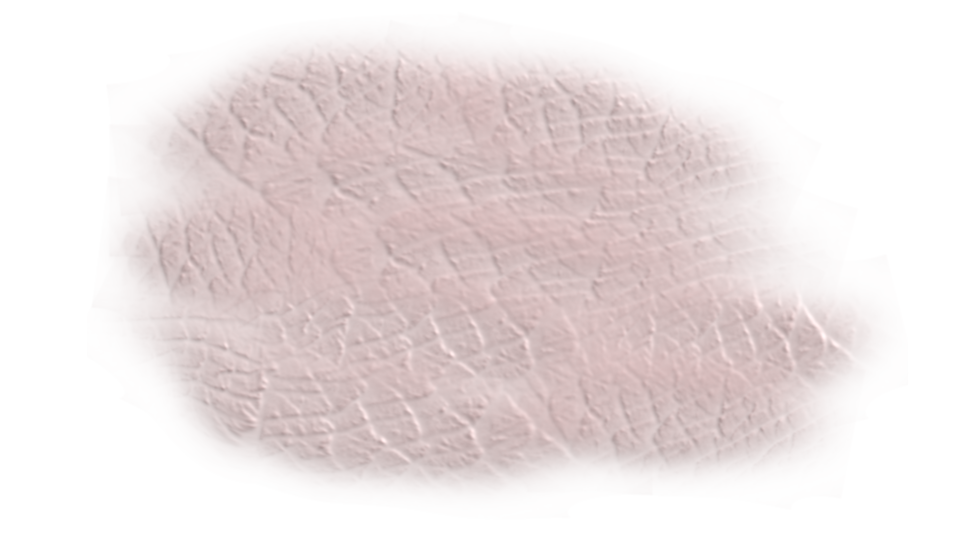
This is an attempt to create realistic vector skin texture. It is not perfect yet, but it is getting there and I am still fiddling with it. I attached all files created in both Affinity Photo and Designer that I created in the process. I am doing this because I like to be able to create realistic vector portraits like this one for example: https://communicats.blogspot.com/2018/03/vladimir-putin-vector-portrait.html. I started with a skin texture photo, then created a vignette around it to give it a black background and from Affinity Photo exported in png. Next I imported in Affinity Designer as a New Textured Intensity Brush. I saved the Photo and Designer files with history, so what I've done to reach this point is visible (they include some intermediate tinkering as well). This is the exported png from Photo. Different types of skin texture can easily be created by replacing the reference image. This is what it looks like in Designer after drawing a few lines with the vector brush. The lines are given a Passthrough filter in the Layers Panel. I grouped the lines and applied a 3D fx to them. And these are the lines drawn with the vector brush in the outline view. It would probably be easier to allow the lines to blend better if Designer would include a feather function, but I think I recall seeing that is in the future roadmap (which is one of the functions I eagerly await). If I succeed in getting better results I will post them here. TEST soft edged - Realistic pores 06.afphoto Realisti skin texture TEST.afdesign
- 3 replies
-
- 1
-

-
- affinity designer
- affinity photo
- (and 1 more)
-
APub hangs when applying text styles
VectorWhiz replied to VectorWhiz's topic in V1 Bugs found on Windows
Gabe, Attached is the Publisher document. I tried to place the document created in Libre Office and exported as docx, but what was placed was an incomplete text Onn several attempts). Then I cut and pasted the text from Libre Office and when editing (applying text styles), it crashed. I continued to work in Libre Office for the time being and by now the document has progressed a lot. Project Oneindige Vooruitgang.afpub -
Publisher 1.8.0.535 hangs when applying text styles and editing text styles - Body Text, 2 indented styles and Header 3 style in use. 3 different types of Master pages defined. Working in Windows 10, i7 CPU, 16 GB RAM, preferred rendering via graphic card (NVIDIA GTX 750 Ti), approximately 30 pages document (so far) including pinned images. In Task Manager crash handler visible under Publisher entry.
-
multi Fifty word science fiction stories
VectorWhiz replied to William Overington's topic in Share your work
What it does basically is increase the space between the letters in words as a result of which the space between words decreases, provided the justification function was added to the paragraph. I use it a lot for visual poems and simply place an Enter (line break) at the end of each line. -
Allow me to make two suggestions: Increase the margins somewhat to make the composition more balanced (easier to visually distinguish between the various components) perhaps consider changing the colour of the type, making it more in balance with the images I've created many educational books and once was suggested to choose colours so that colour blind people would be able to read the text better and understand the explanatory aspects of the drawings with less of an effort.
-
multi Fifty word science fiction stories
VectorWhiz replied to William Overington's topic in Share your work
In lines 'less crowded' than the surrounding ones, consider triple clicking to select the entire line and next simultaneously press alt and arrow to the right several times to give it a better distributed appearance, which results in more space between individual letters and less space between the words. -
Nicely crafted visual narrative.
-
Nice progress. I'm often amazed about the realism that AD allows users to create, which wasn't possible to do in CorelDRAW and AI (which I've used professionally and privately for decades), in spite of the fact that AD is supposedly lacking some functions that the competition has. AD offers great work-arounds that are easily and quickly editable resulting in shorter production times.
- 13 replies
-
- 1
-
-
- mesh warp tool
- photorealism
- (and 1 more)
-
I've occasionally run across a similar misfunction (I think) that an effect was applied to all layers when I selected a particular one both in AD and AP. After re-starting the program, it no longer occurred. Nice work, b.t.w.
-
affinity designer Crest of Amsterdam in vectors
VectorWhiz replied to VectorWhiz's topic in Share your work
Added the red inner silk lining to the crown and fx-ed the gems on it.
-
affinity designer Crest of Amsterdam in vectors
VectorWhiz replied to VectorWhiz's topic in Share your work
The base of the lions is similar. Apart from some minor tweaking, the differences are the result of changing the 3D fx properties (direction, radius, softening and specular colour), directions of the gradient fills and transparencies. In images that contain a ton of objects, selecting objects is done mainly in the outline view (for which I assigned a shortcut) to quickly shift between vector view and outline view. Also I use the Swatches panel a lot to maintain consistency of colours. In any event, a lot of time is spent in tweaking. In the version below I changed the 3D fx of the eyes, Gaussian blurs and some shadowing on the body and banner.
-
affinity designer Crest of Amsterdam in vectors
VectorWhiz replied to VectorWhiz's topic in Share your work
Thanks for pointing this out. I was lost in detailing of which I did some more, apart from separating the type.