DarrenDriven
-
Posts
32 -
Joined
-
Last visited
Everything posted by DarrenDriven
-
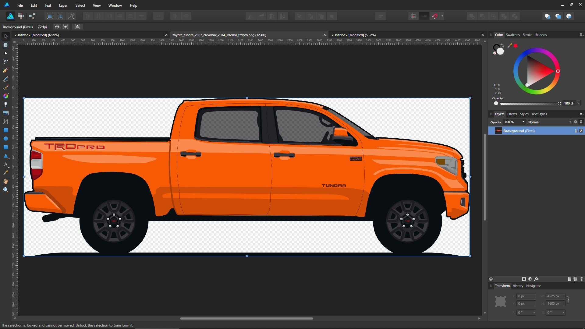
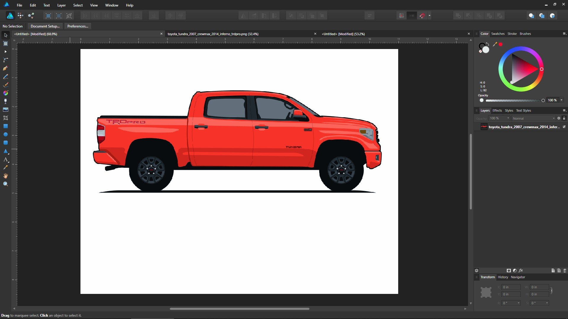
Hmmm... when I import the PNG into a new sRGB Designer document then I see a red truck. If I open the PNG directly then I see an orange truck. ...so when I toggled between my two screenshots I can definitely see the difference in the color selector... ...and this got me thinking. When I open my PNG in Designer what are the document properties? ...so it knows it's for the web and it's RGB/8. Hmmm... what happens if I create a new Designer document for web? Well that looks better! But it looks about the same as if I was using my printer profile as my document color profile... what about printing? It still seems that the PRO-100 printer profile outputs a closer orange... but the blue is nowhere near correct. Hmmm.

-
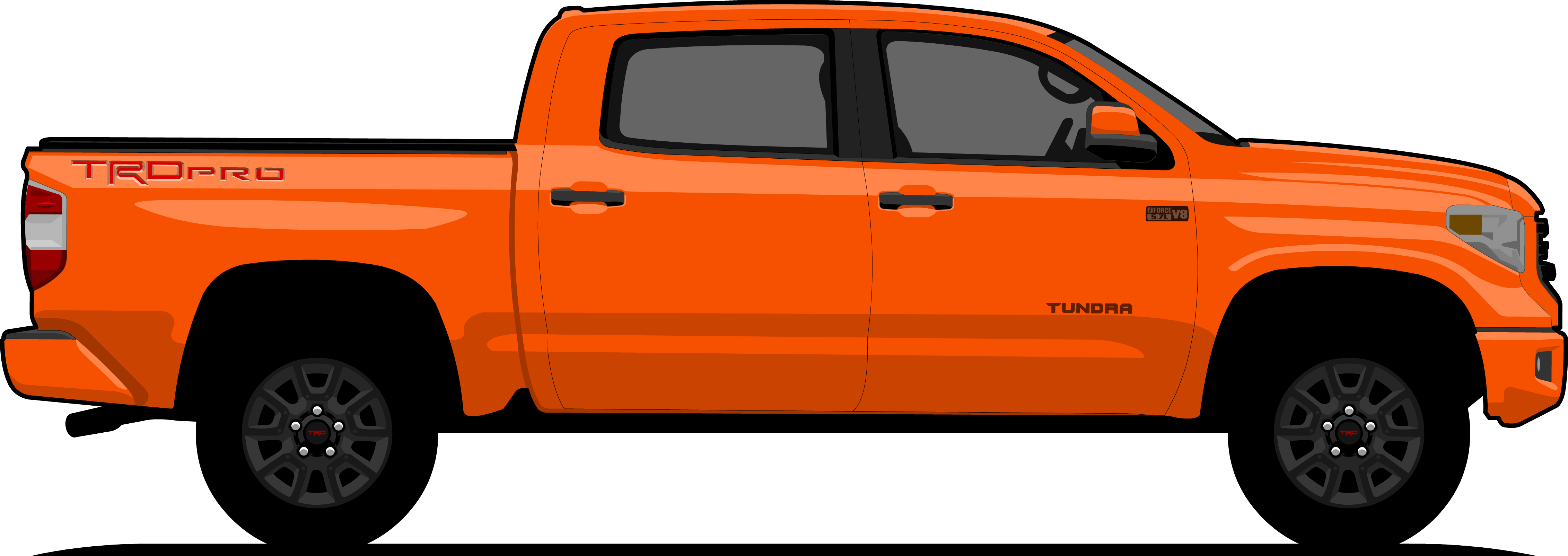
I feel like I just realized that I exist in multiple dimensions. Mind boggled. When I export a PNG from Animate I am offered only the choice of 8/24/32 bit color... not much else. 32-bit is selected by default. Exporting to JPG doesn't offer any color choices... just resolution and that's it. The two truck illustration PNGs posted just under the matching-color truck photos are exported from Animate. Can you tell anything by looking at them? The program is intended for creating web art, so maybe there are no options because print was never it's original intent. I checked out the Wiki page. (sigh) Overloaded with theory and I am not sure at all how to convert that to practical application at this moment. I feel like I can't even wrap my head around step one... importing a PNG image into Designer and have it appear the same color as it does in every other program. In Animate the truck looks orange. On my desktop using any other program the truck looks orange. In my browser the truck looks orange. Import into Designer? The truck only looks orange using the Canon PRO-100 printer color profile as the document color profile -- which is pretty much the only thing I have been told NOT to use. (head scratching) Every other color profile causes the truck to look some kind of red.
-
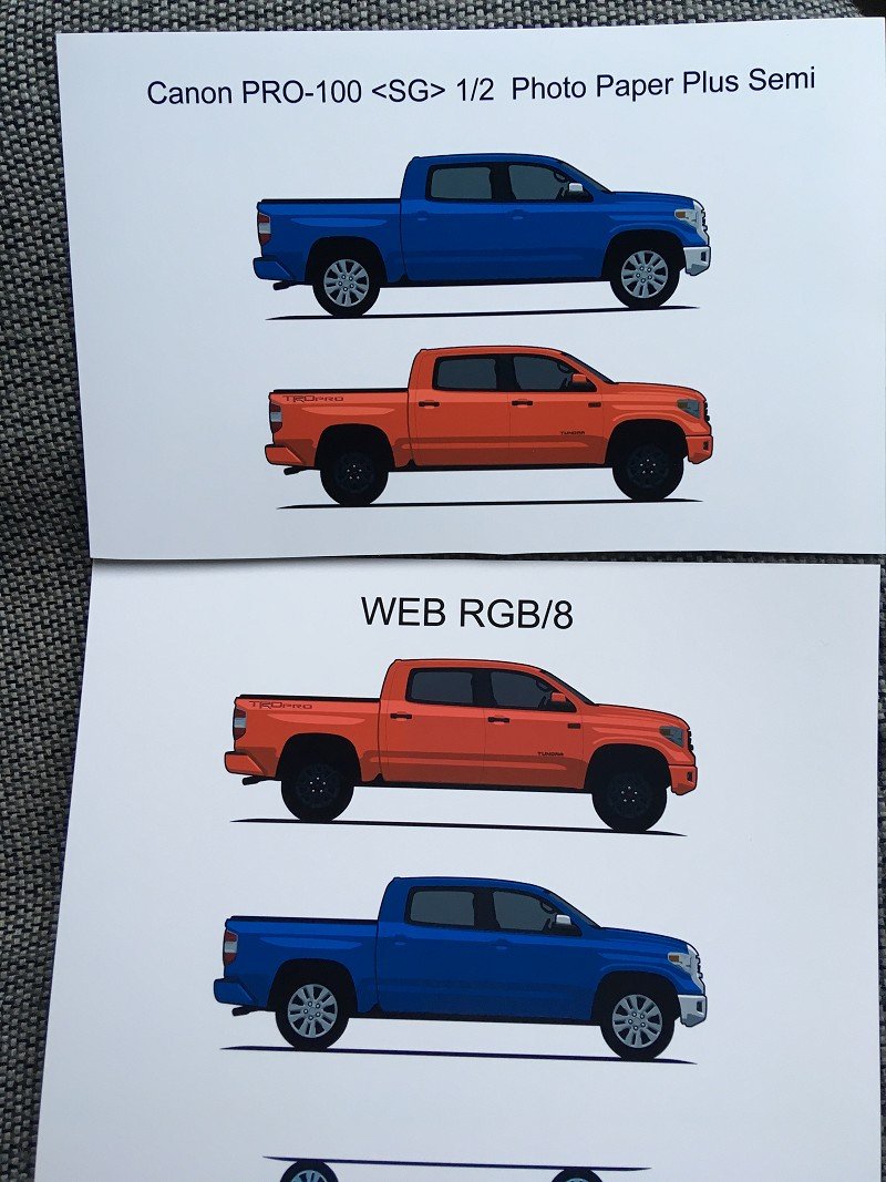
One small note to add... I went down the list of every color profile and checked the colors in Affinity Designer against my original work on the same monitor. The only one that appeared correct is the Canon PRO-100 <SG> 1/2 Photo Paper Plus Semi profile. When I print I get a more orangey-red than the others, but still not close to what I see on the screen.
-
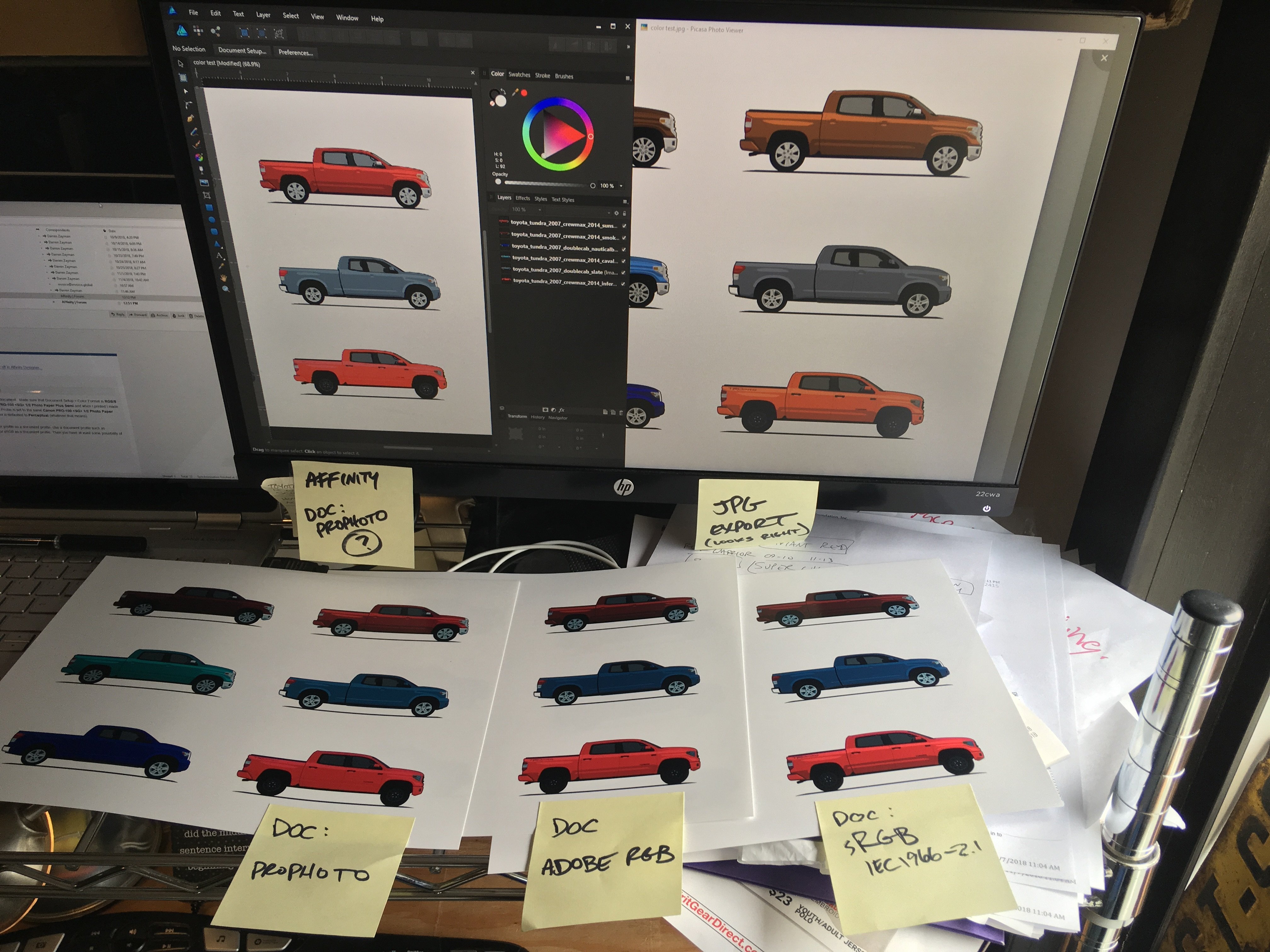
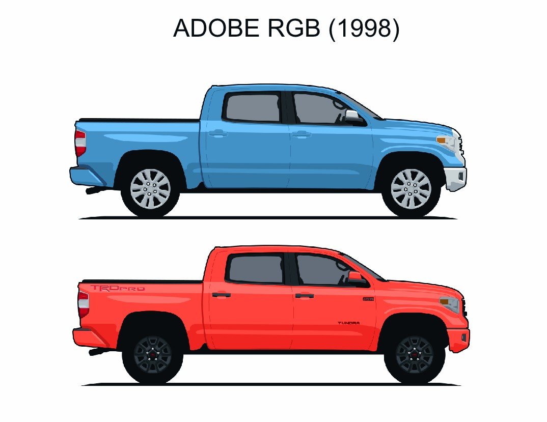
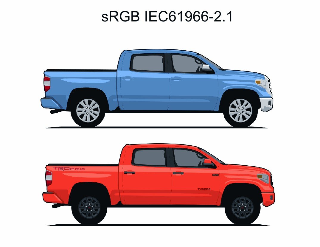
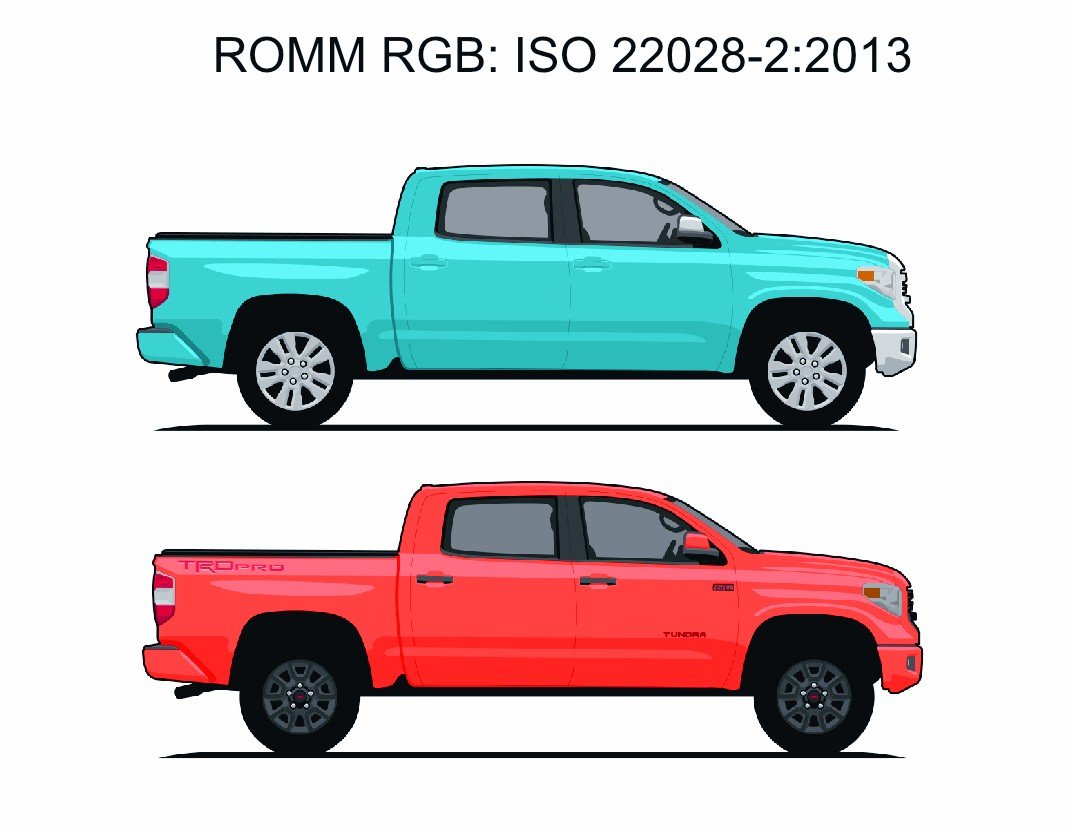
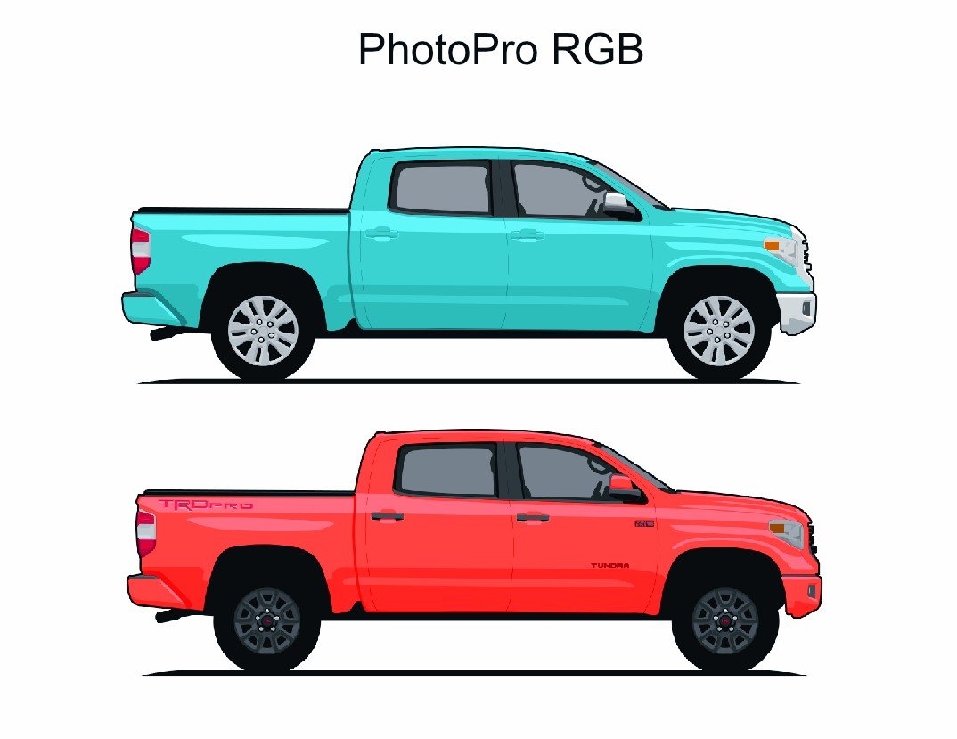
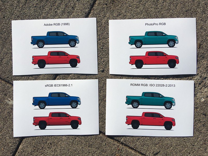
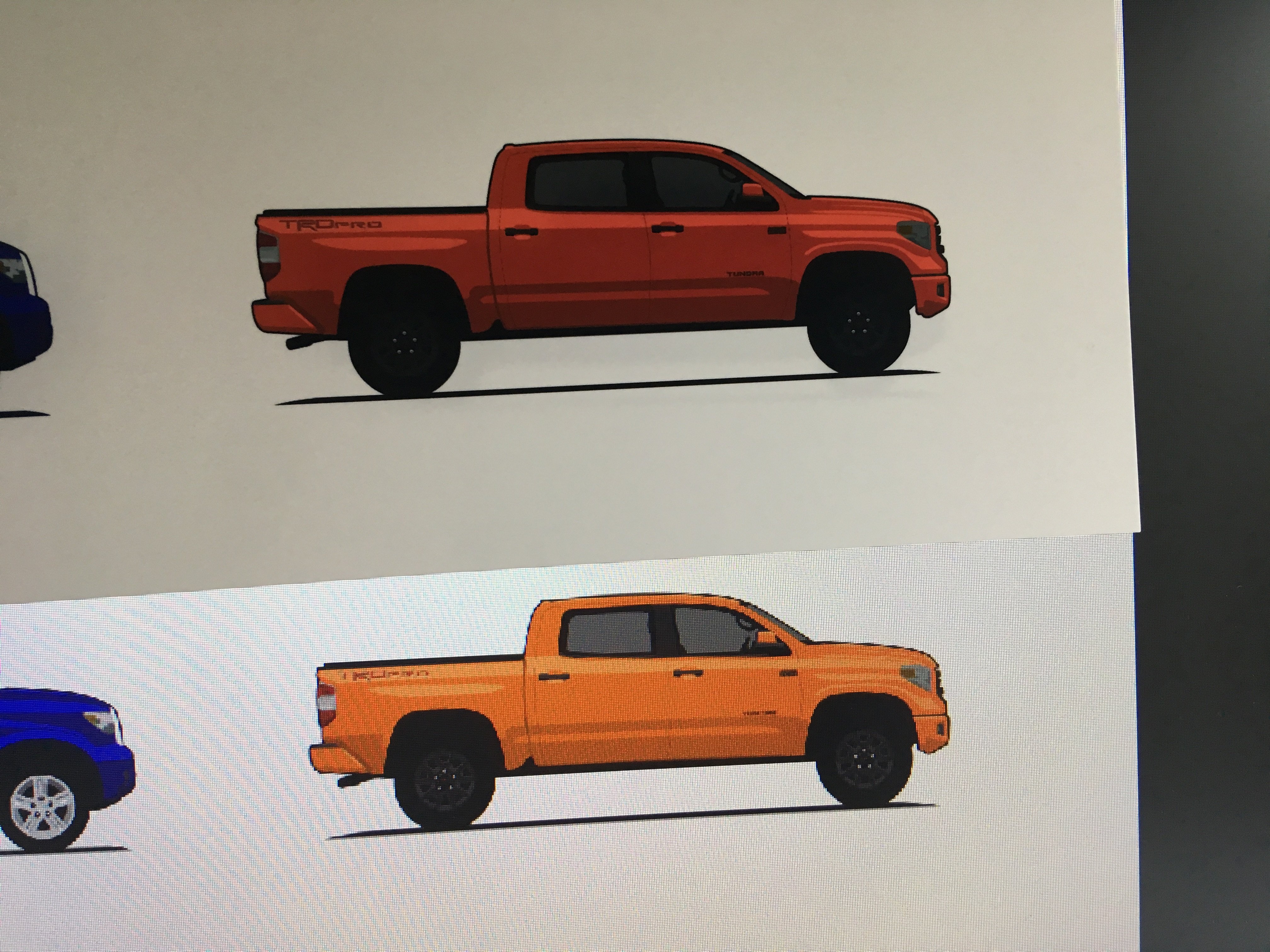
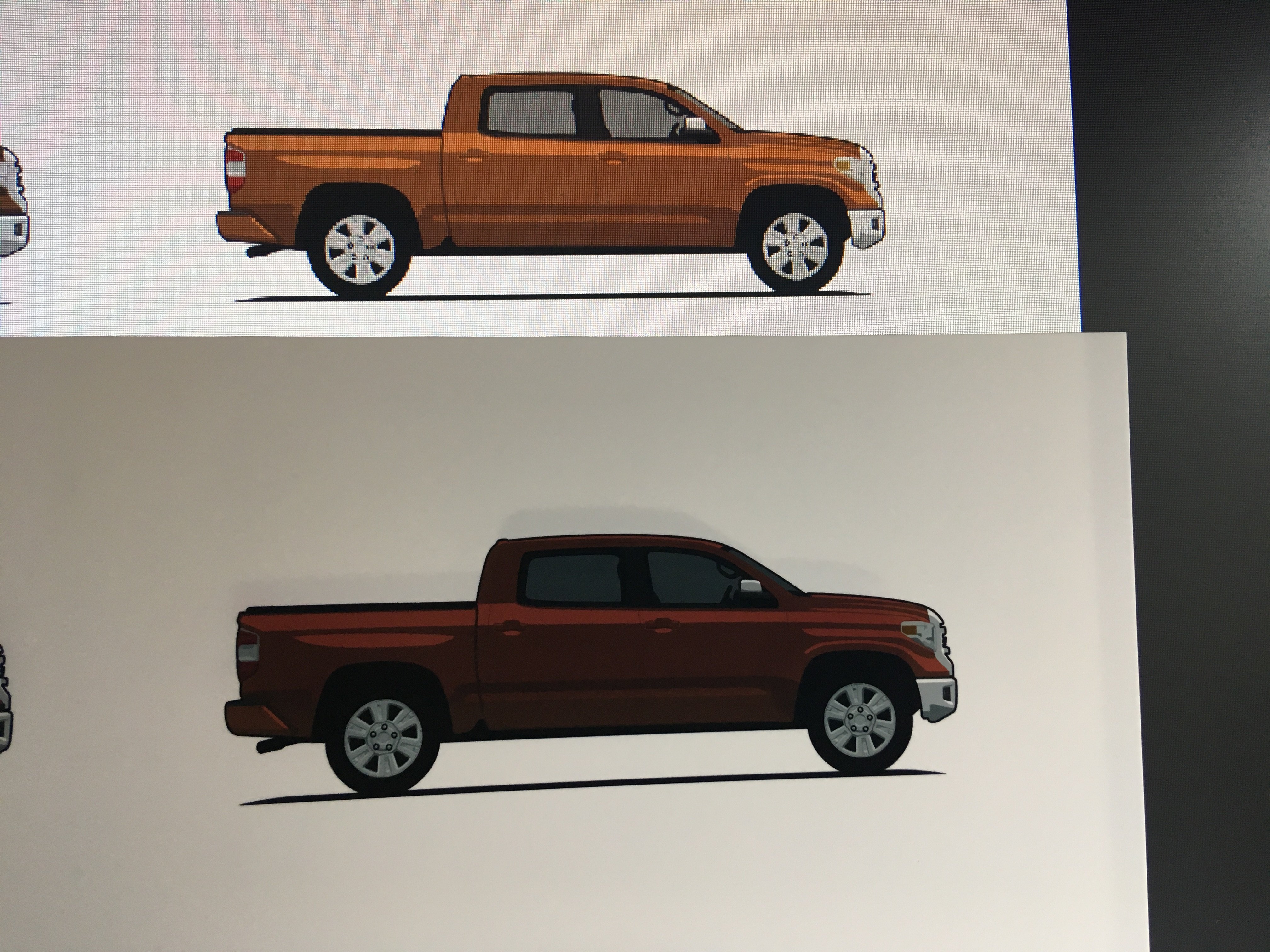
Wow. Those are some of the best tutorials I have seen! Thank you guys, I understand a little better now -- but now I feel even more overwhelmed. I'm not sure if that helped me get closer to figuring out this specific issue. Like I said, I have been printing with no issues for most of a year... everything that came out of the printer looked exactly like what I saw on the screen. I have no idea what changed and I'm banging my head against this damn computer as test after test outputs just as screwy. Same computer. Same printer. Same monitor. Same software. Definitely wasting ink and paper and my frustration level is rising. OK, did three more print tests changing the document profile. I confess that I am more confused now then I was earlier. Changing the document color profile definitely alters what I am seeing on my monitor inside of Affinity Designer. (I'm just making the change on the test document, not creating a new document and pasting the contents into each one... is this OK?) The ProPhoto color profile turned a light blue truck into Seafoam Green. I output the document to a JPG and it spat out a color that looks exactly correct! I print it and it prints out Seafoam Green. My Medium Gray truck printed out medium blue in all three color profiles -- yet it looks correctly-gray in the JPG that I exported. All three prints turned my orange truck into a bright red truck. I feel like I need some concrete steps to start from scratch. 1. Let me start with the original artwork. I design my vehicles in Adobe Animate. The color is chosen using an actual photo of a vehicle. I use my color selector to choose the RGB value of a spot on the photo that looks most appropriate. I think that even if my monitor is screwy it shouldn't matter. The browser displays the photo, the screen shot captures it and the RGB should be dead on at this point. I complete the illustration and output it to a PNG. These are Cavalry Blue and Inferno Toyota Tundras. Forgive the slight color discrepancies, these aren't the photos from which I originally pulled the color, they are just the first ones I found really quick. So far I feel that my color issues are not a problem. I created a new Affinity Designer document and imported each of these two PNG images. It seems to me that sRGB IEC61966-2.1 maintains the best visually-correct blue, but the orange is lost on all of them. I'm not even sure what to make of the last two as far as the blue goes. So then I printed each out out on the PRO-100 using the correct printer profile. None look even close to accurate. (iPhone photo taken in direct sunlight) I'm your clay. Tell me what to try next and I'll hop on it!
-
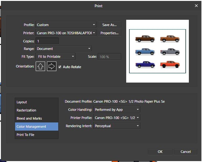
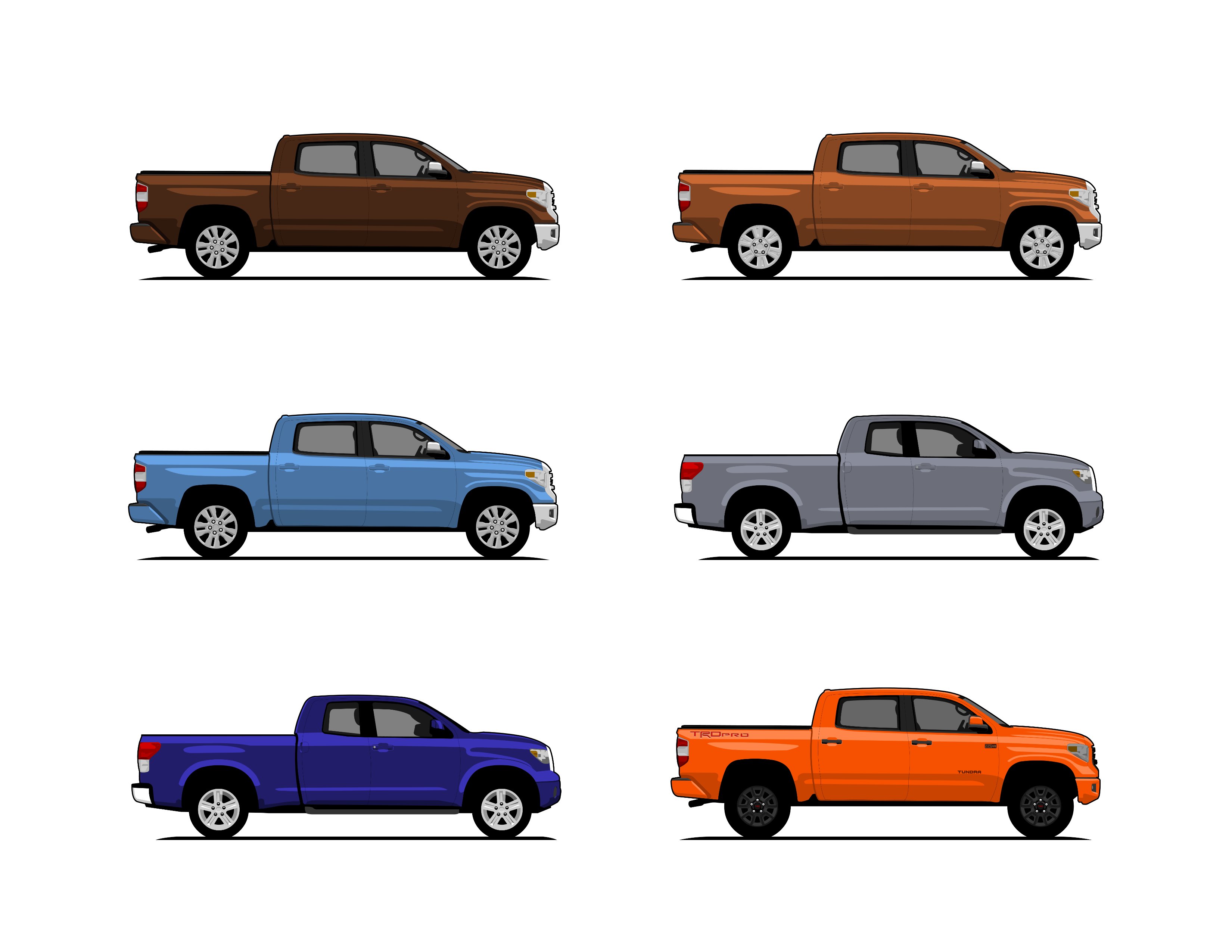
I created a new Affinity Designer document. Made sure that Document Setup > Color Format is RGB/8 and the Color Profile is Canon PRO-100 <SG> 1/2 Photo Paper Plus Semi and when I printed I made sure that Color Handling Printer Profile is set to the same Canon PRO-100 <SG> 1/2 Photo Paper Plus Semi and Rendering Intent is defaulted to Perceptual (whatever that means). Printed another sample... man, these colors seem WAY off! The orange truck looks red on the page. The bronze truck looks burgundy. The brown truck looks almost black and the light blue truck looks dark blue. The light-gray windows look very dark in the printed version. I see that on my print properties dialog box there is a checkmark for "Color/Intensity Manual Adjustment" and I haven't yet messed with that. Could that be a possible solution?
-
Argh! That sounded so EASY to fix... I was excited that it could be something so simple! Dang it. The document color is already set to RGB/8... but maybe I need to try changing it to CMYK? I made the change in Document Setup but I didn't copy/paste the content into a new document. I could see the palette change moments after I changed the color setting, so it seemed unnecessary to copy/paste. Printed a sample. The blacks weren't as dark and the grays were bluish. Then changed to RBG/16 and printed a sample. No change from the original prints. Lastly I created a new document with RGB/16 and copied in the artwork from the original print... no change. Thank you for the suggestion... have another?
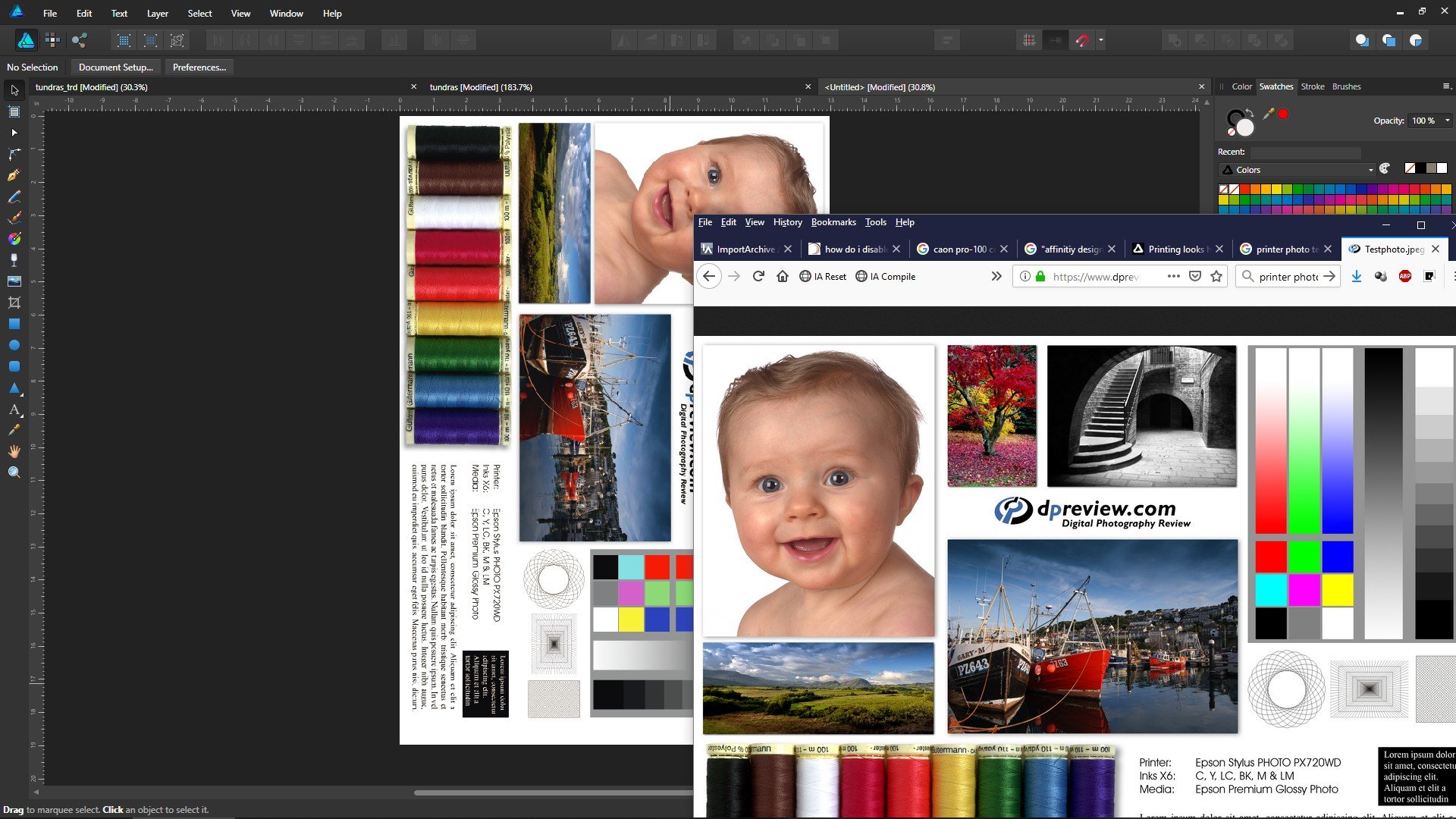
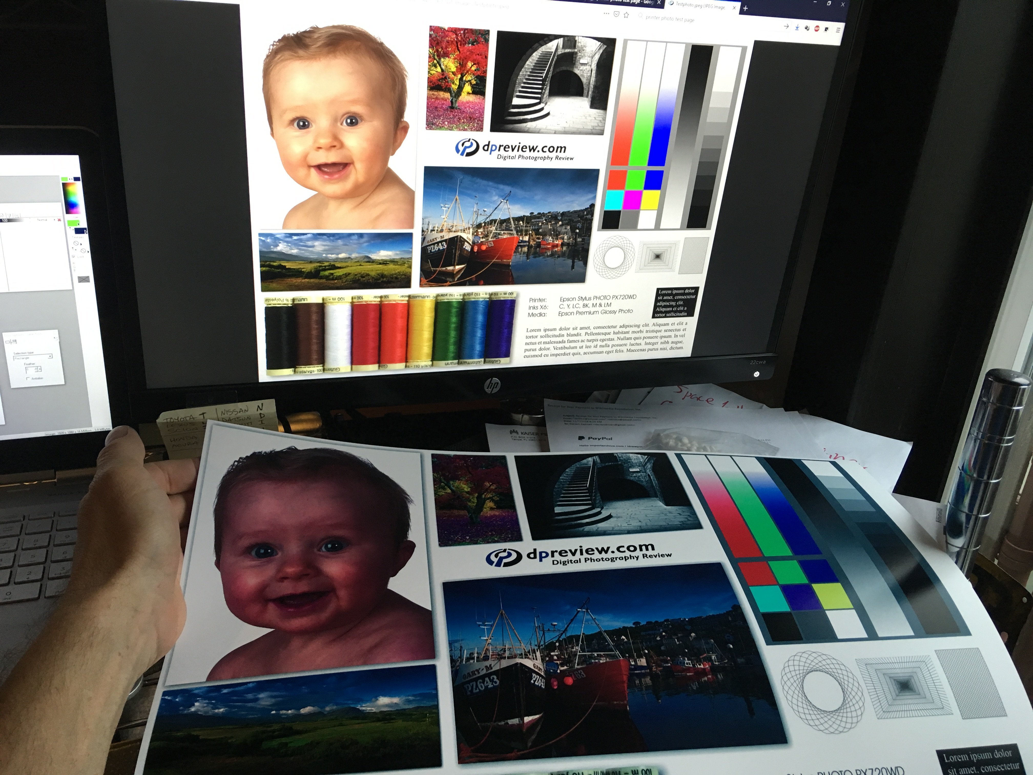
-
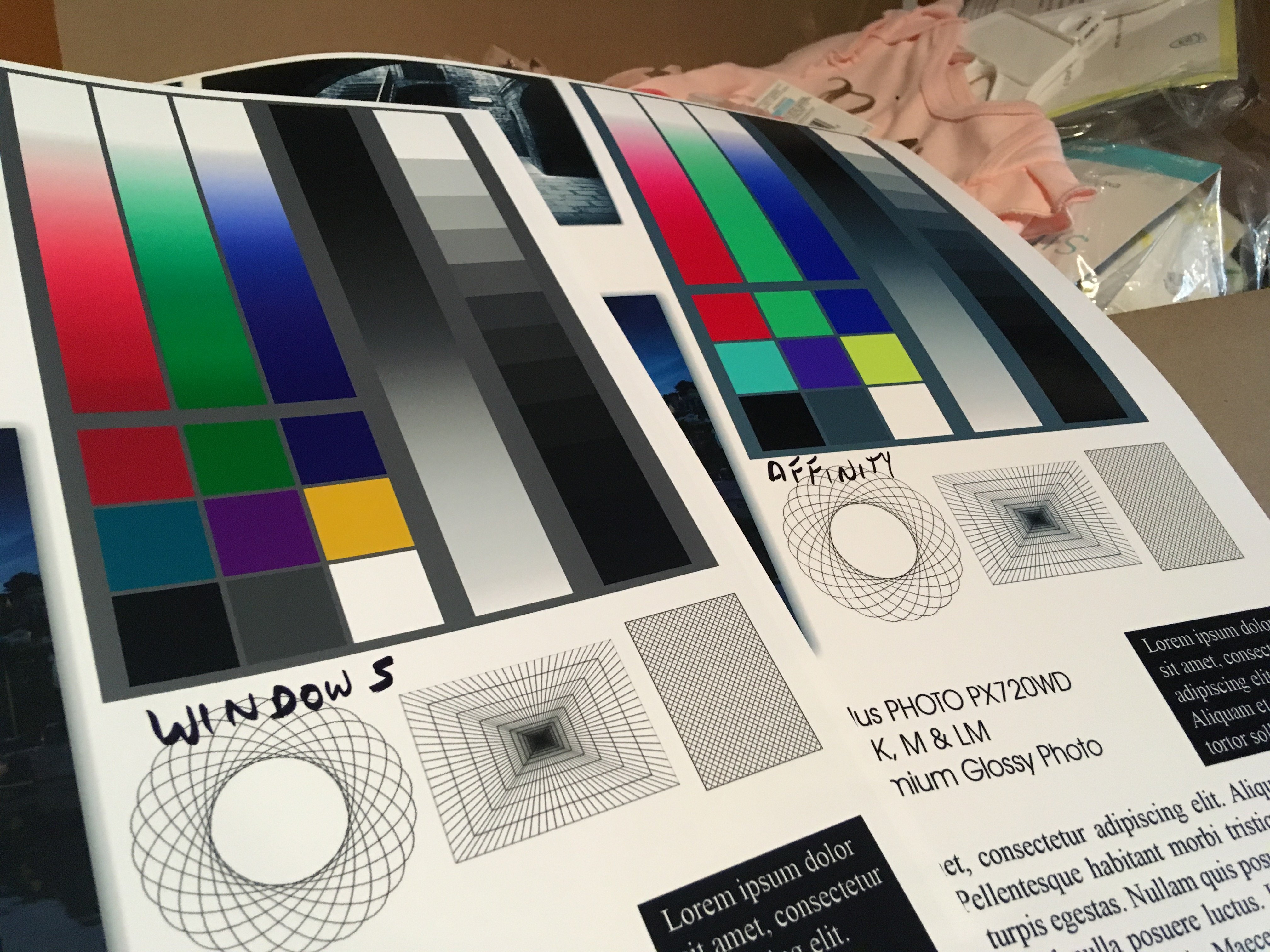
Months ago I bought a Canon Pixma Pro-100 and started using Affinity Designer. My artwork came off the printer looking nearly identical to what I saw on the screen. I was very, very excited. Now I don't know what has happened, but everything that comes off the printer looks like crap. The colors are WAY off. Basics: - Affinity Designer on HP Envy x360 m6 laptop running Windows 10 Home (using laptop monitor and 2nd aux monitor) - Canon Pixma Pro-100 using Canon Semi-Gloss paper The default color profile that was being used was sRGB IEC1966-2.1. I don't know much about color profiles and that was the selection that showed up when I started digging. I have switched my document AND printer profiles to Canon PRO-100 <SG> 1/2 Photo Paper Plus Semi and Adobe RGB (1988) with zero changes in print output results. Everything I have read talks about calibrating monitors... I admit that I have not done this, however I am not printing photos but creating artwork in Adobe Animate using the standard color palette. I feel that no matter how my monitor calibration is set when I select red #FF0000 (255/0/0) that it should still print red, right? So here is the strangest part of this. I downloaded a test image to print. On my monitor the red looks red, green looks green, etc. When I imported the jpeg into Affinity Designer to print I immediately saw that the colors were different. The red appears more pale, the bright green looks like a pastel, etc. Here is a screen shot... pay special attention to the green in the 9-box just to the right of the ship photo. ...so I printed the sample graphic using Affinity Designer and the Canon Semi-Gloss color profile and ended up with this ugly POS: Granted, the light in my office isn't great, but the baby's face looks almost purple and not skin-tone like on the monitor. Hmmm.... WTF? Had a thought... hey, what if I print this using Windows instead of Affinity Designer? Right clicked the jpeg on my desktop and let Windows do it's thing and ended up with this... The color of the baby is VERY close to what I see on the monitor when I printed from Windows. The colors in the 9-box are DRASTICALLY different Windows vs Affinity Designer. So I thought that I could output my designs to a PNG and just let Windows print it... but I tried it with my own artwork and the results came out identical to every other attempt. (scratching head) Hoping someone can help. I'm overwhelmed by Google results on this topic.