kenmcd
-
Posts
1,704 -
Joined
-
Last visited
Everything posted by kenmcd
-
@walt.farrell That was my first guess too, but it turns out the font has no ligatures at all. @Robert H. Did you actually type this text, or did it get copied from another source? I am assuming this is the Mangia font from one of the old Summitsoft collections. Correct? Below on the first line I typed "Specific" - and you can see it looks as expected from this font. The font has no ligatures at all. Not even the old legacy fi ligature which is one of the handful which do have an actual Unicode code point (FB01). On the second line below I entered the fi ligature character (FB01) from Arial. As you can see that looks a lot like the text in your image above. So I am guessing this text was from another source, and that an actual fi ligature character (FB01) was in that text (not an OpenType replacement ligature) and in APub that character was replaced with a fallback font (Arial) because that character does not exist in the Mangia font. You can test this theory by doing Export to PDF and then using a PDF editor/reader to check the actual fonts used on that "fi" in the text. So it does not appear to be a "fi" bug, but depending on how the text came into the document it may be an import issue, or something else.

-
 https://forum.affinity.serif.com/index.php?/search/&q=Tamil
 -
Liebeheide color font
kenmcd replied to Albo's topic in Pre-V2 Archive of Affinity on Desktop Questions (macOS and Windows)
Currently - no. LiebeHeide is an SBIX color font (with SVG image backup) which is a type not supported currently. No word on when, or if, this type of font will be supported. -
What is the Affinity default for Hair Space (U+200A) if none exists in the font? So Thin Space is 1/5 of an em in Affinity (seems big). And the other spaces are all derived from an em. So we can figure-out most of them. Except Narrow No-Break Space (U+202F) - what is its default? InDesign defaults are (from InDesign.Type.Professional.Typography.with.Adobe.InDesign.3rd.Edition.2014.Adobe.Press): Thin Space - 1/8 of an em Hair Space - 1/24 of an em No mention of Narrow No-Break Space
-
This is probably because a fallback font was being used. This is because of the Contextual Alternates in the font. Per the OpenType specs Contextual Alternates are supposed to be On by default. In Affinity apps the Contextual Alternates are On by default as they should be. In MS Word the Contextual Alternates are Off by default - so you have to manually enable them. This is a demo of turning Contextual Alternates On and Off. calt-On-Off.mp4 On is what you see in Affinity, Off is what you see in Word. Cascadia Code and Cascadia Mono are monospace fonts. There is no kerning info in the font. Not sure what auto-kern would do to a monospace font. Guess it depends on the app. But kerning a monospaced font makes no sense anyway.
-
@ricecrispies I see you saw this a couple days ago. It would be helpful to know if either guess addressed the actual issue and was a solution. Or was not correct. Helps to know for future support issues. Thanks.
-
That is what I was getting at - my guess is that the clipboard output from PS is only an image. Whereas from AP it may be both image & curves, which causes the font apps to reject it. So we need to know what AP is putting on the clipboard vs. what PS is putting on the clipboard.
-
Yes. It would be helpful to see the actual APhoto doc. @nicolasbulb What is actually ending up in FontLab/Gylphs when you paste from PS? Is it just an image? I am wondering if the copy of the mixed images and curves gets flattened into just an image and that is what is pasted. Again, like to see the AP doc for testing. FontLab and Glyphs may be rejecting the mixed image/curves data. No font format supports both except OpenType-SVG. So you may have to convert to SVG and paste the SVG in. What type of font are you making?
-
SCIENTIFIC ICONS SIZES
kenmcd replied to SUBH's topic in Pre-V2 Archive of Affinity on Desktop Questions (macOS and Windows)
Color or just black? Do they have layers, or are they flat? Any grayscale or gradients? How many icons? It may be possible to put them in a font for ease of use and easy scaling. -
XnView MP displays the preview image.
-
The problem is a combination of how the font is designed and how AD works. The AllCaps button fails because it does not actually convert the characters to uppercase, it just displays the uppercase version of the character. In FF DIN the uppercase version is the SS character. If the font instead made the uppercase version the Capital Sharp S, then it would work. Or the font could make the uppercase glyph change based on which language is selected...hmmm is there a separate language code for Swiss German?...that would be needed for that to work. The Upper Case command fails because it converts to SS which is two S characters not the correct code point. So again the stylistic set replacement fails. This could work if the proper character was used in the replacement. Affinity would need to fix this. If the font used ẞ by default the AllCaps would work. The easiest solution for you is to replace that glyph or find another font that does. Lots of DIN clones out there. Maybe I can help.
-
Which version of the fonts do you have installed? In the 2105.24 (2021-05-25) version the names were all messed-up. Which could cause an issue like this. The names were fixed in the 2106.17 (2021-07-13) version. So make sure you have the 2106.17 version. https://github.com/microsoft/cascadia-code/releases/tag/v2106.17 If that does not fix it we will need more information. Also: Do not have the variable fonts installed along with the static fonts.
-
And prevent DNS blocks, and prevent protocol blocks, and circumvent government censorship, and prevent ISP spying, and prevent phone company spying, and possibly help someone keep from getting murdered by their communist authoritarian dictator government, or numerous other dictatorships which kill their own citizens. My own phone company has magically sent me free upgrades when I have texted competitors (when the VPN was Off). VPNs are there to provide access, it is highly unlikely they are blocking it. It is more likely being blocked at the source either based on the VPN IP or it simply cannot or will not authenticate the user because of restrictions placed at the source (usually because they have some geolocation required as a safeguard, and with a VPN that check is meaningless).
-
missing fonts
kenmcd replied to mortenosx's topic in Pre-V2 Archive of Affinity on Desktop Questions (macOS and Windows)
Is this from a document which was imported from somewhere else? The fonts could have been named differently in updated fonts (TTF or OTF) used in the doc. And when it was imported these names do not match your old fonts. Normally the names displayed will have spaces (these days). -
missing fonts
kenmcd replied to mortenosx's topic in Pre-V2 Archive of Affinity on Desktop Questions (macOS and Windows)
Do you have more than one version of the fonts installed? Perhaps a different format. Because I am looking at the Type 1 PS fonts from 2000 and none of them have spaces in any of the name fields. Also the MorganSnOffice Regular font has name issues which can cause problems. Both the PostScript Name and the Full Name are just MorganSnOffice. Not MorganSnOffice-Regular as it should be. Since MorganSnOffice is the same as the Family Name and Style Group apps can get confused. Perhaps MyFonts is also confused by this - it is missing the Office Regular in the font list. It may be that they did not fix this before converting to the TTF fonts which are on MyFonts. I will send you some fixed test fonts via PM. You cannot have both versions of the MorganSnOffice fonts installed at the same time. That will cause name issues for sure. So un-install the old fonts first, then install the test fonts. Do this while the Affinity apps are closed. So give the test fonts a try and let us know if that fixes the issue. -
These are from the fonts in macOS Big Sur. Arial - has no narrownobreakspace character - the thinspace (410) is larger than the sixperemspace (341) Baskerville - has no thinspace character (so you are seeing a back-up font). Arial-Regular ------------- U+0020 space 569 U+00A0 nonbreakingspace 569 U+202F narrownobreakspace none U+2000 enquad 1024 U+2001 emquad 2048 U+2002 enspace 1024 U+2003 emspace 2048 U+2004 threeperemspace 683 U+2005 fourperemspace 512 U+2006 sixperemspace 341 U+2007 figurespace 1139 U+2008 punctuationspace 569 U+2009 thinspace 410 U+200A hairspace 171 Baskeville-Regular ------------------ U+0020 space 512 U+00A0 nonbreakingspace 512 U+202F narrownobreakspace 352 U+2000 enquad none U+2001 emquad none U+2002 enspace none U+2003 emspace none U+2004 threeperemspace none U+2005 fourperemspace none U+2006 sixperemspace none U+2007 figurespace none U+2008 punctuationspace none U+2009 thinspace none U+200A hairspace none Again, Affinity folks, users need to see replacements are happening as they type.
-
InDesign overrides the font metrics with its own width for the thinspace character IIRC (quite annoying). So comparing to ID is not an apples-to-apples comparison. What font are you using? It does vary by font and some fonts have some odd width settings compared to what is considered best practices.
-
Construction snapping for type designers
kenmcd replied to Laganama's topic in Feedback for Affinity Designer V1 on Desktop
FontLab has something called Tunni Lines which make this imaginary connection real. Makes it easy to manipulate both handles at once. -
Emoji support
kenmcd replied to M. J. Star's topic in Pre-V2 Archive of Affinity on Desktop Questions (macOS and Windows)
One of the selling points for the COLR color font format was that "it can use existing rasterizers" so that may have been a factor here in choosing it first. I have been testing various COLR fonts in APub today and so far all work. Did not think about MS Word until I saw this so I tested some there also. So far in Word 2019 some work and some do not. Will post the results and fonts info in a new thread when done testing. -
Emoji support
kenmcd replied to M. J. Star's topic in Pre-V2 Archive of Affinity on Desktop Questions (macOS and Windows)
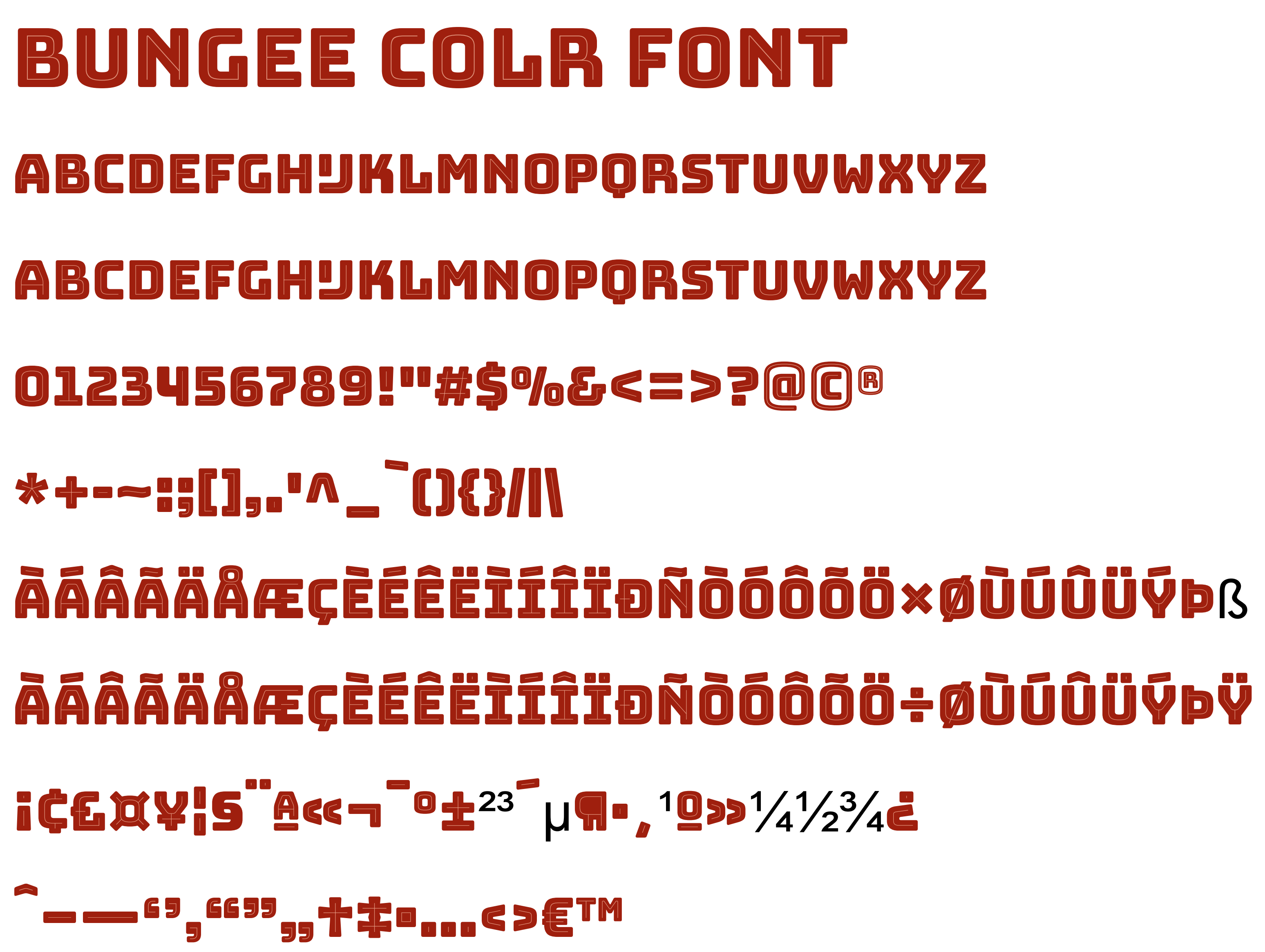
Interesting note: I have been testing some other COLR color fonts ... and they work! Example below is Bungee COLR exported to PDF using APub v1.10.1.1138.x64.Beta Then using PDF-XChange exported from that PDF to a PNG. Hell has frozen over. We have color font support in APub. 🙂
-
Emoji support
kenmcd replied to M. J. Star's topic in Pre-V2 Archive of Affinity on Desktop Questions (macOS and Windows)
Maybe yes, maybe no. The characters available are different. There is a lot of overlap, but there are also many in one that are not in the other. And the drawings are usually quite different. So it may be kind of a hit-or-miss situation. -
Emoji support
kenmcd replied to M. J. Star's topic in Pre-V2 Archive of Affinity on Desktop Questions (macOS and Windows)
This needs to be done by the application, the font technology is already there. Would be a nice feature in Affinity apps. -
Emoji support
kenmcd replied to M. J. Star's topic in Pre-V2 Archive of Affinity on Desktop Questions (macOS and Windows)
Most likely those are just the color shapes, not the fallback. Some of the fallback shapes are quite different, so you can test. Look at some emoticons like fearfulface (1F628) or facescreaminginfear (1F631). Those outlines are not in the color shapes. And some of the buildings - 1F303, 1F306, 1F307. Some of the shapes are simply missing on those. Edit: demo of the buildings switching from color to the fallback mono. Edit: the fallback mono versions of 1F628 and 1F631 In 1F628 the color versions do not include those circles around the eyes. In 1F631 the color versions do not include those lines around the hands.
-
Emoji support
kenmcd replied to M. J. Star's topic in Pre-V2 Archive of Affinity on Desktop Questions (macOS and Windows)
The fallback to the monochrome shapes has to be supported by the application. And the font needs to supply the fallback shapes (was not required and some do not have them). In COLR color fonts the glyphs/shapes are kept in the COLR table. In OpenType-TT fonts the glyphs are kept in the glyf table. So both can be present. When an application opens a font it looks at what tables are included and then decides what it wants to do with them. So the app can see a COLR table and say "oh no, we do not support COLR fonts, so let's see if it also has a glyf table, oh good, it does have a glyf table, so we can use those and treat this font like any other OpenType-TT font." Or the app can be dumb like those which rejected Source Code Pro when they added an SVG table as a test. This SVG table was added to a complete fully working OpenType-TT or OpenType-PS font and some apps simply saw the SVG table and said "we don't support SVG, we cannot use this font" - when it could just use the other "normal" tables. So they took the test SVG table out. So apps need to be updated to expect these fallbacks. Here in the forum we have already seen an SBIX font which also had an SVG table as a fallback. Glyphs App can create these automatically. FontCreator can automatically create an SVG table from the COLR table glyphs. So a font can have normal glyphs, COLR glyphs, and SVG glyphs. An app that does not support COLR but does support SVG can still have a color font. But I do not know of any app which does support all this at the moment. So the font needs to support the fallback, and the application needs support that fallback. -
Emoji support
kenmcd replied to M. J. Star's topic in Pre-V2 Archive of Affinity on Desktop Questions (macOS and Windows)
The Symbol dialog in Word 2016 works the same way as AD - it shows them as just black. But when they appear in the document they are full color.