

RobinMcL
-
Posts
91 -
Joined
-
Last visited
Posts posted by RobinMcL
-
-
Hello Everyone,
Once again, the Forum (YOU) have helped me solve the problem, this time in a rather serendipitous way.
For my project the need is only for an illuminated W, P and F. I have, in this same project, made good use of (what I call) effects to enhance text but now I needed the really elaborative illuminated letters (but just three of them). In an effort to make the clear distinction between the two concepts, I thought I would try to get one example and attach it (the "N" that I attached) but I did not want to rip off someone's work from the Internet. Then I thought I would try AI Art (Midjourney). I have been experimenting with several AI art generators to see if, in the future, they may help me. (During the past five years I have been hiring artists for illustration work.)
So I asked Midjourney to give me "The letter W as an illuminated letter using various birds, hyper-detailed, rich colors, intricate, beautiful, Renaissance style"
That's right, I asked for a W and got an N! But it was a very nice N. So, I plugged away. All I needed was a W, P and F. The "N" was so nice that I thought I would keep trying. By the time I had the W, P and F, I had most of the alphabet - so I kept going. Now, hard to believe, I have the complete alphabet in gorgeous, illuminated letters. I suppose I could easily repeat the process, asking Midjourney to use, butterflies, trees, flowers etc.
This episode makes me ponder. In replying to one of your comments, I wanted to give an example but did not want to "steal" someone else's work. Have I done even worse? Certainly, legally, I have not. The (paid) user of Midjourney has the right to anything they produce (Midjourney also holds non-exclusive rights). So, I am "free and clear" on the legal side. But what about the people who paint such things as their livelihood? I could go on, but this is not the forum where I should philosophize. I just want to let you all know that my current problem is now solved, and you made it happen.
Thanks,
Robin
-
-
Hello Everyone,
I wonder if anyone can suggest how I may go about getting and using illuminated fonts. I don't simply mean colored fonts nor the use of effects. I would like to be able to create really fancy and colorful letters. Ideally, I would like the fonts but would also like some UI that would help me select and use various colors on them in a consistent way. Next to that wish would come a set of vector characters where in, say, Designer, I could color each piece by hand and then scale them. My last option, but perhaps too much work for me, would be to simply copy a letter as an image file and paint over it in Photo.
Kind regards,
Robin McLeod
-
Hello everyone.,
I too tried to install Gigapixel Ai and failed. I tried it both on Photo V1 and Photo V2. So, now, I don't know what to do. I have two questions that someone may manage to answer for me:
- Is there another upscaling app that will work as a plugin (on V2 as this is the one I will use going forward)?
- Are there any plans to make the Gigapixel work as a plugin in V2?
Thanks to all,
Robin
-
Thank you for the suggestion. I will investigate this app.
I noticed that, if I don't use crop marks, then Publisher does not add the extra bleed. This enables me to use the following compromise.
I export pages with bleed to a pdf. Then I do the imposition in the pdf. Then print from there. Of course, this does not take account of creep nor crop. Your suggestion is MUCH better.
Thanks,
Robin
-
Thanks for the interest.
I was simply wanting to make sure that the source document was in Adobe RGB because that is one of only two choices I have in my printer. Hence, I checked the Convert button in Document Setup. This makes certain that any image which was not already in Adobe RGB will be converted into Adobe RGB. It was this image that was printed twice; the same image printed from the same Publisher document. So, fast answer to your question, Yes.
Since my first post on this, I created an ICC profile using my DataColor SpyderPrint and repeated the test with that profile. I got the same results. The print made with Publisher doing the color management was more saturated.
Thanks,
Robin
-
I did a test, printing a gamut test image two ways from Publisher. For one, I had the App do the color management (and made sure that I switched off the color management in the printer) and for the other I did the color management in the printer. I am on Windows 10. I had used X-Rite i1 Studio to create an ICC profile and I used this profile in both cases. I used Perceptual rendering intent in both cases. The color Format in my document was RGB/16 and I selected Adobe RGB (1998) as the Color Profile and selected Convert. When having the printer do the color management, I had the choice of "Standard" or "Adobe RGB (1998) so I chose the Adobe RGB one. My printer is a Canon PRO-100 and I use the latest Canon XPS driver for this printer.
I expected the two prints to be identical. They were not. While both were "good" - VERY close to what I saw on my monitor (A NEC SpectraView II monitor that had been recently calibrated) and both had very smooth shading with no banding, there was a difference in saturation. The print that had been produced having the App do the color management was more saturated.
My feeling is that, since I used the same ICC profile and the same rendering intent in both cases, both printed from Publisher on the same printer and (obviously) the same paper, that the prints should have been identical.
Can anyone tell me what I am missing?
With thanks,
Robin
-
Thank you all for your comments.
To Old Bruce: I tried the TrimBox idea. Brilliant! (I'm only beginning with my pdf software and had not got to that stage. I had hoped that Publisher would do all I needed.)
To MikeW: I'm on my third book and, like you, don't want to do a fourth. I thought about creep but decided that I had enough to worry about. If I end up being crazy enough to try a fourth book, I would take your advice and try to deal with creep. On the sewing and binding, I discovered that the recommended sewing techniques were not good enough when using (heavy) photo-quality paper for the signatures tended to separate from each other when the book opened. I fixed this by doing a second, cross-sewing of the text block; more work. What a pain.
To thomaso: I wrote to Serif on this issue several years ago and was told that they had no intention of fixing this.
To pbasdf: I add my own guides, when designing the cover, so that I get the spine printing in the correct place. This made me wonder about creating my own crop marks but I could never think through how to do that. You have shown me how. Thanks.
Once more, to all, thanks. This means a lot to me. The first book was for our first grandchild. Then the parents had a second child and I could hardly do a book for one and not the other. After over five years of work, I delivered the second book a few months ago. Then the parents said "This has taken you so long and you have had so many trials and tribulations, we would like you to make a book outlining that, multi-year journey." Gulp! This third book I call "The Story of the Stories". None of these books could have been done without the help of you all.
Robin
-
Yes, I am doing the binding myself, so I need the imposition. I am currently doing the following and it seems to be working well. I don't get crop marks but can live without that. You may or may not recall that I have a special, additional, problem in that, with MY Canon printer, I get a white line down the middle whenever I try to print two pages side by side. (It puts in a tiny, but very annoying, gap (hence white) between the two pages.) So, I can only print one page on a sheet. Here's how I manage it:
1) I export to pdf as pages (not spreads), with bleed but no crop marks. This provides single pages.
2) I then select the required number of pages for one signature and save that as a separate file.
3) I then, using my pdf software, "print" to another pdf file AS A BOOKLET. This provides the imposition for that signature. The key thing here is that the two normal sized pages now become A SINGLE double-wide page.
4) I now print that in the usual way and, since the signature spread is now a single page (to my Canon printer) it all works fine.
Life would be so easy if:
1)Publisher could print a page range as a booklet, and
2) There was not a bug in my Canon printer driver, and
3) Publisher could export pages of a spread with crop marks only in the right places,
But, in the meantime, I plod ahead. With luck, this will be the last book I will ever make. What I thought might be a six-month project has turned out to be about six years.
Along the way I have had much help from so many people in the Forum. I could not have done it (not quite finished yet!) without people like you. I will investigate the suggestions given.
Thanks,
Robin
-
Yes and no! The ultimate, most important, critical issue is that I am trying to make a book that is bound in signatures (just like an ordinary book). Hence, I absolutely MUST have imposition. This, in turn, implies that the spreads MUST be split into separate pages and then imposed into signatures (each signature is, essentially, a "booklet") So YES if I export spreads than I get the correct number of crop marks but, NO, exporting as spreads is of no use to me.
It would be great to have this bug fixed, and also to have a page range printed as a booklet. In the meantime, I am using a bizarrely complicated workaround. I export pages from Publisher as pdfs with bleed but no crop marks. Then, in my pdf software I do imposition and create another pdf which now has spreads, but with the pages in the correct order. Finally, I print these spreads. This is a great pain and opens up the possibility for additional problems, for example, my pdf software can change the size of documents in this process unless great care is taken. It would be so nice if Publisher could handle "Print pages 1-36 as a booklet, with bleed and crop marks" correctly.
Thanks for your efforts.
Robin
-
Dear EmT,
There might be a question of terminology. I posted comments on further investigations (I made in the middle of the night) yesterday. (I simply could not sleep for worrying about this.)
What I discovered was that IF I did NOT ask for crop marks, then there was NO extra bleed added. The "terminology" question arises in the following way. My Publisher document uses facing pages to produce a spread. Hence bleed goes round the outside and there is NO bleed in the gutter. Furthermore, and most importantly, there are only FOUR crop marks, one at each corner of the spread. The problem now is, how do I create a book from this? When I came to this stage, originally in PagePlus, I simply could not believe that the software would NOT let me give a range of pages and have it do the imposition to create the appropriate signature. (It's called desktop publishing so why does it stop me doing the actual publishing?!)
Since my pdf software can do the imposition, it seems reasonable to export the PAGES to a pdf and print from my pdf software, using the crop marks to guide my trimming of the text block. Ahha! What should happen is that, since Publisher knows that my pages are part of a spread (facing pages) it should put TWO crop marks on the Left-Hand side of the LEFT page and TWO crop marks on the Right-Hand side of the right page. But that is NOT what it does. It puts four crops marks on EACH page. WRONG!! Now when these pages are put back together via imposition, there is a big gap between them. Whether one calls this extra bleed or just a big gap is of no concern. The issue is, that gap should not be there.
If I do not ask for crop marks then this does not happen. So I may have used the wrong word. I was always wanting the bleed AND the crop marks. I have discovered that, if I don't ask for crop marks, I can still get the bleed. This lets me move ahead. I simply have to use some other method for deciding where to trim. This is not a big problem. But why can't I simply give a page range and have that printed as a booklet from Publisher?! I asked that question years ago and was told that Serif had no intention of providing that capability but no explanation of why was given. It is infuriating that I can print the entire document as a booklet but not part of it. I hope this is a clear enough explanation and that you can reproduce it. If not I can easily create a file for you.
With thanks,
Robin
-
Hello,
I was experimenting again, and I think things work out if I do NOT ask for crop marks. That is, if I export to pdf, ask for bleed but do not ask for crop marks, then I do not get extra bleed down the gutter. I can live with that. I'll try it again in the light of day. (I could not sleep for thinking about this problem and got up in the middle of the night to try it.) I think I can use it as it is without any of the workarounds and wanted to let you know as soon as possible.) Being able to print a page range as a booklet would, of course, be great and save me creating a pdf in the first place.
Cheers,
Robin McLeod
-
Thank you for the speedy response.
No, this is a different issue. Indeed, the previous issue seemed to be related to the Canon printer. It dawned on me that interaction with printers is highly specific to each printer, but PDFs are a bit more "standard". Hence, I may get better luck exporting to a PDF and printing from there. That seems to be true BUT,... But there are then the problems of Publisher introducing Bleed that should not be there. In the previous case I did the following workaround.
I increased my page size to the original plus Bleed and then set Bleed to zero. This was NOT ideal as I then could not use crop marks to guide my trimming of the text block.
An alternative fudge I have used, but ONLY before Publisher started to put the white line down the page on my Canon printer, was to use 2-up and explicitly list the pages of the signature in order (for example, for pages 1 through 16 as a signature I would list 16,1,14,3,12,5,10,3 for one side then turn over the paper and print 2,15,4,13,6,11,8,9 for the other side.) This is a great pain AND I continually made mistakes in the page order resulting in a massive waste of photo-quality paper! The algorithm is trivial AND is already used by Publisher BUT, for some weird reason, it is applied ONLY to the entire number of pages in the file, not to a user-entered page range. That is, if I have 100 pages in the file but want pages 1 through 24 as a signature, while I can enter 1-24 and select Booklet, Publisher actually uses ALL 100 pages so the first sheet has pages 100 and 1 NOT 24 and 1 as it should.
Another problem I have had is color management. This was nothing to do with Publisher but did impact my use of PDFs as I could never get good color if I exported to a PDF. Thankfully, I think I now have learned how to get better control of color when I export to PDF. Hence, I now feel that exporting to a PDF and printing from there SHOULD be the more reliable way to go. My PDF software does impositon very nicely and also does Manual Duplex, which makes printing the entire signature easier. This approach, however, is not open to me if I use bleed because of Publisher adding bleed down the gutter.
I hope this explains the issue.
Publisher is a fantastic application, but it seems that, when you use the word "printer" you are referring to some professional print company and NOT some inkjet printer that an amateur like me might have on their desk. That is, you have not addressed the needs of someone like me who writes the stories, takes their own photos, designs the book (using Photo, Designer and Publisher) prints it out, sews all the signatures, makes the cover and binds the book myself. It's only when I come to the printing stage that I have problems with Publisher.
Any help you can give will be greatly appreciated.
Kind regards,
Robin McLeod
-
It's quite a while since I last posted anything, and my notes indicate that I had thought this problem had been fixed.
In my document, I use facing pages and have bleed round the outer, top and bottom but NO BLEED in the inner. However, when I export pages to PDF and ask for bleed, Publisher ADDS bleed in the inner (gutter). Obviously, this is a disaster when I come to print out signatures as there is a big white stripe (that was NOT there in the original) stuck in between the left-hand page and the right-hand page.
Does anyone know how I can avoid this?
I had also hoped that printing, say pages 1 through 36, as a Booklet would give me the signature I wanted but, even though I can enter that in the Publisher dialog, Publisher ignores the page range and attempts to print the entire file as a Booklet.
I have a 324 page book that I am trying to print in nine signatures.
There seems to be two sensible options but problems with both. If Publisher could print a page range as a Booklet, I'd be home and dry. Alternatively, if Publisher could export without adding Bleed that is NOT there then (since my PDF software can do imposition) I'd be home and dry.
I've struggled with this problem for almost five years and not yet found a solution.
Ideas welcome.
Thanks,
Robin
-
Hello,
I'm still struggling with this kind of problem but have made a little progress. I set my document to RGB/16 as Color Format and Adobe RGB (1998) Color Profile. I also checked the "Convert opened files to working space" in the Preferences. When I exported to PDF, I selected PDF (digital - high quality) and (under More) selected Adobe RGB (1998) as the ICC Profile. I have not completed my tests yet but, so far, have been getting good results.
I have also discovered Understanding Color Management by Abhay Sharma and found it very helpful. (I have searched for years for some explanation of color management and asked for suggestions but failed. This book is straightforward and gives a clear explanation.)
I hope this helps.
Robin
-
I have just discovered something that really worries me and I need to do more investigating before I seek any further response from the Forum.
I do most of my work in my studio which is at the bottom of the garden. But I have a computer in the house though I use it mainly for writing and email etc. However, frustrated out my mind but not wanting to go back to the studio, I "played" around with exporting from Publisher to a pdf. My concern has only been that I want the pdf to look the same (and print the same) as what I see in Publisher. My way of operating is to work with Photo and Publisher to get things the way I want them and then to get this printed and I want it to look like what I does in Publisher. What I found was that, if I exported using PDF/X-1a:2003 as the preset, then the pdfs were (close to) indistinguisable from what I saw in Publisher. I used five different test files, including a pretty challenging gamut test. The pdfs were fantastic. I wondered if, perhaps, when I had been working in my studio, I had not tried the PDF/X-1a:2003 (even though I thought that I had). So I went down today and made certain that I did. The pdfs are not like what I see in Publisher. I'm using the same files and the same software. My head is spinning. The only thing I can think of now is that either Publisher (when it exports) or my pdf software (when it displays) are looking for some profile in some location and NOT finding it. I have had a similar problem (years ago) with my printer.
I did notice that all the profiles that I can see in Publisher are not all located in the same location on my computers.
I will try to find where all the profiles I use are located on each computer and try to make sure that the locations on my studio computer are the same as on the one in the house (where I am getting great pdfs).
I really appreciate all the help I get from the Forum. I have been struggling with color management for over four years now and have never got it to work right. Recently I stumbled into an XPS driver for my printer and, wonderful oh wonderful, now get prints that look the same as on the monitor. But my new project requires that I first create a pdf before printing and this is what has forced me to work with pdfs again.
Thanks.
I'll report back when I have done some more research.
Robin
-
Hello again,
Incredible!! What on earth is going on!?
I have just done two tests. Test one was to use the Microsoft XPS document Writer to create an XPS document from the image (the one I had used in Publisher) I placed in Word. The second test was to print that same image (in Word) using Microsoft to pdf. BOTH created great images, just like the original.
Now I have tried both ways (to XPS and to pdf) printing from Publisher and had very bad results but, printing the same image from Word, creates a great image. So the problem I have been having seems to be at the Publisher end.
What seems very strange to me is that, if I print from Publisher to my Canon PRO-100, then the print is great but if I print using any of the virtual printers (print to pdf, print to XLS etc.) the result is very bad.
Any help will be appreciated.
Robin
-
Hello BofG,
Thank you for taking an interest in my problem. I have attached some screen shots.
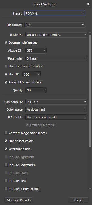
Pdf test 1 shows the setup. Here I chose linked but I have also tried embedded.
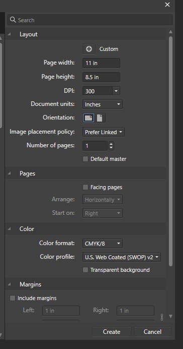
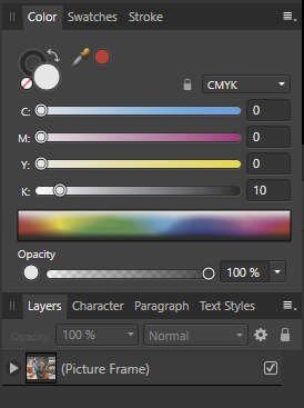
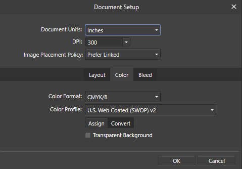
Pdf test 2 and Pdf test 3 show the color as CMYK locked and unlocked).
Pdf test 4 verifies again that it is CMYK.
Pdf test 5 shows my selection of PDF/X-4 and Pdf test 6 shows that I have just gone with the defaults. (I have tried all the other eight different formats. They all have the same problem.)
The image is the Digital Masters test image. It was in a Picture Frame. I have tried several times to upload screenshots of the two images but it has always failed. The ultimate issue for me is if the print from my pdf software looks like the print from Publisher. I use a Canon PROP-100 (calibrated) and the difference is quite marked.
I wish I could print the book from Publisher but I can't as Publisher does not do the imposition required to create signatures.
I have also contacted the PDFsam people to see if they have any clues. I have struggled with this issue for years. In the past I have had to juggle the page number is Publisher so as to get the correct signatures (e.g pages 16,1,2,15 etc) but I am about to produce a 240 page book and this approach would be a nightmare.
Any suggestions you have would be very welcome.
Robin

-
Hello,
I have not found a way of exporting to a pdf from Publisher without it changing the colors. I have a test image (Digital Masters) in Publisher with the document color format CMYK/8. I have exported in all nine pdf formats and, while there are small colour differences among them, ALL of them have pinker flesh tones than the image in Publisher. I have also tried many variants, for example making sure that conversion is done to the document space. I have used both PDFSAM and Foxit as the pdf applications from which I print and the results are the same. I have the color locked in Publisher. I checked by unlocking and it was, as expected, CMYK. I use a calibrated NEC Spectraview monitor and create my own ICC profiles for printing on a Canon PRO-100 printer. The prints are indistinguishable from what I see on the monitor (I do not have a calibrated viewing station so there may very well be slight differences, but too small for me to worry about.) I use color management done by the printer in both cases. Both prints look (as near as I can tell) exactly like their corresponding image on the monitor - but the pdf image is markedly different from the one in Publisher. Can anyone suggest what I have done wrong?
Sincerely,
Robin
-
-
Okay, I printed on my Epson printer and did not get the line down the middle. So I think that the problem was specific to the Canon PRO-100 printer. (I checked on the latest printer drivers and they have this problem.) Using my Epson printer is not the best option since, with 11" x 17" paper, I have to feed it one sheet at a time.
I also did an export as pdf and print from my pdf app (PDF SAM). This was okay as far as not showing the spurious line. However, I have never mastered colour management when using pdfs. I do my own ICC profiles and so, when printing directly from Publisher, I switch off colour management in the printer and let Publisher do it. I specify which ICC profile and rendering intent. I see that I can select an ICC Profile on Export but I don't see how to select a rendering intent.
I have now come around to the opinion, expressed by Old Bruce, that I should export to pdf and print from there. That would be great if I can sort out the colour management problems I have had. I would welcome any suggestions in this regard. At the point when I want a hard copy, I know which ICC Profile and which Rendering Intent I would use, were I to print directly from Publisher. Which pdf format should I use and how should I mage colour so as to achieve the same results via exporting to pdf and printing from PDF SAM?
Thanks to you all, at least I now feel sure that the problem I was having was an Affinity/Canon driver problem and (probably) not something silly I had done.
Robin
-
Thanks again for the comments. Actually, years ago, I did export as a PDF but went back to trying to use Affinity. Here's a little more background and I apologize if I bore you.
I write short stories just as a hobby (Word documents). It was after the birth of our first grandchild and I had written a story for him that my wife suggested I turn it into a "real" book. This is what set me off getting the Affinity products, a decent monitor, printer, calibration stuff - and trying to learn how to use it all. Phew! I then do my own binding in sewn signatures. I had terrible problems trying to print in signatures from Publisher, and still do. Bleed is also an issue because, even if I DON'T have bleed in the gutter, Publisher adds it for me. So I can't use bleed. (I adjust by making my pages a bit bigger and then trimming.) So then I tried exporting as a PDF. Now my message here is that I am a rank beginner just trying to get a silly little book made for my grandson. So which of the 9 PDF formats should I use? I was bewildered.
There was, however, one huge advantage to doing it this way - I could easily print my signatures. (pages 1-16 as booklet, 17-32 as booklet etc.) This was something I couldn't do in Publisher. But there was a huge downside. I found that I could not control colour. But things may have changed and I thank you for the suggestion. It took me three years to get that first book out by which time our son and daughter-in-law were bringing our next grandchild into the world. So I can't do a book for one and not the other. It's this second book that I am struggling with now. I've been working on these issues for five years and, while I am still useless, I'm not quite as useless as I was in the beginning.
So, thanks to you, today, as I investigate the printing directly from Publisher but on a different printer, I will also have another crack at exporting to PDF and then printing from my PDF app (PDF SAM).
I notice that Publisher has a print option called "Book" but I can't find any information about it. What I had always hoped for was the ability to say something like, "Book; 1-16, 17-32,33-52" and have it print three signatures, properly imposed. I can achieve that from my PDF app but not with Publisher.
Thanks,
Robin
-
Thank you all for your efforts on my behalf.
Exporting works fine so it seems that the problem arises only when I print. I, too have been wondering if there is some conflict between the Publisher printing setup and my printer. I think I should spend tomorrow on that issue and then report my findings.
I use a Canon Pro-100. I think I have the latest drivers. I used 11 x 17 inch matte paper and the full spread was 16.2 x 9.7 inches. I also centered the image (very accurately).
But I also have an Epson XP-960. I have not been using that as it is in a different location etc., etc. However, I think the problem warrants me taking the time to try to print on that printer. It would be very interesting, and informative, if the same file printed fine on my Epson but had the line down the middle in the Canon.
Sorry about not including the tiff. I should have embedded it.
I'll do a little more homework and report tomorrow.
With thanks,
Robin
-
The attached file shows the spread that is not printing out the way I would like. Actually, I'd prefer not to see the white line in Preview mode either but it is on the print that is the real problem.
Thanks,
Robin


Touchstone Dimensional Printing Software
in Affinity on Desktop Questions (macOS and Windows)
Posted
Hello All,
I would like to print a textured image and am thinking of trying the Touchstone plugin. I wonder if anyone has used this and, if so, if it was easy to use and did a good job.
Does anyone know of alternatives to this software?
Sincerely,
Robin