jmwellborn
-
Posts
2,155 -
Joined
-
Last visited
Everything posted by jmwellborn
-
“All that glisters is not gold: Often have you heard that told: Many a man his life has sold, But my outside to behold: Gilded tombs do worms enfold.” Wm Shakespeare had it right. Personally I don’t care two hoots about the sveltness or lack therof of the outside. I am waiting eagerly for April 30 to buy the new 24” M1 Mac, not because it comes in colors, but because of its insides. And I will definitely be upgrading from the basic model to acquire more of everything I will need and want in the way of ports, RAM and hard drive space. Judging from the overwhelmingly positive experience I am having with the M1 chip in my new MacBook Pro, I expect to be even happier with this new Mac than I have consistently been with my previous Mac desktops. (Although I must confess that I will be plugging in my trusty old tethered mouse and my trusty old tethered keyboard.) To each his/her own!
-
@StuartRc The asset kits are pure genius!
- 22 replies
-
- 1
-

-
- vector artwork
- brushes
- (and 1 more)
-

background blur
jmwellborn replied to Alvin Wang's topic in Feedback for Affinity Designer V1 on Desktop
@Alvin Wang If you will refer to the topic shown below in the section of the forums "Affinity on Desktop Questions" you will find two excellent ways to achieve a background blur from @Old Bruce and @GarryP. Just tried them in Designer. They work just as well there as in Photo. Hope this will help!
-
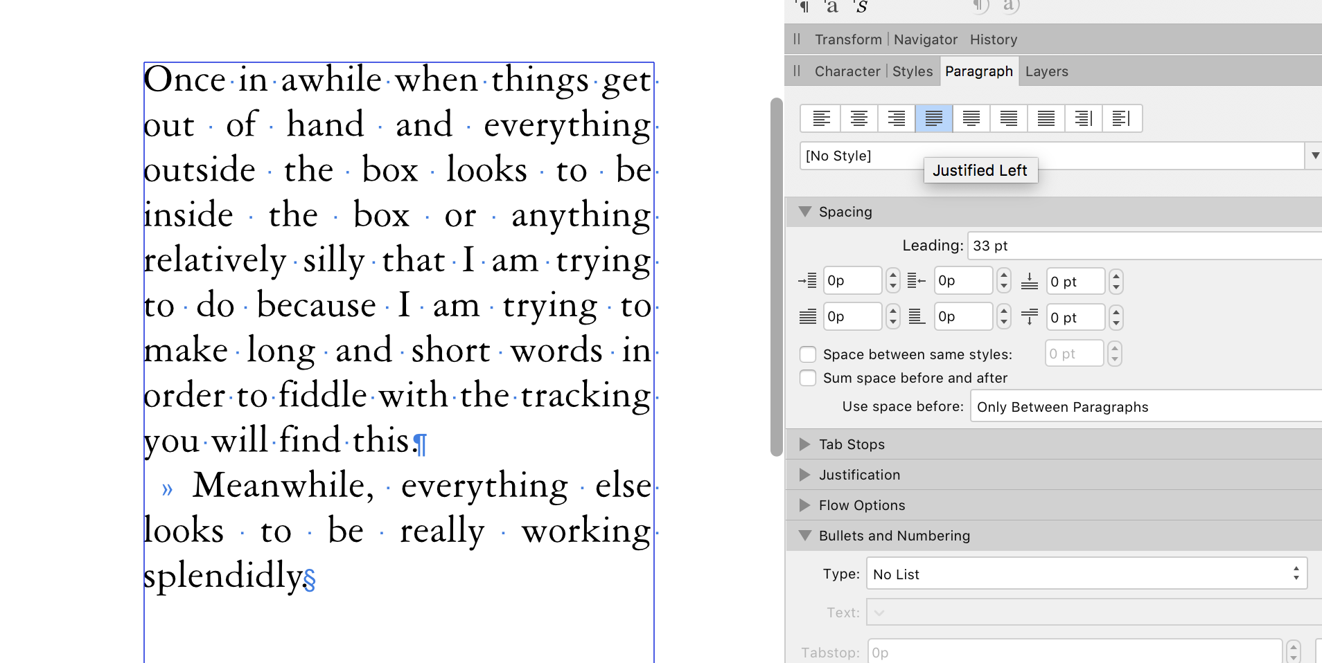
@Maaja Welcome to the Forums! @Old Bruce is spot on, but additionally you will find that occasionally even with the "Justified Last Line Left" setting you will have some lines with large gaps between words and others (such as the last 4 lines of your example on your page 4) where the words are much closer together. You can resolve much of this by adjusting the tracking, using your Character Panel, in the Positioning and Transform Section, second setting in the left column, Tracking. Once in awhile, if tracking still resists you, you may wish to insert a hyphen in order to move a few letters up or down. Here are some examples to show what I mean. (I wrote some stuff with long and short words just to achieve the effect I am trying to explain.)
-
Having experimented with both @Old Bruce and @GarryP solutions, they both work beautifully, although @GarryP's makes it possible to change the amount of blur and/or the size and location of the mask, including converting it to curves and altering its shape ; so perhaps a final "Merge Visible" could then do away with the background image layer? Anyway, here is the vote from here (naturally before I added "Merge Visible."😳 )
-
Typography in Affinity Publisher
jmwellborn replied to Prouvé's topic in Tutorials (Staff and Customer Created Tutorials)
I think that is because the paragraph starts with a word with an apostrophe and the second with four vowels. By then the mind goes into lockdown for a second or two, before pressing on regardless. -
Who's excited for 2.0?
jmwellborn replied to evtonic3's topic in [ARCHIVE] Designer beta on macOS threads
Read this and weep, @RNKLN
-
Typography in Affinity Publisher
jmwellborn replied to Prouvé's topic in Tutorials (Staff and Customer Created Tutorials)
@Prouvé Here's another version:
-
No user manual?
jmwellborn replied to 4711's topic in Pre-V2 Archive of Affinity on Desktop Questions (macOS and Windows)
@DaveS 71 Please look at the first newly-pinned post in this section of the Forums, for many resources to help you learn. -
Typography in Affinity Publisher
jmwellborn replied to Prouvé's topic in Tutorials (Staff and Customer Created Tutorials)
@smadell and @Alfred surely those must be "typos?" 🤪 -
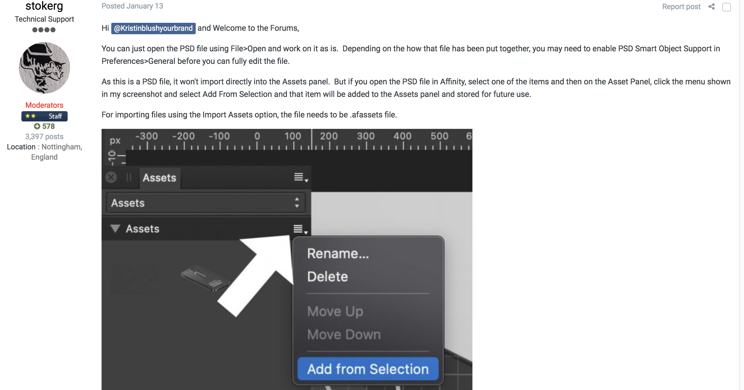
Welcome to the Forums @Cr1ym Are the assets you are trying to import in .afassets format? There is also this information that might help you.
-
No user manual?
jmwellborn replied to 4711's topic in Pre-V2 Archive of Affinity on Desktop Questions (macOS and Windows)
@towelhead and @DaveS 71 I suggest that you check out some very useful official information on the basics of Photo, Designer, and Publisher that is posted here and readily available on the forums. It is a little hard to find, but there nevertheless. Go up to the top of the Forum page, click on the word “Affinity” then click on “Spotlight.” You will open a vast resource of official Affinity articles. Scroll down to the section titled “Learning” and click on that. More very useful “how to” articles. Then scroll to “Top Learning Articles for Affinity Newcomers” and you will find — among other things — three specific articles: “Jump Into Affinity Publisher,” “Jump Into Affinity Designer,” and “Jump into Affinity Photo.” All are very helpful and very easy to understand. NOT a “stinking pile” of anything. Hopefully Spotlight will help you on your way. -
Masking Effect...
jmwellborn replied to Gort's topic in Pre-V2 Archive of Affinity on Desktop Questions (macOS and Windows)
@Alfred And turned loose with someone like me, your method can result in things like this. Zowie!!🙄 On the other hand . . .
-
Upload, Download and share Affinity resources for free
jmwellborn replied to Aaron Martin's topic in Resources
I got a “not secure” notification from Apple regarding this website. -
@boriscargo Those little green men are so clever and so funny. I don't know about antialiasing, but you have certainly "aliened" your drawing. One keeps looking and looking and finding more and more of them peeking around corners, skateboarding on roofs, caught in a rope around a tree trunk, upside down in the trash, etc. The whimsy is wonderful. The patterns are inventive. Bet you started drawing things like this in elementary school, when you were supposed to be practicing your handwriting!
-
Welcome to the Forums @PinkLouie☺️ Nope. The Shift-click thing doesn't work in Designer. I am left-handed but have to use my right hand to draw with my mouse (tremor in left hand). Here is what I was able to achieve in Designer, using the vector brush tool and with a check mark beside "Stabilizer" in the Context Toolbar. The veritical lines were freehand. The horizontal lines were used by following a Guide which I pulled out from the rulers. Hopefully your hand is much steadier than mine. Perhaps this will help?
-
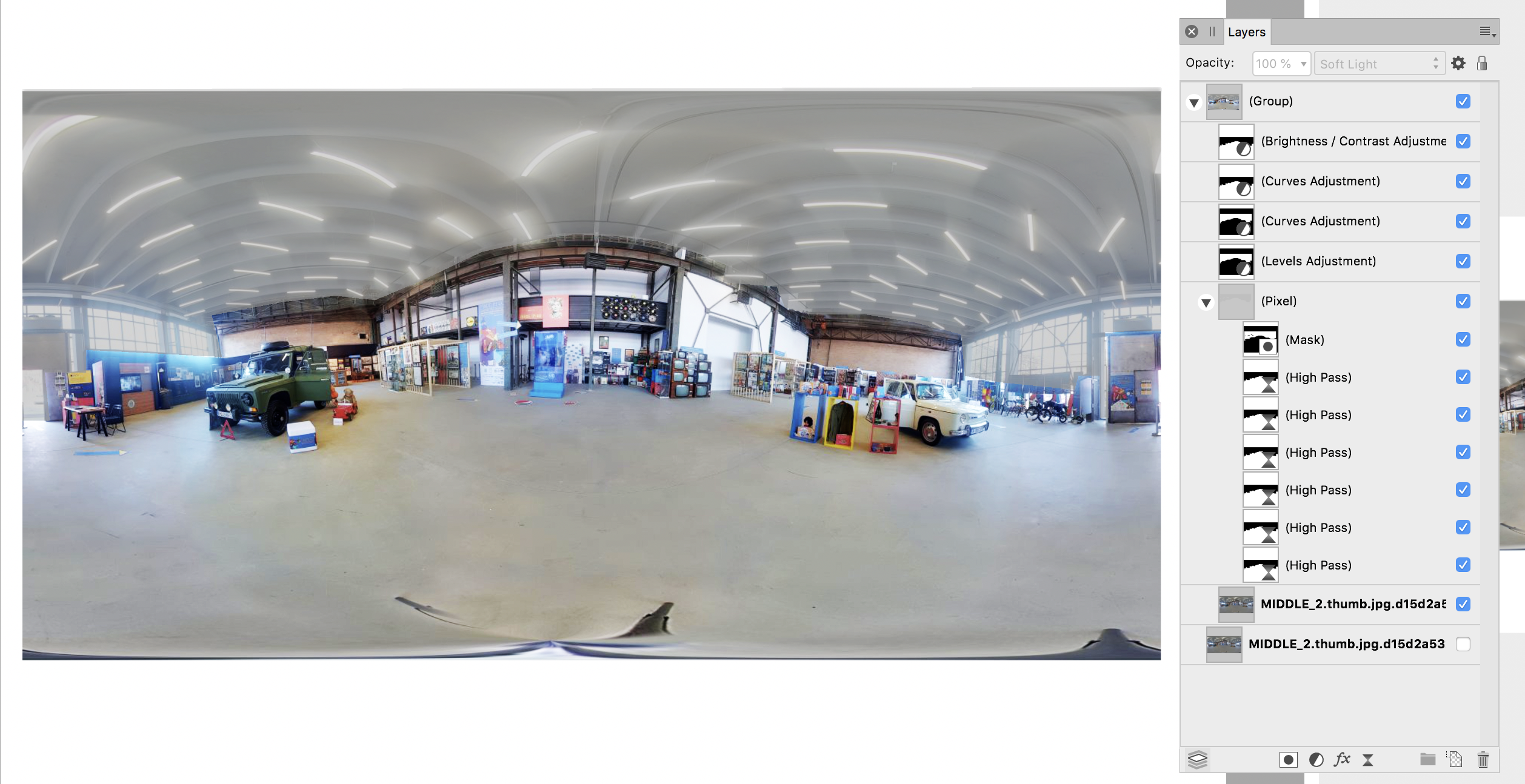
Here's another effort. I was trying to avoid the pixellation in @smadell's image. I tried various and sundry things with spectacularly howling lack of success, so the history is going to look like something out of a "how not to. . . manual" but I have included it in the attached file all the same. Since @Vale22 wanted to brighten the colors and contrast, I also used "Dave's 6-Layer High Pass Sharpening.afmacro" (you can find this in Resources: Multi-layer high-pass sharpening (with macro) to give the image some instant sharpening. The attached file was done in v. 1.8.4 so it can be imported into v. 1.9.2. Using_6-layer_high_pass_sharpening.afphoto
-
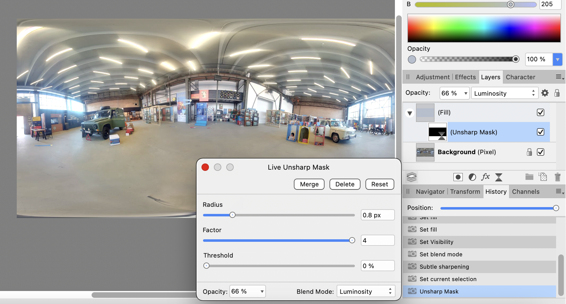
@Vale22 Thought of something else you might be able to try. I used the Selection Brush Tool to isolate the parts of the image that I wanted to keep as they are, using the Quick Mask to work around the tiny bright bits near the doors, then inverted the selection and used FILTERS>BLUR>Depth of Field Blur and dragged the radius until I had muted the overhead lights. I found a few remaining bits that were still too bright, so I just repeated the process, this time using the Selection Brush Tool at a very small setting with the Quick Mask to go over those bits again (In the second image I had still missed two. SubsequentlyI repeated the Blur>Depth of Field two more times on those two.) I then inverted the selection a second time so that I was back to the central part of the image and chose FILTERS>SHARPEN>Unsharp Mask. I stopped there, but could have made any other adjustments I wanted. This process has the advantage of not being restricted to v. 1.9.2 and the Divide Blend mode, and would be a relatively quick fix for many images, although not a one-stop shopping trip.
-
Welcome to the Forums @Vale22 and Happy Easter! I am absolutely unqualified to give you a professional answer, such as @smadell, or @Old Bruce but if you are using Photo v. 1.9.2 (Mac) or the equivalent in Windows, you might try using the new Divide Blend Mode to take some of the sharpness out of those windows. I fiddled with it until I discovered that you need to choose one of the grays in your image to dull the brightness of the windows. At that point, I used a Sharpening Filter to make things a little more crisp. The attached image shows the initial result. The attached file (including the history) was done in v. 1.9.2, so you wouldn't be able to open it on an earlier version of Photo. I exported my result as a JPG and then on my 21" Mac (skinny 13" laptop was a bit squinty) I tried some Levels Adjustments and Curves Adjustments to work on the various colors. One thing I discovered was that reducing the Output White Level to about 83% in the Levels Adjustment helped take more of the glare out of the ceiling lights. I didn't work on the floor to ceiling windows. But I have subsequently followed @Old Bruce's suggestion and used the Freehand Selection Tool to outline those windows and then applied the Exposure Adjustment with a reduced opacity. This might give you some more ideas. Using Divide Blend Mode.afphoto
-
@Mike76 The answer in my case is that with v. 1.8.4 the default position for the Overlay box was Thirds Grid. Or at least it seemed to be set that way each time I started a new file and used the crop tool. The default position in v. 1.9.2 seems to be "None," so that the grid doesn't automatically appear. If you will open a document, use the crop tool and set your Overlay to "Thirds Grid" and then go up to EDIT>DEFAULTS>SAVE you should then be able to open any file thereafter, select the crop tool, and find the Thirds Grid there automatically. (Note: If you choose EDIT>DEFAULTS> and then Synchronize from Selection you will only save the default of Thirds Grid for the currently open document. Hope this is your answer!
-
@Digitally Fearless the link to the video has disappeared.
-
@StuartRc The Humble Bumble has turned into a tree!!! What would Rudolph say to that? Really really like this piece. You are truly inspired -- and gifted!
- 22 replies
-
- 1
-
-
- vector artwork
- brushes
- (and 1 more)
-
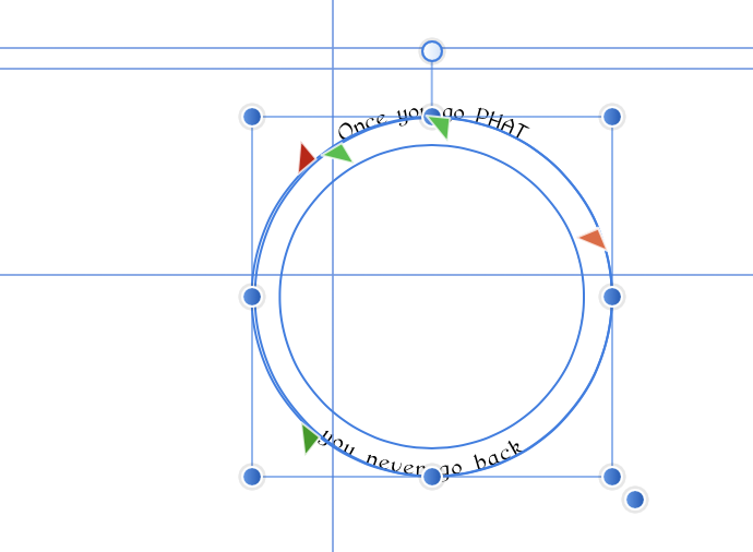
Text on a path
jmwellborn replied to jackamus's topic in Pre-V2 Archive of Affinity on Desktop Questions (macOS and Windows)
@jackamusQuestion 2. If you separate the two ellipses that make up your circle then you can use the artistic text tool, drag over the text and then use the Context toolbar to change your font and font size to anything you want, one text layer at a time. I changed your font to Pierce Roman just to try it out. Question 4. I just dragged the green and red sliders around until I made the lines appear where they needed to be before I (stupidly) noticed that there were two separate ellipse layers . A more accurate way to adjust the baseline is to use the Character Panel, Positioning and Transform, and adjust the baseline either up or down (see screenshot). I used an exaggerated example -- moving the text up, rather than down, to show you. Question 3. As for resizing the whole image, I just grouped the text and ellipse layers and dragged on the lower right dot. I strongly suspect that nobody would hire me to design anything. C'est la vie!😑 Text_on_path -2.afdesign
-
Macht nix @Failix DeepL says that means "never mind." Google translate says that means "no problem." We can all muddle through until we figure it out, whatever "it" is! I'm glad you all found the solution.☺️
-
@Charles Kirke If you are on Mac, the original download should be in Finder>Downloads. If not, download it again. Then if you want to add the LUTs to your Adjustment Panel>LUTS you click on the cog beside the little LUTs icon, select Import LUTs or Import LUT Category (see screenshot below) and you will be directed to Finder. Choose Downloads, and click on the 9 LUT Pack folder. This should work, although I have not purchased that pack so can't guarantee it. If you wish to keep the LUTs in a folder and then just add one when you choose, then copy the 9 LUT Pack folder from your Downloads to a permanent file (see second screenshot) that you can access whenever you want, via LAYER>New Adjustment Layer>LUT. A small window will appear with the block Load LUT (see third screenshot). Click on that and you can then go to the place in FINDER where you have your LUT file.