Swoop
-
Posts
13 -
Joined
-
Last visited
-
 Swoop reacted to a post in a topic:
Uneven image edge after straightening and cropping
Swoop reacted to a post in a topic:
Uneven image edge after straightening and cropping
-
Swoop reacted to a post in a topic:
Uneven image edge after straightening and cropping
-
 I have the latest version of Affinity Photo on my MacBook Pro. I have noticed whenI rotate or straighten an image then crop it to the required size that it somehow leaves a rather uneven edge on the image which is about 1 pixel in hight along the edges! This then means I have to crop the image again to remove the uneven edge. I hope this makes some sense and it only appears to happen whenever I have rotated or straightened the image prior to cropping. Thanks for any info. Peter
 -
Swoop reacted to a post in a topic:
Photomerge
-
Thanks MikeFromMesa I think your probably right about it not being on many priority lists, I would personally love it and it would just put the icing on the cake for me as I haven't got a photomerge programme after dumping the creative cloud. My latter comment was a little tongue in cheek but I would genuinely like to know if Serif and the guys at Affinity Photo have got any plans at any stage to add Photomerge? Not a hard thing for them to answer really. Thanks again Mike for your reply.
-
Yikes looks like this one has fallen on deaf ears!!
-
Will Photomerge ever be on Serifs road map for Affinity Photo? Ta, sorry if this has already been covered!
-
Swoop reacted to a post in a topic:
Affinity Photo Public Beta (1.1.2.23923)
-
Just curious!
-
Affinity Photo Help - the good, bad, or ugly?
Swoop replied to acapstick's topic in [ARCHIVE] Photo beta on macOS threads
Liking AP but as per my post in the forum about fuzzy Text rendering which does not seem to have been addressed with the latest update. Heres hoping. Peter -
Just downloaded the very latest version of Affinity Photo. I have to say there is still an issue with slightly fuzzy text when the image (sizes and dimensions as above) is saved as a decent sized .JPEG If you physically merge down the text on the image or just simply save it as above the text rendering is not crisp and clear as it is on the screen before it is saved! I won't harp on any more about this issue but I need text on images so it would be very important for me. I do like this programme but the text fuzziness is a pain and it is just not right! Peter
-
Hi MEB Sorry I couldn't post yesterday but I hit my post limit :-) This forum will not let me upload the format which you asked me to send to you! I am getting the Error message saying I am not permitted to upload this kind of file!! Maybe you could try and replicate a 955px x 637px .jpg saved at about 250kb with a small font wrote on it, and see if the font is fuzzy when you save the image. (and view it outside Affinity Photo). Cheers MEB
-
Thanks MEB Saving it as a .PNG and then rendering a new text layer and then exporting it as a .JPG definitely worked with a much more sharper text albeit very onerous. With every respect and no implied offence to you or this great App, I can render text in pixelmator without having to save it as a .PNG and then a .JPG and it is very sharp! I wonder if anyone else has this issue of fuzzy text on a saved .JPG or could it be a small Beta type issue in Affinity Photo? Thanks MEB, hopefully this can be sorted somehow. Best regards Peter
-
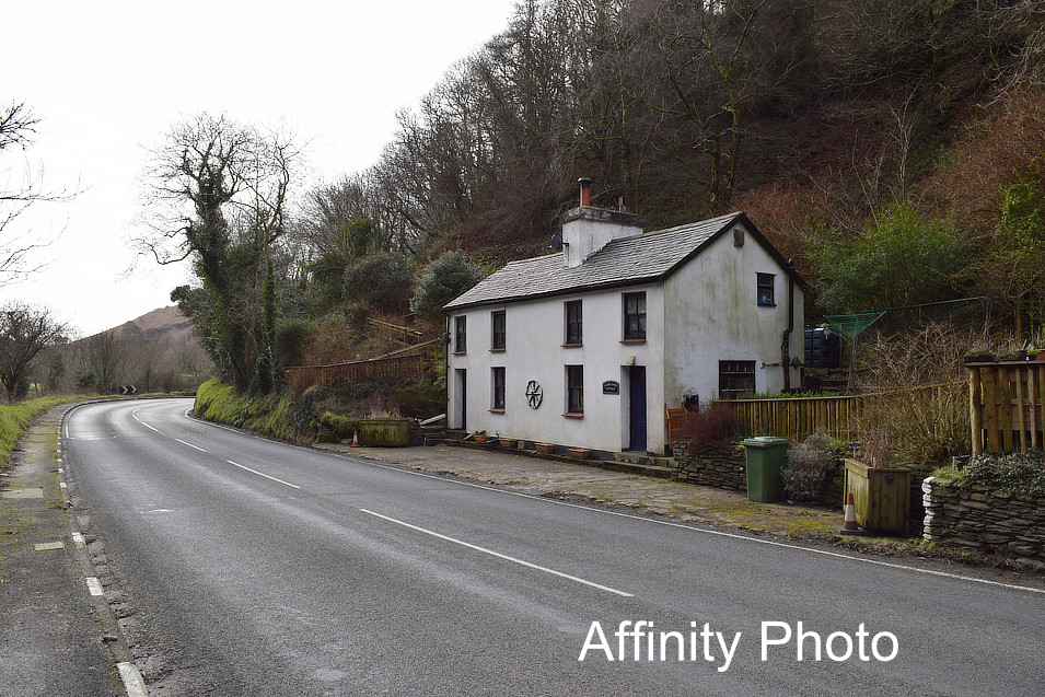
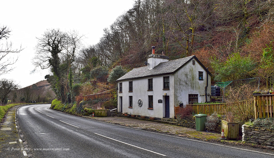
Here you go MEB 1st image is a screen shot of the text in-app so to speak 2nd image is exported in Lanczos and fractionally not as sharp. Definitely so much sharper in app and obviously the smallest the text the fuzzier it is. Peter

-
Hi MEB I have been playing around with the text layer on the same image and I am starting to bang my head against the wall a bit :-) When I add a text ayer to the image it is crisp and perfect in the Affinity Photo Beta App. When I come to save the image in .jpg at a reasonable size for web use (250kb) the text is not as sharp as it was in the app!! Bit confused to be honest. Peter
-
Hi MEB Thanks so much for all your advice, I will have a play with what you suggested, and I agree the road surface and small font doesn't appear to help with this particular text layer. Loving this Affinity Photo Beta and thanks once again for your advice. Peter
-
Swoop reacted to a post in a topic:
Text Layer
-
Not sure if this is a issue or me doing something not quite right in the Beta of Affinity Photo?! When i have prepared a low res jpg for web use (say 200kb) I always add a © of my name, I am noticing that when the layers are flattened for completion the text does not appear to be standing out as it should. I hope the attached example explains better! Any help or advice would be appreciated. Peter