dannyg9
-
Posts
450 -
Joined
-
Last visited
Everything posted by dannyg9
-
Tweak some bits here and there, but overall they all stand on their own. That's the glory of experimentation. As creative endeavors are always subjective, there is no "wrong" in any of it. Discovery comes from practice, throwing caution to the wind, and unintentionally wandering down a path.
-
 Love it. It's pieces like this that I call Grand Simplicity, which is no easy thing to achieve. On rare occasions it can be a happy accident. Incredibly good job.
 -
affinity publisher Sharing my publisher newsletter
dannyg9 replied to pcdlibrary's topic in Share your work
Nice work. Simple and clean. A few comments. On the TOC page, you can make the text a little larger and increase the leading to fill out the space a bit, OR maybe add an image on the bottom (Large American Flag, or the Legion Logo from the cover). Maybe make the color and size of the frames on the photos on pages 1-3 uniform. Simple 1 point strokes on the photos throughout with the key blue or red color. -
affinity photo First time at trying to restore a old photo
dannyg9 replied to tycoon1954's topic in Share your work
I've done a number of photos that require time (if, in my opinion, you want it done right) and patience. I walk away and come back to certain pieces, often because I work on sections at a time and I tend to get "cross-eyed" so-to-speak. As the image becomes clearer as you progress, it will let you know where to go and what to work on. As Vector Whiz said, reconstructing realism takes time. -
affinity photo First time at trying to restore a old photo
dannyg9 replied to tycoon1954's topic in Share your work
So far, so good, although he looks as though he's no longer "grounded." I can only comment in as much as what you may or may not have done. One thing I never do when retouching is to select areas and work on them with any filters or lighting effects. The area worked on seems to become "isolated" from the rest of the photo and that causes more work to blend it back in. The outline of the woman in the background has become more pronounced. Good or Bad? That's subjective. Depends what you're trying to achieve. Personally, I use the Patch, Burn, Dodge, and Clone tools along with occasional application of the Blur tool. Methodology is different from person to person. If you can't achieve the results using what one person employs or what a video shows you, but you DO get results by your own methods and experiments then you've still achieved the goal. I've also learned that it's a life-long process of learning and experimentation, both as your skills improve and as programs are updated with newer features. I've included a sample before and after.
-
Thanks. In regards to the tattoos, unfortunately, no. Fallon is really cool. I've designed some tattoos for friends YEARS ago but I'm not a tattooist. Love that Pee Wee tat. Fallon has gotten a lot more ink since that photo set was taken.
-
Coil tattoo machines.
-
Gorgeous. Well done.
-
Brilliant. Where and when can I purchase one?
-
it IS reminiscent of a screen print! Love it, and the title is brilliant.
- 1 reply
-
- 1
-

-
- affinity designer
- ad
- (and 3 more)
-
Brutally strong image.
-
This looks fantastic and as we don't have access to what you previously did, it stands amazingly on it's own. Personally, I like discovering the bits and pieces of Designer as I absolutely LOATHED the bloated albatross known as AI. I've had NONE of the problems with Designer that had plagued me with AI. Truthfully, I probably only used AI when there was no other option so I didn't venture very far with it, but with Designer I have been exploring and advancing much more than otherwise. I think whatever shortcomings the program may have in regards to certain features will be a gap that will be closed sooner than later.
-
Absolutely fantastic! A feast for the eyes.
-
Normally I'm not crazy about colorizing photos, but this has an otherworldly aura about it. The color choices and their application. It's not over-the-top and it compliments the tonality of the original. Very akin to the manual method of applying dyes to the photos. Fantastic job.
-
Nice work Dr. Frankenstein. (yes, that's meant as a sincere compliment).
-
This is genius. I had an old program years ago that would do this, but if you would, can you explain how you did this in Publisher? By the way, thanks for the book I shall "digitally" keep it on a close shelf!
-
affinity designer Crystal Reed vector portrait
dannyg9 replied to VectorWhiz's topic in Share your work
Beautiful. Love the hair. All the more impressive as it's a vector piece. -
Super Impressive!
-
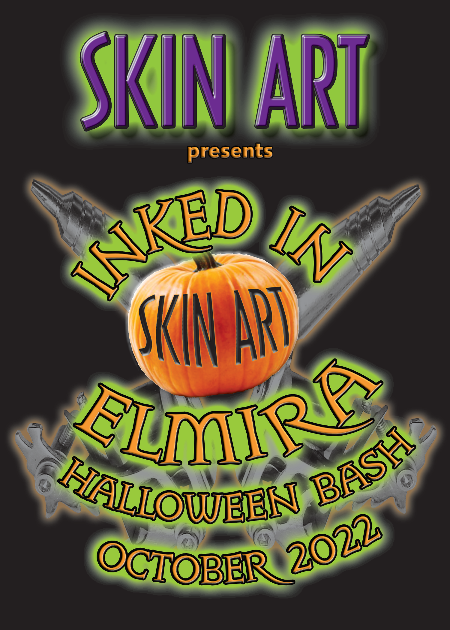
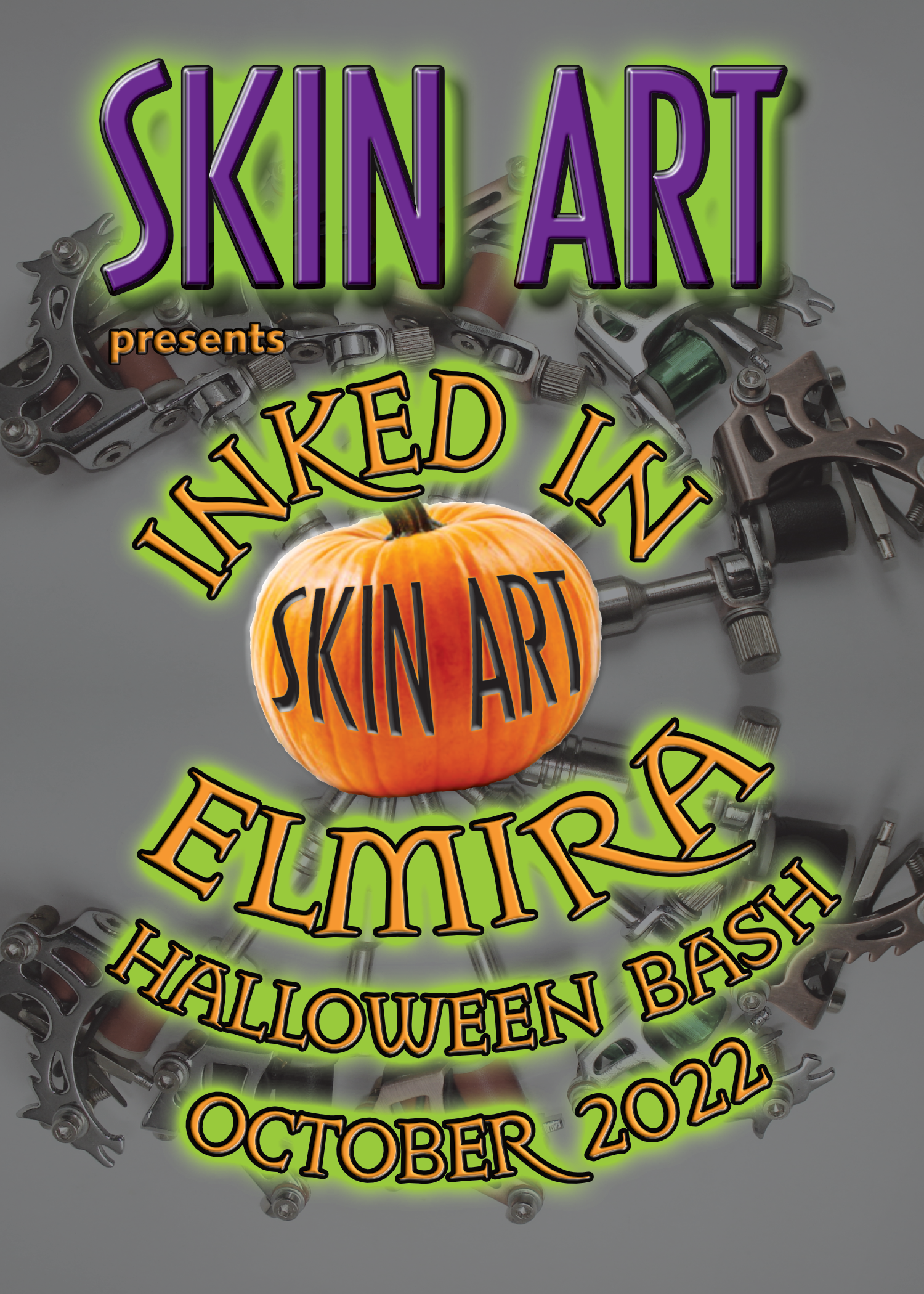
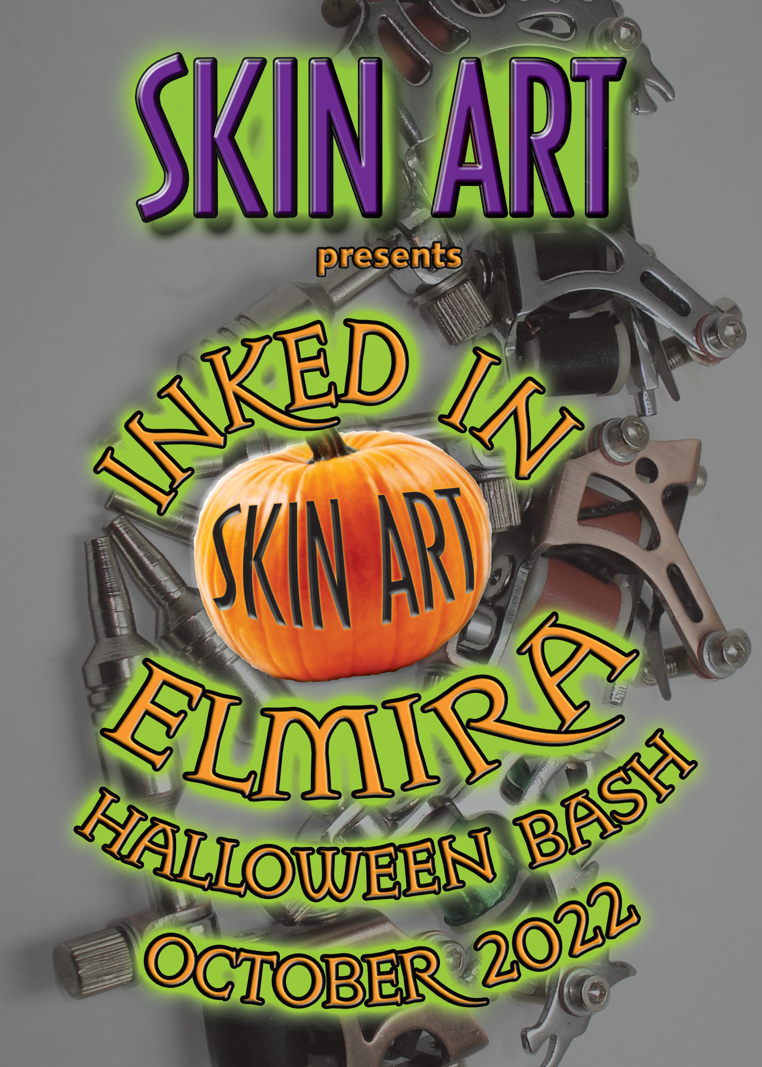
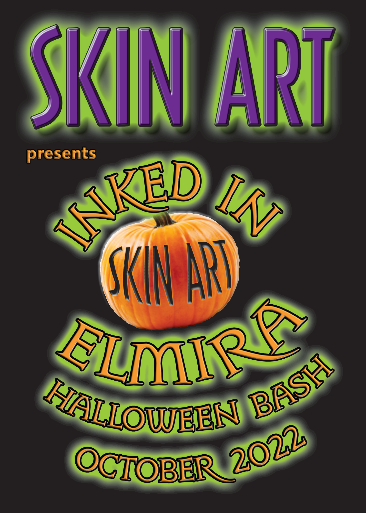
Visuals for promoting Skin Art / Tattoo Media Ink's first convention. The model is Fallon Vendetta and was a featured cover model several years ago. Created in Publisher and Photo.
- 4 replies
-
- 2
-
-
- affinity publisher
- affinity photo
- (and 1 more)
-
I think you did a rather brilliant job. John needs to be a little shorter.
-
Very cool work. I think that's the best when something comes out of no particular intention and what was tooling around becomes something rather brilliant.
-
Love it. So much to look at. Love the "third eye." Do the objects in the third eye symbolize anything? Rich color work too.
-
Love it! Then again I'm a sucker for Art Deco and Art Nouveau! My only suggestion has nothing to do with the overall design or choices, which are fine, but the kerning on the word "Cocktail." That's it. Nice work.
-
Fantastic. Quick question though, and in no way am I supporting or defending adobe: Can photoshop not handle it due to insufficient memory (As in maybe your computer might need more in order for the Godzilla of editing programs to deal with the file size)? Haven't touched photoshop or any adobe product in over 3 years. Your post proves a point about Photo's abilities and photoshop's lack thereof. My guess is you'd have to second mortgage the house to afford the gobs of memory photoshop would require to attempt the tasks that Affinity Photo handles with ease.
-
Beautiful work. Love the variations and can only imagine the unlimited transformations with the changing of the colors.