-
Posts
450 -
Joined
-
Last visited
Everything posted by dannyg9
-
Excellent work. Proves the Adobe is NOT the "be all-end all" and that Affinity programs are just as robust and powerful. From personal experience, Adobe programs are bloated and I always found it a fight to work in Illustrator. Being that I know ZERO about Grand Prix, is the number supposed to be at an angle? Doesn't bother me one way or the other, just curious.
-
Beautiful work. I agree with GarryP that you don't really need the noise filter. That said, the effect makes it look like a distressed, 2nd-generation out from the original sort of halftone print in a magazine.
- 13 replies
-
More genius work. Patience and absolute craftsmanship.
-
W O W ! Outstanding work!
-

affinity photo New to Digital Art ... and loving it!
dannyg9 replied to johndmoulton's topic in Share your work
Great books too!- 6 replies
-
- learning
- digital art
-
(and 2 more)
Tagged with:
-
The only changes I would suggest are minor. Scale back the amount of embossing on the white text. The text with the orange/yellow gradient is getting lost, especially the text on the right. Maybe on those, if you want to keep the gradient, a one or two point white outline. Maybe change the outline color on the photos to make them pop off the equally dark background color. Overall its a cool layout and I like the movement added with the diagonal text and the arrow/linear shapes on the bottom.
-

multi 1950s-style ‘Creature Feature’ movie title still experiments
dannyg9 replied to GarryP's topic in Share your work
Love them. Brings back memories of the classic BW horror films of the 30s. The old RKO credits with the prop plane flying around a radio tower (If memory serves correctly). Take a look at some of the fonts in the link below. I'll bet they'll serve up some inspiration. Same type company has a family called "Tiki" that would fit your endeavor. https://housefonts.com/hi/monster -

affinity photo Miniature Dachshund Illustration
dannyg9 replied to Bobby Beetle's topic in Share your work
Love it! We had 3 doxies and this captures the doxie spirit and mischief and plotting so well! -
I went to Art School in the 80s in NYC. I worked at Limelight in NYC for a couple of years. Leigh's influence was EVERYWHERE, especially with the "club kids" at Limelight. Great illustration. You never fail to impress!
-
Love them. The Gary and Chris are really strong. The Pam "M" is a little difficult, balance wise. Great work.
-

affinity designer Rock tribute portraits illustrations
dannyg9 replied to Andando's topic in Share your work
G E N I U S. Love your work. Thanks for including the video.- 2 replies
-
- desktop
- illustration
- (and 4 more)
-

affinity designer New artwork - Put the Knife Down Sandra
dannyg9 replied to Greggry P's topic in Share your work
80s nightmare. Met her in a dark nightclub and the streetlight revealed reality! Put the knife down, indeed! Great stuff as usual. -

affinity designer Sea of Clouds, Affinity designer illustrations
dannyg9 replied to Don Lee's topic in Share your work
All of them are pretty spectacular, but the greyscale one with the older transmission lines overhead is really cool (maybe because it's greyscale?). -
Well done. I'm not sure the owl appreciates your effort as that's quite a menacing stare he's giving you!
- 4 replies
-
- watercolour
- watercolor
-
(and 3 more)
Tagged with:
-
Great stuff. The split views (reveals) remind me of the airbrush artists from the 70s-80s (I know there are contemporaries as well, but that seemed to be the time when technical illustration flourished).
-
It's like a Herbie "reboot." Very cool and brings back a lot of memories.
-
Nice work. Could truly pass for an actual watercolor.
-
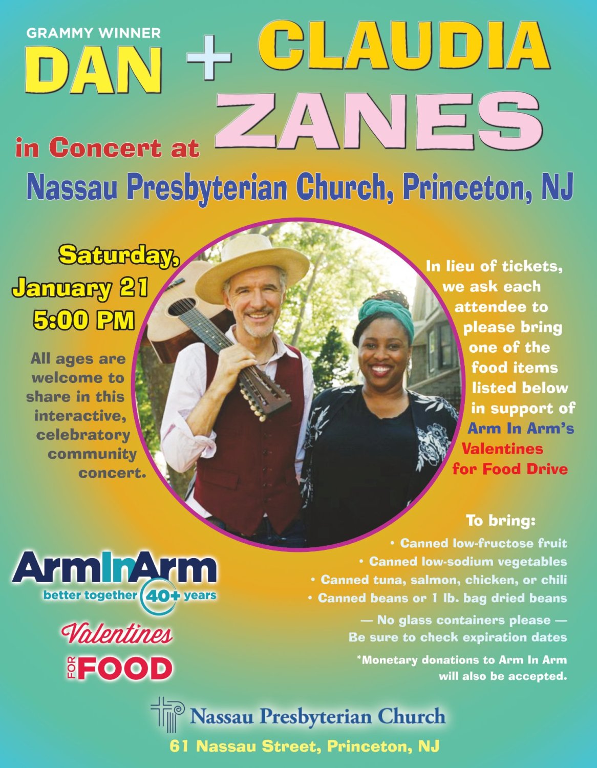
Just a simple flyer for local promotion. I took visual cues from their website as I was only provided with a photo and sponsor logos.
-
It's a piece that you step back from and say "perfect." Just the right amount of thought, design, execution, flair, craft and composition.
-
Really well done. Far easier than using actual oil paints! And I would say more forgiving!
-
Love it. Knowing next to nothing about creating animation, the only suggestion I can think of is to highlight bits of the boy that are facing the tree when it's fully lit and blinking. That's a minor detail I suppose. Overall though it's very well executed and I love the style.
-

affinity designer Mustang Charge Trace Composite
dannyg9 replied to G-F-H's topic in Share your work
A combination of both patience and brilliance. Can never go wrong with a classic Mustang. -
Sinister invite. Love it.
-

affinity designer New work: Debbie Does Dishes (drag inspired artwork)
dannyg9 replied to Greggry P's topic in Share your work
Debbie's got some serious bling and some serious dishwater! Pretty damn brilliant. Looking forward to the rest of the series. -

Publisher V2 Not exporting 40 page booklet to PDF for Print
dannyg9 replied to dannyg9's topic in V2 Bugs found on macOS
Unable to get this to work.


