-
Posts
11,448 -
Joined
-
Last visited
Everything posted by firstdefence
-
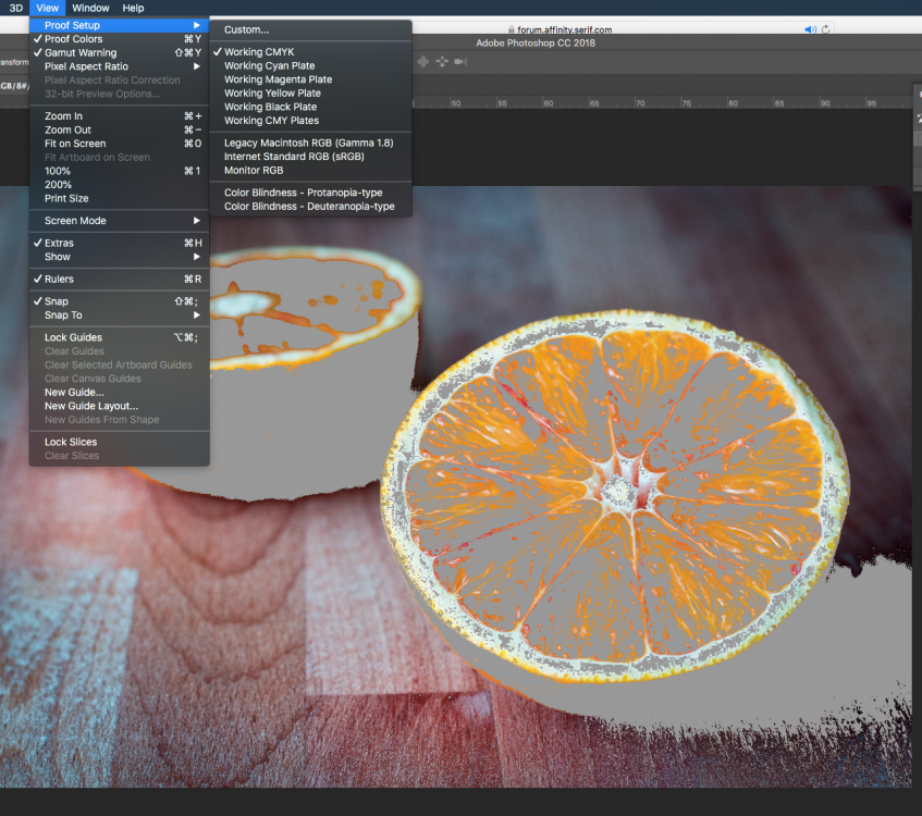
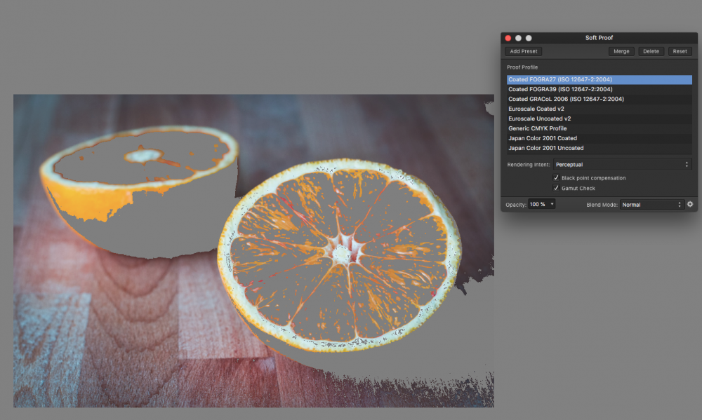
Hi, in Photoshop if I select View > Proof Setup > Working CMYK I can turn on the Gamut Warning and then Photoshop shows me the same greying as in Affinity Photo. Affinity Photo Photoshop CC2018 I don't think this is coincidence. Using sRGB disables the Gamut Warning option in Photoshop. Also could you be more specific about the paper ICC profile as there are a number of Rag options and do you know what printer the lab is using?
- 8 replies
-
- macos
- soft proof
-
(and 2 more)
Tagged with:
-
Welcome to the forum. Its a good idea to put what you are using, what Platform/Operating System you're on and a screenshot of the app you are using always helps. You may be trying to select from an image layer, if so right click on that image layer and choose Rasterise, then try to use the Selection Tool.
-

Slooooow
firstdefence replied to eddietheone's topic in Pre-V2 Archive of Affinity on Desktop Questions (macOS and Windows)
-

greycard
firstdefence replied to larsh's topic in Pre-V2 Archive of Affinity on Desktop Questions (macOS and Windows)
But depending upon the ICC profile applied to the image the grey would read differently, I'm not sure R:72 G:70 B:72 is the correct reading if the image is exposed correctly I would expect it to be more than that. So an approximate reading of R:128 G:128 B:128 or a bit higher depending on the ICC profile used on the image. That image looks dull, dark and out of focus to me. -
I can remember waiting for a slot machine game to load on a ZX82 spectrum and it squealed away for 17 mins before failing to load, so we had to do it again lol I remember selling the Commodore 64 from Dixons and literally a sale every 2 mins at Christmas, every time I sold one I was entered into a raffle, I won in excess of 200 bottles of wine and I don't drink alcohol Re Mice, back in the day, when I was on windows, I used a Logitech mouse, I agree totally that a mouse is a very personal thing and that mouse fit my hand like it had been made for it. Like kaffeeundsalz, I bought a couple of spares because once you hit that sweet spot you just don't want to change. When mine died I buried it lol!
-
With such graphics and fine lines I use a vector app to get it as sharp as possible and export as an svg. black_replacement_1.afdesign black_replacement_1.svg
- 4 replies
-
- affinity photo
- color
-
(and 3 more)
Tagged with:
-

greycard
firstdefence replied to larsh's topic in Pre-V2 Archive of Affinity on Desktop Questions (macOS and Windows)
From what I have read, it was Kodak that effectively cocked it up in the 1970's and omitted the info that "the camera should be opened half a stop when using their grey card" bringing it more in line with the 12-14% so from then on photographers were actually using the grey card incorrectly informed, later on Kodak put the "open half a stop" info back into their instructions but I doubt people actually read the instructions and just start to take a reading from an 18% card and that's it. The highlighted info was originally omitted: http://www.silverbird24.com/shop/media/files_public/trwtjbbcr/1903061.pdf which is a 2007 instruction manual, the info was put back in 2006 or thereabouts. -
sRGB has a smaller colour swatch compared to Adobe RGB but sRGB has a brighter colouring hence the "blushing" Wouldn't it be better to set the camera to sRGB and eliminate the Translation away from Adobe RGB to sRGB that way you fix the "blushing" in ON1 RAW or actually on the camera. Or just keep everything in Adobe RGB. and keep the image slightly muted compared to sRGB.
-

greycard
firstdefence replied to larsh's topic in Pre-V2 Archive of Affinity on Desktop Questions (macOS and Windows)
That's pretty much as I understand it, So at best it's a ball-park guide. -

greycard
firstdefence replied to larsh's topic in Pre-V2 Archive of Affinity on Desktop Questions (macOS and Windows)
I always thought the 18% grey card was a myth and most camera's aren't actually set to 18% they are bias towards 12-14% ish anyway. I use the threshold adjustment to find the hotspot. -
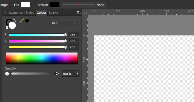
Its the white that makes the grey look darker, you could try creating a rectangle with white and changing its opacity to about 60% then lock the layer. and just turn it off when you're ready to export. its a bit of a trick on the eyes, it makes the transparency look faded. No fade layer With a 60% white fade layer
- 7 replies
-
- document
- background
-
(and 1 more)
Tagged with:


