firstdefence
-
Posts
11,458 -
Joined
-
Last visited
Everything posted by firstdefence
-
 I think it’s because Chrome browser is the default app to open PDF files so Chrome is interpreting them that way, do you Adobe Acrobat Reader installed? Adobe Acrobat Reader should be the "open with…" default or a dedicated PDF browser of some description.
 -
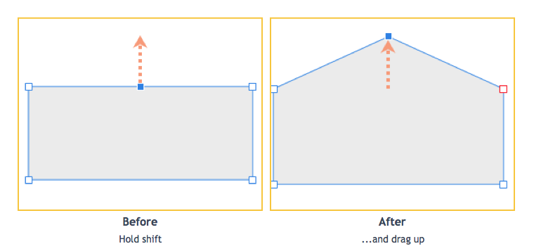
A simpler way would be: Draw a rectangle. Press ‘A’ to select the node tool Convert to curves Add a node in the centre of the top line Hold shift and move the added node up to form a peak Now edit the corners. I tried your method and got the same result, a workaround for this is, before you use the corner tool, with the node tool selected, click on the bottom right node and click sharp on the convert section on the context panel for the node tool, then use the corner tool you want to edit.

-
Big improvement, definitely a workable solution. @Paul Mudditt results are freaking me out lol!
-
I found this technique on Stack exchange a while ago and can sometimes work on random (non-FTT) patterns. It does however require the original so not much good in this instance but maybe good for future reference. Easily translated into Affinity https://photo.stackexchange.com/questions/23445/what-is-the-best-way-to-remove-texture-from-a-scanned-textured-photo-paper
-
I haven’t given up yet 😉 trying a few idea’s if I succeed I’ll post the brush here. I surrender, it’s not possible in Affinity Photo
-
For the curious... https://affinity.help/photo/English.lproj/pages/Layers/layerBlendModes.html
-
Weird Green Tint
firstdefence replied to DWS's topic in Pre-V2 Archive of Affinity on Desktop Questions (macOS and Windows)
Welcome to the forum, @DWS It looks like it’s highlighted, what happens if you click Artboard 1 in the layers panel, Does the tint remain on Artboard 2 ? -
This brush can be done in Affinity Designer because Affinity Designers brushes can be configured to have head and tail offsets, so creating this brush in Affinity Designer just requires a pill shaped PNG. In Affinity Photo the brushes can’t be configured to have head and tail offsets.
-
Probably! Are there other file options such as PDF you can download?
-
@carl123 I think this is the brush style that is wanted. it’s doable in Affinity Designer.
-
My sister has used https://www.kateproof.co.uk/ and was very impressed.
-
Hi, @aymanzone There is a feedback section for each app and affinity in general here: https://forum.affinity.serif.com/index.php?/forum/52-feature-requests-feedback/ you can post a feature request there.
-
@Artcraft Technically these “vector" brushes are hybrid raster/vector brushes, not a true vector brush so raster images on a vector curve.
-
Amended Dan C
-
Just out of curiosity I used a colour balance filter on the top left grey, I created a square swatch shape and filled it with the corresponding RGB colour 190, 185, 178 and adjusted the colour balance sliders to get the swatch to fade into the grey card sample, the arrow points to the square swatch. Using the eye dropper after using the Colour Balance Tool shows RGB 191, 184, 179-180 as you move the eyedropper about. The problem with this is although it gets the other grey samples close to their RGB numbers it cannot make them accurately read the RGB values, they are close "ball-park” values, the other issue is if you use the colour panel eyedropper you will see the values change as you move it about showing pixel colour variations, using the colour picker tool allows you to take larger average samples to average out the variations in pixel colours
-
For Q1. and Q2. Lagarto has used Affinity Designer to screenshot the New Document settings, in Affinity Publisher artboards aren’t an option for new documents and the size option is just the default for an A4 sheet so, yes, your size will be different. Affinity Publisher new document settings, the size in the page width & page height are for "poker size cards.” Ignore the margins option I forgot to uncheck that. These are the Affinity Photo new document options, added for clarity Just to clarify which app are you designing these cards in?
-
Which app are you using? I’m assuming you mean the Reset Formatting button from the Text Styles edit panel, this button doesn’t have a keyboard option nor can one be set. These are the options related to text styles within keyboard shortcuts preferences.
-
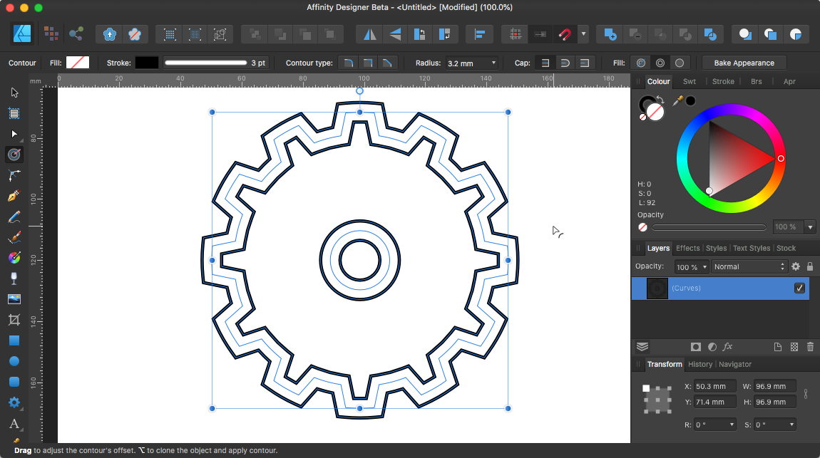
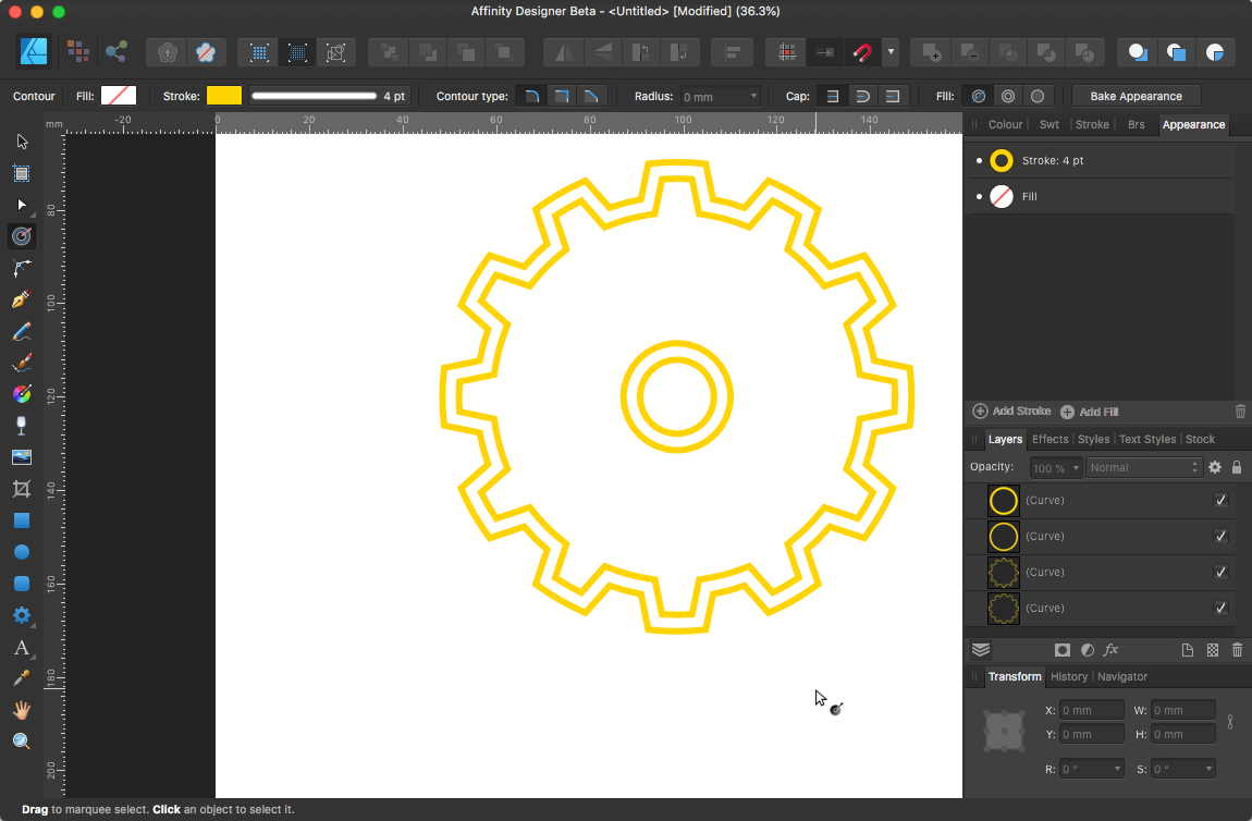
In the Mac version of Affinity Designer beta 1.9.0.2 there is a contour tool, it’s a bit odd to use but you can get offset paths, but this requires the dividing of the shape which seems an unnecessary step. There is an option to press the Alt key to clone the object and apply the contour but it doesn’t appear to work and doesn’t do anything when you press the alt key and adjust the radius, maybe I’m not doing it correctly but with no information about this tool just guesswork as to how it functions/should function it a play with it and see what happens affair. Maybe a brief explanation about how the tool works from the dev would help? Contour tool Fill: Auto closed (Left Icon) Radius controls distance. After using Fill: Force Open (Middle Icon) and then Geometry: Divide
-
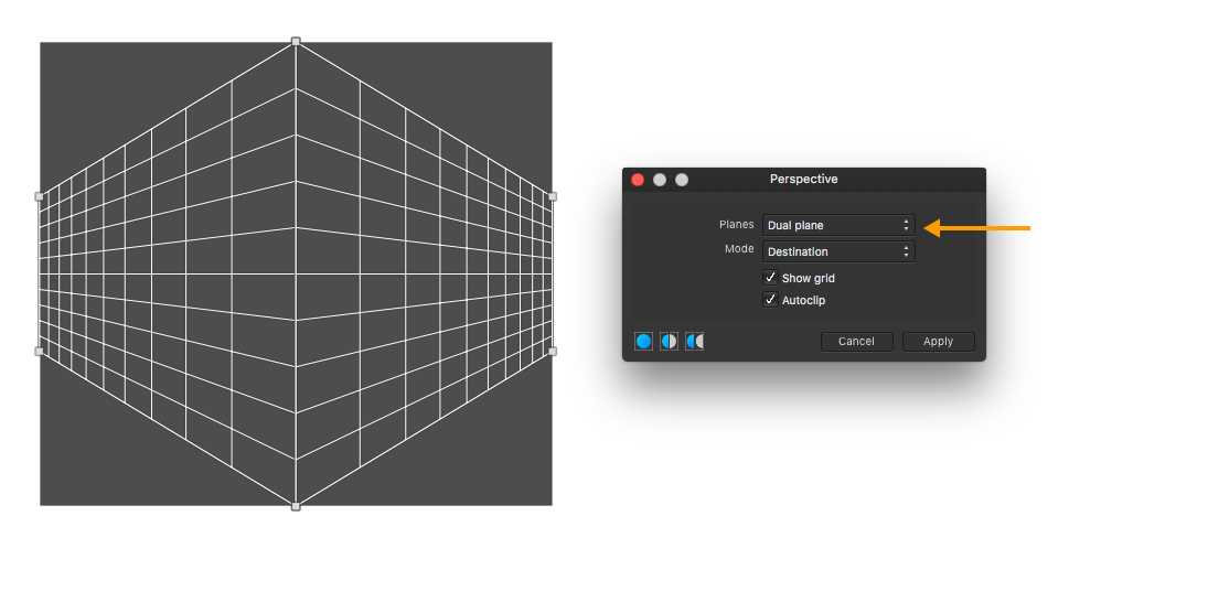
Welcome to the forum @zenkislayer The perspective tool in Affinity Photo has a dual plane feature
-
Hi Sue, Take a look at XnViewMP I’m sure there will be other suggestions but try it and see if it suits your needs.
-
I’m on Mac so I don’t have MS Edge but maybe Microsoft Edge is rendering the image with a different profile? Try opening in a different web browser, Opera is a very good browser, or PDF viewer like Acrobat Reader. Upload the exported PDF and lets see if we see what you see.
-
Tutorial request
firstdefence replied to Nika's topic in Pre-V2 Archive of Affinity on Desktop Questions (macOS and Windows)
Ok Ive saved with history so you can jog back and forth in the history panel. Having the right image makes this kind of edit much easier, so a gritty black and white that is quite high contrast really helps. GoT Promo.afphoto -
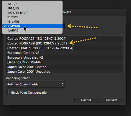
Welcome to the forum, changing the format to CMYK/8 will give you the FORGRA39 CMYK profile.
-
Tutorial request
firstdefence replied to Nika's topic in Pre-V2 Archive of Affinity on Desktop Questions (macOS and Windows)
Maybe something like this? First step find a decent image to grit up Add a clarity filter and whack it up to around 90% I used a Fill layer with a blue (#366690) that almost matches the examples and changed the layer blend mode to Overlay Stamped the snow on with a single click, the Brush I used was from: Visualsofjulius Brush Bundle (Snow 1) I added an exposure filter to darken the image a bit Coloured the eye (#5E3690) with a splurge of colour from a basic brush and added a gaussian blur to diffuse the colour, set the layers blend mode to Hue Added a LUT from Triune Fantasy LUTs Game of Thrones (Castle Black) This doesn’t add a lot to the image and you can get away with it without the LUT but left it in anyway. Add the text and there you have it. Here is another one with a better image, more in keeping with GoT