NotMyFault
-
Posts
7,148 -
Joined
-
Last visited
Everything posted by NotMyFault
-
P3 monitor
NotMyFault replied to Geminitiger's topic in Pre-V2 Archive of Affinity on Desktop Questions (macOS and Windows)
Good choice Without the exact model number a cant't tell for sure but the display will probably support P3 color format. So this would be the way to go. The other important decision is which file format to choose. JPEG can be used with P3, but is limited to 8 bit color channels, and have only loosely comprression. I often use PNG files for export, as they at least support 16 bit, P3 color profile, transparency, and a lossless compression. TIFF are the other alternative. HEIF / HEIC is a mixed bag: too many compatibility issues for my taste. -
Seems to be a design choice by Affinity to enforce dithering for all palletised exports using "posterise" for palette creation even in cases where the number of used colors is so low that no extra posterisation (Edit: I hate the auto correction which gave: pasteurisation) required (leading to avoidable dithering, and consequently bloating png sizes making the whole process useless) the at some time intended use of custom palettes never got implemented for >5 years now
-
Well, it seems that you now got all what you where asking for. Anything left making you unhappy?
-
affinity applies a forced anti-aliasing on brush level, independent from layer settings. You can use layer anti-alias settings and coverage profiles to make this to be rendered as hard edges, but this wont change the actual pixel content. Never the less, you can rasterize and trim that layer. Basically, you would to do all “adding” on a new pixel layer, add a channel mixer which boost opacity to 100% (except when zero), and rasterize or merge down. To erase, you may need to use a similar but mirrored effect: reduce alpha to zero unless it is 1., then rasterize. as far as i know based on older answers from moderators, there is no way to deactivate brush anti-aliasing. Except pixel brush - give it a try. This is actually working in the mode you are looking for. Requires using basic brushes (black / white, no grey or holes inside), but with every color
-
Just found: unfixed since 2017
-
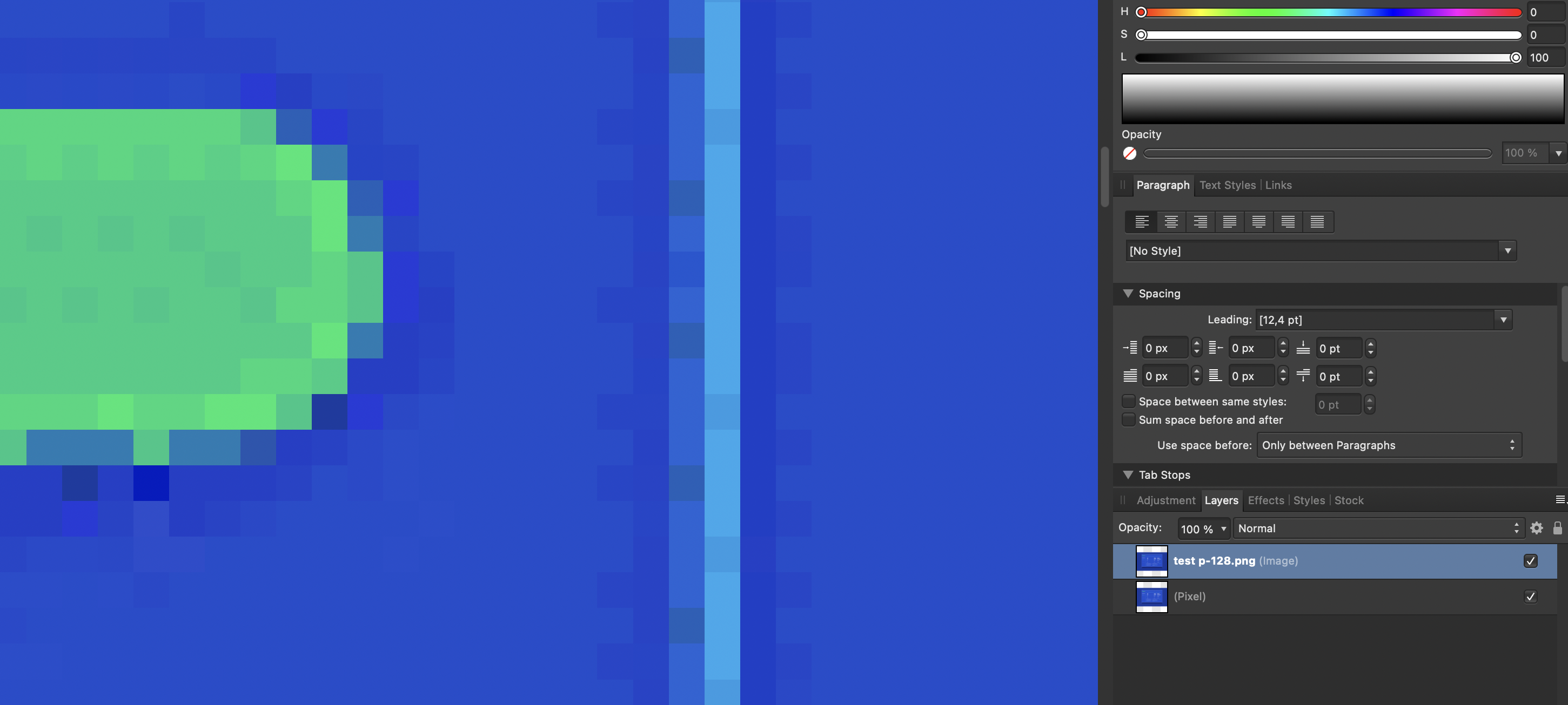
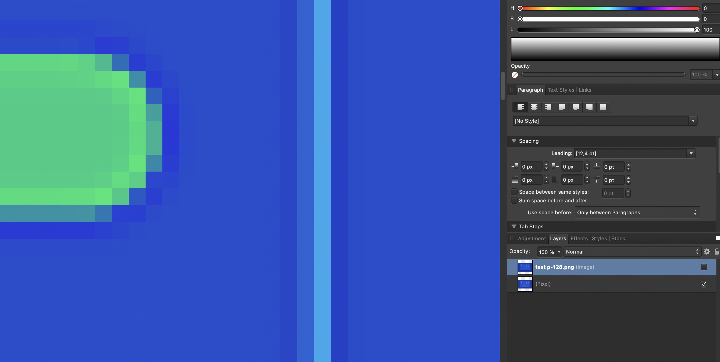
What I can see is that photo creates a lot of dithering when using palletised export. we know that Affinity tends to use forced dithering in other situations e.g. for gradients, and doesn't offer a regular way to deactivate it in case of unwanted. Original before export: This might explain why it uses more storage. If you compare this (zoomed in 10x at least) to PS export, is that a bit smoother? I assume Affinity wants to provide a smoother visual rendering by dithering, but this leads to bigger files in this specific case. So the way to avoid would be using a "cleaner" file. The file contains lots of anti-aliasing artifacts and sharpening lead to halos / overshooting colors (across the light coloured lines). I'm sure the original file contained only 3-5 colors (blue, green, white, maybe some shades in between), and would compress like nothing. The pixelisation caused lots of sartiufacts, breaking the compression / palettes algorithm.

-
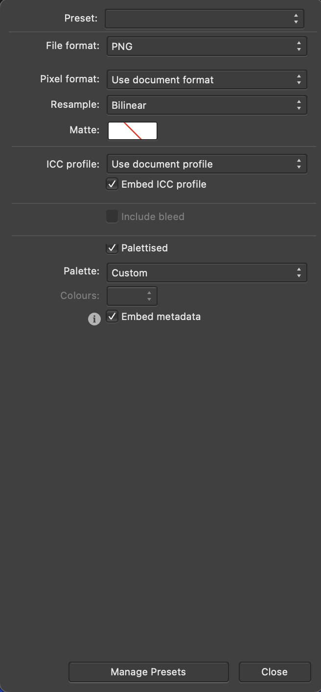
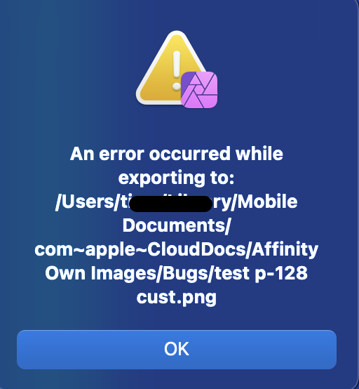
Hi, Photo allows to specify "custom palette" in Export. Unfortunately, I did find any way to specify which actual palette to use, and Photo always throws an error: Any ideas how to get this working? To add: this is no issue about saving the file. This issue is that "custom" does not work. If you use "preview", you can cycle through the settings, but customs never gives anything except empty canvas in preview. So the issue is before saving. Mac version
-
Thanks for the screenshots. Can you upload the source file (as affinity afphoto)? PS and Affinity differ in what algorithms or low level functions are used, could give different results in edge cases - like here.
-
Welcome to the forum. any chance you can add an example file, and screenshot of the exact export settings used ? Adding sharpening filters will introduce lots of “additional” colors to the file. If you want small files, you should try to reduce the number of colors, and have smooth areas of identical colors. Sharpening is the natural enemy of small files (for compressed formats). On the other side, i cannot rule out a possible bug or missing feature on Affinity side. But probably it is more a design choice what colors to prioritize (keep) and what to remove. Palletizing is an aggressively lossy type of compression. I tried some test exports using Affinity and an online service to create png-8 from the same source image. While the images look visually identical, there are minor color differences on pixel level, and in file size.
-
P3 monitor
NotMyFault replied to Geminitiger's topic in Pre-V2 Archive of Affinity on Desktop Questions (macOS and Windows)
Ps: Using wide color gamut in combination with RGB/8 limited image formats like jpeg makes no sense. It will reduce the dynamic range and amplify color banding (e.g. blue sky). Choose wisely after considering pros & cons. If in doubt, stay with sRGB. -
P3 monitor
NotMyFault replied to Geminitiger's topic in Pre-V2 Archive of Affinity on Desktop Questions (macOS and Windows)
P3 offers a wider color gamut vs sRGB, and is supported by almost every current device on earth since more than 5 years (Apple, Android, HDR capable displays for Windows PC and Macs, video oriented apps and devices, TV etc). If you have a photographers heart and want preserve the wide spectrum of colors, use it. If you want to stay compatible to every legacy device (Windows NT, XP, …), or want to use cheap consumer print services, use sRGB. If you have a print focussed workflow, use AdobeRGB (needs displays supporting AdobeRGB, too). If you want CMYK, use those profiles intended for CMYK. If you are part of of $$$ Million movie production, may consider ROMRGB, OCIO, ProPhoto, BlackMagic RaW etc. It totally depends on: Your traget audience (web, photo print service cheap, photo print service quality, books, video consumer, video high end movie, … the capabilities of you devices (display, app, OS) You cannot create good images in color formats exceeding your hw/sw tool chain, because you cant see the result in full quality. Almost everybody will be happy with sRGB sRGB cuts off so many colors of nature / reality that it hurts me deep in my photographic soul to continue using this crippled color profile unless unavoidable. -
To be totally honest: a real world zipper, no matter if metal or plastic is used, never changes its width. Only the gaps of fabric change their with. If you intend to achieve photo realistic look, you would need to crate individual shapes for every element of the zipper.
-
You can always use a gradient map to change colors.
-
Nothing important. Create a new image brush (not intensity brush) and all is well. Source should be black/white (RGB/8 in fact ), export as png.
-
And your question is? On windows, you have to use (hold down) the AltGr key while clicking the Layer>Geometry>Add menu to create an compound.
-
What DPI Means ?
NotMyFault replied to Ammar's topic in Pre-V2 Archive of Affinity on Desktop Questions (macOS and Windows)
Hi, 3 point equals 4 pixel (by convdntion / tradition) if devices render files at files DPI, yes. But apps today tend to display files zoomed (in booth ways), it normally differs unless you ask them to display at 100% zoom. Smartphone screens are to small (vs. PC), so zooming out is technically required and unavoidable. To make files readable. E.g. an PDF containing a A4 page (21x29cm) must be zoomed out to fit on a 8x4cm smartphone screen. User can then zoom in if he wants to -
HSL adj hue target range selection not working
NotMyFault replied to frank26080115's topic in V1 Bugs found on Windows
Hi, thank you for reporting the issue, looks like you are using RGB/32. This bug has been already reported and logged -
These layers probably have been scaled (move tool). If you rasterize them individually, they stay sharp. this is a known phenomena and has been discussed in epic depth (search for merge and blur).
-
How to make a inner shadow depth
NotMyFault replied to Indelton's topic in Pre-V2 Archive of Affinity on iPad Questions
Maybe this way use color picker nest colored shapes to get clipped by parent sort layers from back to front (z.axis) dime.afphoto
- 1 reply
-
- 1
-

-
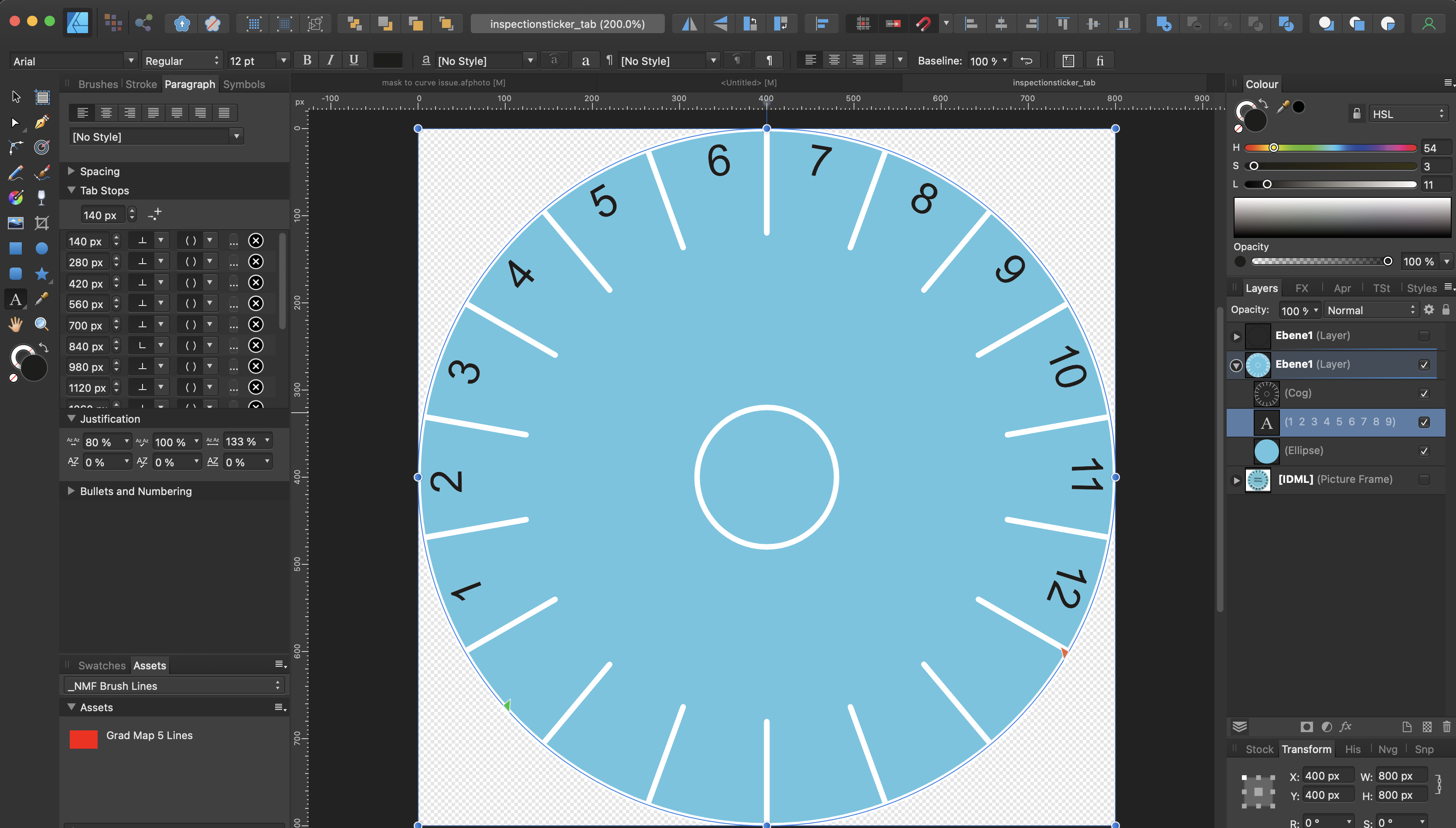
Inspection sticker
NotMyFault replied to nommu's topic in Pre-V2 Archive of Affinity on Desktop Questions (macOS and Windows)
While Old Bruce advise works well, it has the disadvantage that you need to enter all numbers again. You could achieve even spacing by using the text paragraph style, and set a default tab stop. Then enter one tab key (instead of space key) between all numbers. Unfortunately Affinity does not allow to change the default tab type to "center", this would get an even better distribution. Consequently, added 12+1 tabs manually (to even get the 1 correctly aligned) and shifted the little green rectangle to hit the center. inspectionsticker_tab.afdesign
-
Yes, the good old trap. Move by whole pixels will not remove fractional digits, it will preserve them. You will almost never need this feature, except you have a rectangle shape with 1px stroke width. These must be aligned to .5 positions to get a sharp stroke. If you move that shape, the option is valuable to avoid the stroke will be blurred across 2px. Otherwise, always deactivate this snapping option.
-
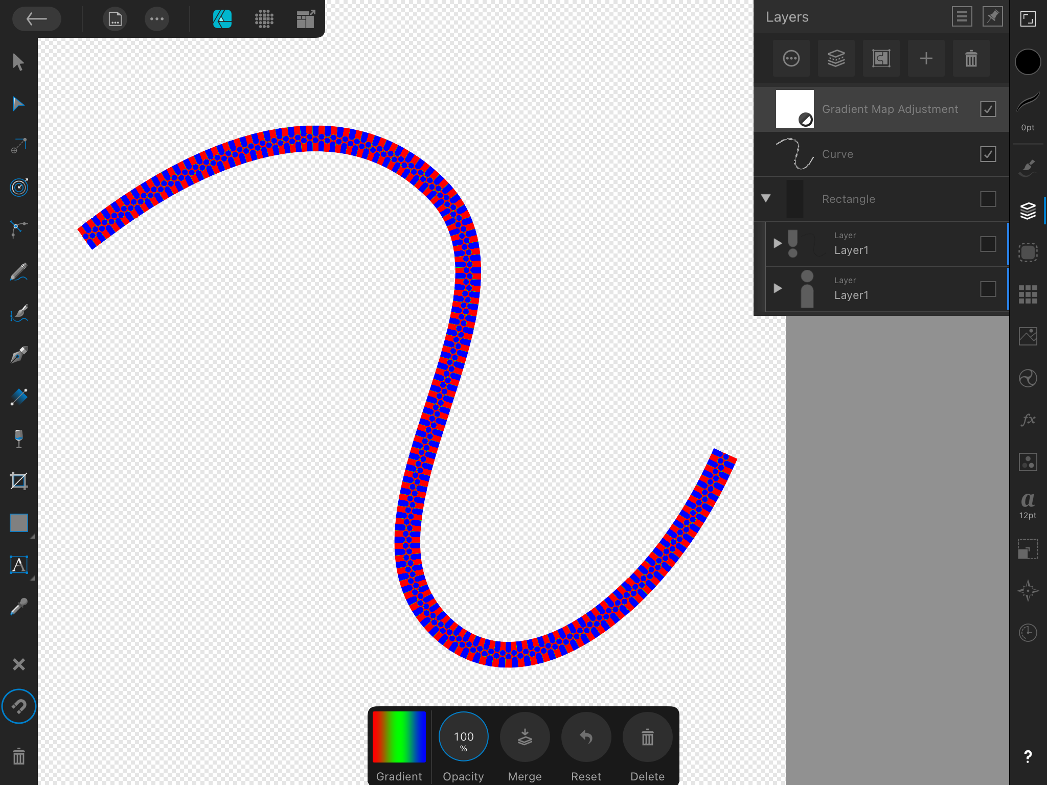
Those shapes should stay separate for gradient / coloring. you could use gradients, linear for rectangles, conical for circles. Choose the values at the edges wisely. if you combine all shapes into one, you won’t be able to achieve the gradient.
-
Thank you, the outline helps me to understand your intentions. I would choose other shapes to start with, to simplify the process: Use start / end angle of donut tool to get the lower bow Create the pieces stepwise, using the full spectrum of add / subtract / intersect. / divide to get the red part divided, i would use „divide“, using a helper circular shape (copy of the black shape moved to the right by the width) i will edit this post and add the file later IMG_0756.MOV