

true_blue1878
-
Posts
61 -
Joined
-
Last visited
Everything posted by true_blue1878
-
I'd love to see a video of what you're describing. I'll hit youtube and see if I can find one! Cheers for the info. It sounds awesome, but I'm a bit of an old dog, so to speak lol. It'll take a long while to get into that, I'd imagine! But they're not super expensive either so might just get one and gently ease myself into using it 🤔
-
I have heard good things about trackballs but I can't even imagine how I'd get used to it. I'll definitely look at that though, cheers! Ahh probably not then. It's about 7 years old! Cheers
-
I have an old trust one that was never amazing but it won't work on w10 and I don't have the time to go through .inf files trying to fix them at the minute! So I might just give the wacom graphite 3 a try as it's only about £20 second hand on ebay if the drivers are already there for me! 🤔 I don't mind paying for a name but I've seen the new wacoms for about £1100+ lol. It'd just be overkill for someone who mostly just vectorises flat images and uses the fine selection tool. It would be neat to have a little screen on my lap though I guess which is why I am considering the XP-PEN Artist as its relatively cheap and seems to offer a lot! Nice, I have looked at their website and they do seem good quality. The small one is £129 For that kind of price though I may just try out that XP-PEN Artist12 @ £149 (on amazon) as you get a nice built-in medium sized screen to comfortable gaze at while you work. My only wonder though, is how accurate is the nib to pixel ratio going to be? I do fine selection cutting out hair and stuff like that sometimes so it would need to be quite sensitive! I'm an android man myself but I do have an ipad air also packed away collecting dust. Quite old now but I wonder if that would be good enough? Cheers Yes that's kind of where I'm coming from. It's not so much about being fancy, it's about comfort and accuracy above all else. There's no point getting something that has a rough DPI rating because a lot of what I do requires long tedius fine and careful selection. I like your idea but don't think I could get used to that mouse you've linked. The mouse pen is interesting though cheers! Holding a pen is a bit like riding a bike again, it's second nature. So thinking a tablet and/or pen is where I'm leaning towards. I also find that when I'm using my mouse in Affinity I tend to claw it like it's a gear stick 🤦♂️ Would love an opinion of this from someone if anyones ever had one! https://amzn.eu/d/dab2OIJ Its rated 2nd on top tablets 2023 by "tech radar" with the wacom being 1st. I'm tempted but I am concerned/curious about how accurate the DPI will be! Thanks all!
-
Thanks guys! I've seen the wacum tablets but they seem very expensive. Was looking at the XP-PEN Artist 12 to start with which cost significantly less. What do you guys think of those? I'm no drawer/artist so I wouldn't get the full use out of a wacum, but i do a lot of the tedious technical stuff which cramps my hand a lot! Maybe ill try find an old wacum off ebay and use hacked drivers too 🤔 Cheers!
-
Hi all Just wondering what drawing tablets are best for affinity and which ones do people generally use? Getting muscular issues by constantly using my mouse so thinking about getting more comfortable equipment! Suggestions are very welcome. Cheers!
-
Yup I think at the end of the day it boils down to "if you're making enough money" then someone will target you and use whatever little loopholes they can to get some of your it. Thanks for your reply as always I appreciate it mate! Cheers. Yes I've bought material from a few of them before. Freepik is a nice site also where you can pay monthly for commercial rights to everything on there. A handful of designs are also free to use as long as you attribute credit to the designer. Will check out the two you mentioned! Thanks all
-
That's a good example thanks! I found this part especially interesting So they felt that just changing the colours wasn't enough to be distinguished from the original. As you say though, every case is different and I doubt anyone will take me to the supreme court but just wanted to be careful before I started. Thanks for that! 🙂

-
Don't be ridiculous. The issue of copyright and/or protecting intellectual property is a big part of graphic design whether you like it or not. So the logic was that someone may have asked the same question in their past and have experience or research in the matter. I can't be the only one on here who has wanted to design something but worried about infringement. There are millions of questionable designs out there and they certainly weren't made using MS paint.
-
I wouldn't be surprised. The Simpsons definitely have a long history of collaborating with real artists and stars. But then look at the makers of South Park, they literally make things just to upset them and laugh when they get court orders. I don't really know much about how it goes for them though, but they're still going strong after like 30 years, continually offending and winding celebs up, portraying them negatively. So 🤷 It's crazy how these things are still wildly open to interpretation. But I see tons of questionable stuff on etsy and ebay and they seem to stay there for months or years, so I guess it's just down to whether or not you're a big enough fish for them to fry? But some of the stuff I have designed is very vaguely similar and not direct copying. I suppose I could see how it goes with "print on demand", that way I'm not risking losing large amounts of stock if I'm ordered to cease and desist. But POD services are so expensive and not viable for long-term. Maybe a copyright lawyer will see this thread eventually and give a more in-depth answer. Thanks guys!
-
Yeah I am finding that the info around the web is very hit and miss and often very complicated.. But figured this forum might have some people who want to do the same sort of thing. But I am not Matt Groening, so I guess the bottom line question is.. are they going to pick on a little old etsy/ebay seller over something that might "look similar" to their material? I think the "fair use" goes out the window if you charge for something, but I'll read more on it. Cheers!
-
Just interested to know if we have any copyright experts here who would know if drawing or vectorising an iconic copyrighted image or a still from a music video, but changing it in several different ways, like colours, removal of parts, adding things, but generally keeping the basic look, would still be infringement? Let's use the "Nirvana baby" on the cover of Nevermind, for instance, if you vectorise that and only use a basic handful of colours and clean it up a bit, it will look more like a cartoon or drawing. So is that still going to be copyright material after I say, remove the dollar bill and replace it with teddy bear or something? And similarly, if you draw a copyrighted image to copy it as best you can but with your own hand, is that copyright infringement? And do these rules apply internationally, or are you more likely to be sued if you live in the US or UK? (I am in the UK). I also am semi-aware of a "comedy law" which lets you somewhat bypass copyright rules, as long as you are clearly making a joke out of the copyrighted material. Is this true and does it apply if I were to produce and sell them as like "memes on t shirts"? Attachment is from The Simpsons and not my work. But it's clearly created to be similar to the Nevermind album cover. Thanks!
-
Thanks for your in-depth explanation! I really hope more printers start to support Affinity, because Illustrator just isn't good enough. Everything that seems simple and logical that I like in Affinity is painstakingly complicated in Illustrator. (The lack of outside stroke for text for instance).. there is a way around it, but its just a ridiculous process and probably actually a program "glitch" in order to get it done. If anyone is interested, you basically have to use the appearance panel to apply a new stroke and fill, then drag the stroke to be underneath the fill. Which only works sometimes. I still haven't figured out why or how. Or even if it'll open up that way after exporting. So I decided to just stick with converting text to curves to be safe. But atleast now, I can create the text in AI so I avoid that strange issue above. More here: AI forum post Only small issue now is the text spacing just doesn't have the same look to it as it did in Affinity, and playing with the character settings I can't seem to emulate the right look! There also isn't a option for "mitre" % so you get 3 basic options of jagged, round and bevel or something like that. I'll have to just settle for just as close to it as I can get. Hotkeys in AI are all wrong to me, as if they've designed it specifically to be unnatural to a windows user. You also can't right-click anything.. it all has to be done with hotkeys. It's such a ball ache, I don't know why people hype it so much lol. But unfortunately this printer I've chosen only uses AI and at first, I thought it would be a simple task of just exporting to PDF for them, but nope.. that didn't work and I couldn't understand why so I went and paid for a month of AI just to see the mess he was getting. Then I have spent this last week trying to un-screw the project from an AI perspective. So let this hopefully be a warning to anyone who thinks they can send their Affinity designs to a printer.. you will likely run into the same problems and have to redo the entire project in AI unless they happen to support Affinity. I haven't seen anyone who does though, so far! If anyone has recommendations of an Affinity-friendly printer please let me know! Thanks all!
-
Update: I edited my last comment to include the aphoto file as well as the SVG. I also noticed that it exported the kiss-cut contour path with a 1px stroke as a 1px solid shape! So had to fix that as well by deleting the outer path and removing fill, setting stroke. I am also trying to unscrew the mess AI has made of the layers. Not sure why it's done all this crazy separation and excessive grouping, or why it's created spare black text shapes! (they're not the white spot shapes either, they're on a lower group). I also don't know why some are called path and some are called compound path. There doesn't seem to be any pattern to that either. Question: Will the printer care if some are compound paths?? Having an absolute nightmare.. I need to find a printer who uses Affinity for next time, because I'm not doing this again in my next project, and AI is utter rubbish in my humble, unbiased opinion. I couldn't even add an outside stroke to my text in there. I could only achieve center stroke in AI. Which is why I had to export it all as curves from Affinity. I begrudge the £25 for one month just to get bogged down with all this lunacy it's created rant over lol
-
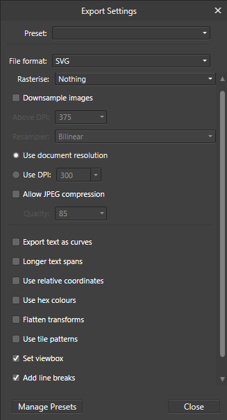
Attached an aphoto/SVG fileforum file.zip. It's a bit big but since I have little idea what most of it means, I didn't know what options to select, so I thought it was best to deselect anything that sounded like it would interfere with the quality. Thanks I appreciate you guys helping here. Bare in mind though, that I had the stroke set to 6 and set as "align to outside", and that the text was filled with a PNG before I converted it. So maybe one of those could be the reason you're getting different results? Anyway here is the aphoto file and SVGforum file.zip, also for some reason Inkscape is also the only program that keeps the glitter image resolution intact. AI and Affinity both pixelate it while it's in SVG form. I should also mention that when importing it into AI, I get this error but I am unsure what it means : Cheers guys!
-
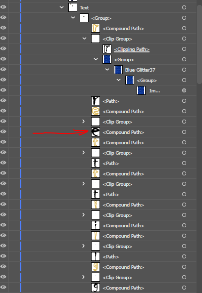
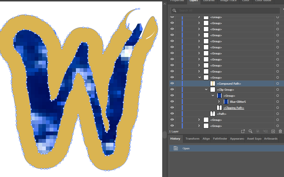
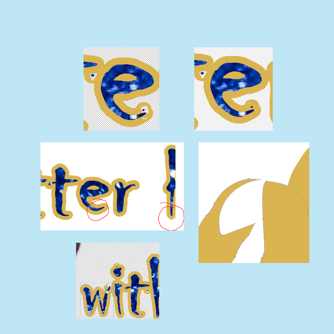
Tried exporting this "converted to curve" text to SVG, PDF and just plain copy and pasting between programs but for some bizarre reason, these 3 letters just kept losing their path structure and always in that same spot. The e's and the b were easy to fix, but that w was a nightmare. Somehow, the inside path got joined to the outside path at the top right of the letter. Using font "chiller". I even removed the sort of "spatter" marks as you can see, but it didn't help and the curves still got messed up in exactly the same place. Strangely, 3 e's on the bottom part of the text were messed up, but one e from the top half of the text was fine (circled, although that snippet was after removing the spatter bits). I reshaped the letters with use of scissors and pen in AI. But it was truly a PITA for me being brand new to AI. But I checked the paths in Affinity and it just didn't look broken in any way. I even dragged each node around to see if they had doubled up somehow, but the path looked fine before export! How can I avoid this happening in future? Sadly, AI can't achieve the same type of text effects that Affinity can. That would be too easy wouldn't it? So I am painstakingly having to transfer each letter over as curves, then duplicating them to use as a whitespot. And the amount of layers AI splits everything into is just ridiculous. Ugh. Cheers!
-
Yes I have done that using the attribute window but that doesn't seem to work for the palette or spot colours. As you say though, they'll do all this stuff themselves. Thanks mate!
-
I have enabled overprint for the white filled layers and also for the cutcontour stroke. Still not really sure what a spot colour is, or how the printer cuts out the magenta line without leaving magenta ink on the edges but I'll see what they say for my latest submission. Fingers crossed! As I said just now to Print Monkey, I have set the attributes to overprint on both the contour and the fill. As you say, I think it's necessary after doing some googling also. But I am not sure to set the colours themselves to overprint inside AI. But I figure the printer/designer can and probably will add that stuff in himself anyway! But I have downloaded the files from that thread you linked so I can inspect them. Thanks for your advice, guys! I can't even imagine figuring this stuff out without the help of the community. Fingers crossed they accept the new design redo, and I'll keep you posted. Cheers!
-
Well, the printers customer service lady speaks very simple English, and they only use AI. So it's been difficult sending my design to them as AI imports Affinity designs in the worst way possible. It scatters and splits layers up randomly, it separates text into individual letter shapes and removes effects and without having access to AI I had to try and read between the lines of what she was asking for. I am not quite sure if she wanted just a vector outline for the white ink to be laid, or whether she requires the image to be completely vector. I am going to try sending them the flat image first and see if they can print that over the white spot colour underlay. I am hopeful this will be acceptable to them. But if not, then I will have to try and convert the images to vector, but I have zero experience or knowledge of how to do that. So it will be a huge task considering the images are real faces! I have had a play around with auto-trace and I feel like to get anything near resembling photo realism, I'd need over a thousand paths and tens of thousands of anchors per face. It just feels so messy. Yes I think it is about finding the sweet spot for each image. But there are more than one setting, so it is definitely a learning "curve". I'd rather not have to do it with these sorts of images. They're just too complex. But in future I'll definitely be making my more simpler designs with full vector in mind! Just waiting to hear back from the printer about my latest sample submission, which is just the raster image on top of a white underlayer set to "Overprint". I bit the bullet and paid for AI and made sure it was fully ok in there. In doing that, I learnt how absolutely awful AI is at importing other apps work. I really wish printers used Affinity, it is superior in so many ways. People are designing fancy logos and things in Affinity, sending it to their printer, and they open it up in AI which dissects/removes all effects and screws with the layers so much. Then they're told it can't be printed and people then have to go and recreate it from scatch in AI but without most of fancy effects Affinity can do. It's really frustrating. Will update soon. Thanks all!
-
Sorry, what I mean is... Is simply letting AI auto-trace an image into vector curves going to be acceptable to a printer? I was worried because it seems to split solid colours up into lots of odd little sections, even though the exact same colour is directly next to it. Like, even with a black outline I drew around my design, the auto-trace split that line up into about 100 shapes! The image totalled at about 3000 shapes and 40,000 anchor points lol. Will a printer accept that, or is it just too messy for them to use? Just messed with this example image to show what I mean.. I am having similar issue with my design where it's creating too many shapes and finding too many shades of black when the rasterised colour is just pure black! Though most of them are clustered next to each other and the same colour. Is this kind of vectorisation going to be too complicated/heavy for the printer to print? Cheers!
-
Thanks yes I have got the magenta CMYK 0, 100, 0, 0 named "CutContour", and a white CMYK 0,0,0,0 "WhiteSpot" both as global colours in a document palette. Both set as spot colours, and I set the white one as overprint but not the CutContour. I hope that's what you mean? And was everything else I assumed correct? Cheers!
-
Yes was thinking that too, just drawing underneath to match the colour of the shapes. I will do that and then leave it as an optional layer and see if the printer wants to use it. Thanks mate! Also one more question.. is the AI auto-trace good enough for sending to printers? I find that when trying to trace complicated rasters (I.E. A face), it can create over 1000-3000 shapes just on the low-end setting of 20% colour. I have tried combining shapes but then when I click "join" it says they are not joinable layers Am I best just leaving complex stuff like faces as raster? Cheers!
- 13 replies
-
- 1
-

-
- adobe ai
- affinity photo
- (and 4 more)
-
Ahhh I think I understand, so basically it is just either AI exporting with antialiasing or affinity antialiasing, but the printer obviously won't do that so there won't be any gaps when it's printed? I'll check out the blend options cheers!
-
So basically, I asked in the Adobe forums about a printer's requests for my transparent kiss-cut sticker sheets, as I thought I'd get more logo designers and such passing by. The printers designer asked for a vector image so that the printer can print white ink first and then the design on top of that. So the way I (think) I understand it, is that I have to create a new vector layer that paths perfectly around the shape/image, fill it 100% opaque white, and then sit it below the main layer and rename it "print first" or something along those lines? Then add the white colour to another document swatch? I am not sure what the guy in the screenshot means when he mentions "overprint in the attributes panel". Is that basically what I have already done in affinity by creating a "CutContour" swatch and adding the cut line colour (magenta)? Also regarding the text, I have used a glitter texture to fill the text, so I assume I need to do the same thing for that and would it be best to keep it on the same white layer as the image, or create a 2nd white layer just for the text? The printer is Chinese, so it is difficult to grasp exactly what she is saying. So if anyone has experience with this sort of thing, I'd really appreciate guidance! Thanks!
-
Something very simple. Just a low colour crown. As you can see with the purple velvet area, AI did a good job at vectorising it, but then when it gets exported and opened in affinity, it has a hairline gap between most of the shapes! It could be something not right with my export settings in AI, I'll keep playing with the settings, I have a feeling it could be related to the "decimal" value with the export options, but for some reason, affinity is taking AGES to open the SVG files, so it's a difficult one to solve with trial and error. There is also an option in auto-trace to "overlap shapes", but I'd rather not. Cheers!
-
I used AI to create a vector image, but when i import it into affinity I see hairline white gaps between each shape, which are also apparent when then saving it as a png or jpg. The gaps don't seem to be there in AI, so is it an export issue with AI or something with affinity thats doing it? Tried exporting from AI as both svg and pdf. Cheers!


