

Mike B
-
Posts
11 -
Joined
-
Last visited
Everything posted by Mike B
-
hi @R C-R, I'm using the page layouts with objects setting, and have pixel alignment turned on.
-
@owenr That worked perfectly, thanks!!
-
I am working on a very simple document consisting mostly of rectangles. I have maybe only 200 or 300 objects in my artboard so far, but copy/pasting, then dragging the duplicated objects into position is almost impossible because the snapping guides are slow to calculate. I have by no means a sluggish machine (i7 with 32GB RAM and SSD drive). Any suggestions on improving performance of snapping guides? Thanks! ~Mike
-
@owenr Thanks! I will give that a shot.
-
Hi Everyone, I'm not sure if this has been discussed before, or if it is possible and I'm just missing how to do it, so please excuse me if I'm mis-posting here. I would like to create symbols that are derived and synced with other symbols. The purpose here is that these symbols-of-sumbols are unique variations, but I want to use them to keep the common elements in sync. Here's what I have tried: - Create a new symbol. - Create an object from that symbol. - De-sync the object, make some changes, and re-sync the object. - Click "Create" symbol button, but nothing happens. Any help would be appreciated, or maybe this should be a feature request? Thanks!
-
Could this be a feature request? Pretty please!
-
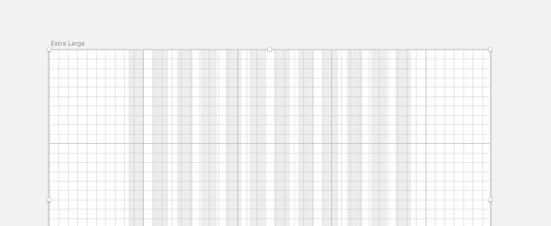
I am trying to create a complex responsive grid to easily work with bootstrap mockups: - grid centered to artboard - maintain constant gutter of 30px (no issues there) - limit grid to 12 main columns - set y axis grid to 32pt (or whatever lineheight I need for my type rythm, independent of gutter) I know this is a very specific setup, and there are templates out there with column groups that approximate this, but even those aren't resizable, and you have to make a new group for every page, just tedious. Would love to set up some pre-programmable and responsive guides for different situations, and just select the guide I need for whatever project. Just as a reference, Sketch seems to be able to do this quite nicely: https://medium.com/@petehouston/setup-twitter-bootstrap-grid-in-sketch-f6e69eab95c2 They have split this functionality out from the grid system into a layout system that has snapping behavior, in addition to the grid system. This way I can make the columns according to bootstrap grid layout, and the actual grid set to my type-face's baseline for vertical rhythm. Thanks for listening

-
Is it possible to create constraints that are relative to its neighbors (looking at the layers panel)? Or alternatively selecting two objects from the same level, and specifying constraints between them? Thanks!
-
Thanks for explaining why this happens, @stokerg! Do you know if there are any plans to add the functionality to convert an embedded document to layers easily?
-
Hi am experiencing a weird issue, and I think I've seen this before, but for the life of me cannot remember how to work around it. Create SVG object, save to file. Create new Designer document (with Artboard, not sure if that matters). Import the SVG file created in step one and drop it onto the artboard. Duplicate the imported object. Double-click on the duplicate to edit it. It opens in a new tab. Make your edits. Switch back to the tab of the document and observe that both the original object as well as the duplicate have these edits applied to them How do I edit a duplicate object without it also editing the original? I made this recording of the problem: http://share.genealabs.com/NAUepmJ Thanks! ~Mike