Kiarian
-
Posts
155 -
Joined
-
Last visited
Everything posted by Kiarian
-
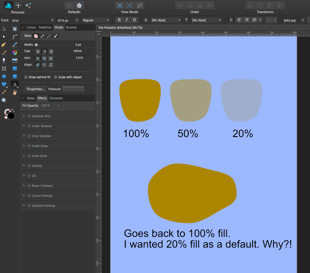
 No probs. You would think 'Synchronise defaults from this selection' would mean exactly that. From what I can make out, all it does is synchronise colour attributes. Does nothing at all with opacity settings.
 -
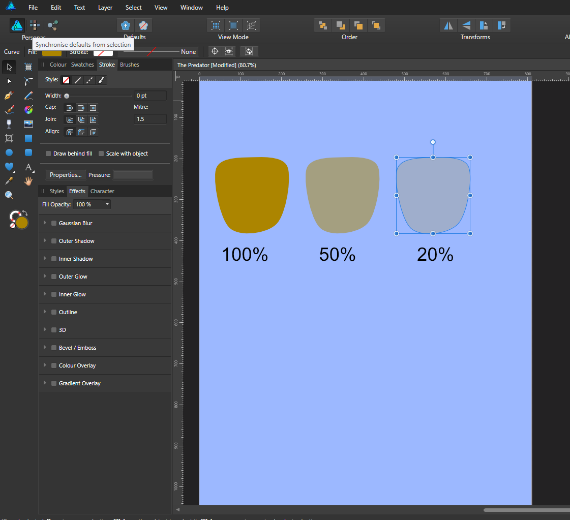
Hi Callum, Not sure what you mean. I select the shape with the opacity already set to 20%, to set this as the default. When I then select the pen tool, to then draw out a shape, it's always set to 100% fill. I set the opacity beforehand either by pressing the number keys 1 to 10 (10% to 100%), or I manually set the opacity.
-
The documentation states that this works for 'fill attributes'. But whenever I draw a shape, change opacity then click the 'Sychronise defaults from this selection', the opacity always reverts back to 100%. Why does it not store opacity information? It makes vector drawing a real pain.

-
Ahhh, thanks. I was trying to get my head around it. Assumed the selection would have a gradient, but wasn't sure. Makes sense.
-
No, I selected a radial gradient on a new layer, from black to 0% opacity, then clicked the image layer to make active, then pressed delete.
-
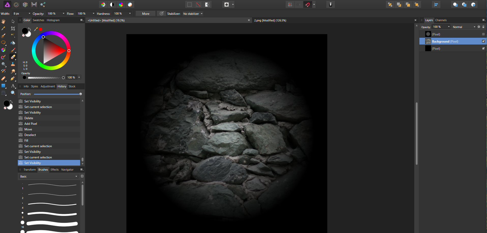
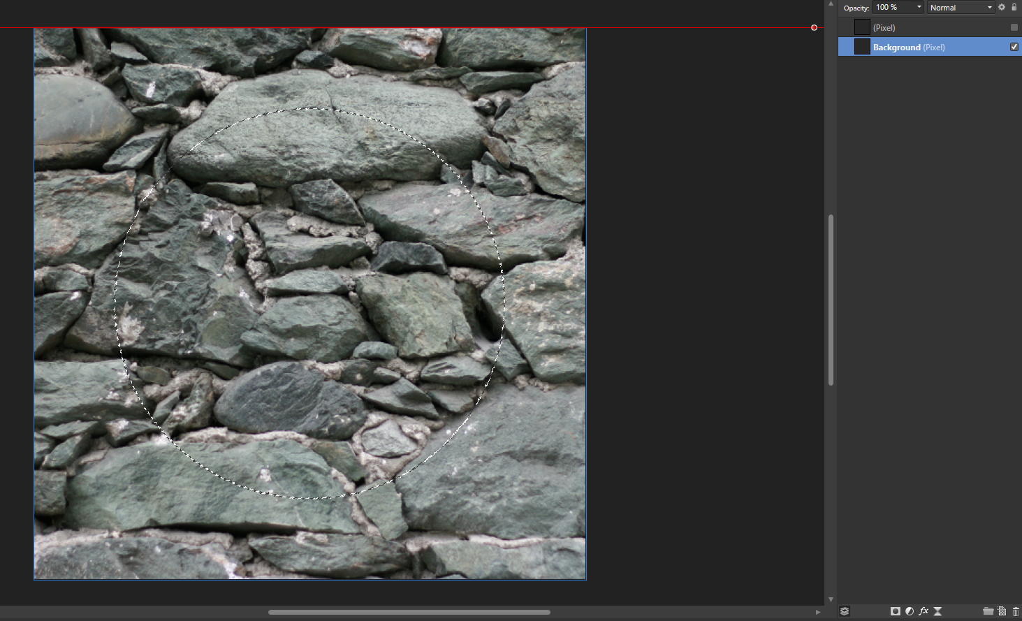
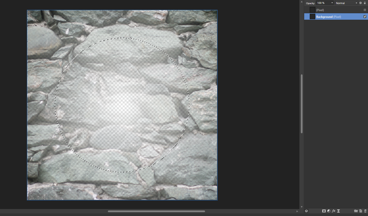
In the context toolbar for what tool? Erase doesn't have a feather value. I CTRL clicked a radial gradient to get a selection, then I have clicked the stone texture pixel layer to make active, then delete. All the Erase tool has is Width/Opactiy/Flow/Hardness, all set to 100%. Edit: I CTRL+I the selection and pressed delete, to get my desired effect. Still not 100% sure why I get this faded gradient, from what looks like a solid selection though. It's the effect I want, just trying to understand it.
-
So how do you explain this? Pixel layer - selection Now I press delete Eh?!?
-
Ah cool. Pretty handy especially if you don't have any dedicated software to do it with.
-
Yes, I am trying to make a custom brush from scratch to use in the newly released Quixel Mixer. I only just realised that I have Quixel Suite 2.0, and I can convert any image into a normal/diffuse/AO/cavity map, so I can use that. I was just wondering if there was a way create a displacement map purely using Affinity Photo. I suppose it might be similar to recreating a normal map. I know NVIDIA have a free plug-in for Photoshop for normal maps (which I am guessing you can also use in Affinity Photo - haven't tried to yet)
-
I'm trying to make a custom brush, using this as an example (image 1). I'm trying to figure out how they got this soft negative effect. First image is what I am using as a reference, second image (Image 2) is a stone wall image I'm using as a test image. I've already tried inverting a desaturated image, but that's not it. How would I go about creating this?
-
Hi Gabe, Whoa.. excellent. That's extremely useful. Thanks.
-
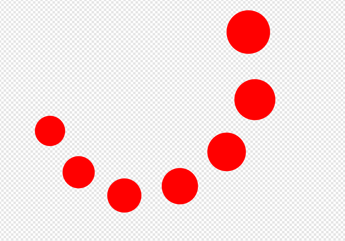
I've just been going through a tutorial on Expressions, using the Transform tab to create mathematical patterns. I understand the basics of it, for example x+200 moves the Power Duplicated object 200 on the x axis, y+100 moves object 200 on the y axis, w*.5 reduces width by 50%, but what if I want a curved pattern? I'm trying to get a simple inward spiral using a simple ellipse. I want this to curve outward slightly, but gradually decrease in size inwards, in a spiral pattern. Can I use Expressions for this? The attached pic uses Expressions and Power Duplicate to gradually decrease size, but the spiral I have manually created.
-
Affinity Photo and Designer 1.6 have launched!
Kiarian replied to TonyB's topic in News and Information
Objects off the canvas you mean? Pressing \ toggles this on and off. -
Here is the tutorial I mentioned, by Nemanja Sekulic called 'Frost Effect in Photoshop'.
-
Thanks. I'm after a more organic look to apply to someone's hands. I'm trying to replicate a tutorial on Photoshop, but using Affinity Photo. The Photoshop filters used were 'plastic wrap' and 'frosted glass'. Trying to figure out how to do this the long way, then save it as a macro. I still have an old CS6 license, so easier for me just to load that up, use filter gallery, then finish in Affinity Photo. I would prefer not to though. Less is more!
-
I'm trying to find the equivalent of Photoshop's filter gallery function on Affinity Photo. Let's say I want a frozen ice sculpture look in Affinity Photo. How would I go about doing this without the filter gallery? Would I use custom macros for this?
-
Hi MEB, Thanks for the update. I've noticed I can delete any unnecessary nodes, shift the remaining node to the centre, select node using node tool, then use pen tool, and holding shift to then drag out two equal control handles to make if perfectly symmetrical.
-
I created a curve in Affinity Designer. I copy over, flip the horizontal to create two equal symmetrical shapes. With snapping on I move them so they are flush together, then I add curves again to create a new shape which are these two, identical and symmetrical shapes together. Why then does it add these nodes to the new curve?
-
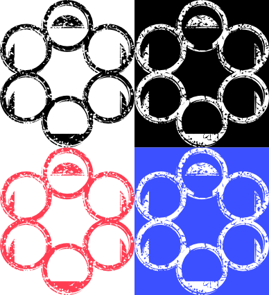
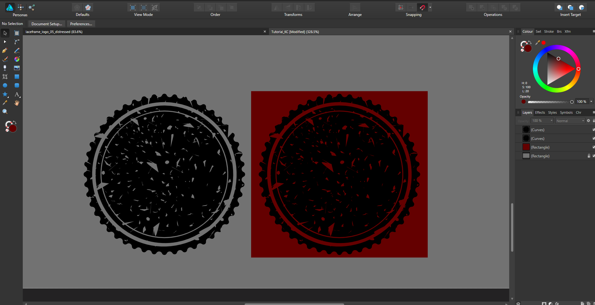
Thanks for the steps MEB. Yes this is what I'm after. The design in negative space, or the opposite as a solid virtual stamp so to speak. Working through them now. I also got to the same point with the bugged overlapping nodes. As well as the blend mode set to 'erase'. I was also getting confused what layer should be subtracted, as well as the 'expand stroke' command. I'll keep practising, as I really want to nail this down. See attached images to illustrate for anyone still confused. The images on the left show a solid stamp, where you can edit the colour to whatever you choose, and the images on the right show the image subtracted, in negative space, with colour flooding around it.
-
Thanks MEB. The first part I've done. All looking good. When I go to subtract, I get nothing. Both layers disappear?! Using both boolean subtract, and compound object subtract. What am I missing? See attached images.
-
Hi MEB, The first image is no problem. That's the effect I am after, so all good with that image. Where I am getting problems is in the second image. The logo has a duplicate of the logo nested underneath it, but with a jagged pen tool pressure setting, and under that there is the multiple speckles with an 'erase' setting on the layer, to give the appearance of chipping away at the original logo. So, I want a stamp/stencil design of this. So all the information is cut out of the background, the same effect as the first image. How would I go about subtracting the jagged edge effect, and the distressed look multiple vectors from the logo? Is it a simple case of selecting the logo, inverting selection, then erasing the vectors outside the logo boundary, to then subtract from the logo? See image attached.
-
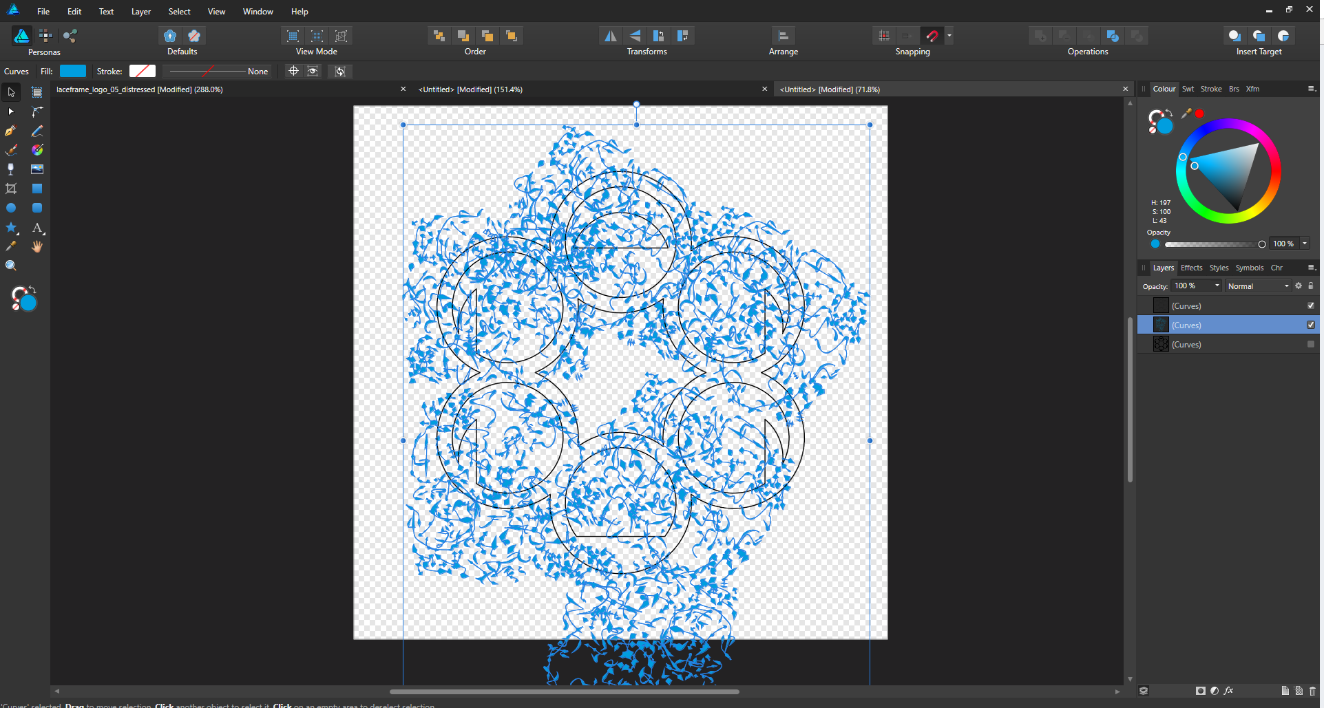
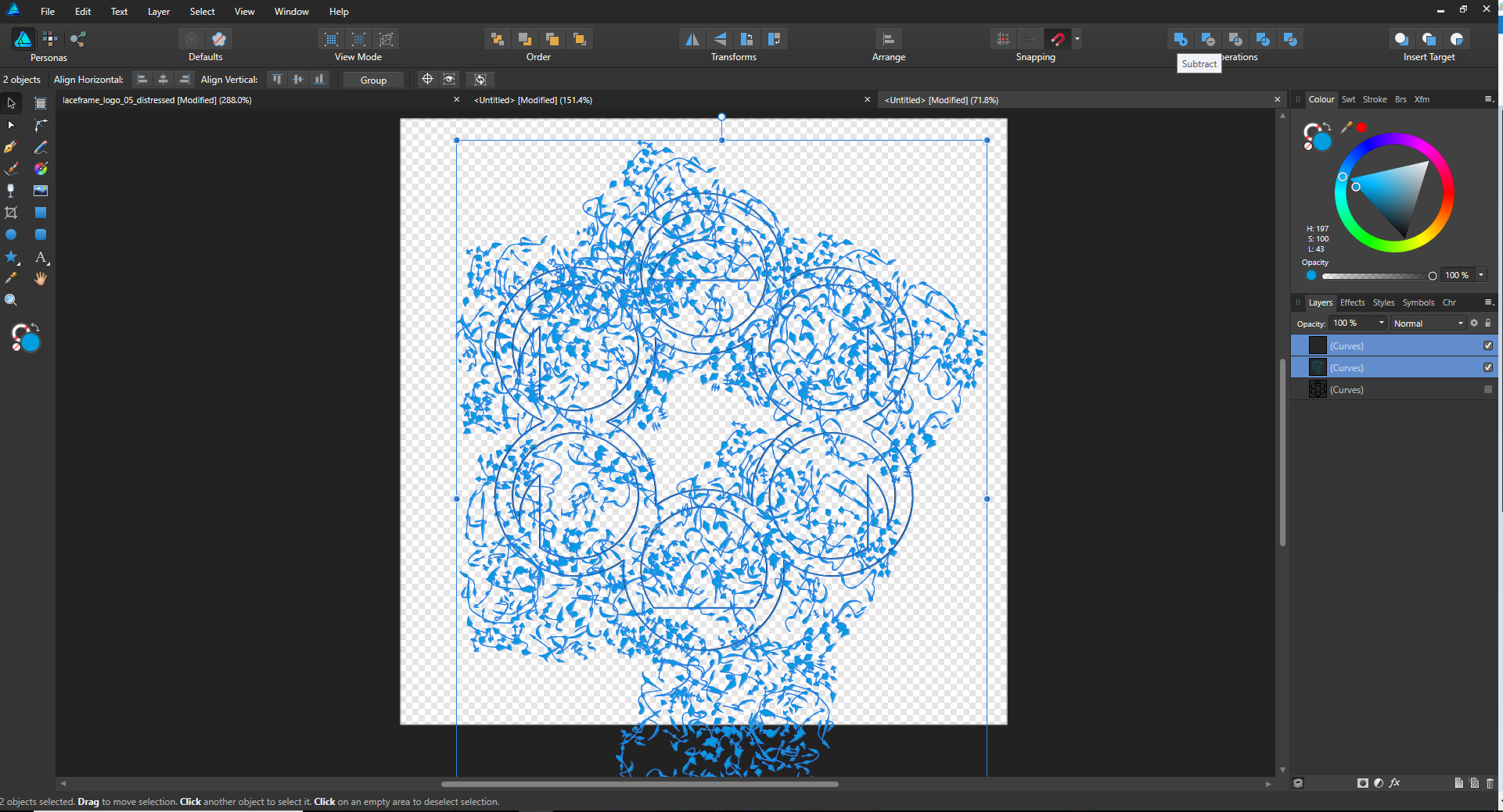
Hi Callum & Stuart R, I've been experimenting with this all evening. Understanding it to a point. With this first example, the circles inside the circular badge were solid strokes, with no fill. Using a normal 'subtract' would result in the entire circle being subtracted. This is not what I wanted. I wanted just the outline of the circle to be cut away from the background. I expanded the stroke, then simply subtracted the expanded stroke (with no fill, either using standard subtract, or combine the two objects into a compound object, and selecting subtract for the expanded stroke). With more complicated designs, this is where I am running into problems. I want the same effect with this design, taken from the Affinity Workbook. I'm having trouble combining everything to curves, keeping the distressed effect, and then subtracting it all from the main background.
-
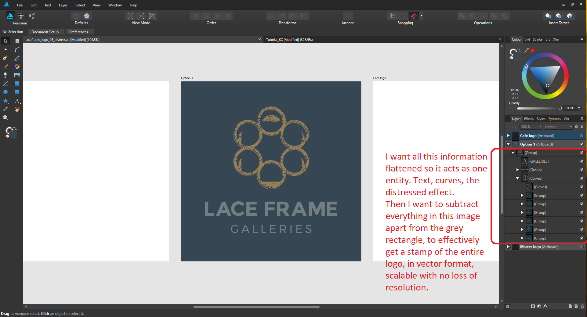
I'm kind of getting there. Working through the Work Book on this. I still have a few questions though. Starting to understand it better. What I'm stuck on now is how do I flatten everything to make a vector based stamp? For example, I want the text, with the distressed vectors and jagged edges all white (to cut out of image). Would that be an 'expand stroke' then subtract from object?
-
I've created a vector mask, for a vector, to make the image look degraded. How do I then combine this mask/aged look effect, so I get one complete vector layer, so I can scale and resize with no loss? Am I missing something obvious? Edit: 'Distressed Look' Chapter in Affinity Workbook p.324 should help. Any more pointers though, do let me know.
-
Hi stokerg, No problem. It's something that would be so handy, and could be seamless if implemented well in your workflow. You could start a curve with the pen tool, draw a line, hold ALT, or a hotkey, select the required tangent/intersection/perpendicular/quadrant, pick, then carry on your linework. It's been a staple of AutoCAD for donkey's years.