.jpeg.37a396a6569b86cb3217559d5bb29f4b.jpeg)
dysamoria
-
Posts
34 -
Joined
-
Last visited
Posts posted by dysamoria
-
-
It is unacceptable that these are not CONSISTENT across all selection tools.
SHIFT is almost universally the ADD to selection modifier in MOST SOFTWARE.
- HCE, mailmindflyer and Hofnaar
-
 2
2
-
 1
1
-
I find strong muscle memory difficulty where Shift-click/drag is NOT add to selection. Most tools I've used on the Mac that HAVE selection use Shift to Add, and Alt/Option to remove. Is it not that way in Photoshop?
I just spent 20 minutes looking at Affinity Photo preferences looking for these and they don't seem to be user-configurable.
-
Thank you very much for the info. I do think it’s counter-intuitive. The two settings are named such that they sound like the same thing. I really do appreciate your help and all the explanations.
😊
-
Thank you very much for the detailed explanation! 😊
Just so I understand fully: these two settings can have undesirable interactions. If I want everything forced to stay within pixel alignment, I need to disable “Move by pixel” so any fractional pixel values aren’t perpetuated?
I understand the suite of tools are sharing code & design. That’s sensible. Maybe Affinity Photo should be defaulted to what’s optimal to not distort pixel data. Having these settings, the use of which sounds counter-intuitive, and which users aren’t expecting to deal with, seems a user-directed burden and a workaround for Affinity Photo design choices, rather than a design for expected use.
-
I just checked. "Force Pixel Alignment" has been on the whole time. I never disabled it. What else is going on?
EDIT: Oh, you said to DISable "Move By Whole Pixels". That is also on by default, and it sounds like it's what I want. Why would it not be?
-
Will “Force Pixel Alignment” stay set permanently? I’ve never noticed that setting. I’m away from my computer at the moment but appreciate the response and will check for this later.
What is the utility of things NOT being pixel-aligned and why is that the default behavior?
EDIT: This does explain why a paste that originates at the top-left corner of the document doesn’t suffer this problem. It does NOT explain why 1 out of 6 pastes looks absolutely horrible.
i consider this a bug. Even if there is utility behind sub-pixel positioning, doing it transparently to the user, and automatically, results in unexpected and undesired outcomes. There’s a lot of this in Affinity Photo, like the PITA scenario of trying to cut content in layers when Affinity Photo has decided they’re not rasterized pixel layers for some reason, depending on where the layer came from (inconsistency is bad).
-
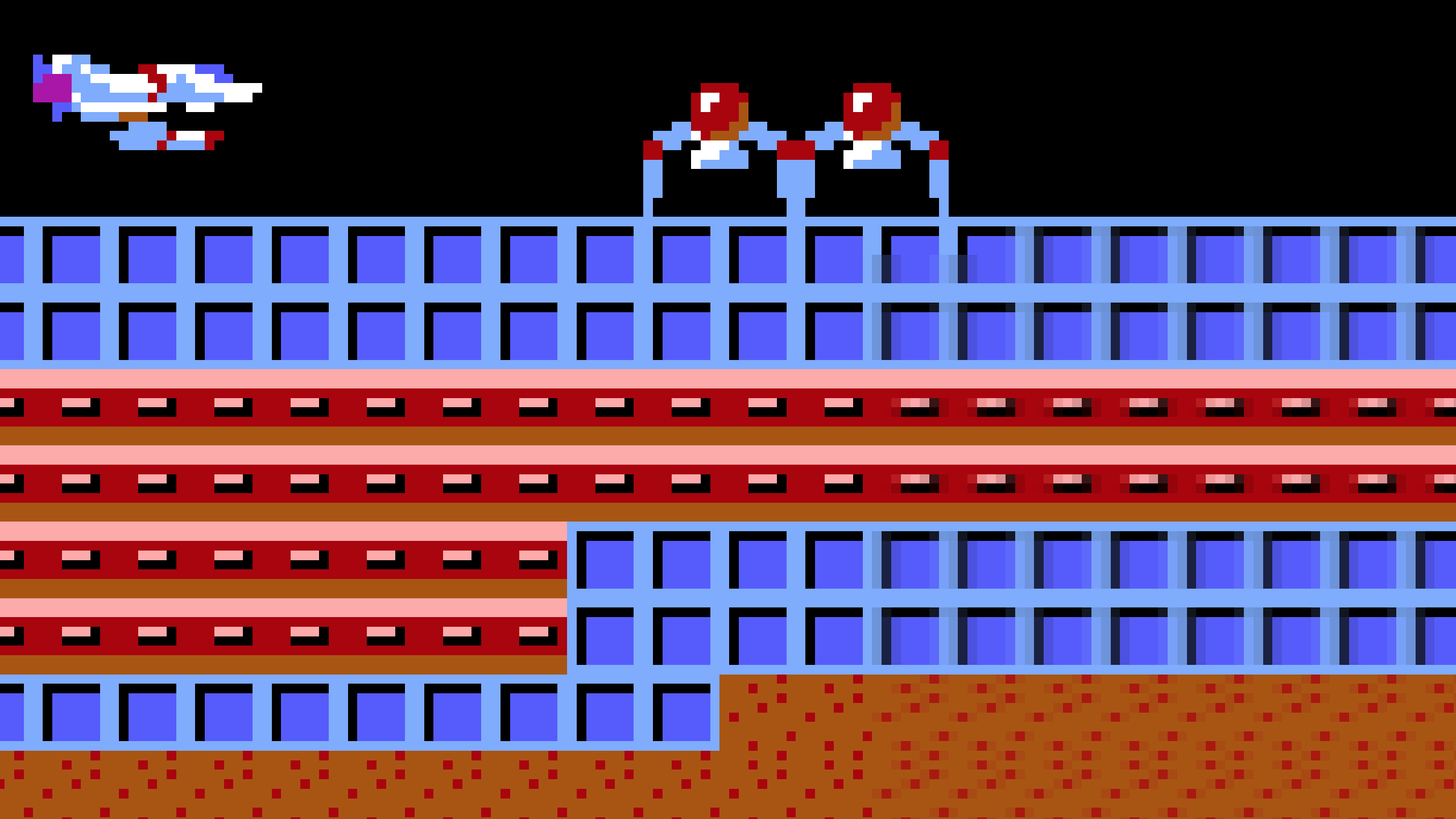
I've been piecing together a large image of the first level of the Sierra/GameArts video game "Thexder" from many screenshots. I open each screenshot PNG in Photo, crop off the bottom game UI, copy the image, close it, and paste that copied content into my main document. As I paste these shots into my primary document, the sharp solid colors in the image start to degrade at their edges, in ways you would see if you resampled an image to scale it. I am NOT scaling anything. Sometimes it's REALLY bad upon pasting a new chunk of image into the main document. In THIS specific case, it seems that undoing the paste, zooming WAY out in the document, and pasting again results in a correct paste (this time it pastes in at the top left corner of my document, where as before it pasted where I was working).
Moving layers around shows the color shifts happening as part of rendering the layers on screen, but merging down, etc, will eventually start to show that the edges of hard color borders are "smudged" with slight color shifts.
Anyone who plans to use Affinity Photo to create pixel art should beware. This could be especially problematic when changing between set palettes and full-color. It also has me wondering how much degradation is going on all the time. How much blur is Affinity Photo adding to everyone's images while they're working on them, unsuspectingly? I only noticed this because of working at the pixel level, zoomed in at them, and knowing the explicit limit of 16-colors in these screenshots (the game only shows 16 colors from an MCGA palette).
My main document is a regular Affinity Photo document. I am importing PNG images from Boxer (DOSBox shell in Mac OS) which are 320x200.
I've attached an image showing what's happening. I have zoomed way in so that you can see the individual pixels (very important with pixel art). The left side of the image shows sharper content while the right side has areas that have been through layer movement and merging down. One edge even turned partially transparent.
EDIT: It seems to be getting progressively worse as I extend my canvas to the right and downward, as the older content to the upper left does not seem degraded.

-
And I am yet ANOTHER person here for this same undocumented, unexplained in the UI, and unintuitive/uncommon behavior. I copied an image on a Safari page and pasted it into Affinity Photo. Couldn't delete parts of it. Repeat over and over. I found the Edit menu has some kind of masking command, but it seemed stupidly obtuse and I KNEW I'd been able to delete before. Came here and...
Affinity need to come up with some different behavior or visual to indicate what's going on to the user. The concept is not a bad one, but the implementation is utterly opaque.
Another inconsistency is using Control modifier key to Add to a selection instead of the Shift or Command modifier. I know I could edit the keyboard commands, but the default most everywhere else is to use Shift or Command. Control is not used as often on Mac OS, and certainly not for these kinds of things. Usually Shift is a sequential add, while Command is a non-sequential add.
-
On 11/4/2020 at 10:36 AM, Gabe said:
So far, it happened just the once.
-
Welcome to software development. Frankly, this is the norm anymore. I can't STAND this industry. But hey, if I don't want to deal with Adobe, I have to deal with Affinity. The industry is a disgrace and there are geeks left and right who will use the logical fallacy of "special pleading" to excuse and justify everything wrong with it.
This same "pick your evil" is everywhere in the industry. I use Apple products for computing because Microsoft is just that much worse. Apple sold me on Mac OS with Snow Leopard, sold me on iPhones with the first few generations of iOS and phones... but now, they're like every other computer industry company: cram the next thing on the market without fixing the bugs of the prior thing (while introducing more).
I have seen this problem in other image display programs, by the way, including in Adobe Photoshop. It seems to be related to using GPU for image display acceleration. GPUs are not big on accuracy, just speed. So the issue COULD be complicated. OR it could just be the fact that Affinity has judged it to be purely cosmetic and therefore entirely unworthy of attention while they continue to try to compete with Adobe purely from a feature list standpoint.
Regardless, we, as the customers in this abysmal industry, have to just take it the way it is because we have zero choice otherwise. We are actually exercising our minimal choice potential here by using Affinity products instead of Adobe products. Is it worth it? Time will tell. Maybe.
-
EDIT: Thanks for moving this post to the Affinity Photo forum. Sorry about the mixup.
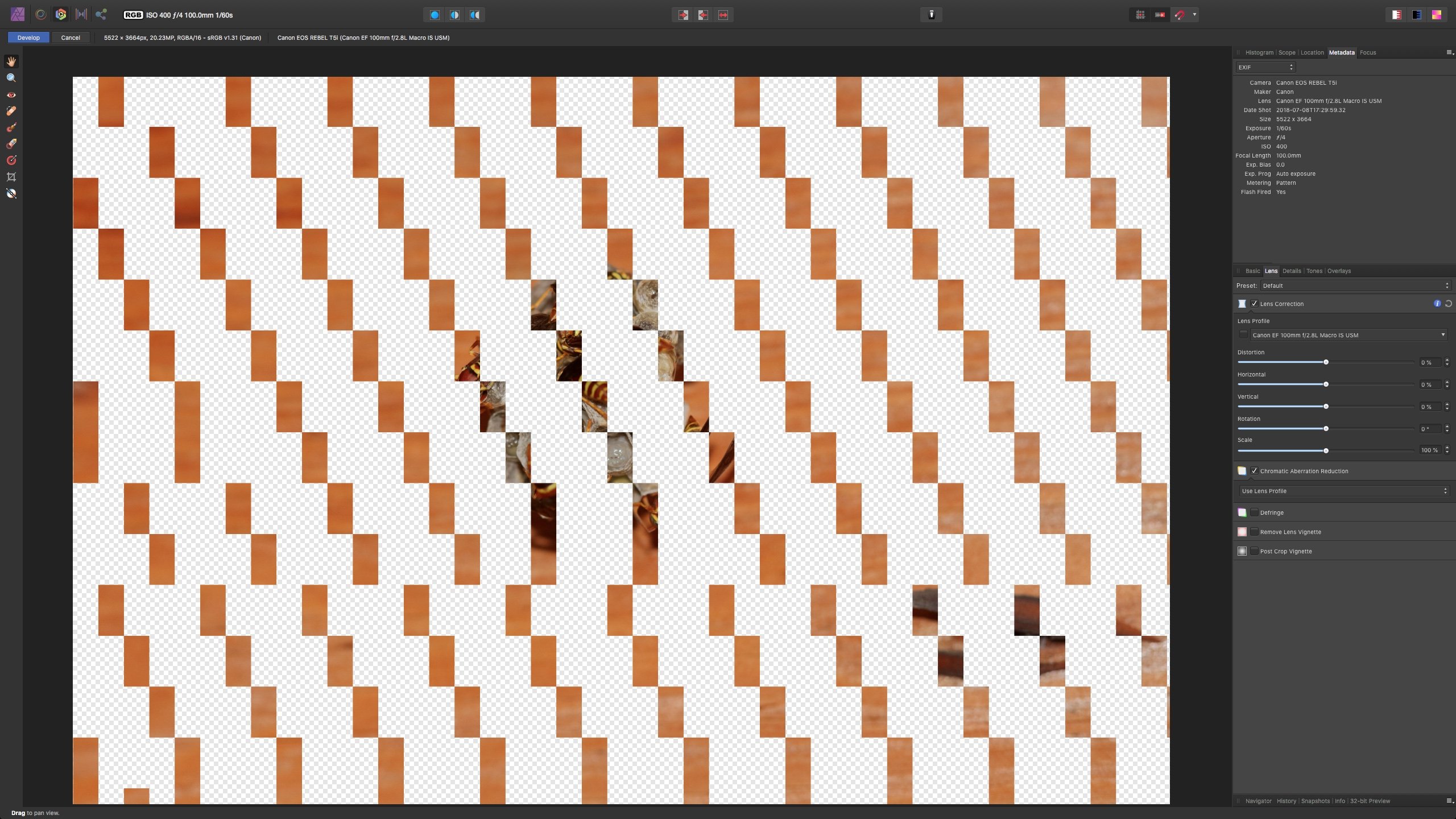
See attached files. The only thing unique about this image file is that it is created via "New Panorama..." from a number of other TIFF images (the wasps weren't centered in the compositions of the images).
This is seen while in Develop Persona.Wasps Panorama (Chromatic Aberration Bug Example).afphoto
-
I see this too on Mac OS (High Sierra), on an iMac 12,2.
It's irritating.
-
Agreed. I just found this weird behavior today while trying out Affinity Photo on iPad for the first time since my original two posts here (I found it unusable at that point and have ignored it for almost three years). When the FX palette is open, tapping in the image should absolutely NOT toggle a setting!
-
This is the setting I change Photoshop to when I use it, and I'm not sure why it's not the default. So, yes, I think this is useful.
-
Wasn't the whole point of these apps that they were 100% the same functionality between platforms? I swear I just read this very claim on the Affinity pages marketing these products...
- Mark Freeman, iuli and Massi
-
3
-
-
I finally came here to find out why Affinity Photo has never had any updates. iOS 10 gets no new updates. Lovely. I don't even know if any of my issues I reported with Affinity Photo were ever fixed before dumping iOS 10 support. I feel abandoned.
I'm on an iPad Pro 12.9" (first generation) and I actively fear iOS "upgrades". I've been an iOS user since the first iPhone and I've watched devices be utterly crippled by iOS "upgrades". Buying a new $1000 piece of hardware every couple of years is unacceptable
Sigh.
-
It's very hard to learn to use this software with SO MANY BUGS. This is beta level, not release level. I have been very eagerly awaiting this product coming to iOS and I'm regretting spending money on it with it being this unreliable.
-
Update: This is a bug. The color picker tool did NOT select the color i wanted for this tool, but it DID show the color in the color palette (sorry, "studio"). Then later when i used the color picker from the "color studio" i was required to tap on the color next to the eye dropper icon to make it active. Why is this step necessary? Just choose the color. After this, the tools behaved as expected: I selected a color and it used it. I changed the color with either the color palette or the eye dropper on the left side tool bar and the Color Replacement Brush reflected that choice.
-
I've noticed that the Color Picker Tool does not seem to impact other tools as i would expect, for example the Color Replacement Brush. Am i doing something wrong?
-
As i am trying to learn Affinity Photo, I'm running into situations where it feels the app has frozen, but i am waiting for Photo to finish some processing. There needs to be an indicator that something is happening. I see that some of the tools and processes cover the screen with a progress bar. This is a bit heavy handed, but it needs to be present for every situation where the user is forced to wait. I recommend a less intrusive version of it, as well (covering the whole screen is too much).
-
As I am moving through the Interactive Introduction, i am noticing that moving the image around results in pixelation (or downsampling) of the image. I then noticed the same thing happens when painting with color overlay (the iris color change).
Is this something i can stop, so i am working with the image in full resolution at all times? Any painting actions will be rather difficult for me if the image is downsampled while I'm working on things. I've not seen this happen in any of the other image editing/painting apps i have, so I'm presuming it's not a requirement of the iPad or iOS architecture. In fact, the video demonstration doesn't show this happening either.
-
Also, it's frustrating that the browser scroll is reset to the top of the page when going back to a prior page...
-
Is this not the consequence of a webpage having rollovers that aren't usable on a touch interface? It's quite frustrating to have to tap multiple times. Every desktop site with rollovers is a PITA on touch-based devices and I generally give them feedback about it. The whole "responsive" web design thing should be removing rollovers based on browser detection.
Affinity Photo Brushes are Pixelated
in Pre-V2 Archive of Affinity on Desktop Questions (macOS and Windows)
Posted
Isn't this the exact opposite of expected meaning for "hardness"?