Kal
-
Posts
175 -
Joined
-
Last visited
Everything posted by Kal
-

Has V2 fixed Affinity's biggest issues?
Kal replied to Kal's topic in Feedback for the Affinity V2 Suite of Products
Sigh. I thought it would be obvious that this wasn’t a new ‘feature request’. It was a one-off review off the first major upgrade to Affinity‘s ‘pro’ apps, pulling together a bunch of missing features that I happen to think are most important. Yes, these features have been requested more than once already, over many years. (I’ve linked to some of those discussions). That’s kind of the point—they were things we might have expected to be in V2, and their omission is a signal to me that Affinity’s software designers don’t rate the importance of these things highly. If this isn’t the place for an overall review and discussion of V2 and its most glaring missing features, how about being a little constructive and telling me where the right place is? I did look at all the options, and the ‘Feedback for the Affinity V2 suite of products’ certainly seemed like the best fit.- 186 replies
-
- 13
-

-

-
Exciting times. With precious little in the way of recent updates, some users wondered if Affinity was dead—but no, we were promptly told that they were just focused on the next major version. And four months later, here it is! A common expression amongst users has been 'hopefully in version 2', so here's my list of hoped for changes. I'm about to fire up my new V2 apps for the first time and see if all the hopeful waiting has been rewarded. I've divided my list into two main categories: 'UI frustrations' and 'Missing or broken features'. UI frustrations Window management (Separated Mode) Ever since MultiFinder appeared on the Mac in 1987, we've been able to run multiple apps and see their document windows side by side. Over the years came other improvements like drag and drop between apps and documents. You lose some of those benefits when an app takes up the whole screen with a solid background. For this reason, many of us preferred a separated workspace (turning off Application Frame in Adobe apps), but after switching to Affinity, quickly discovered that Affinity's Separated Mode was pretty broken, with document windows and Studio panels seemingly having no knowledge of each other's existence. After much criticism, Affinity finally responded in June 2020 with a help article titled 'Increase your efficiency with Affinity’s Separated Mode'. There was no admission of any issues though, and I parodied the unhelpful article in this forum comment. Changes in V2 Affinity seems to have finally acknowledged the issues with Separated Mode. Their solution? Remove it altogether! The new 'Float View to Window' command kind of gives us the worst of both worlds… separate windows that still aren't aware of your Studio panels, and a big old solid-grey app window obscuring every other background app. It looks like Affinity might have just put this one in the too hard basket. Panel management Resizing Studio panels in V1 is somewhere between painful and impossible. To be fair, this was never a perfect experience with Adobe either, but Affinity takes the pain to a new level. Can't see most of your Paragraph panel? Hover your cursor very carefully over that one-pixel hairline between panels… Nope, there's the 'no entry' cursor telling you the panel can't be resized (for some unknown reason). Double-click to minimise a panel or two to make more space… only to find that it added several inches of completely empty space to a different panel instead. Try to resize that one. Nope, there's the 'no entry' cursor again. Start double-clicking ALL the panels until you can finally see the one you want. Utter frustration. Changes in V2 After playing around with panels for just a few minutes, the results are mixed. Firstly, I can resize panels (without seeing the 'no entry' icon all the time)—great! Secondly, the hover-zone seems to have expanded from one pixel to around two—I'll take it! Beyond that, things are still quite unpredictable. For example, I currently have a massive Swatches panel full of mostly empty space, and a tiny Text Styles panel below it which is showing me only two lines. I can resize the Text Styles panel to my liking, but if I then minimise and reopen it, it's right back to the way it was—tiny and useless. Whatever algorithm is determining these panel sizes is clearly not fit for purpose. On a positive note, on the Mac the Studio panels are now listed under the Window menu—exactly where they should have been all along! Oh one other thing… I lost the Swatches panel in Designer. As in, it just totally vanished. 😳 I can hide it and unhide it again from the menu, but it does not reappear. Restarting the app doesn't bring it back either. This could be a bit of a problem!! (Edit: Found!) Working with guides Creating a simple guide the normal way, by dragging out from the ruler, works fine. Unfortunately though, Affinity apps lack the power and flexibility of other drawing apps like Illustrator, which let you select and manipulate guides like normal objects—positioning them numerically for example, or hitting delete to remove then. Illustrator even lets you convert normal vector objects into guides. With Affinity apps, you have to drag a guide off the edge of a page to remove it. The issues with this approach are (1) you have to be zoomed out so that you can see the edge of the page, and (2) it's inconsistent with the behaviour of other objects, which can be safely dragged and positioned beyond the edge of the page. This creates confusion for users as discussed on threads like this one. Instead, Affinity gives us the Guides Manager. It's a useful tool, but it would be less necessary if guides were more flexible in the first place. Changes in V2 There appears to be no changes to the way guides work in V2. Working with colour swatches In my opinion, Affinity seriously dropped the ball in V1 with the way colour swatches are handled. Here are some of the features that are missing or broken: There's no obvious place to put your custom colours. You have to find the 'Add Document Palette' command first, which then creates something called 'Unnamed'. Other actions may trigger the app to add a second palette named 'Document'. Once a swatch is created, you can't convert it to or from a global or spot colour. You can't select more than one swatch at a time. You can't drag and drop colour swatches between palettes or between different parts of the UI. There's no obvious way to add a Pantone swatch to an existing document palette. (You need to apply the colour to an object on the canvas, select the object, switch back to your document palette and click on one of the two 'Add…' buttons.) New global colours are given generic names (Global Colour 1, etc). Pantone colour names are not preserved when added as global colours (the most common requirement!) and need to be typed in manually. Global colours are not transferred between documents when copying and pasting objects. (You need to explicitly export a palette from the first document and then import it into the second document.) Global spot colours are not added to a Publisher document palette when placing a Designer file (unlike InDesign and Illustrator). There's no search field in the 'Add Global Color' panel or edit colour pop-up, making it almost impossible to select the one you want from a large list of swatches. (They aren't displayed as a list, even if you set the panel appearance to 'Show as List'.) There's no command to find and delete unused swatches from a document palette. There's no option to merge two global colours. When deleting a used swatch, you're not asked what to replace it with. (If you delete a global colour, all instances just get replaced with a non-global version.) Yes, colour swatch management in Affinity V1 is bad—really bad. In one forum comment I wrote, 'That's one thing Adobe got right, and something the Affinity devs would have done well to replicate, rather than trying to get clever and do their own thing. Gosh I hope version 2 starts to take this seriously.' Well let's check out V2 and see… Changes in V2 (1) The 'Add Document Palette' command now displays a pop-up which asks, 'Please enter a name for the new palette.' It still defaults to 'Unnamed', but it's a small improvement over the previous behaviour. (9) Both the 'Add Global Color' panel and the edit colour pop-up now feature a search field, making it much easier to select from a large list of swatches. (They also now respect the 'Show as List' setting.) Aside from those two improvements, very little seems to have changed with colour swatches across the Affinity suite. That's a big disappointment, and seems to communicates that the Affinity team don't share the view of many users, that this really needed an overhaul. Undo/Redo In Affinity apps, the action of selecting or deselecting an object gets added to the undo/redo stack. This is counterintuitive, goes against years of established practice, and (if the user is not familiar with it) can lead to data loss. Only an action that alters the artwork in some way should be added to the undo/redo stack, as discussed here. Changes in V2 Nothing has changed. Missing or broken features 1-bit black and white artwork (line art) Graphics applications have, since the beginning of time, supported true 1-bit black and white artwork, so many professional users were understandably shocked to discover that Affinity V1 apps offered no support at all for 1-bit files. The only workaround is to work with grayscale and manually compress your lightness levels. This is anything but reliable, as compression algorithms at export time will not recognise the difference between a faux B&W image and a grayscale one, downsampling line art to an unacceptably low resolution and adding unwanted antialiasing. Changes in V2 Incredibly, there's still no support for 1-bit black and white artwork. Turning off antialiasing The ability to turn off antialiasing of exported graphics is an essential feature for any professional graphics application. Affinity V1 apps lacked this feature entirely in the beginning, but in response to a forum post in 2015, one of Affinity's developers added highly-customisable, per-object control of antialiasing. Then, in 2020, it got better, with a simple on or off option, which you can apply to multiple objects at once. This is a huge improvement already, but some of us would still like to see a simple on/off checkbox at export for outputting something like a raster print versions of a logo. As I explained in the same discussion: 'it's about tailoring the artwork to different output media. That should be an export function, not something I have to hard-code into the design file.' Changes in V2 Turning off antialiasing cannot be done globally at export—it must still be hard-coded into each object of the file. Reliably exporting for print Affinity Publisher's default PDF export settings for print-ready artwork ('PDF (press-ready)') turns black (K:100) to a CMYK mix (e.g. C:71, M:66, Y:66, K:76), which would be a disaster if not detected before your job goes to print (something which is difficult when there are no pre-press tools provided). There are other issues too, like line art being downsampled and antialiased (related to the previous two issues). Changes in V2 This has not been fixed. The 'PDF (press-ready)' export preset still has an all-or nothing 'Embed profiles' option ticked by default, and still causes black artwork (like text) to get converted to a CMYK mix. Previewing colour separations Affinity has no alternative to Acrobat Pro. For print professionals, this means no way of previewing and checking colour separations before going to print. When combined with the issues mentioned above, the chances of poor quality artwork and printing are high. Changes in V2 There are no new apps or built-in tools for checking colour separations. Summary V2 may have brought some cool new features, but it has only brought modest improvements to a few of the features which matter to me the most, while other issues have been overlooked completely. Having waited so many years for the first major update, I have to say, I'm pretty disappointed. I'll still purchase all the apps, and I'll still recommend them to family and friends. They do a lot of great things, and you certainly can't beat the price. Of course, this is not an exhaustive list of the issues I have with the Affinity apps—just a few that frustrate me the most. If I've left out some of your biggest issues, feel free to add them below with a note on whether V2 fixed them for you.
- 186 replies
-
- 44
-
-
-

-
Oh no, the most useful tip on the forums got replaced with '(...)'. I've seen this elsewhere. What happened here…?
-
Definitely better than nothing though. For what I needed today, it actually worked quite well.
-
It's this kind of stuff that makes me feel some regret at jumping all in with Affinity. Aside from the endless frustrations I feel with the UI (particularly with colour swatches), there are some essential features for professionals (like support for 1-bit images and turning off anti-aliasing) that are simply missing. Years go by, with users requesting the same features over and over, and there seems to be little evidence that these features are even on the roadmap. It makes me wonder if Affinity just doesn't have any print professionals on their team, if they think these things aren't essential.
-
Ah, okay. I went full CMYK for years, before seeing the benefits of a tagged RGB workflow for photos. The problem with converting photos to CMYK at our end is that the 'prepress guy' can't then do anything to correct colours, even if he wants to (aside from minor ink coverage fudges on the press). Right. Adobe, for all its faults, was very explicit about this kind of thing, so you knew where you stood. With Affinity's one-setting-fits-all approach, we can really only guess at what's happening.
-
Agreed. (For colours defined in Publisher anyway—I still prefer to let the printer convert RGB photos to CMYK.) Ah okay, that's a relief about RGB profiles. I always assumed they were included when I chose a 'press-ready' export, but manually deselecting that 'Embed profiles' option had me worried! I guess we'd need to talk to someone who works in pre-press for a living. I've never delved into the PostScript or PDF code the way you have, so I have no idea what it all looks like under the hood—I just assumed that when I preview separations in software designed for that task (I used Acrobat Pro for many years, but switched to those other options as per our discussion about Acrobat Pro alternatives) I'm seeing how it will separate at the other end. I've never used PACKZVIEW, but if all the other software is showing the same thing, that black text has been converted to a CMYK mix, that's reason enough for me to want to fix it before it goes to the printer. Imagine a whole book being printed that way! What a disaster that would be. TL;DR: Choose the 'PDF (press-ready)' export preset and uncheck 'Embed profiles'. 🙂 BTW, has anyone submitted a feature request to make this behaviour the default?
-
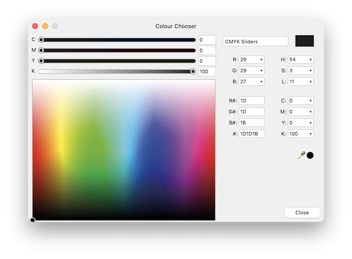
@lacerto I'm confused about this issue too. I don't do this stuff regularly enough anymore to come across this often, but I just had to output a couple of jobs and could not work out why the black was being converted to a CMYK mix. I checked the seps in your 'PDF Output Preview' app, as well as the PDFTRON WebViewer Demo, and both show the same thing, so I don't think it's an 'illustory' Acrobat issue as you described it earlier. My document colour settings are: Colour format: CMYK/8 Colour profile: Coated FOGRA39 (ISO 12647-2:2004) The text colour is K:100 as shown by selecting the text and double clicking on the fill colour well: With the default 'PDF (press ready)' preset, the profile is set to 'Use document profile'. After PDF export, the black is changed to a CMYK mix every time: I was scratching my head because I don't remember this being a problem in the past. But when I found your advice to uncheck the 'Embed profiles' option, problem fixed! This makes absolutely no sense to me. Firstly, I want colour profiles embedded, because RGB images need to be converted correctly to CMYK at prepress. Secondly, there should be no conversion of CMYK values to new CMYK values when the output profile matches the document profile. Is there something I'm missing here? A publishing program that turns black text to C:71, M:66, Y:66, K:76 with the default prepress settings?? What the #$^&*@??

-
Save dialogue issues after upgrading to macOS Monterey
Kal replied to Kal's topic in V1 Bugs found on macOS
Thanks @Lee D. I haven't had the problem happen again since I filed the bug report, but then I'm mostly working on existing files. I'll let you know if it starts happening again. -
Freeze on Save after upgrading to macOS Monterey
Kal replied to Kal's topic in V1 Bugs found on macOS
Thanks @stokerg. No, I'm not using an external monitor or iPad—just the built-in iMac display. I'm not using Photo in my work at the moment, but if I do have more problems in future, I'll try out the beta and report back. -
When trying to save a file for the first time, I find that I am frequently unable to enter a filename, as though Designer has frozen. If I click somewhere else, and then back to the filename field, text may suddenly appear and I can type as normal. I have also had some issues with the Save dialogue in Photo since upgrading to macOS Monterey. My system: iMac 5K 2017 RAM: 24 GB macOS Monterey 12.2.1
-
Photo totally froze up when I tried to save a file. It became completely unresponsive (spinning beachball), and after a long wait it became clear to me that it was not going to recover, so I had to do a Force Quit. (Thankfully, the autosave recovered most of what I had worked on.) I have also had some issues with the Save dialogue in Designer since upgrading to macOS Monterey. My system: iMac 5K 2017 RAM: 24 GB macOS Monterey 12.2.1
-
Okay, I understand now. You didn't mention the slice tool in your first comment, and it sounded like you were talking about snapping guide lines to the grid. I guess we just hit a language barrier. Yes, you're right, slices don't snap to guides. Earlier in the thread, Meb confirmed that 'slices only snap to the Pixel grid'. I think everyone who has tried the slice tool would agree—you just expect this kind of basic snapping behaviour from such a tool. Affinity, in my experience, is not quick to respond to user feedback. As you can see, this was posted almost 6 years ago, and nothing has changed.
-
Are you saying that a vertical guide doesn't snap to a horizontal grid line? A vertical line always crosses a horizontal one, at infinite points—what is there to snap to? Perhaps I don't understand what you're trying to do. Are you wanting it to actually snap to your cursor?
-
@X-Raym, do you mean 'guides'? Guides should be snapping to the grid. Go to View > Snapping Manager, and make sure 'Snap to grid' is ticked.
-
An incredibly useful thread, but yes, it takes a bit of work to sift through 11 pages of discussion! So, if you’ve just tuned in, and you’re wanting to check your print separations in a post-Adobe world (without breaking the bank), here are the highlights: PACKZVIEW: a free app to preview and inspect production PDF files. This seems to be the best option out there. The only catch is, you need to register, and registrations are reserved for ‘labels/packaging’ companies. If you’re a graphic designer with a commercial website, you should qualify. Otherwise, you might want to try one of the other options. (Thanks to @leob, developer of PDF Checkpoint.) PDFTRON WebViewer Demo: This isn't a standalone product; it's a JavaScript-based SDK that developers can license for their own apps. But if all you need to do is check print separations, the online demo may very well suit your needs. It finds all the spots and CMYK inks, and lists them with checkboxes that you can turn off and on, just like Acrobat Pro. You can move your cursor over the preview image and see ink coverage percentages. (Original comment) PDF Output Preview: This useful little app was created by fellow forum member @Lagarto in response to this very thread. It uses Ghostscript, a free command-line tool for working with PostScript and PDF, so you’ll need to install this too. I believe the current versions (as of 15 October 2021) of PDF Output Preview are 1.0.0.16 for Windows and 1.0.0.10 for macOS. (I don't think there's currently a single web page where you can find and download the latest versions, but Lagarto can update us if that happens.) We can update or repost this as necessary to keep the information fresh.
-
You're most welcome! Also check out PDF Output Preview by fellow forum member @Lagarto if you haven't already. (Links on the previous page.)
-
Indeed it does! Great job Lagarto. Hey, it's not Acrobat Pro 😄 but it shows me those colour seps, which is what I really need to see. Thanks again for investing your time to make life easier for all of us! 🏆
-
On the command line (Bash or Zsh), I find it much easier to just enclose file paths in single quotes, rather than muck around with escape characters. With scripting, if you're storing your command as a string, you might need to escape the backslash itself before you can use it to escape another character in the actual command. It gets confusing—my tip, just go with single quotes! 🙂 So I can confirm that your app is working, so long as there are no spaces elsewhere in the path. If one of the containing folders has any spaces in the name, it still crashes.
-
You're right. That file of yours opens no problem, and the app works beautifully (when it's working). 😊 I've sent you my PDF as requested. Ah okay. I did skim the whole conversation, but I can't recall what your Automator plugin does? I don't mind running Ghostscript from the Terminal, but the layering of seps provided by Lagarto's app would really take it to another level.
-
Thanks, I've sent you a PM. When it silently crashed on my production file (print-ready artwork with 2 spot colours) I tested a bunch of other PDFs, and the same thing happened every time. So I wonder if there's some other issue on my system. I'm on macOS Big Sur 11.2.3.
-
I've been away from this thread for a while, but I see much has happened… @Lagarto, absolutely legendary stuff, to get in there and actually make this app for everyone! I just downloaded the latest version, but unfortunately the app is crashing for me when I try and open any PDF. I have Ghostscript 9.50 installed in the usual place (/usr/local/bin/) and can confirm it is working to produce separations from the same PDFs. This is the error in the console, which probably isn't very helpful: com.apple.xpc.launchd[1] (application.com.lagarto.pdfoutputpreview.PDF-Output-Preview.65202316.65202319[7782]): Service exited with abnormal code: 1 Any ideas what to try?
-
How strange that we have two different tools to accomplish the exact same thing (rounded corners), and they're completely incompatible with each other.
-
Sounds like a decent app, but like many of the other similar suggestions, it doesn't appear to do what the OP was asking for related to pre-press. Checking spot-colour separations seems to be the feature most lacking in these apps. Check out the full conversation for some options.
-
There's a project for a keen bean. Not sure you could charge any money for it though, depending on Ghostscript's licensing. Do we need Acrobat Pro to see the separate layers? 😝