hifred
-
Posts
407 -
Joined
Everything posted by hifred
-

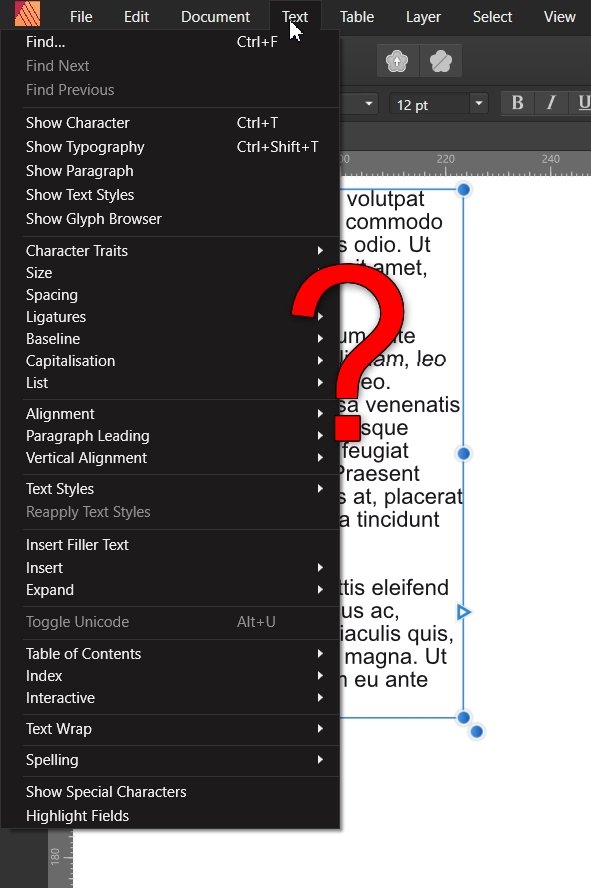
Wish for monochromatic workspace
hifred replied to hifred's topic in Feedback for Affinity Publisher V1 on Desktop
Hehe, I'm already pretty hardcore in that respect: I really do not like looking at multicoloured buttons and close needless toolbars anyway, whenever possible. But in this case I would call an exception justified: These buttons are pretty important, they form a group and they as abstract artworks are pretty much indistinguishable in greyscale. If one stuck to greyscale one needed additional text or differently shaped icons. -
I have just begun testing the integration of Designer and Photo (a nice surprise indeed!) with Publisher with Preferences/User Interface/ Monochromatic Iconography checked. While I greatly prefer greyscale icons, this option does not work well with the buttons for Photo and Designer. On initial startup the integration buttons appear greyed out, as one first needs to run Photo and Designer and accept the license. But even after having done this, the alternative "Personas" seemingly remain greyed out. Right now, with greyscale icons active it's really hard to spot which persona is active. One either needed App Icons which in greyscale looked very different from each other or – and that's likely the most straightforward solution – one should show these three important icons in colour. All apps a correctly linked but they still look greyed out. It's hard to spot that the Publisher-Persona is active. As its GUI is extremely similar to Designer one needs a clear visual identifier.

-
I suggest you to read a few more of my posts / threads. Having done hat I would be surprised if you still called me defensive of stuff that doesn't work. In fact, I still don't use any of the programs of the Affinity-Suite in production, as I consider them not got and not fast enough for what I want to do. That being said, I want to give precise and constructive feedback to developers, so that they can identify and fix problems. There's nothing wrong with the statements in my first reply to you - let's please no longer waste time and move on.
-
I had read all this. You should have read my posts too... Such as this one.
-
Ok, you're correct. I had in mind that it was the OP who first brought up the Cintiq, but later posters mention this device, before I did. Apart from that I have no idea what could have caused your anger. Also I still don't know exactly what you mean. If you prefer the GUI and speed available in Photoshop I am with you – as I already wrote earlier.
-
I can't follow. The OP referred to Cintiq behavior in the intial post. And he asked for picking with the ALT-Key and nothing else. It turned out that this sort of sampling works on Cintiqs (but with any other supported input device tooI). If you don't like this implementation you should first describe what you're missing.
-
Photoshop has a similar concept to Image Layers and one may also link or embed files. One still may create selections, duplicate portions or sample colours from this sort of content. The Image Layer implementation is a needless trap as partial rasterization could take place on the fly.
-
The originally requested feature is not missing. One can sample colours by pressing ALT with the Brush tool active, also with Cintiqs. No need either, to switch tools first. But Affinity Photo gives less feedback than Photoshop and the colour sampler feels slow.
-
Could someone from staff please extract the remaining feature requests? While the title is misleading (ALT+Picking works on Cintiq) there's some valid concerns: Feedback is poor (no cursor change when pressing ALT with the brush tool active. Too slow initialization of the magnifying glass Needless tool-decoration (instead of colour judgment-helpers)
-
I agree. Immediate feedback on pressing the ALT Modifier is badly missing. As the cursor doesn't change to a colour picker there's no way to understand that the mode-change has registered. One needs to start sampling to have that magnifying glass appear: But also here the feedback is poor, as it easily takes half a second or more, until the Loupe finally shows up. One nearly can feel the program think: "Hang on – the user has pressed ALT and now even keeps LMB held down – what was it again what I'm supposed to show? While speeding up that widget one might consider removing that distracting bevel-effect from the picker. Giving the user a picker-experience which lets users judge the just sampled colour sure was more helpful than skeuomorphism. That's how things look in Photoshop CS6.
- 48 replies
-
- 2
-

-

-
- color picker
- color wheel
- (and 8 more)
-
We users are in neither of these roles. Not in the role to mull over Serifs business strategy and possible complications, caused by some decision or another. Not in the role to patronize fellow users either – on what adequate expectations might look like. There's also zero point in building an argumentation based on the price point Serif has chosen. That's again entirely "their beer" (up to them) as we say in German. I would gladly pay considerably more for a suite of tools on a perpetual license, which is on par performance-wise with Adobe's offering. As a matter of fact work on the DAM has already begun and it should be helpful for Serif to get feedback. I understand that you don't consider a DAM important – that is perfectly fine. I personally can state that I wasn't willing to use an otherwisely highly mature Affinity Photo 3.0 in 2025 if it still dealed with RAWs in the same the way it does today.
-
@Chris B I just tried the Beta for the first time with a Cintiq. Doubleclicking the knob with a pen doesn't work, the click target is simply too small, every tiny offset with the second click registers as repositioning. Just try it our yourself :o). To support Pen input properly one either had to enlarge the hotspot around the knob or – what other apps offer – is alternatively clicking onto the Slider Title, which is a larger and static target. This should work with pens as well.
-
Nice! Yes thanks, I have seen dmstraker's later post, where he mentioned this. I personally think overdragging to Undo would fell even more direct. One usually already knows while dragging that one has messed up – that way one could undo without even releasing the knob. Also a lot of retouchers work with tablets / pen displays – and the doubleclick event generally sucks with a pen. A similarly pen-friendly implementation is btw. overdragging to remove nodes in graphs (like in curves). So, if you still have a line left on your notepad... :o) Node removal by overdragging in Photoshop. The gif drops a few frames, but I guess you get the sense.
-
Very useful! While at it one might consider implementing a second, equally useful power-user feature: Return to previous slider value by "overdragging" the slider considerable. This differs from the new double-click functionality insofar as on may also return to previous custom values. If the previous value was zero however, the slider gets reset. That way one can freely play around but can be sure that the previous value isn't lost. It's more flexible than Undo in multiple slider adjustment layers, works very well with pen /tap based input and can't get in the way.
-
Ok, I have to admit that this is better than nothing (also available on Windows). Still it's certainly not where I would search first – admittedly biased from my Indesign background (which doesn't give individual objects layers but uses Layers as folders for similar stuff). For me text is primarily text and I would look in its associated options, in order to turn it to dumb vectors.
-
@Mark Ingram ,all Devs. Yes, that is the real question. Why does one make it up to the user to activate an arbitrarily chosen workmode to get access to Text to Curves Tool? It's bloodcurdling not to have Text to Curves in the Menu / the RMB-Menu of the Text tool but having to change to the Move tool. Left: Publisher, Right Indesign. Yes, it generally makes sense to offer context-adapted toolsets. But one has clearly overdone things when one forces users to memorize and obey programmer determined artificial editing sequences which have no practical foundation: Just in order to get access to certain tools.
-
@Mark IngramIt's a step in a good direction to show bigger thumbnails. But it was still required to have them in document aspect ratio. The current implementation isn't as readable as it could be – it is even is misleading – as it suggests the user that the document is actually square but cropped in some way. This really needs to get fixed. Also the Mask should never display a checker pattern,, but always appear in greyscale. Interestingly Alpha Channels show the correct aspect ratio:
-
Thank you :o)
-
Hi @Mark Ingram Here I have piled up and explained a few other UX issues. They all, without a question fall into the "changing the default behaviour of the application is a thing which we rarely want to do" realm :o) It took some time to collect and maybe you find some of this not too foolish after all... I'd be happy if you / the UX guys had a look, before the the thread gets burried in this ever growing feature-requests-thread.
-
I meant: Please refrain from private judgment on fellow users attitude and from assumptions, how statements might come across.
-
I can not know. You have no evidence of the opposite either. We only know three letters, which can mean quite different things. Please do refrain from further private judgment.
-
The mentioned products are only tools to browse and sort images, but are also called DAM, yes. It also to me would make zero sense that Serif spend development time on a tool which is limited to these tasks. Many DAMs however include a RAW development module which allows for editing large amounts of RAWs at a speed and flexibility that is unthinkable with the principle currently used in the Develop Persona - think factor 100 faster. If one uses such a tool and wants to further edit developed images with a classic layer based program later, one needs colour management - the integration Adobe offers with Photoshop is quite attractive indeed. I think we all would profit, if Serif told us, what sort of program they actually plan to release - most of the users at least, who voted in my little poll don't only want a browser.
-
Hi @SrPx I feel kind of bad that you spent time to write all this down. Honestly, I have a hard time sift through your (usually pretty long) posts and often give up soon. Where do you pick up what has been discussed, what's random scattered opinion /senior artist advice and chit chat? All hard to identify. Your posts seem to me like a stream of conciousness, as if you spoke freely into your phone and pressed the Send button. At any rate I didn't address you with my posts :o)
-
I do understand this notion - however we are still looking at the 1.x version, right :o) Even Photoshop in version xx changed how Ctrl+Z works, quite recently... Of all those users who don't post in the forums - what scenario would you consider more likely: Relatively inexperienced users running into what happened to Patricia (neither being aware of the cause, nor of the recently introduced fix in Preferences). Or experienced users who use a lot of keyboard shortcuts and even like the concept of stacked hotkeys - who at the same time get just mad about little behaviour change, which they may get rid of with one little checkmark in Preferences? My personal preference is that software makers remain open for change - even on long established conventions :o)
-
In contrast to you I am convinced that one could tell us quite a bit more. Not customer support staff, but management. You can't prove me wrong, neither can I do the opposite. But there's certainly nothing wrong with expressing a wish. The only thing which doesn't make sense are quarrels of this nature and fellow customers trying to speak for a brand.