ashf
-
Posts
2,032 -
Joined
-
Last visited
Everything posted by ashf
-
I just changed the document size from A4 to Letter. it did not affect the result at all though. AD-print-screen.mp4
-
Also I see MPlus font has small shift on your PDF too.
-
Both MS' and Adobe's pdf printer have the shift problem. See the attached pdf. And this is not only on my PC, I'm reporting this because I was asked about this problem from another user. Print Adobe.pdf Print MS.pdf
-
Also you better update the GPU driver to the latest one. GPU driver is usually not being updated via Windows Update.
-
Uncheck Hardware Acceleration in Preference>Performance
-
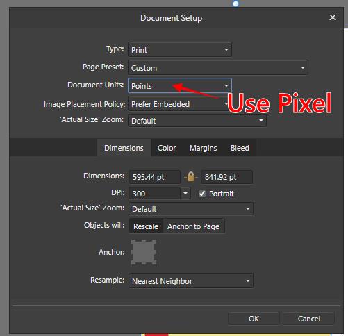
I believe even though you use a custom CMYK profile, it still is a CMYK file with a color profile. So Affinity will treat it as a regular CMYK.
-
Uploaded. Sample artwork uses a few fonts including that have no shift. Distance of the shift seems to be different for each font. TrueType of DynaFont fonts(DF) are old and already discontinued, but still many users are using it. I uploaded some but if you need I will send you entire font pack. UD Digital fonts come with MS Office. MPlus fonts are open source. https://github.com/coz-m/MPLUS_FONTS
-
The ICC profile of imported images will be converted to the document's profile.
-
The stroke on text with particular font will be shifted when printing. I can send the font(it's a paid font so I can not upload here directly) as sample.

-
I don't think IvyBridge is supported... According to the Help:
-
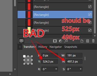
See the attached pictures. Also I amended your file as sample. Untitled-pixel.afdesign
-
That's because you created the object as an image(raster format). If you want to export an artwork in raster format: 1. use pixel unit 2. objects should not have sub-pixel(decimal point) size/position. 3. align objects to pixel grid.
-
As I mentioned, you will see the gap on the editing screen of Affinity. But you won't see the gap in Acrobat Reader. I opened Untitled.pdf you uploaded in Acrobat, there's no gap.
-
Short answer: just ignore it. This is artifacts caused by antialiasing and common thing in many vector software but not only Affinity. Export the artwork to PNG or PDF. you won't see the gap if you created the artwork properly. It's only on the editing screen.
-
Fixed in 1.10.0 beta. Thank you.
-
Gradients should have 3 stops or more in order to preserve editability. Not sure why but this is a compatibility problem between Affinity and Illustrator.
-
Still not available in Photo?
-
Suggestions for Japanese UI
ashf replied to ashf's topic in Feedback for the V1 Affinity Suite of Products
Translation suggestion for the Export dialog ”Export Preview” should be 書き出しプレビュー, not プレビュー書き出し- 112 replies
-
- 2
-

-
- japanese
- translation
- (and 3 more)
-
Affinity Photo Customer Beta (1.10.0.244)
ashf replied to Andy Somerfield's topic in [ARCHIVE] Photo beta on macOS threads
What's the ACM lens profile? lcp file? -
Enabling the black point compensation made it better.
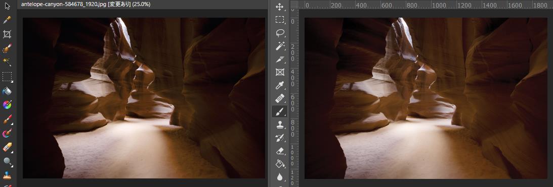
-
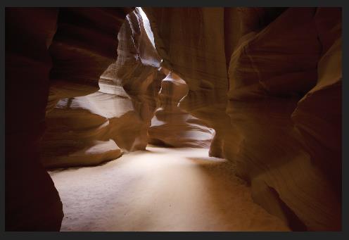
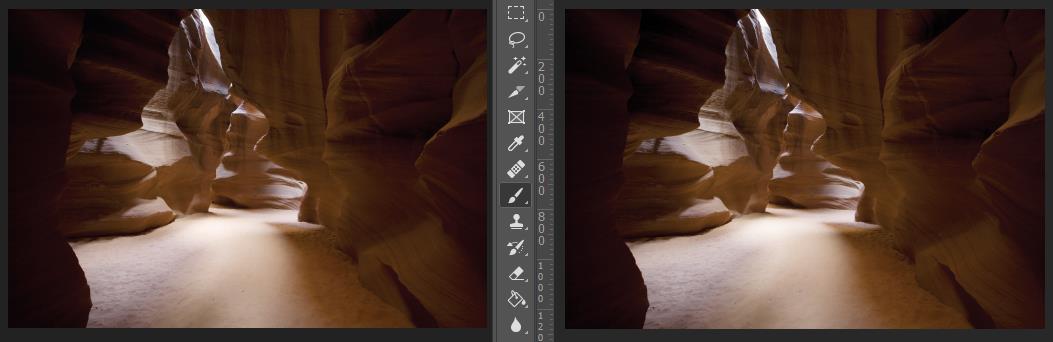
The result of color conversion from RGB to CMYK with perceptual intent(second picture) doesn't look good. Compared to Photoshop, too much shadow part that lost detail. Conversion with relative intent(first picture) is good enough though...
-
Would be nice if "Clip Canvas" could be applied to visible/selected layer(s).
-
No, not exactly the same as MS Office, please see the linked page. Photoshop way is that small sticky note icon is placed on the document and when you click it, the comment is shown on the Notes panel. Similar to online design feedback service such as Invision.
-
it's little different from what you're thinking. it's more like the Comment tool of MS Office. http://www.photoshopforphotographers.com/CC_2013/Help_guide/tp/Annotation_tools.html
-
I would like you to implement Note tool like Photoshop to Affinity that can place sticky notes on the document. It's useful for reviewing document/feedback or explaining content to another designer.