Roger C
-
Posts
174 -
Joined
-
Last visited
Everything posted by Roger C
-
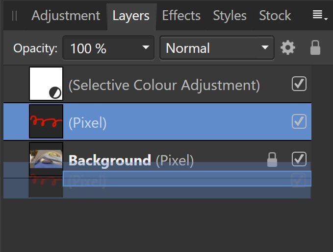
 Notice these blue lines. This long blue line right across the layers panel will move the red squiggle layer below the Background layer. This shorter blue line will move the red squiggle inside the Background layer.
-
Artistic Filters
Roger C replied to Richio75's topic in Pre-V2 Archive of Affinity on Desktop Questions (macOS and Windows)
Thanks firstdefence, this is just what I've been looking for! ...Perfecto. -
@telemax An elegant solution! When following along with your video, I just needed to read the hint bar at the bottom of the screen and Ctrl click on the Symbol in order to clone it and create the other half of the heart. Thanks. P.S. Do you have a video channel? Your replies are super helpful.
-
This is a known problem. Please see this thread: Note the last post suggesting a fix is/will be available.
-
I spent a frustrating half hour clicking back and forth this morning trying to get rid of this thing. I thought something had accidentally been enabled in my profile page. --------------------------- The Devs are welcome to put whatever experience enhancements they like in it, as long as it can be removed with user preferences.
-
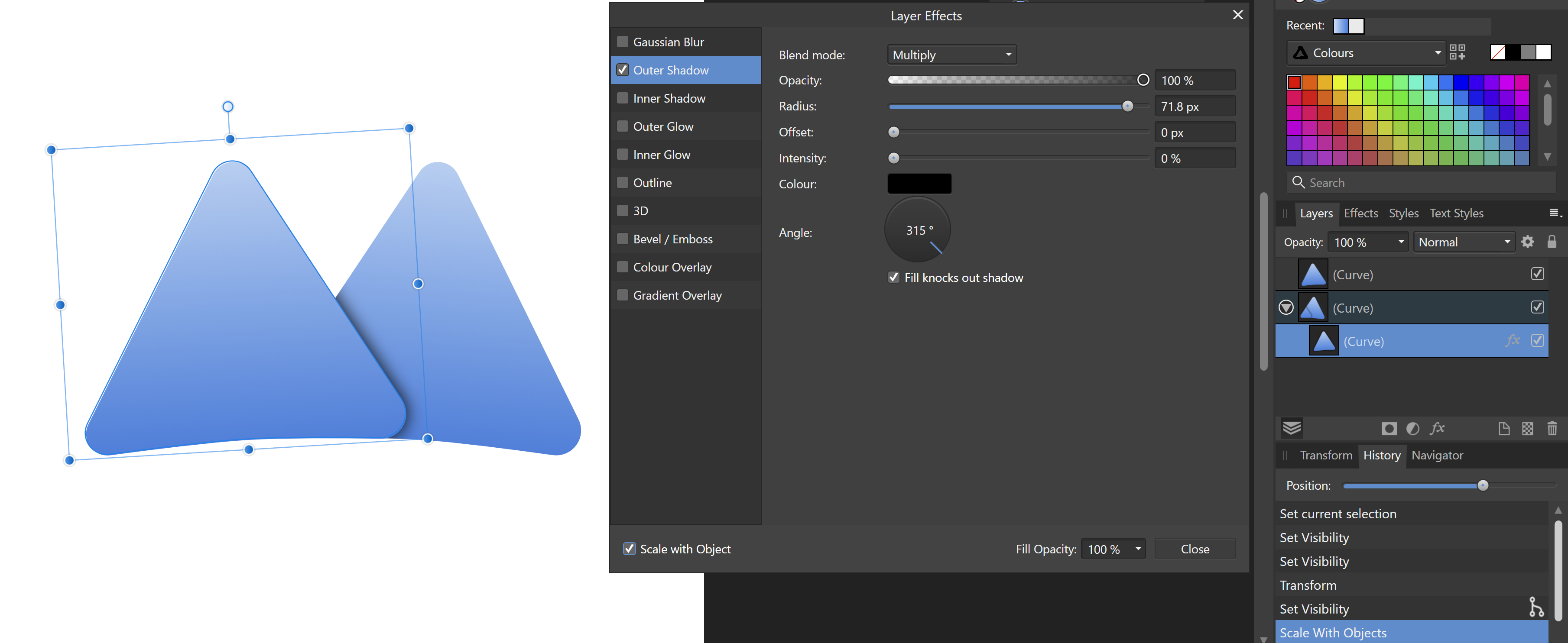
You will need to set the shadow radius above zero in order to see the shadow. The radius is the "size" of the shadow. And tick the "Scale with Object" box so it stays in proportion if you change the size. Also, see what Carl says above. Attached is my attempt. Feel free to pull it apart and have a root around. Result!.afdesign
-
Yet another elegant and intelligent interpretation. Simply well done!
-
affinity designer Kagoshima / Tramway network / Transit Diagram
Roger C replied to transitdiagrams's topic in Share your work
This bright version is absolutely delicious! And Super Elegant. Yes, the Hokusai waves were a lovely surprise too. Delightful. -
Yeah, I'm already feline queasy. Is it pussible you could stop now?
-
So the clunky and sub-optimal Search facility on this forum is a feature the website provider itself struggles with! ---------------------------------------------------------------------- Thank you @Hilltop and @Alfred ! I hadn't thought to search outside the forum to find things inside this forum, but it actually works; and so much better than what we have here. Yes, it's an extra step, but it ultimately saves the time and frustration of repeatedly trying to second guess what the forum's search engine might respond to each time...
-
affinity photo My first AP Shaded Relief [WORK IN PROGRESS]
Roger C replied to ivanozzo's topic in Share your work
Thank you for your detailed reply. I look forward to seeing your next steps. -
affinity photo My first AP Shaded Relief [WORK IN PROGRESS]
Roger C replied to ivanozzo's topic in Share your work
This is interesting, and something I haven't seen before on the forum. I thought it would have taken much longer to achieve the result you already have. The colouring is intriguing. I meant to ask you: how did you choose the colouring and apply it? Is it purely hypsometric? (As some valleys don't appear to be so). -
affinity photo My first AP Shaded Relief [WORK IN PROGRESS]
Roger C replied to ivanozzo's topic in Share your work
It already looks very impressive viewed full size. This must have taken some time to create? -
MAJOR problem -All white screen after Windows 10 update
Roger C replied to Scho's topic in V1 Bugs found on Windows
@Scho Thank you for completing the thread and posting your solution. Yes, your post will be helpful to others. Always good to find the cause of problems. regards R -
A book of spells? The Magic wand tool could come in useful, perhaps?
-
The Live Layer Adjustments have a grouping that in general make sense. The Layer Adjustments options appear to have been compiled by someone in a passive/aggressive mood who was being perverse just for the sake of it! Standardising on the Live Layer Adjustments layout across the board wouldn't hurt at all.
-
affinity designer Bern / trolleybus, tram / transit maps
Roger C replied to transitdiagrams's topic in Share your work
Off the top of my head I was going to suggest Tokyo, but that would be an insane challenge that would take forever: the metro stops would have to be as crammed as the commuters! How about somewhere split by water? Have you tried Istanbul? Plenty of variety there. Whichever you choose will look good, I suspect.- 12 replies
-
- 1
-

-
- bern
- switzerland
- (and 5 more)
-
affinity designer Bern / trolleybus, tram / transit maps
Roger C replied to transitdiagrams's topic in Share your work
... and each one is a masterclass, showcasing a variety of design styles.- 12 replies
-
- 1
-

-
- bern
- switzerland
- (and 5 more)
-
affinity designer Sheffield / Tram / Transit diagram
Roger C replied to transitdiagrams's topic in Share your work
@ChrisSmere That's a great design, and an excellent clear lay out. Yes, it has a classic look. Lovely style. Wow! It seems transit maps can make anywhere look good, don't you agree @Alfred?- 16 replies
-
- 1
-
-
- sheffield
- transit map
- (and 3 more)
-
Until I saw your Instagram page I had never seen maps done in "Dark View" before. It makes a great change and the result is really striking. I was too simple minded to think other than white for land, blue for water. Nice work.
- 14 replies
-
- 1
-
-
- bus
- trolleybus
- (and 5 more)
-
affinity designer Eskişehir / tramvay ağı / another transit map
Roger C replied to transitdiagrams's topic in Share your work
@ChrisSmere Beautiful work! Calm, cool and collected. Your Instagram page is delicious. Were these all done in Designer? You could post the San Francisco map here, as well. It looks remarkably like a Unicorn. Is that just coincidence?- 14 replies
-
- 1
-
-
- eskişehir
- transit map
- (and 4 more)
-
Are the missing blue lines just a UI bug?
-
Aha! Those suggestions are going to be useful for a problem I've been stuck on for some time. Thanks (yet again) Toltec for helping me think outside the [marquee] box!
-
With all due respect to everyone at Serif, Affinity's 'Help' sections are more what you'd call.... ...."guidelines" ....
-
Holy Mackerel, Batman. Did you juggle on a unicycle at the same time?